about
echarts官网:https://www.echartsjs.com/zh/index.html
示例
在视图函数中处理好相关数据:
from django.shortcuts import render, redirect, HttpResponse
from django.http import JsonResponse
def test(request):
if request.method == "POST":
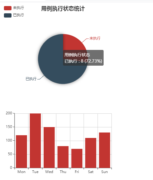
obj = ([{'value': 3, 'name': '未执行'}, {'value': 8, 'name': '已执行'}], ['未执行', '已执行'])
bar = [120, 200, 150, 80, 70, 110, 130]
return JsonResponse({"obj": obj, 'bar': bar})
else:
return render(request, 'test.html', )然后前端调用:
<!DOCTYPE html>
<html lang="en">
<head>
    {% load static %}
    <meta charset="UTF-8">
    <meta http-equiv="x-ua-compatible" content="IE=edge">
    <meta name="viewport" content="width=device-width, initial-scale=1">
    <title>Title</title>
</head>
<body>


<div id="Pie1" style="width: 400px;height:300px;"></div>
<div id="barSimple" style="width: 400px;height:300px;"></div>


</body>

<script src="https://cdn.bootcss.com/jquery/2.2.4/jquery.min.js"></script>
<script src="https://cdn.bootcss.com/echarts/3.0.0/echarts.min.js"></script>
<script>
    // 饼图
    function Pie1(data, ) {
        var myChart = echarts.init(document.getElementById('Pie1'));
        option = {
            title: {
                text: '用例执行状态统计',
                subtext: '',
                x: 'center'
            },
            tooltip: {
                trigger: 'item',
                formatter: "{a} <br/>{b} : {c} ({d}%)"
            },
            legend: {
                orient: 'vertical',
                left: 'left',
                data: data[1]
            },
            series: [
                {
                    name: '用例执行状态',
                    type: 'pie',
                    radius: '55%',
                    center: ['50%', '60%'],
                    data:data[0],
                    itemStyle: {
                        emphasis: {
                            shadowBlur: 10,
                            shadowOffsetX: 0,
                            shadowColor: 'rgba(0, 0, 0, 0.5)'
                        }
                    }
                }
            ]
        };
        myChart.setOption(option);


    }


    // 柱状图
    function barSimple(data) {
        var myChart = echarts.init(document.getElementById('barSimple'));
        option = {
            xAxis: {
                type: 'category',
                data: ['Mon', 'Tue', 'Wed', 'Thu', 'Fri', 'Sat', 'Sun']
            },
            yAxis: {
                type: 'value'
            },
            series: [{
                data: data,
                type: 'bar'
            }]
        };
        myChart.setOption(option)
    }

    window.onload = function () {
        $.ajax({
            url: "/test/",
            type:"POST",
            data: {"k1": "v1"},
            success: function (data) {
                // 饼图
                Pie1(data['obj']);
                // 柱状图
                barSimple(data['bar']);
                console.log(data)
            }
        })
    }
</script>
</html>
效果:
about
echarts官网:https://www.echartsjs.com/zh/index.html
示例
在视图函数中处理好相关数据:
from django.shortcuts import render, redirect, HttpResponse
from django.http import JsonResponse
def test(request):
    if request.method == "POST":
        obj = ([{'value': 3, 'name': '未执行'}, {'value': 8, 'name': '已执行'}], ['未执行', '已执行'])
        bar = [120, 200, 150, 80, 70, 110, 130]
        return JsonResponse({"obj": obj, 'bar': bar})
    else:

        return render(request, 'test.html', )
然后前端调用:
<!DOCTYPE html>
<html lang="en">
<head>
    {% load static %}
    <meta charset="UTF-8">
    <meta http-equiv="x-ua-compatible" content="IE=edge">
    <meta name="viewport" content="width=device-width, initial-scale=1">
    <title>Title</title>
</head>
<body>


<div id="Pie1" style="width: 400px;height:300px;"></div>
<div id="barSimple" style="width: 400px;height:300px;"></div>


</body>

<script src="https://cdn.bootcss.com/jquery/2.2.4/jquery.min.js"></script>
<script src="https://cdn.bootcss.com/echarts/3.0.0/echarts.min.js"></script>
<script>
    // 饼图
    function Pie1(data, ) {
        var myChart = echarts.init(document.getElementById('Pie1'));
        option = {
            title: {
                text: '用例执行状态统计',
                subtext: '',
                x: 'center'
            },
            tooltip: {
                trigger: 'item',
                formatter: "{a} <br/>{b} : {c} ({d}%)"
            },
            legend: {
                orient: 'vertical',
                left: 'left',
                data: data[1]
            },
            series: [
                {
                    name: '用例执行状态',
                    type: 'pie',
                    radius: '55%',
                    center: ['50%', '60%'],
                    data:data[0],
                    itemStyle: {
                        emphasis: {
                            shadowBlur: 10,
                            shadowOffsetX: 0,
                            shadowColor: 'rgba(0, 0, 0, 0.5)'
                        }
                    }
                }
            ]
        };
        myChart.setOption(option);


    }


    // 柱状图
    function barSimple(data) {
        var myChart = echarts.init(document.getElementById('barSimple'));
        option = {
            xAxis: {
                type: 'category',
                data: ['Mon', 'Tue', 'Wed', 'Thu', 'Fri', 'Sat', 'Sun']
            },
            yAxis: {
                type: 'value'
            },
            series: [{
                data: data,
                type: 'bar'
            }]
        };
        myChart.setOption(option)
    }

    window.onload = function () {
        $.ajax({
            url: "/test/",
            type:"POST",
            data: {"k1": "v1"},
            success: function (data) {
                // 饼图
                Pie1(data['obj']);
                // 柱状图
                barSimple(data['bar']);
                console.log(data)
            }
        })
    }
</script>
</html>
效果: