目录
上一篇已经介绍了ECharts库的导入工作和绘制基本的图标,今天我们来了解一下常用的组件,如果对数据可视化感兴趣的麻烦点个关注,内容会持续更新。
如果不清楚ECharts库的导入过程的可以参考:ECharts导入
在介绍常用组件之前,先了解一下series系列
一.series系列
我们知道数据的可视化包含了我们可以直接看见的图表,还包含了数据,而这些都包含series系列里,一个series系列必须包含两个要素:图表数值data和图表类型type,有了这两个要素数据才可以表现出来
常见的图表类型:
- 折线图line
- 柱状图bar
- 饼图pie
- 散点图scatter
- 关系图graph
- 树图tree
例如:一个折线图表,type为line,给定数据data
<script type="text/javascript">
    // 因为该demo会经常更该,所以要销毁前一个图表
    echarts.init(document.getElementById('div')).dispose();
    //定义
    var myChart = echarts.init(document.getElementById('div'));
    var option={
        xAxis:{
            data:[
                'jan','feb','mar','apr','may','jun',
                'jul','aug','sep','oct','nov','dec'
            ]
        },
        yAxis:{},
        series:[
            {
                type:'line',
                data:[43,62,56,91,23,5,12,31,38,97,86,57]
            }
            ]
    }
  myChart.setOption(option);
</script>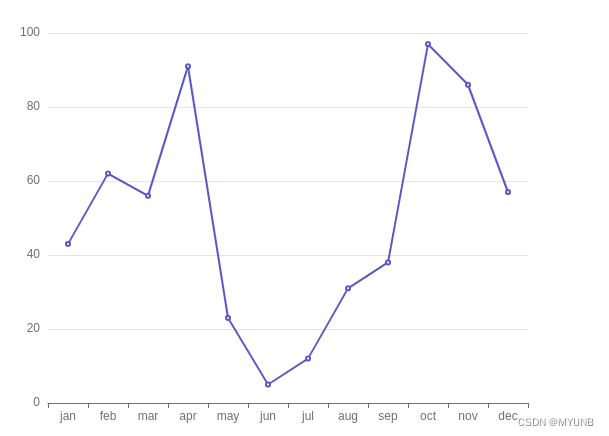
二.常见组件
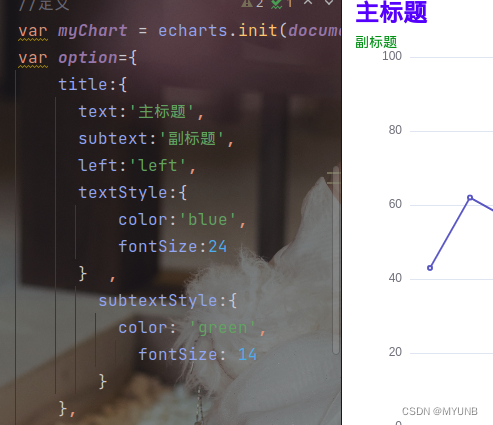
1.标题title
- 主标题 title
- 副标题 subtext
- 位置 left
- 主标题样式 textStyle
- 副标题样式 subtextStyle
- 可见性 show
例如:在上面的例子中加入标题
2.图例legend
图例legend方便对数据的分辨,它的data参数和series系列搭配使用
 var option={
        legend:{
         data:['人数'],  //要和series的name对于
    },
        xAxis:{
            data:[
                'jan','feb','mar','apr','may','jun',
                'jul','aug','sep','oct','nov','dec'
            ]
        },
        yAxis:{},
        series:[
            {
                name:'人数',
                type:'line',
                data:[43,62,56,91,23,5,12,31,38,97,86,57]
            }
            ]
    }
在数据上会多出legend图例

3.工具栏toolbox
- 保存图片 saveAslmage
- 配置项还原 restore
- 数据视图工具 dataView
- 数据区域缩放 dataZoom
- 动态类型切换 magicType
例如:加上toolbox后
toolbox:{
          feature:{
              saveAsImage:{type:'jpg'},
              dataView:{},
              restore:{},
              dataZoom:{},
              magicType:{
                  type:[
                      'line',
                      'bar',
                      'stack',
                      'titled'
                  ]
              }
          }
        },
图表上会多出一些工具

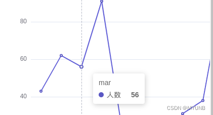
4.提示框tooltip
提示触发方式trigger
item 图形触发,主要在散点图,饼图等无类目轴的图表中使用
axis 坐标轴触发,主要在柱状图,折线图等会使用类目轴的图表
none什么都不触发
例如:在上面的例子中加入提示框
 tooltip:{
          trigger:'axis'
        },
当鼠标触碰到图表坐标时,会有提示信息
5.坐标轴 xAxis yAsix
- 坐标名称 name
- 类名数据 data
y轴的分割设置:
- splitNUmber 分割段数
- interval 坐标分割间隔
- minlnterval 坐标轴最小间隔
- maxlnterval 坐标轴最大间隔
6.series系列
- 类型 type
- 类名名 name
- 数据data
- 标记点 markPoint
markPoint:{
data:[
{type:'min'},{type:'max'},{value:'value',coord:[x,y]} //coord 坐标
]
}
- 标记线 markLine
markLine:{
data:[
{type:'min'},{type:'max'},{value:'value',coord:[x,y]} //coord 坐标
]
}
全例:
<!DOCTYPE html>
<html lang="en">
<head>
    <meta charset="UTF-8">
    <title>Title</title>
<script src="echart.js"></script>
    <style>

    </style>
</head>
<body>
<div style="height: 500px;width: 600px" id="div"></div>
<script type="text/javascript">
    // 因为该demo会经常更该,所以要销毁前一个图表
    echarts.init(document.getElementById('div')).dispose();
    //定义
    var myChart = echarts.init(document.getElementById('div'));
    var option={
        legend:{
         data:['人数'],  //要和series的name对于
    },
  title:{
          text:'主标题',
            subtext:'副标题',
            textStyle:{
              color:'blue',
                fontSize:20
            },
            subtextStyle:{
              color: 'red',
                fontSize: 10
            }
        },
        toolbox:{
          feature:{
              saveAsImage:{type:'jpg'},
              dataView:{},
              restore:{},
              dataZoom:{},
              magicType:{
                  type:[
                      'line',
                      'bar',
                      'stack',
                      'titled'
                  ]
              }
          }
        },
        tooltip:{
          trigger:'axis'
        },
        xAxis:{
            data:[
                'jan','feb','mar','apr','may','jun',
                'jul','aug','sep','oct','nov','dec'
            ]
        },
        yAxis:{},
        series:[
            {
                name:'人数',
                type:'bar',
                data:[43,62,56,91,23,5,12,31,38,97,86,57],
            markPoint:{
                    data:[
                        {type:'min'},
                        {type: 'max'},
                        {coord:[0,70],value:70},
                    ]
            },
                // markLine:{
                //     date:[
                //         {name:'平均线',type:'min'},
                //     ]
                // },
            }
            ]
    }
  myChart.setOption(option);

</script>
</body>
</html>