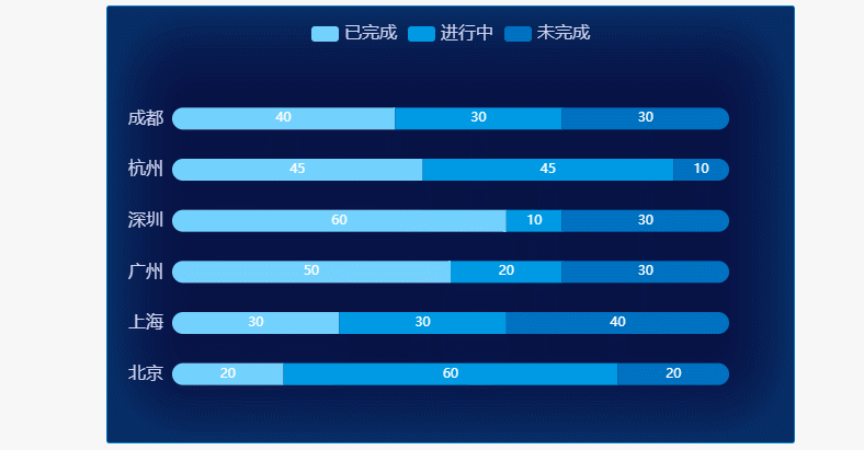
效果图
背景图片

下载ECharts
npm install echarts --save引入并注册全局ECharts
在 main.js 文件里引入并注册 ( 这里是 Vue3.0 的模板 )
import Vue from 'vue'
import App from './App.vue'
import router from './router'
import store from './store'

import echarts from 'echarts'
Vue.prototype.$echarts = echarts

Vue.config.productionTip = false

new Vue({
  router,
  store,
  render: h => h(App)
}).$mount('#app')
在组件中使用ECharts
<template>
  <div class='wrapper'>
    <div class='chart' id='chart'></div>
  </div>
</template>

<script>
export default {
  data () {
    return {}
  },
  mounted () {
    this.drawChart()
  },
  methods: {
    drawChart () {
      // 基于准备好的dom,初始化echarts实例
      let chart = this.$echarts.init(document.getElementById('chart'))
      // 监听屏幕变化自动缩放图表
      window.addEventListener('resize', function () { chart.resize() })
      // 绘制图表
      chart.setOption({
        color: ['#74d1fd', '#009ae4', '#0071c1'],
        // 设置图表的位置
        grid: {
          x: 60, // 左间距
          y: 80, // 上间距
          x2: 60, // 右间距
          y2: 40 // 下间距
        },
        // 提示框组件
        tooltip: {
          trigger: 'axis', // 触发类型, axis: 坐标轴触发
          axisPointer: {
          	// 指示器类型  'line' 直线指示器 'shadow' 阴影指示器 'none' 无指示器
          	// 'cross' 十字准星指示器 其实是种简写,表示启用两个正交的轴的 axisPointer
            type: 'none'
          },
          textStyle: {
            color: '#cdd3ee' // 文字颜色
          },
          // 提示框浮层内容格式器,支持字符串模板和回调函数两种形式 折线(区域)图、柱状(条形)图、K线图
          // {a}(系列名称),{b}(类目值),{c}(数值), {d}(无)
          formatter: '{b}<br />{a0}: {c0}%<br />{a1}: {c1}%<br />{a2}: {c2}%'
        },
        // 图例组件
        legend: {
          textStyle: { // 文本样式
            fontSize: 16,
            color: '#cdd3ee'
          },
          top: 13, // 定位
          data: [ '已完成', '进行中', '未完成' ] // 图例的数据数组
        },
        // X轴
        xAxis: {
          type: 'value', // 坐标轴类型,   'value' 数值轴,适用于连续数据
          // 坐标轴刻度
          axisTick: {
            show: false // 是否显示坐标轴刻度 默认显示
          },
          // 坐标轴轴线
          axisLine: { // 是否显示坐标轴轴线 默认显示
            show: false // 是否显示坐标轴轴线 默认显示
          },
          // 坐标轴在图表区域中的分隔线
          splitLine: {
            show: false // 是否显示分隔线。默认数值轴显示
          },
          // 坐标轴刻度标签
          axisLabel: {
            show: false // 是否显示刻度标签 默认显示
          }
        },
        yAxis: [
          // 左侧Y轴
          {
            // 坐标轴类型,  'category' 类目轴,适用于离散的类目数据
            // 为该类型时必须通过 data 设置类目数据
            type: 'category',
            // 坐标轴刻度
            axisTick: {
              show: false // 是否显示坐标轴刻度 默认显示
            },
            // 坐标轴轴线
            axisLine: { // 是否显示坐标轴轴线 默认显示
              show: false, // 是否显示坐标轴轴线 默认显示
              lineStyle: { // 坐标轴线线的颜色
                color: '#cdd3ee'
              }
            },
            // 坐标轴在图表区域中的分隔线
            splitLine: {
              show: false // 是否显示分隔线。默认数值轴显示
            },
            // 坐标轴刻度标签
            axisLabel: {
              show: true, // 是否显示刻度标签 默认显示
              fontSize: 16, // 文字的字体大小
              color: '#cdd3ee', // 刻度标签文字的颜色
              // 使用字符串模板,模板变量为刻度默认标签 {value}
              formatter: '{value}'
            },
            // 类目数据,在类目轴(type: 'category')中有效
            data: ['北京', '上海', '广州', '深圳', '杭州', '成都']
          }
        ],
        // 系列列表
        series: [
          {
            type: 'bar', // 系列类型
            name: '已完成', // 系列名称, 用于tooltip的显示, legend 的图例筛选
            // 数据堆叠,同个类目轴上系列配置相同的stack值后,后一个系列的值会在前一个系列的值上相加
            stack: '总量',
            barMaxWidth: 20, // 柱条的最大宽度,不设时自适应
            // 图形上的文本标签
            label: {
              show: true,
              // 标签的位置 left right bottom top inside  // 绝对的像素值 position: [10, 10]
              // 相对的百分比 position: ['50%', '50%']
              position: 'inside'
            },
            // 图形样式
            itemStyle: {
              barBorderRadius: [10, 0, 0, 10] // 圆角半径, 单位px, 支持传入数组分别指定 4 个圆角半径
            },
            data: [20, 30, 50, 60, 45, 40] // 系列中的数据内容数组
          },
          {
            type: 'bar', // 系列类型
            name: '进行中', // 系列名称, 用于tooltip的显示, legend 的图例筛选
            // 数据堆叠,同个类目轴上系列配置相同的stack值后,后一个系列的值会在前一个系列的值上相加
            stack: '总量',
            barMaxWidth: 20, // 柱条的最大宽度,不设时自适应
            // 图形上的文本标签
            label: {
              show: true,
              // 标签的位置 left right bottom top inside  // 绝对的像素值 position: [10, 10]
              // 相对的百分比 position: ['50%', '50%']
              position: 'inside'
            },
            data: [60, 30, 20, 10, 45, 30] // 系列中的数据内容数组
          },
          {
            type: 'bar', // 系列类型
            name: '未完成', // 系列名称, 用于tooltip的显示, legend 的图例筛选
            // 数据堆叠,同个类目轴上系列配置相同的stack值后,后一个系列的值会在前一个系列的值上相加
            stack: '总量',
            barMaxWidth: 20, // 柱条的最大宽度,不设时自适应
            // 图形上的文本标签
            label: {
              show: true,
              // 标签的位置 left right bottom top inside  // 绝对的像素值 position: [10, 10]
              // 相对的百分比 position: ['50%', '50%']
              position: 'inside'
            },
            // 图形样式
            itemStyle: {
              barBorderRadius: [0, 10, 10, 0] // 圆角半径, 单位px, 支持传入数组分别指定 4 个圆角半径
            },
            data: [20, 40, 30, 30, 10, 30] // 系列中的数据内容数组
          }
        ]
      })
    }
  }
}
</script>

<style scoped>
.wrapper {
  width: 100%;
}
.wrapper .chart {
  width: 60%;
  height: 400px;
  margin: 100px auto 0;
  background: url(../../public/static/bg.png) no-repeat;
  background-size: 100% 100%;
}
</style>
