定义动画:
1.通过@keyframas+自定义动画名称{}
2.在动画集中通过from和to设置动画的开始和结束状态
@keyframes move{
from{
opacity:0;
}
to{
opacity:1;
}
}
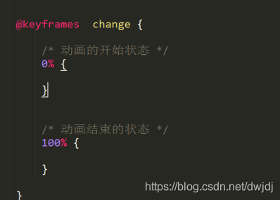
也可以用0%代替from,100%代替to
注意:
◆动画集要单独定义,不能放到类样式中
animation-name属性:
用于定义@keyframes动画规定的名称
animation-name:keyframename;
animation-duration属性:
用于定义动画效果完成所需的时间(秒|毫秒)
animation-duration:time;
animation-timing-function属性:
用于定义动画效果完成的速度变化
一般取linear(匀速),与过渡效果(transition-timing-function)的速度取值一样
animation-delay属性:
定义动画效果执行的延迟时间
animation-delay:time;
animation-iteration-count属性:
定义动画的播放次数
可以取number或者infinite(无限次)
animation-direction属性:
用于定义动画播放的方向,即动画播放完成后是否逆向交替循环
animation-direction:nomal|alternate(逆向交替循环播放);
animation-fill-mode属性:
用于定义动画之外的状态,保持变化之后的状态
animation-fill-mode:forwards;
animation-play-state属性:
用于设置动画暂停
animation-play-state:paused;
.box:hover {
			 /* 动画暂停 */
			 animation-play-state: paused;
		}
<!DOCTYPE html>
<html lang="en">
<head>
<meta charset="UTF-8">
<title>Title</title>
<style type="text/css">
.box{
width: 300px;
height: 300px;
background-color: #000000;
animation-name: move;
animation-duration: 2s;
animation-iteration-count: infinite;
animation-timing-function: linear;
animation-direction: alternate;
}
.box:hover{
animation-play-state: paused;
}
@keyframes move {
from{
transform: translateX(0px);
}
to{
transform: translateX(400px);
}
}
</style>
</head>
<body>
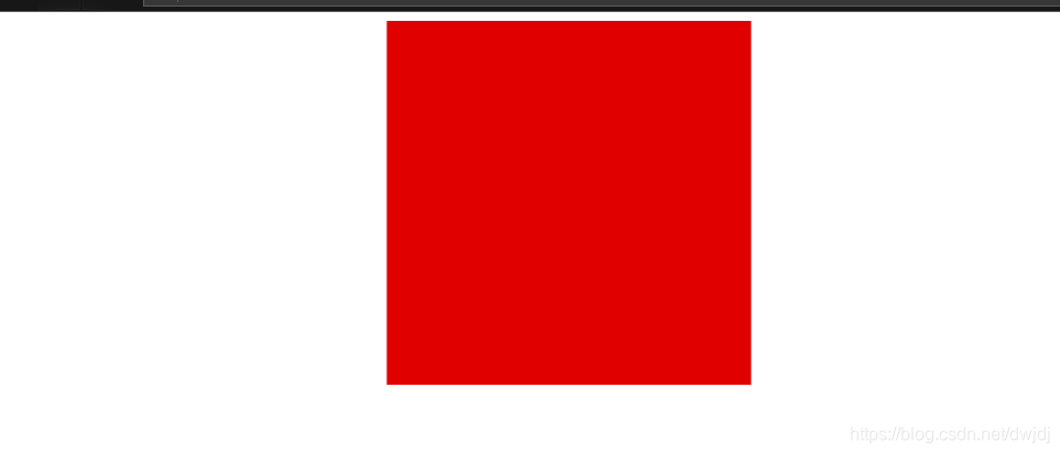
<div class="box">
</div>
</body>
</html>
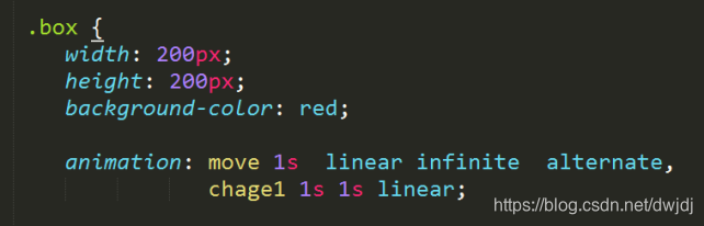
动画属性联写
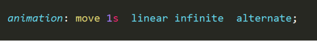
或者可以调用多个动画集
<!DOCTYPE html>
<html lang="en">
<head>
    <meta charset="UTF-8">
    <title>Title</title>
    <style type="text/css">
        .box{
            width: 300px;
            height: 300px;
            background-color: #000000;
            animation: move 1s linear infinite alternate,
                       change 1s linear infinite alternate;
        }
        .box:hover{
            animation-play-state: paused;
        }
        @keyframes move {
            from{
                transform: translateX(0px);
            }
            to{
                transform: translateX(400px);
            }
        }
        @keyframes change {
            from{
                background-color: #000000;
            }
            to{
                background-color: red;
            }
        }
    </style>
</head>
<body>
<div class="box">

</div>
</body>
</html>
可以设置百分比的形式设置动画集中的不同状态
**
百分比是相对动画执行时间而来的。
**