本文分2部分:
- 之前写的CSS3新特性详解篇,共6篇博文总结;
- 常见的一些CSS组件、效果汇总(不包括BootStrap等前端框架已实现的CSS组件);
一、CSS3新特性总结
1、CSS3选择器、边框、背景使用细节及案例演示
参考文章:
知识点:
- CSS3选择器使用,如:a[src^=“https”]属性匹配,p:nth-child(2)位置索引等;
- 盒子模型的边框圆角使用,边框阴影使用,如:按钮柔化、pop层阴影处理等;
- CSS3背景,可以对背景图片进行缩放,指定背景区域,可以使用渐变色填充;
2、CSS3 字体@font-face详解、如何创建和修改woff字体文件及text-shadow等文本效果
参考文章:
知识点:
- 自定义字体文件引入、使用,如:Font Awesome fa字体使用;
- 了解文本特效:text-shadow文字阴影,text-overflow文本溢出可省略号显示,text-stroke文字描边(可通过描边色与背景色一致,实现文字变瘦)
3、CSS3 2D转换和3D转换 transform 变形使用详解
参考文章:
知识点:
- 了解scale, rotate, skew, translate等2D和3Dtransform变形函数使用;
- 了解transform本质,元素依然占DOM文档流空间,却有absolute的层级;
- 2D转换的skew函数相对比较难掌握,关键点是坐标轴的理解;
- 3D转换相对难学,我们需要一点透视基础知识和空间想象力;
4、CSS3过度transition和动画animation @keyframes规则详解
参考文章:
知识点:
- 了解transition, animation和@keyframes使用;
- 了解transition,animation区别:
- transition使用简单,可以作用到css大多数属性上;transition只有一个时间段动画效果;transition不能控制动画次数,播放方向(正向还是逆向);
- animation使用稍微复杂,但是功能强大;animation可以有好几个时间短动画,可以循环播放等控制播放次数及播放方向;
- transition可以实现的,animation一定可以实现,反之不然;可以理解为transition是animation的一个语法糖实现。
- 有个开源的CSS3动画库 Animate.css,大家可以参考。
5、多列columns column-count和flex布局
参考文章:
知识点:
扫描二维码关注公众号,回复:
9213779 查看本文章

- 了解块级元素行内显示的来龙去脉;
- 了解多列布局columns, column-count使用;多列布局除用于经典的报纸多栏显示外,也可实现瀑布流功能;
- 多列布局有个难点,column-count和column-width不能混合设置,如果设置column-width则还要理解根据容器宽度、column-width、column-gap如何计算列数columns;
- 了解flex布局使用:flex-direction: row行布局,flex-direction: column列布局
- flex布局有个难点:flex-basis,flex:1元素内容溢出,宽度或高度相互影响问题,往往是内容溢出没有overflow:hidden处理。
6、多列columns column-count和flex布局
参考文章:
知识点:
- 了解颜色渐变:线性渐变Linear Gradients和径向渐变Radial Gradients使用说明
- 线性渐变有个难点:颜色占比问题
linear-gradient(red, yellow 10%, green 20%),表示黄色的实色部分在宽度10%处,绿色实色部分在宽度20%处,剩余80%有绿色填充 - 径向渐变的难点在于:语法描述不清楚,很多网上资料包括w3c国内站点,按其DEMO提示压根就不工作。
二、常用CSS组件、特效汇总
所谓CSS组件就是按照约定的DOM结构+组件class,即可实现组件展示效果,与js无关。现在有很多前端UI,比如:Bootstrap,妹子UI,layui就有很多CSS组件,甚至目前流行的前端3剑客:angular, react, vue都有很多对应的css组件。比如:栅格布局;导航、面包线、选项卡;表单、按钮;徽章、引用块等。除此之外,实际项目中我们也会积累一些自主的css组件和特效。
1、箭头:边框相关衍生品
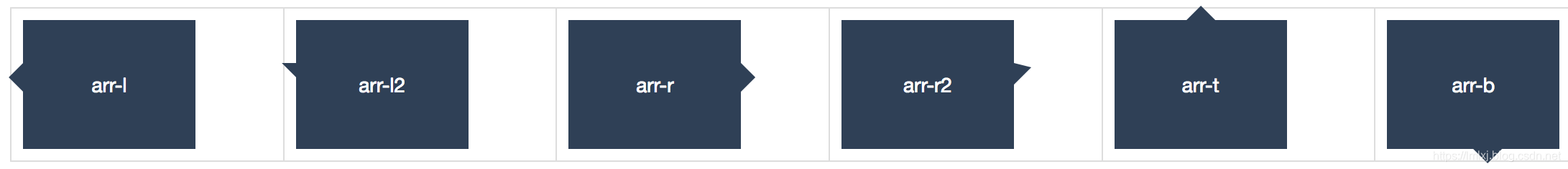
1)提示框的箭头指向
.table .box {position: relative; width: 120px; height: 90px; text-align: center; line-height: 90px; background: #2F4056; font-size: 14px; color: #fff;}
.table .box::before { content: ''; position: absolute; }
.table .arr-l::before { top: 30px; left: -10px; border-top: 10px solid transparent; border-bottom: 10px solid transparent; border-right: 10px solid #2F4056; }
.table .arr-l2::before { top: 30px; left: -10px; border-bottom: 10px solid transparent; border-right: 10px solid #2F4056; }
.table .arr-r::before { top: 30px; left: 120px; border-top: 10px solid transparent; border-bottom: 10px solid transparent; border-left: 10px solid #2F4056; }
.table .arr-r2::before { top: 30px; left: 120px; border-top: 3px solid transparent; border-bottom: 12px solid transparent; border-left: 12px solid #2F4056; }
.table .arr-b::before { top: 90px; left: 60px; border-left: 10px solid transparent; border-right: 10px solid transparent; border-top: 10px solid #2F4056; }
.table .arr-t::before { top: -10px; left: 50px; border-left: 10px solid transparent; border-right: 10px solid transparent; border-bottom: 10px solid #2F4056; }
<table class='table table-bordered'>
	<tr>
		<td><div class='box arr-l'>arr-l</div></td>
		<td><div class='box arr-l2'>arr-l2</div></td>
		<td><div class='box arr-r'>arr-r</div></td>
		<td><div class='box arr-r2'>arr-r2</div></td>
		<td><div class='box arr-t'>arr-t</div></td>
		<td><div class='box arr-b'>arr-b</div></td>
	</tr>
</table>
2)线条的箭头指向
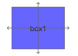
.box{position: relative; width: 101px; height: 81px; text-align: center; line-height: 80px;}
.box-arrow .rect {width: 100%; height: 100%; border: 1px solid #666; background: rgba(0, 0, 255, 0.6)}
.box-arrow .line {display:block; font-size:0; line-height:0; position:absolute; z-index:9}
.box-arrow .hline{width:116px; height:0; top: 40px; left: -8px; border-top:1px solid #666; }
.box-arrow .vline{width:0px; height:96px; top: -8px; left: 50px; border-left:1px solid #666; }
.box-arrow .arrow {position: absolute; display: block; width: 5px; height: 5px; text-indent: -999px; transform: rotate(45deg);}
.box-arrow .arrow-t { left: 48px; top: -8px; border-left: 1px solid #666; border-top: 1px solid #666; }
.box-arrow .arrow-b { left: 48px; bottom: -8px; border-right: 1px solid #666; border-bottom: 1px solid #666;}
.box-arrow .arrow-l { left: -8px; top: 38px; border-left: 1px solid #666; border-bottom: 1px solid #666; }
.box-arrow .arrow-r { right: -8px; top: 38px; border-right: 1px solid #666; border-top: 1px solid #666; }

<div class="box box-arrow">
	<div class="rect">box1</div>
	<span class="line vline"></span>
	<span class="line hline"></span>
	<span class="arrow arrow-t"></span>
	<span class="arrow arrow-b"></span>
	<span class="arrow arrow-r"></span>
	<span class="arrow arrow-l"></span>
</div>
2、滤镜使用
滤镜通常用于调整图像,背景和边框的渲染,以实现一些特殊视觉效果,如:模糊滤镜、灰度滤镜、透明度滤镜、增强滤镜等。
关于滤镜具体说明,请参考MDN Filter,我们只要知道碰到特殊场景可以使用某些滤镜即可,如之前的汶川大地震,我们就需要使用灰度滤镜将网页变灰,常用滤镜列表如下:
- 模糊滤镜,filter: blur(5px);
- 明暗度滤镜,filter: brightness(0.4);
- 对比度滤, filter: contrast(200%);
- 阴影效果滤镜,filter: drop-shadow(16px 16px 20px blue);
- 灰度滤镜,filter: grayscale(50%);
- 色相旋转滤镜,filter: hue-rotate(90deg);
- 反转图像滤镜,filter: invert(75%);
- 透明度滤镜,filter: opacity(25%);
- 转换图像饱和度filter: saturate(30%);
- 将图像转换为深褐色,filter: sepia(60%);
