Material组件库中的按钮
Material 组件库中提供了多种按钮组件如RaisedButton、FlatButton、OutlineButton等,它们都是直接或间接对RawMaterialButton组件的包装定制,所以他们大多数属性都和RawMaterialButton一样。在介绍各个按钮时我们先介绍其默认外观,而按钮的外观大都可以通过属性来自定义,我们在后面统一介绍这些属性。另外,所有Material 库中的按钮都有如下相同点:
1.按下时都会有“水波动画”(又称“涟漪动画”,就是点击时按钮上会出现水波荡漾的动画)。
2.有一个onPressed属性来设置点击回调,当按钮按下时会执行该回调,如果不提供该回调则按钮会处于禁用状态,禁用状态不响应用户点击。
一、Flutter中的按钮组件介绍
Flutter里有很多的Button组件,常见的按钮组件有:RaisedButton/FlatButton/IconButton/
OutlineButton/ButtonBar/FloatingActionButton等。
RaisedButton:凸起的按钮,其实就是Material Design风格的Button,它默认带有阴影和灰色背景
        RaisedButton(
          //icon: Icon(Icons.thumb_up),
              child: Text('按钮'),
              color: Colors.blue,
              onPressed: (){
                print('这是一个RD按钮');
              },
            ),
FlatButton:扁平化的按钮,默认背景透明并不带阴影。按下后,会有背景色
        FlatButton(
          //icon: Icon(Icons.thumb_up),
              child: Text('按钮'),
              color: Colors.blue,
              onPressed: (){
                print('这是一个RD按钮');
              },
            ),
OutlineButton:线框按钮,默认有一个边框,不带阴影且背景透明。按下后,边框颜色会变亮、同时出现背景和阴影(较弱)
        OutlineButton(
          //icon: Icon(Icons.thumb_up),
              child: Text('按钮'),
              color: Colors.blue,
              onPressed: (){
                print('这是一个RD按钮');
              },
            ),
IconButton:图标按钮,是一个可点击的Icon,不包括文字,默认没有背景,点击后会出现背景
IconButton(
  icon: Icon(Icons.thumb_up),
  onPressed: () {},
)
ButtonBar: 按钮组
FloatingActionButton:圆形浮动按钮
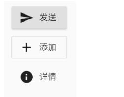
带图标的按钮
RaisedButton、FlatButton、OutlineButton都有一个icon 构造函数,通过它可以轻松创建带图标的按钮,如图所示:
代码如下:
RaisedButton.icon(
  icon: Icon(Icons.send),
  label: Text("发送"),
  onPressed: _onPressed,
),
OutlineButton.icon(
  icon: Icon(Icons.add),
  label: Text("添加"),
  onPressed: _onPressed,
),
FlatButton.icon(
  icon: Icon(Icons.info),
  label: Text("详情"),
  onPressed: _onPressed,
),
自定义按钮
按钮外观可以通过其属性来定义,不同按钮属性大同小异,我们以FlatButton为例,介绍一下常见的按钮属性,详细的信息可以查看API文档。
源代码如下:
const FlatButton({
  ...
  @required this.onPressed, //按钮点击回调
  this.textColor, //按钮文字颜色
  this.disabledTextColor, //按钮禁用时的文字颜色
  this.color, //按钮背景颜色
  this.disabledColor,//按钮禁用时的背景颜色
  this.highlightColor, //按钮按下时的背景颜色
  this.splashColor, //点击时,水波动画中水波的颜色
  this.colorBrightness,//按钮主题,默认是浅色主题
  this.padding, //按钮的填充
  this.shape, //外形
  @required this.child, //按钮的内容
})
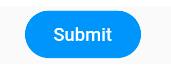
**示例:**定义一个背景蓝色,两边圆角的按钮。效果如图:
示例代码:
FlatButton(
  color: Colors.blue,
  highlightColor: Colors.blue[700],
  colorBrightness: Brightness.dark,
  splashColor: Colors.grey,
  child: Text("Submit"),
  shape:RoundedRectangleBorder(borderRadius: BorderRadius.circular(20.0)),
  onPressed: () {},
)
在上面的代码中,我们主要通过shape来指定其外形为一个圆角矩形。因为按钮背景是蓝色(深色),我们需要指定按钮主题colorBrightness为Brightness.dark,这是为了保证按钮文字颜色为浅色。
Flutter 中没有提供去除背景的设置,假若我们需要去除背景,则可以通过将背景颜色设置为全透明来实现。对应上面的代码,便是将 color: Colors.blue 替换为 color: Color(0x000000)。
细心的读者可能会发现这个按钮没有阴影(点击之后也没有),这样会显得没有质感。其实这也很容易,将上面的FlatButton换成RaisedButton就行,其它代码不用改(这里 color 也不做更改),换了之后的效果如图所示:
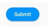
之所以会这样,是因为RaisedButton默认有配置阴影:
const RaisedButton({
  ...
  this.elevation = 2.0, //正常状态下的阴影
  this.highlightElevation = 8.0,//按下时的阴影
  this.disabledElevation = 0.0,// 禁用时的阴影
  ...
}
注意:
在Material 组件库中,我们会在很多组件中见到elevation相关的属性,它们都是用来控制阴影的,这是因为阴影在Material设计风格中是一种很重要的表现形式
二、Flutter按钮组件中的一些属性:
onPressed :
必填参数,按下按钮时触发的回调,接收一个
方法,传 null 表示按钮禁用,会显示禁用相关
样式
child :文本控件
textColor :文本颜色
color :按钮颜色
disabledColor :按钮禁用时的颜色
disabledTextColor :按钮禁用时的文本颜色
splashColor :点击按钮时水波纹的颜色
highlightColor :点击(长按)按钮后按钮的颜色
elevation :阴影的范围,值越大阴影范围越大
padding :内边距
shape :设置按钮的形状,如下代码,圆角矩形:
shape:RoundedRectangleBorder(borderRadius: BorderRadius.circular(10.0)),
