属性
| 属性 |
释义 |
| onPressed |
按钮点击响应事件 |
| textColor |
按钮显示文本的颜色 |
| color |
按钮的颜色 |
| diabledColor |
按钮禁用时的颜色 |
| disabledTextColor |
按钮禁用时的文本颜色 |
| splashColor |
水波纹颜色 |
| highlightColor |
长按显示的颜色 |
| elevation |
阴影的范围,值越大阴影范围越大 |
| shape |
设置按钮的形状 |
按钮使用实例
import 'package:flutter/material.dart';
class ButtonDemoPage extends StatelessWidget {
@override
Widget build(BuildContext context) {
return Scaffold(
appBar: AppBar(
title: Text("按钮"),
),
body: Center(
child: Column(
mainAxisAlignment: MainAxisAlignment.center,
children: <Widget>[
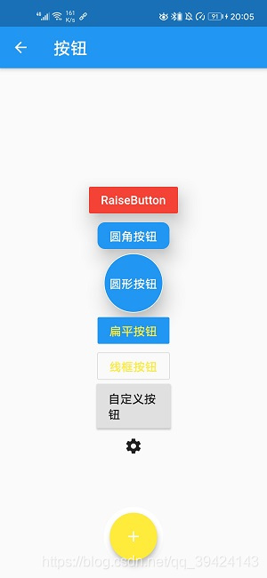
RaisedButton(
child: Text("RaiseButton"),
color: Colors.red,
textColor: Colors.white,
elevation: 20,
onPressed: () {
print("click");
},
),
RaisedButton(
child: Text('圆角按钮'),
color: Colors.blue,
textColor: Colors.white,
elevation: 20,
shape: RoundedRectangleBorder(
borderRadius: BorderRadius.circular(10)),
onPressed: () {
print("圆角按钮");
}),
Container(
height: 80,
child: RaisedButton(
child: Text('圆形按钮'),
color: Colors.blue,
textColor: Colors.white,
elevation: 20,
splashColor: Colors.red,
shape:
CircleBorder(side: BorderSide(color: Colors.white)),
onPressed: () {
print("圆形按钮");
}),
),
FlatButton(
child: Text("扁平按钮"),
color: Colors.blue,
textColor: Colors.yellow,
onPressed: () {
print('FlatButton');
},
),
OutlineButton(
child: Text("线框按钮"),
textColor: Colors.yellow,
onPressed: () {
print('FlatButton');
}),
MyCustomButton(text: "自定义按钮",height: 60.0,width: 100.0,pressed: (){
print('自定义按钮');
})
],
),
)
);
}
}
//自定义按钮组件
class MyCustomButton extends StatelessWidget {
final text;
final pressed;
final width;
final height;
const MyCustomButton(
{this.text = '', this.pressed = null, this.width = 80, this.height = 30});
@override
Widget build(BuildContext context) {
return Container(
height: this.height,
width: this.width,
child: RaisedButton(
child: Text(this.text),
onPressed: this.pressed,
),
);
}
}
FloatingActionButton
属性
| 属性 |
释义 |
| tooltip |
Fab长按时显示,无障碍功能 |
| backgroundColor |
背景颜色 |
| elevation |
未点击的时候的阴影 |
| hignlightElevation |
点击时阴影值,默认12.0 |
| onPressed |
点击事件回调 |
| shape |
Fab形状 |
| mini |
显示大小类型 |
return Scaffold(
    appBar: AppBar(
      title: Text("按钮"),
    ),
    floatingActionButton: Container(
      height: 80,
      width: 80,
      decoration: BoxDecoration(
        borderRadius: BorderRadius.circular(40),
        color: Colors.white,
      ),
      margin: EdgeInsets.only(top: 10),
      padding: EdgeInsets.all(8),
      child: FloatingActionButton(
        child: Icon(Icons.add),
        backgroundColor: Colors.yellow,
      ),
    ),
    // fab在底部居中
    floatingActionButtonLocation: FloatingActionButtonLocation.centerFloat,
body: ...,