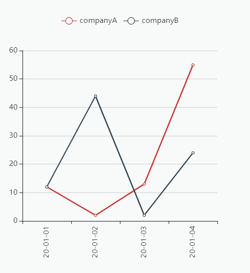
效果图
需求:
当有多组数据的时候,常常需要对比同一x轴的不同线上的点的数据,并且当数据组过多的时候,也就是线过多的时候,需要明确知道我们当前选中的线是哪条。
解决方案:
通过设置显示x轴的tooltip可以显示同一x轴点上面的各个线上面的数据,通过自定义tooltip和监听事件可以设置高亮当前鼠标悬停或点击的线对应的数据组。
关键点:
如何知道当前的点击或悬停的点与tooltip里面所有的数据点中需要的数据项对应起来,每个点都有一个坐标,通过对比坐标做判定即可。
代码
<template>
<div class="index">
<div ref="chart" class="chart"></div>
</div>
</template>
<script>
let echarts = require('echarts');
require("echarts/lib/chart/line");
// 引入提示框和标题组件
require('echarts/lib/component/tooltip');
require("echarts/lib/component/legend");
export default {
data(){
return {
}
},
methods:{
drawEchart(datax,datay,ref){
console.log(datax,datay,ref)
let node=this.$refs[ref]
let myChart = echarts.init(node);
let nameArr=[]
let seriesArr=datay.map(item=>{
nameArr.push(item.name)
return {
type: 'line',
data:item.data,
name:item.name
}
})
let currentSeriesIndex=0//定义当前点的y坐标
let currentDataIndex=0//定义当前点的x坐标
let option={
tooltip:{
extraCssText:'text-align:left',
trigger:'axis',
formatter:function(params){
console.log(params)
let html=''
params.forEach(item=>{
if(currentSeriesIndex===item.seriesIndex&¤tDataIndex===item.dataIndex){//判断坐标点,并给与选中的样式
html+=`${item.marker}<span style="color:blue;font-size:28px">${item.seriesName}</span>:<span style="color:blue;font-size:28px">${item.value}</span> </br>`
}else{
html+=`${item.marker}${item.seriesName}:${item.value} </br>`
}
})
return html
}
},
legend:{
data:nameArr
},
xAxis: {
type: 'category',
data: datax,
axisLabel: {
interval:0,
rotate:90
}
},
yAxis: {
type: 'value'
},
series: seriesArr
}
myChart.setOption(option)
myChart.on('mousemove', function (params) {//通过事件获取坐标点
console.log(params)
currentSeriesIndex=params.seriesIndex
currentDataIndex=params.dataIndex
})
myChart.on('mouseout',function(){
currentSeriesIndex=0
currentDataIndex=0
})
}
},
created(){
let datax=['2020-01-01','2020-01-02','2020-01-03','2020-01-04']
let datay=[
{
data:[12,2,13,55],
name:'companyA'
},
{
data:[12,44,2,24],
name:'companyB'
}
]
this.$nextTick(()=>{
this.drawEchart(datax,datay,'chart')
})
}
}
</script>
<style lang="less">
.index{
.chart{
width: 400px;
height: 400px;
}
}
</style>