Jetpack compose:炫酷的按钮点击效果
屏幕的每个组件在与用户交互时都有其给用户反馈的方式。例如,当用户触摸 Toggle 按钮时,它会更改其状态以响应交互。这种交互给用户一种感觉。
在此博客中,我们将实现一些自定义点击效果,使您的按钮点击更具吸引力。
默认情况下,按钮在被触摸时会显示波纹效果。您可以根据您的要求自定义波纹颜色、alpha 等,但我们不打算在本文中介绍。是的,但我们将学习一些禁用默认连锁反应的方法。
我们要做些什么?
缩放效果
点击效果
震动效果
单击动画形状
3种禁用默认点击效果的方法
让我们开始吧…
缩放效果

对于这种效果,我们只需要更改按钮的比例即可获得漂亮的弹跳效果。代码如下:
enum class ButtonState {

     Pressed, Idle }
fun Modifier.bounceClick() = composed {


    var buttonState by remember {

     mutableStateOf(ButtonState.Idle) }
    val scale by animateFloatAsState(if (buttonState == ButtonState.Pressed) 0.70f else 1f)

    this
        .graphicsLayer {


            scaleX = scale
            scaleY = scale
        }
        .clickable(
            interactionSource = remember {

     MutableInteractionSource() },
            indication = null,
            onClick = {

      }
        )
        .pointerInput(buttonState) {


            awaitPointerEventScope {


                buttonState = if (buttonState == ButtonState.Pressed) {


                    waitForUpOrCancellation()
                    ButtonState.Idle
                } else {


                    awaitFirstDown(false)
                    ButtonState.Pressed
                }
            }
        }
}
没什么特别的,只是根据按钮状态对缩放值进行动画处理。让我们将此修改器应用于按钮。
@Composable
fun PulsateEffect() {


    Button(onClick = {


        // clicked
    }, shape = RoundedCornerShape(12.dp),
        contentPadding = PaddingValues(16.dp),
        modifier = Modifier.bounceClick()) {


        Text(text = "Click me")
    }
}
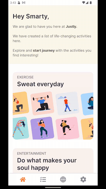
下面是一个实用的App,UI效果是不是很棒
按压效果
我们将稍微移动按钮以使其具有按压效果。
enum class ButtonState {

     Pressed, Idle }
fun Modifier.pressClickEffect() = composed {


    var buttonState by remember {

     mutableStateOf(ButtonState.Idle) }
    val ty by animateFloatAsState(if (buttonState == ButtonState.Pressed) 0f else -20f)

    this
        .graphicsLayer {


            translationY = ty
        }
        .clickable(
            interactionSource = remember {

     MutableInteractionSource() },
            indication = null,
            onClick = {

      }
        )
        .pointerInput(buttonState) {


            awaitPointerEventScope {


                buttonState = if (buttonState == ButtonState.Pressed) {


                    waitForUpOrCancellation()
                    ButtonState.Idle
                } else {


                    awaitFirstDown(false)
                    ButtonState.Pressed
                }
            }
        }
}
没什么新的,和我们之前的效果一样,我们只是tranlateY在按钮状态变化时设置了动画值。
@Composable
fun PressEffect() {


   Button(onClick = {


        //Clicked
    }, shape = RoundedCornerShape(12.dp), contentPadding = PaddingValues(16.dp),
        modifier = Modifier.pressClickEffect()) {


        Text(text = "Click me")
    }
}

震动效果
摇动效果对于显示无效交互非常有用,例如,注册表单上的无效数据。
对于摇动,我们只需要实现可重复的动画。
fun Modifier.shakeClickEffect() = composed {


    var buttonState by remember {

     mutableStateOf(ButtonState.Idle) }

val tx by animateFloatAsState(
        targetValue = if (buttonState == ButtonState.Pressed) 0f else -50f,
        animationSpec = repeatable(
            iterations = 2,
            animation = tween(durationMillis = 50, easing = LinearEasing),
            repeatMode = RepeatMode.Reverse
        )
    )
    this
        .graphicsLayer {


            translationX = tx
        }
        .clickable(
            interactionSource = remember {

     MutableInteractionSource() },
            indication = null,
            onClick = {

     }
        )
        .pointerInput(buttonState) {


            awaitPointerEventScope {


                buttonState = if (buttonState == ButtonState.Pressed) {


                    waitForUpOrCancellation()
                    ButtonState.Idle
                } else {


                    awaitFirstDown(false)
                    ButtonState.Pressed
                }
            }
        }
}
在这里,我们添加了可重复的动画来将按钮移动 2 次以实现摇动效果。
@Composable
fun ShakeEffect(){


    Button(onClick = {


        //Clicked
    }, shape = RoundedCornerShape(12.dp), contentPadding = PaddingValues(16.dp),
        modifier = Modifier.shakeClickEffect()) {


        Text(text = "Click me")
    }
}
震动效果

单击动画形状
为此,我们将为视图角半径设置动画。
val interactionSource = remember {

     MutableInteractionSource() }
val isPressed = interactionSource.collectIsPressedAsState()
val cornerRadius by animateDpAsState(targetValue = if (isPressed.value) 10.dp else 50.dp)
这里我们使用animateDpAsStateAPI 来动画半径dp值
现在,将此半径应用于可组合
Box(
    modifier = Modifier
        .background(color = pink, RoundedCornerShape(cornerRadius))
        .size(100.dp)
        .clip(RoundedCornerShape(cornerRadius))
        .clickable(
            interactionSource = interactionSource,
            indication = rememberRipple()
        ) {


            //Clicked
        }
        .padding(horizontal = 20.dp),
    contentAlignment = Alignment.Center
) {


    Text(
        text = "Click!",
        color = Color.White
    )
}
动画效果

3种禁用默认点击效果的方法
1.使用自定义InteractionSource
InteractionSource表示与组件发出的事件相对应的交互流。这些交互可用于更改组件在不同状态下的显示方式,例如当组件被按下或拖动时。
class NoRippleInteractionSource : MutableInteractionSource {


    override val interactions: Flow<Interaction> = emptyFlow()

    override suspend fun emit(interaction: Interaction) {

    }

    override fun tryEmit(interaction: Interaction) = true
}
所以这里我们有一个返回空流,这意味着按钮不会对不同的点击状态做出反应,例如按钮按下或拖动。
如何使用这个自定义的InteractionSource?按钮有interactionSource属性。
@Composable
fun NoRippleEffect1() {


    Button(
        onClick = {


            //Clicked
        },
        interactionSource = remember {

     NoRippleInteractionSource() },
        shape = RoundedCornerShape(12.dp),
        contentPadding = PaddingValues(16.dp),
    ) {


        Text(text = "Button without Ripple Effect")
    }
}
检查此输出。你将有一个没有任何效果的按钮。

2.通过“指示”去除视觉效果
指示表示发生某些交互时出现的视觉效果。
例如:按下组件时显示波纹效果,或聚焦组件时高亮显示。
该按钮没有指示属性,因此将创建一个具有Box可组合性的自定义按钮。
@Composable
fun NoRippleEffect2() {


    Box(
        modifier = Modifier
            .height(height = 38.dp)
            .background(
                color = pink,
                shape = RoundedCornerShape(percent = 12)
            )
            .clickable(
                interactionSource = remember {

     MutableInteractionSource() },
                indication = null
            ) {


                //Clicked
            }
            .padding(horizontal = 20.dp),
        contentAlignment = Alignment.Center
    ) {


        Text(
            text = "Click me",
            color = Color.White
        )
    }
}
3.通过使用自定义波纹主题
private object NoRippleTheme : RippleTheme {


    @Composable
    override fun defaultColor() = // Ripple color

    @Composable
    override fun rippleAlpha(): RippleAlpha = RippleAlpha(0.0f, 0.0f, 0.0f, 0.0f)
}
RippleAlpha 为不同的交互定义了波纹/状态层的 alpha。我们为所有状态添加了 0.0f,这意味着没有连锁反应。将自定义主题应用到按钮使用CompositionLocalProvider
@Composable
fun NoRippleEffect3() {


    CompositionLocalProvider(LocalRippleTheme provides NoRippleTheme) {


        Button(
            onClick = {


                //Clicked
            }, shape = RoundedCornerShape(12.dp),
            contentPadding = PaddingValues(16.dp)
        ) {


            Text(text = "Click me")
        }
    }
}
文章所涉源码地址:
https://github.com/cp-radhika-s/CoolButtonClickEffects
结论
到目前为止,我们已经学习了一些自定义按钮点击效果。按钮是任何应用程序的重要组成部分,值得付出更多努力使您的按钮更具吸引力和交互性。您可以使用 Jetpack compose 的 Animation API 实现许多此类效果。