前言
ConstraintLayout即约束布局, 在2016年由Google I/O推出. 从支持力度而言, 将成为主流布局样式, 完全代替其他布局, 减少布局的层级, 优化渲染性能. 且自Android Studio 2.3起创建新的Activity,默认的layout根布局就是ConstraintLayout。
Android Studio 2.3以下的在build.gradle中添加如下依赖:
compile 'com.android.support.constraint:constraint-layout:1.0.2'距离ConstraintLayout出现至今已经有一年了,所以再不学习就真的晚了。
一、概念
ConstraintLayout约束布局的含义: 根据布局中的其他元素或视图, 确定View在屏幕中的位置, 受到三类约束, 即其他视图, 父容器(parent), 基准线(Guideline).
layout_constraint[当前控件位置]_[目标控件位置]="[目标控件ID]"例如:
app:layout_constraintTop_toTopOf="@id/tv1"约束当前View的顶部至目标View的顶部, 目标View是tv1. 简单来说就是把当前View的顶部对齐到tv1的顶部.
二、基本使用
下边看个例子:
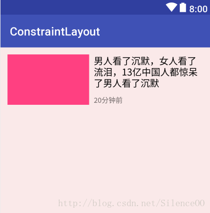
这是要给我们经常会写的一个布局样式,我们用ConstraintLayout来写:
<?xml version="1.0" encoding="utf-8"?>
<android.support.constraint.ConstraintLayout xmlns:android="http://schemas.android.com/apk/res/android"
    xmlns:app="http://schemas.android.com/apk/res-auto"
    xmlns:tools="http://schemas.android.com/tools"
    android:layout_width="match_parent"
    android:layout_height="match_parent"
    android:background="#11ff0000"
    tools:context="com.xp.constraintlayout.MainActivity">

    <TextView
        android:id="@+id/tv1"
        android:layout_width="140dp"
        android:layout_height="86dp"
        android:layout_marginLeft="12dp"
        android:layout_marginTop="12dp"
        android:background="@color/colorAccent"
        app:layout_constraintLeft_toLeftOf="parent"
        app:layout_constraintTop_toTopOf="parent"
        />

    <TextView
        android:id="@+id/tv2"
        android:layout_width="0dp"
        android:layout_height="wrap_content"
        android:layout_marginLeft="8dp"
        android:layout_marginRight="12dp"
        android:text="男人看了沉默,女人看了流泪,13亿中国人都惊呆了男人看了沉默"
        android:textColor="@android:color/black"
        android:textSize="16sp"
        app:layout_constraintLeft_toRightOf="@id/tv1"
        app:layout_constraintRight_toRightOf="parent"
        app:layout_constraintTop_toTopOf="@id/tv1" />

    <TextView
        android:layout_width="wrap_content"
        android:layout_height="wrap_content"
        android:layout_marginLeft="8dp"
        android:text="20分钟前"
        android:textSize="12sp"
        app:layout_constraintLeft_toRightOf="@id/tv1"
        app:layout_constraintBottom_toBottomOf="@id/tv1" />


</android.support.constraint.ConstraintLayout>
解释一下几个属性
app:layout_constraintLeft_toLeftOf="parent"
app:layout_constraintTop_toTopOf="parent"
第一个的意思是tv1的左侧与父控件对齐,第二个的意思是顶部对齐父控件。
app:layout_constraintLeft_toRightOf="@id/tv1"这个的意思就是当前控件在与tv1的右侧。
与上边类似的属性还有如下的一些,当然这里没有写完,属性的意思类推就可以了,也比较好理解。
layout_constraintRight_toLeftOf
layout_constraintRight_toRightOf
layout_constraintTop_toTopOf
layout_constraintTop_toBottomOf
layout_constraintBottom_toTopOf
layout_constraintBottom_toBottomOf
细心的朋友可能会看到上边tv2的宽度我用了0dp,这里为什么要用0dp呢,因为我是想让tv2占满tv1剩下的控件,这里使用match_parent会有问题,可以自己试一下。
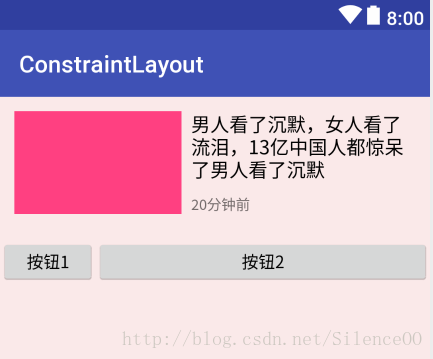
我们在上边的布局下边在加两个按钮:
<?xml version="1.0" encoding="utf-8"?>
<android.support.constraint.ConstraintLayout xmlns:android="http://schemas.android.com/apk/res/android"
    xmlns:app="http://schemas.android.com/apk/res-auto"
    xmlns:tools="http://schemas.android.com/tools"
    android:layout_width="match_parent"
    android:layout_height="match_parent"
    android:background="#11ff0000"
    tools:context="com.xp.constraintlayout.MainActivity">

    <TextView
        android:id="@+id/tv1"
        android:layout_width="140dp"
        android:layout_height="86dp"
        android:layout_marginLeft="12dp"
        android:layout_marginTop="12dp"
        android:background="@color/colorAccent"
        app:layout_constraintLeft_toLeftOf="parent"
        app:layout_constraintTop_toTopOf="parent"
        />

    <TextView
        android:id="@+id/tv2"
        android:layout_width="0dp"
        android:layout_height="wrap_content"
        android:layout_marginLeft="8dp"
        android:layout_marginRight="12dp"
        android:text="男人看了沉默,女人看了流泪,13亿中国人都惊呆了男人看了沉默"
        android:textColor="@android:color/black"
        android:textSize="16sp"
        app:layout_constraintLeft_toRightOf="@id/tv1"
        app:layout_constraintRight_toRightOf="parent"
        app:layout_constraintTop_toTopOf="@id/tv1" />

    <TextView
        android:layout_width="wrap_content"
        android:layout_height="wrap_content"
        android:layout_marginLeft="8dp"
        android:text="20分钟前"
        android:textSize="12sp"
        app:layout_constraintLeft_toRightOf="@id/tv1"
        app:layout_constraintBottom_toBottomOf="@id/tv1" />

    <Button
        android:id="@+id/btn1"
        android:layout_width="80dp"
        android:layout_height="40dp"
        android:text="按钮1"
        android:layout_marginTop="20dp"
        app:layout_constraintTop_toBottomOf="@id/tv1"/>
    <Button
        android:layout_width="0dp"
        android:layout_height="40dp"
        android:text="按钮2"
        app:layout_constraintLeft_toRightOf="@id/btn1"
        app:layout_constraintTop_toTopOf="@id/btn1"
        app:layout_constraintRight_toRightOf="parent"/>

</android.support.constraint.ConstraintLayout>
如果改成match_parent的话按钮2会把按钮1覆盖,如图:
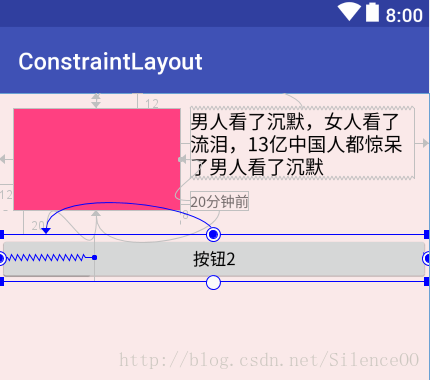
这里看看官网的解释:

所以可以认为:在ConstraintLayout中不支持MATCH_PARENT这个值,你可以通过MATCH_CONSTRAINT配合约束实现类似的效果。其实在ConstraintLayout中0代表:MATCH_CONSTRAINT。
三、宽高比
ConstraintLayout除了指定约束, 还支持设置比例. 我们现在往按钮1和按钮2底部添加一个图片,宽度为占据整个屏幕,宽高比为16:6。
在之前的话这个可能不太好做,但是ConstraintLayout支持,看一下怎么做
<?xml version="1.0" encoding="utf-8"?>
<android.support.constraint.ConstraintLayout xmlns:android="http://schemas.android.com/apk/res/android"
    xmlns:app="http://schemas.android.com/apk/res-auto"
    xmlns:tools="http://schemas.android.com/tools"
    android:layout_width="match_parent"
    android:layout_height="match_parent"
    android:background="#11ff0000"
    tools:context="com.xp.constraintlayout.MainActivity">
    ...
    省略部分代码
    ...
    <Button
        android:layout_width="0dp"
        android:layout_height="40dp"
        android:text="按钮2"
        app:layout_constraintLeft_toRightOf="@id/btn1"
        app:layout_constraintTop_toTopOf="@id/btn1"
        app:layout_constraintRight_toRightOf="parent"/>

    <TextView
        android:id="@+id/banner"
        android:layout_width="0dp"
        android:layout_height="0dp"
        android:background="#765"
        android:gravity="center"
        android:text="图片"
        app:layout_constraintDimensionRatio="H,16:6"
        app:layout_constraintLeft_toLeftOf="parent"
        app:layout_constraintRight_toRightOf="parent"
        app:layout_constraintTop_toBottomOf="@id/btn1"/>

</android.support.constraint.ConstraintLayout>
效果图:
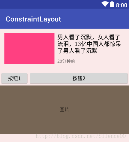
这里宽高都设置了0dp,然后添加了两个属性:
app:layout_constraintLeft_toLeftOf="parent"
app:layout_constraintRight_toRightOf="parent"
让这两个属性来约束,让宽度充满屏幕,再添加一个属性:
app:layout_constraintDimensionRatio="16:6"该属性指的是宽高比,所以16:6就可以完成我们的需求,宽高比还支持下边的写法:
app:layout_constraintDimensionRatio="W,16:6"//宽为6,高为16
app:layout_constraintDimensionRatio="H,16:6"//宽为16,高为6
四、横竖比例
我们在看一个例子,如图:
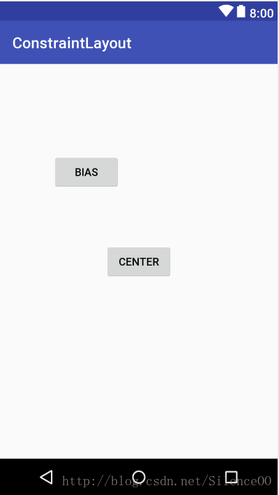
Center按钮的全部边界与ConstraintLayout(父容器)边界对齐, 则为居中. 同时还可以设置水平与竖直的比例, 如BIAS按钮, 在对齐父容器后, 设置水平与竖直的比例均为0.25, 表示按钮左侧与右侧的间隙比例是1:3, 按钮上部与下部的比例是1:3.
constraintHorizontal_bias设置水平比例, constraintVertical_bias设置竖直比例.
<?xml version="1.0" encoding="utf-8"?>
<android.support.constraint.ConstraintLayout xmlns:android="http://schemas.android.com/apk/res/android"
    xmlns:app="http://schemas.android.com/apk/res-auto"
    xmlns:tools="http://schemas.android.com/tools"
    android:layout_width="match_parent"
    android:layout_height="match_parent"
    tools:context="com.xp.constraintlayout.Test1Activity">

    <Button
        android:layout_width="wrap_content"
        android:layout_height="wrap_content"
        android:text="Center"
        app:layout_constraintLeft_toLeftOf="parent"
        app:layout_constraintRight_toRightOf="parent"
        app:layout_constraintTop_toTopOf="parent"
        app:layout_constraintBottom_toBottomOf="parent"/>

    <Button
        android:layout_width="wrap_content"
        android:layout_height="wrap_content"
        android:text="Bias"
        app:layout_constraintLeft_toLeftOf="parent"
        app:layout_constraintRight_toRightOf="parent"
        app:layout_constraintTop_toTopOf="parent"
        app:layout_constraintBottom_toBottomOf="parent"
        app:layout_constraintHorizontal_bias="0.25"
        app:layout_constraintVertical_bias="0.25"/>

</android.support.constraint.ConstraintLayout>
五、链样式(Chain)
如果我们在底部添加几个按钮,一般我们会使用线性布局用权重,ConstraintLayout也支持类似的属性,这与LinearLayout的layout_weight属性非常类似, 通过设置不同的样式排列元素.
看看怎么实现的:
<TextView
android:id="@+id/tab1"
android:layout_width="0dp"
android:layout_height="30dp"
android:background="#0f0"
android:gravity="center"
android:text="Tab1"
app:layout_constraintBottom_toBottomOf="parent"
app:layout_constraintLeft_toLeftOf="parent"
app:layout_constraintRight_toLeftOf="@+id/tab2" />
<TextView
android:id="@+id/tab2"
android:layout_width="0dp"
android:layout_height="30dp"
android:background="#ff0"
android:gravity="center"
android:text="Tab2"
app:layout_constraintBottom_toBottomOf="parent"
app:layout_constraintLeft_toRightOf="@id/tab1"
app:layout_constraintRight_toLeftOf="@+id/tab3" />
<TextView
android:id="@+id/tab3"
android:layout_width="0dp"
android:layout_height="30dp"
android:background="#f0f"
android:gravity="center"
android:text="Tab3"
app:layout_constraintBottom_toBottomOf="parent"
app:layout_constraintLeft_toRightOf="@id/tab2"
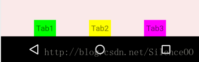
app:layout_constraintRight_toRightOf="parent" />这样写的话,可以实现,但是看起来没有线性布局灵活,所以ConstraintLayout也支持这样写:
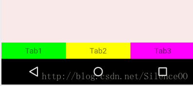
app:layout_constraintHorizontal_weight给每个tab添加这个属性就可以了,可以设置单个tab占的比例。如图:
这是给每个按钮添加属性,比例为2:2:1
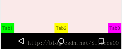
ConstraintLayout还支持线性布局不支持的属性,借助官网的图:
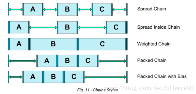
3个tab两两设置了依赖,横向的相当于组成了一个链(Chains)。在这个链的最左侧的元素成为链头,我们可以在其身上设置一些属性,来决定这个链的展示效果:
layout_constraintHorizontal_chainStyle之前已经实现了一种效果,即按照weight等分,可以成为weighted chain。设置条件为:
chainStyle=”spread”,所有控件宽度设置为match_constraint,因为默认就是spread,所以我们没有显示设置。chainStyle的取值还可以为packed和spread_inside
1、spread + 宽度固定
<TextView
        android:id="@+id/tab1"
        android:layout_width="40dp"
        android:layout_height="30dp"
        android:background="#0f0"
        android:gravity="center"
        android:text="Tab1"
        app:layout_constraintBottom_toBottomOf="parent"
        app:layout_constraintLeft_toLeftOf="parent"
        app:layout_constraintRight_toLeftOf="@+id/tab2"
        app:layout_constraintHorizontal_chainStyle="spread"
        />


    <TextView
        android:id="@+id/tab2"
        android:layout_width="40dp"
        android:layout_height="30dp"
        android:background="#ff0"
        android:gravity="center"
        android:text="Tab2"
        app:layout_constraintBottom_toBottomOf="parent"
        app:layout_constraintLeft_toRightOf="@id/tab1"
        app:layout_constraintRight_toLeftOf="@+id/tab3"
        />


    <TextView
        android:id="@+id/tab3"
        android:layout_width="40dp"
        android:layout_height="30dp"
        android:background="#f0f"
        android:gravity="center"
        android:text="Tab3"
        app:layout_constraintBottom_toBottomOf="parent"
        app:layout_constraintLeft_toRightOf="@id/tab2"
        app:layout_constraintRight_toRightOf="parent"
        />
2、spread_inside + 宽度固定
代码就不贴了,就改下chainStyle就行
3、packed + 宽度固定

六、引导线(Guideline)
ConstraintLayout 还支持与引导线(Guideline)约束,主要用于辅助布局,即类似为辅助线,横向的、纵向的。该布局是不会显示到界面上的。
所以有android:orientation属性:取值为”vertical”和”horizontal”。根据orientation来决定辅助线是横向还是纵向。
下边三个属性决定该辅助线的位置:
layout_constraintGuide_begin
layout_constraintGuide_end
layout_constraintGuide_percent
begin=20dp,距离顶部20dp的地方有个辅助线。
end,即为距离底部。
percent=0.8即为距离顶部的百分比为80%。
我们在之前的布局里用引导线添加一个按钮:
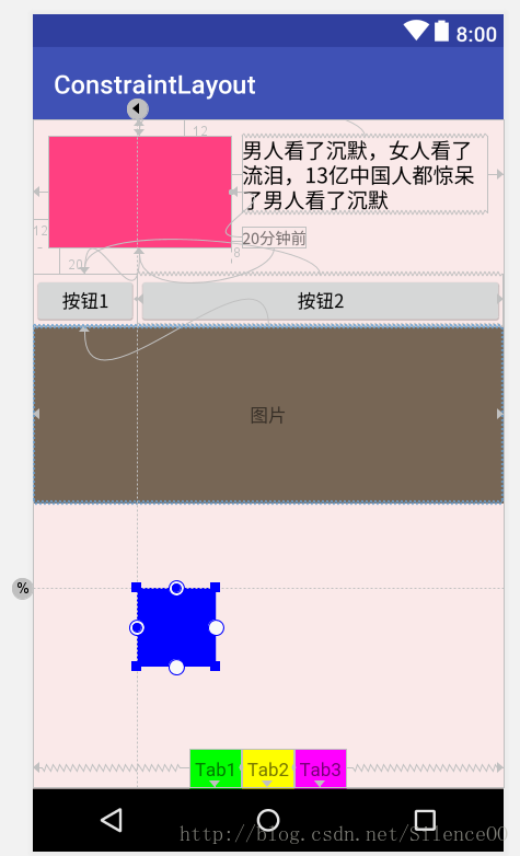
通过两根辅助线来定位,一根横向距离底部70%,一个纵向距离顶部8dp,按钮在他们交叉的地方。代码如下:
<android.support.constraint.Guideline
        android:id="@+id/gl_h"
        android:layout_width="wrap_content"
        android:layout_height="wrap_content"
        android:orientation="horizontal"
        app:layout_constraintGuide_percent="0.7" />


    <android.support.constraint.Guideline
        android:id="@+id/gl_v"
        android:layout_width="wrap_content"
        android:layout_height="wrap_content"
        android:orientation="vertical"
        app:layout_constraintGuide_begin="80dp" />

    <TextView
        android:layout_width="60dp"
        android:layout_height="60dp"
        android:background="#00f"
        app:layout_constraintLeft_toRightOf="@id/gl_v"
        app:layout_constraintTop_toBottomOf="@id/gl_h" />
ConstraintLayout的基本使用方式差不多就这么多,可能有遗漏的就自己去官网看看文档吧, ConstraintLayout非常适合构建复杂布局, 降低布局的层级.
参考:
https://developer.android.google.cn/reference/android/support/constraint/ConstraintLayout.html#VirtualHelpers
http://blog.csdn.net/lmj623565791/article/details/78011599
https://developer.android.google.cn/reference/android/support/constraint/Guideline.html#