多背景
可以给一个容器同时设置多张背景图片
<!DOCTYPE html>
<html lang="en">
<head>
    <meta charset="utf-8">
    <style type="text/css">
        * {
            margin: 0;
            padding: 0;
        }
        html,body {
            width: 100%;
            height: 100%;
            background-color: #ccc;
        }
        .box {
            width: 623px;
            height: 417px;
            background: url(images/bg1.png) no-repeat left top,
            url(images/bg2.png) no-repeat right top,
            url(images/bg4.png) no-repeat left bottom,
            url(images/bg3.png) no-repeat right bottom,
            url(images/bg5.png) no-repeat center #fff;
            margin: 50px auto;
        }
    </style>
</head>
<body>

<div class="box"></div>
</body>
</html>
线性渐变
背景颜色由一种颜色向另外一种颜色渐变
要素
开始的背景颜色和结束的背景颜色
渐变的方向
1.水平或者竖直
2.通过角度表示渐变方向
渐变的范围(可以不用设置)
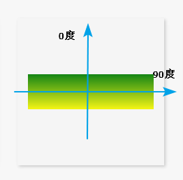
通过角度表示渐变的方向

注意
0deg:代表渐变的方向是从下向上渐变
90deg:代表渐变的方向是从左向右渐变
其他角度按下面这个标准顺时针转
通过百分比可以表示渐变的范围
1.如果不设置background-size属性的时候,百分比是相对父元素宽度,如果设置了background-size的时候,百分比是相对于background-size设置的。
<!DOCTYPE html>
<html lang="en">
<head>
    <meta charset="UTF-8">
    <title>线性渐变</title>
    <style type="text/css">
        .one{
            width: 100%;
            height: 100px;
            background-image: linear-gradient(to right,red,blue );
        }
        .two{
            width: 100%;
            height: 100px;
            background-image: linear-gradient(
            135deg,red 20%,blue 20%,blue 40%,red 40%,red 60%,blue 60%,blue 80%,red 80%
            );
            background-size: 100px 100px;
        }
    </style>
</head>
<body>
<div class="one">

</div>
<div class="two">

</div>
</body>
</html>
径向渐变
组成:
开始颜色和结束颜色
圆心的位置和半径
前面100px表示渐变的范围,后面表示渐变的圆心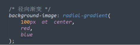
总结:
◆通过 at + center top left right bottom设置圆心位置
◆通过设置具体值也可以设置圆心位置
background-image:radial-gradient(100px at 20px 30px,red,blue);◆如果在径向渐变中,只设置一个半径值,那么默认水平半径和垂直半径一样
◆如果要实现一个椭圆的径向渐变效果,那么我们需要设置水平半径和垂直半径
background-image:radial-gradient(100px 30px,20px,40px,red,pink);<!DOCTYPE html>
<html lang="en">
<head>
<meta charset="UTF-8">
<title>线性渐变</title>
<style type="text/css">
/*.one{*/
/* width: 100%;*/
/* height: 100px;*/
/* background-image: linear-gradient(to right,red,blue );*/
/*}*/
/*.two{*/
/* width: 100%;*/
/* height: 100px;*/
/* background-image: linear-gradient(*/
/* 135deg,red 20%,blue 20%,blue 40%,red 40%,red 60%,blue 60%,blue 80%,red 80%*/
/* );*/
/* background-size: 100px 100px;*/
/*}*/
.three{
width: 200px;
height: 200px;
background-image: radial-gradient(100px at center,red,blue);
}
</style>
</head>
<body>
<!--<div class="one">-->
<!--</div>-->
<!--<div class="two">-->
<!--</div>-->
<div class="three">
</div>
</body>
</html>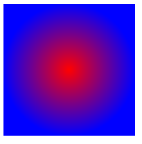
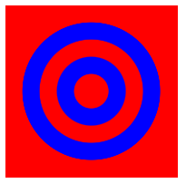
和线性渐变一样也可以设置渐变的范围
<!DOCTYPE html>
<html lang="en">
<head>
    <meta charset="UTF-8">
    <title>线性渐变</title>
    <style type="text/css">
        /*.one{*/
        /*    width: 100%;*/
        /*    height: 100px;*/
        /*    background-image: linear-gradient(to right,red,blue );*/
        /*}*/
        /*.two{*/
        /*    width: 100%;*/
        /*    height: 100px;*/
        /*    background-image: linear-gradient(*/
        /*    135deg,red 20%,blue 20%,blue 40%,red 40%,red 60%,blue 60%,blue 80%,red 80%*/
        /*    );*/
        /*    background-size: 100px 100px;*/
        /*}*/
        .three{
            width: 200px;
            height: 200px;
            background-image: radial-gradient(100px at center,red 20%,blue 20%,blue 40%,red 40%,red 60%,blue 60%,blue 80%,red 80%);
        }
    </style>
</head>
<body>
<!--<div class="one">-->

<!--</div>-->
<!--<div class="two">-->

<!--</div>-->
<div class="three">

</div>
</body>
</html>