EDA-数据探索性分析
非常感谢Datawhale的组队学习活动,让我这个零基础的小白也能够有机会亲身的接触一下数据挖掘,走完一个流程
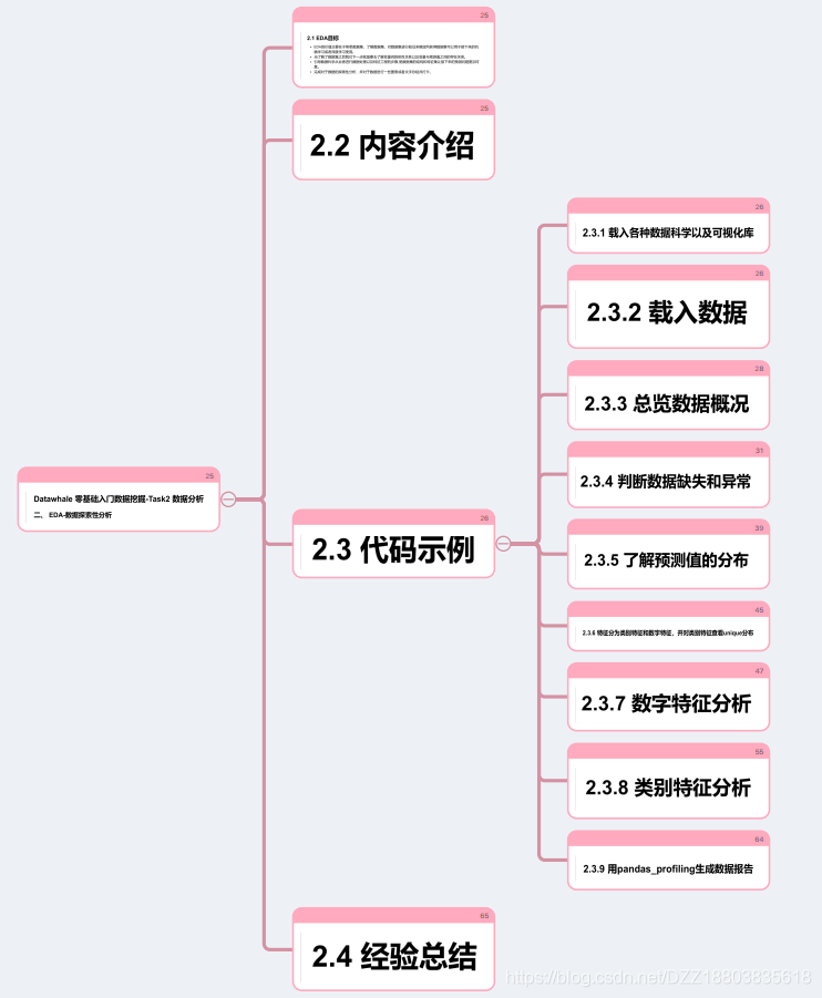

这次使用的是天池实验室,路线的话主要是根据datawhale发布的《零基础入门数据挖掘》教程来走。
下面是EDA的部分。
1.载入各种数据科学以及可视化库
#coding:utf-8
#导入warnings包,利用过滤器来实现忽略警告语句。
import warnings
warnings.filterwarnings('ignore')
import pandas as pd
import numpy as np
import matplotlib.pyplot as plt
import seaborn as sns
import missingno as msno
2.载入数据
## 1) 载入训练集和测试集;
Train_data = pd.read_csv('train.csv', sep=' ')
Test_data = pd.read_csv('testA.csv', sep=' ')
## 2) 简略观察数据(head()+shape)
Train_data.head().append(Train_data.tail())
Train_data.shape
Test_data.head().append(Test_data.tail())
Test_data.shape
3.总览数据概况
我的理解就是大致的看一下这些数据的特征及分布,对数据有个大概的“理解”:
## 1) 通过describe()来熟悉数据的相关统计量
Train_data.describe()
Test_data.describe()
## 2) 通过info()来熟悉数据类型
Train_data.info()
Test_data.info()
4.判断数据缺失和异常
## 1) 查看每列的存在nan情况
Train_data.isnull().sum()
Test_data.isnull().sum()
# nan可视化
missing = Train_data.isnull().sum()
missing = missing[missing > 0]
missing.sort_values(inplace=True)
missing.plot.bar()
# 可视化看下缺省值
msno.matrix(Train_data.sample(250))
msno.bar(Train_data.sample(1000))
# 可视化看下缺省值
msno.matrix(Test_data.sample(250))
msno.bar(Test_data.sample(1000))

## 2) 查看异常值检测
Train_data.info()
Train_data['notRepairedDamage'].value_counts()
Train_data['notRepairedDamage'].replace('-', np.nan, inplace=True)
Train_data['notRepairedDamage'].value_counts()
Train_data.isnull().sum()
Test_data['notRepairedDamage'].value_counts()
Test_data['notRepairedDamage'].replace('-', np.nan, inplace=True)
Train_data["seller"].value_counts()
Train_data["offerType"].value_counts()
del Train_data["seller"]
del Train_data["offerType"]
del Test_data["seller"]
del Test_data["offerType"]
5.了解预测值分布
Train_data['price']
Train_data['price'].value_counts()

## 1) 总体分布概况(无界约翰逊分布等)
import scipy.stats as st
y = Train_data['price']
plt.figure(1); plt.title('Johnson SU')
sns.distplot(y, kde=False, fit=st.johnsonsu)
plt.figure(2); plt.title('Normal')
sns.distplot(y, kde=False, fit=st.norm)
plt.figure(3); plt.title('Log Normal')
sns.distplot(y, kde=False, fit=st.lognorm)

## 2) 查看skewness and kurtosis
sns.distplot(Train_data['price']);
print("Skewness: %f" % Train_data['price'].skew())
print("Kurtosis: %f" % Train_data['price'].kurt())

Train_data.skew(), Train_data.kurt()

sns.distplot(Train_data.skew(),color='blue',axlabel ='Skewness')

sns.distplot(Train_data.kurt(),color='orange',axlabel ='Kurtness')

## 3) 查看预测值的具体频数
plt.hist(Train_data['price'], orientation = 'vertical',histtype = 'bar', color ='red')
plt.show()

# log变换 z之后的分布较均匀,可以进行log变换进行预测,这也是预测问题常用的trick
plt.hist(np.log(Train_data['price']), orientation = 'vertical',histtype = 'bar', color ='red')
plt.show()
6.特征分为类别特征和数字特征,并对类别特征查看unique分布
# 分离label即预测值
Y_train = Train_data['price']

#此处代码有缺失
numeric_features = ['power', 'kilometer', 'v_0', 'v_1', 'v_2', 'v_3', 'v_4', 'v_5', 'v_6', 'v_7', 'v
categorical_features = ['name', 'model', 'brand', 'bodyType', 'fuelType', 'gearbox', 'notRepairedDam


# 特征nunique分布
for cat_fea in categorical_features:
print(cat_fea + "的特征分布如下:")
print("{}特征有个{}不同的值".format(cat_fea, Train_data[cat_fea].nunique()))
print(Train_data[cat_fea].value_counts())

# 特征nunique分布
for cat_fea in categorical_features:
print(cat_fea + "的特征分布如下:")
print("{}特征有个{}不同的值".format(cat_fea, Test_data[cat_fea].nunique()))
print(Test_data[cat_fea].value_counts())
7.数字特征分析
numeric_features.append('price')

numeric_features

Train_data.head()

## 1) 相关性分析
price_numeric = Train_data[numeric_features]
correlation = price_numeric.corr()
print(correlation['price'].sort_values(ascending = False),'\n')

f , ax = plt.subplots(figsize = (7, 7))
plt.title('Correlation of Numeric Features with Price',y=1,size=16)
sns.heatmap(correlation,square = True, vmax=0.8)

del price_numeric['price']

## 2) 查看几个特征得 偏度和峰值
for col in numeric_features:
print('{:15}'.format(col),
'Skewness: {:05.2f}'.format(Train_data[col].skew()) ,
' ' ,
'Kurtosis: {:06.2f}'.format(Train_data[col].kurt())
)

## 3) 每个数字特征得分布可视化
f = pd.melt(Train_data, value_vars=numeric_features)
g = sns.FacetGrid(f, col="variable", col_wrap=2, sharex=False, sharey=False)
g = g.map(sns.distplot, "value")

## 4) 数字特征相互之间的关系可视化
sns.set()
columns = ['price', 'v_12', 'v_8' , 'v_0', 'power', 'v_5', 'v_2', 'v_6', 'v_1', 'v_14']
sns.pairplot(Train_data[columns],size = 2 ,kind ='scatter',diag_kind='kde')
plt.show()

Train_data.columns

Y_train

## 5) 多变量互相回归关系可视化
fig, ((ax1, ax2), (ax3, ax4), (ax5, ax6), (ax7, ax8), (ax9, ax10)) = plt.subplots(nrows=5, ncols=2,
# ['v_12', 'v_8' , 'v_0', 'power', 'v_5', 'v_2', 'v_6', 'v_1', 'v_14']
v_12_scatter_plot = pd.concat([Y_train,Train_data['v_12']],axis = 1)
sns.regplot(x='v_12',y = 'price', data = v_12_scatter_plot,scatter= True, fit_reg=True, ax=ax1)
v_8_scatter_plot = pd.concat([Y_train,Train_data['v_8']],axis = 1)
sns.regplot(x='v_8',y = 'price',data = v_8_scatter_plot,scatter= True, fit_reg=True, ax=ax2)
v_0_scatter_plot = pd.concat([Y_train,Train_data['v_0']],axis = 1)
sns.regplot(x='v_0',y = 'price',data = v_0_scatter_plot,scatter= True, fit_reg=True, ax=ax3)
power_scatter_plot = pd.concat([Y_train,Train_data['power']],axis = 1)
sns.regplot(x='power',y = 'price',data = power_scatter_plot,scatter= True, fit_reg=True, ax=ax4)
v_5_scatter_plot = pd.concat([Y_train,Train_data['v_5']],axis = 1)
sns.regplot(x='v_5',y = 'price',data = v_5_scatter_plot,scatter= True, fit_reg=True, ax=ax5)
v_2_scatter_plot = pd.concat([Y_train,Train_data['v_2']],axis = 1)
sns.regplot(x='v_2',y = 'price',data = v_2_scatter_plot,scatter= True, fit_reg=True, ax=ax6)
v_6_scatter_plot = pd.concat([Y_train,Train_data['v_6']],axis = 1)
sns.regplot(x='v_6',y = 'price',data = v_6_scatter_plot,scatter= True, fit_reg=True, ax=ax7)
v_1_scatter_plot = pd.concat([Y_train,Train_data['v_1']],axis = 1)
sns.regplot(x='v_1',y = 'price',data = v_1_scatter_plot,scatter= True, fit_reg=True, ax=ax8)
v_14_scatter_plot = pd.concat([Y_train,Train_data['v_14']],axis = 1)
sns.regplot(x='v_14',y = 'price',data = v_14_scatter_plot,scatter= True, fit_reg=True, ax=ax9)
v_13_scatter_plot = pd.concat([Y_train,Train_data['v_13']],axis = 1)
sns.regplot(x='v_13',y = 'price',data = v_13_scatter_plot,scatter= True, fit_reg=True, ax=ax10)
8.类别特征分析
## 1) unique分布
for fea in categorical_features:
print(Train_data[fea].nunique())

categorical_features

## 2) 类别特征箱形图可视化
# 因为 name和 regionCode的类别太稀疏了,这里我们把不稀疏的几类画一下
categorical_features = ['model',
'brand',
'bodyType',
'fuelType',
'gearbox',
'notRepairedDamage']
for c in categorical_features:
Train_data[c] = Train_data[c].astype('category')
if Train_data[c].isnull().any():
Train_data[c] = Train_data[c].cat.add_categories(['MISSING'])
Train_data[c] = Train_data[c].fillna('MISSING')
def boxplot(x, y, **kwargs):
sns.boxplot(x=x, y=y)
x=plt.xticks(rotation=90)
f = pd.melt(Train_data, id_vars=['price'], value_vars=categorical_features)
g = sns.FacetGrid(f, col="variable", col_wrap=2, sharex=False, sharey=False, size=5)
g = g.map(boxplot, "value", "price")

Train_data.columns

## 3) 类别特征的小提琴图可视化
catg_list = categorical_features
target = 'price'
for catg in catg_list :
sns.violinplot(x=catg, y=target, data=Train_data)
plt.show()

categorical_features = ['model',
'brand',
'bodyType',
'fuelType',
'gearbox',
'notRepairedDamage']

## 4) 类别特征的柱形图可视化
def bar_plot(x, y, **kwargs):
sns.barplot(x=x, y=y)
x=plt.xticks(rotation=90)
f = pd.melt(Train_data, id_vars=['price'], value_vars=categorical_features)
g = sns.FacetGrid(f, col="variable", col_wrap=2, sharex=False, sharey=False, size=5)
g = g.map(bar_plot, "value", "price")

## 5) 类别特征的每个类别频数可视化(count_plot)
def count_plot(x, **kwargs):
sns.countplot(x=x)
x=plt.xticks(rotation=90)
f = pd.melt(Train_data, value_vars=categorical_features)
g = sns.FacetGrid(f, col="variable", col_wrap=2, sharex=False, sharey=False, size=5)
g = g.map(count_plot, "value")
9.用pandas_profiling生成数据报告
import pandas_profiling

pfr = pandas_profiling.ProfileReport(Train_data)
pfr.to_file("./example.html")
如果能将上面的代码认认真真跟着敲一遍,那么对EDA以及一些包和函数的使用将会有更深的理解
扫描二维码关注公众号,回复:
11875296 查看本文章