文章目录
Flutter 布局组件
约束布局
ConstrainedBox
对子组件添加额外的约束条件。
如:让子组件最小高度为50,最大高度为100。
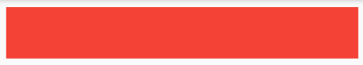
ConstrainedBox(
    constraints: BoxConstraints(
        minWidth: double.infinity,
        minHeight: 50,
        maxHeight: 100,
    ),
    child: Container(
        height: 500,
        child: DecoratedBox(
            decoration: BoxDecoration(color: Colors.red),
        ),
    ),
)
SizedBox
为子组件设置固定的宽高。功能上类似ConstrainedBox组件。

SizedBox(
    width: 50,
    height: 50,
    child: childWidget,
)
UnconstrainedBox
用于去除父组件的约束,允许子组件按照自己的尺寸绘制。
ConstrainedBox(
    constraints: BoxConstraints(minWidth: 100, minHeight: 100),
    child: UnconstrainedBox(
        child: ConstrainedBox(
            constraints: BoxConstraints(minWidth: 50, minHeight: 50),
            child: childWidget,
        ),
    ),
)
Row & Column
Row表示水平方向线性布局,Column表示垂直方向线性布局。线性布局有主轴和纵轴之分,如果是水平线性布局,主轴指水平方向,纵轴指垂直方向。类似于Android中的LinearLayout布局。
主轴方向会尽可能的占用最大空间,而纵轴的长度取决于他们最大子元素的长度。还有一种特殊情况Column嵌套Column,外层Column会尽可能占用空间,里层Column则所占用空间为实际大小。
mainAxisSize:主轴方向占用空间。
	- 默认是MainAxisSize.max表示尽可能多占用空间。
	- MainAxisSize.min表示尽可能少占用空间。

mainAxisAlignment:主轴对齐方式。当`mainAxisSize=MainAxisSize.min`时该属性无意义。
    - start:子元素尾部对齐。
    - end:子元素头部对齐。
    - center:子元素居中对齐
    - spaceBetween:左右两端无间距,中间平分间距。
    - spaceAround:左右两端间距相同。
    - spaceEvenly:平分间距。

crossAxisAlignment:纵轴对齐方式,与主轴对齐方式类似。

textDirection:水平方向子组件的布局顺序,默认为系统环境(中文和英文是从左到右,阿拉伯语是从右到左)。

verticalDirection:垂直的对齐方向,默认是VerticalDirection.down表示从上到下。
    - VerticalDirection.up:表示开始在底部,结束在顶部。
    - VerticalDirection.down:表示开始在顶部,结束在底部。
Row
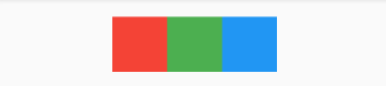
Row(
    mainAxisAlignment: MainAxisAlignment.center,
    children: [
        Container(height: 50, width: 50, color: Colors.red),
        Container(height: 50, width: 50, color: Colors.green),
        Container(height: 50, width: 50, color: Colors.blue),
    ],
)
Column
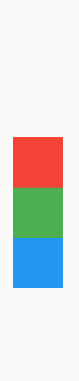
Column(
    mainAxisAlignment: MainAxisAlignment.center,
    children: [
        Container(height: 50, width: 50, color: Colors.red),
        Container(height: 50, width: 50, color: Colors.green),
        Container(height: 50, width: 50, color: Colors.blue),
    ],
)
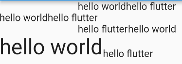
Column(
    crossAxisAlignment: CrossAxisAlignment.start,
    children: [
        Row(
            mainAxisAlignment: MainAxisAlignment.center,
            children: [
                Text("hello world"),
                Text("hello flutter"),
            ],
        ),
        Row(
            mainAxisSize: MainAxisSize.min,
            mainAxisAlignment: MainAxisAlignment.center,
            children: [
                Text("hello world"),
                Text("hello flutter"),
            ],
        ),
        Row(
            textDirection: TextDirection.rtl,
            mainAxisAlignment: MainAxisAlignment.center,
            children: [
                Text("hello world"),
                Text("hello flutter"),
            ],
        ),
        Row(
            crossAxisAlignment: CrossAxisAlignment.start,
            verticalDirection: VerticalDirection.up,
            children: [
                Text(
                    "hello world",
                    style: TextStyle(fontSize: 30),
                ),
                Text("hello flutter"),
            ],
        ),
    ],
)
弹性布局
类似于Android中的weight属性。弹性布局指允许子组件按照一定比例分配父容器空间。Flutter中弹性布局主要通过Flex和Expanded组件配合实现或Flexible组件。
Flexible
Flexible组件可以控制Row、Column、Flex的子组件占满父组件
fit:填充剩余空间的方式
	- loose:默认值,尽可能填满剩余空间,也可以不填满。
	- tight:强制填满剩余空间。

flex:按比例划分空间。
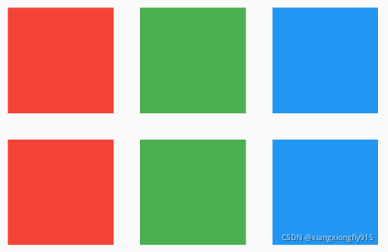
Row(
    children: [
        Container(
            width: 50,
            height: 50,
            color: Colors.red,
        ),
        Flexible(
            fit: FlexFit.loose,
            child: Container(
                width: 50,
                height: 50,
                color: Colors.green,
            ),
        ),
        Container(
            width: 50,
            height: 50,
            color: Colors.blue,
        ),
    ],
),
SizedBox(height: 10),
Row(
    children: [
        Container(
            width: 50,
            height: 50,
            color: Colors.red,
        ),
        Flexible(
            fit: FlexFit.tight,
            child: Container(
                width: 50,
                height: 50,
                color: Colors.green,
            ),
        ),
        Container(
            width: 50,
            height: 50,
            color: Colors.blue,
        ),
    ],
),
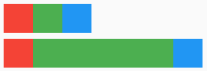
Row(
    children: [
        Flexible(
            flex: 1,
            fit: FlexFit.loose,
            child: Container(height: 50, color: Colors.red),
        ),
        Flexible(
            flex: 2,
            fit: FlexFit.loose,
            child: Container(height: 50, color: Colors.green),
        ),
        Flexible(
            flex: 3,
            fit: FlexFit.loose,
            child: Container(height: 50, color: Colors.blue),
        ),
    ],
),
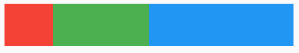
Expanded
Expanded继承于Flexible组件,会强制填满剩余空间。

Row(
    children: [
        Expanded(
            child: Container(height: 50, color: Colors.red),
        ),
        Expanded(
            child: Container(height: 50, color: Colors.green),
        ),
        Expanded(
            child: Container(height: 50, color: Colors.blue),
        ),
    ],
)
Spacer
Spacer本质是由Expanded组件实现,区别是:Expanded组件可以设置子元素,Spacer不能拿设置子元素,主要用于填充空白用的。

Row(
    children: [
        Container(width: 50, height: 50, color: Colors.red),
        Spacer(),
        Container(width: 50, height: 50, color: Colors.green),
        Spacer(),
        Container(width: 50, height: 50, color: Colors.blue),
    ],
)
Flex & Expanded & Spacer
Flex组件可以实现沿着水平或垂直方向排列子组件,配合Expanded组件实现弹性布局。
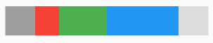
Flex(
    direction: Axis.horizontal,
    children: [
        Container(width: 50, height: 50, color: Colors.grey),
        Expanded(
            flex: 1,
            child: Container(height: 50, color: Colors.red),
        ),
        Expanded(
            flex: 2,
            child: Container(height: 50, color: Colors.green),
        ),
        Expanded(
            flex: 3,
            child: Container(height: 50, color: Colors.blue),
        ),
        Container(width: 50, height: 50, color: Colors.black12),
    ],
)
流式布局
类似于Android中的FlexboxLayout布局。
Wrap
spacing: 主轴间距。

runSpacing: 纵轴间距。

direction: 布局方向。

alignment: 主轴对齐方式。

crossAxisAlignment: 纵轴对齐方式。

runAlignment :纵轴方向每一行的对齐方式
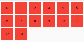
Wrap(
    //主轴间距
    spacing: 8,
    //纵轴间距
    runSpacing: 4,
    //布局方向
    direction: Axis.horizontal,
    //主轴对齐方式
    alignment: WrapAlignment.start,
    children: List.generate(
        14,
        (index) => Container(
            width: 50,
            height: 50,
            color: Colors.red,
            alignment: Alignment.center,
            child: Text("$index"),
        ),
    ),
)
Flow
Flow相比Wrap更加复杂,一般情况优先使用Wrap,如果需要一些自定义布局或性能要求高时可以使用Flow。
Flow(
    delegate: MyFlowDelegate(margin: EdgeInsets.all(10)),
    children: [
        Container(width: 80, height: 80, color: Colors.red),
        Container(width: 80, height: 80, color: Colors.green),
        Container(width: 80, height: 80, color: Colors.blue),
        Container(width: 80, height: 80, color: Colors.red),
        Container(width: 80, height: 80, color: Colors.green),
        Container(width: 80, height: 80, color: Colors.blue),
    ],
)


class MyFlowDelegate extends FlowDelegate {
    EdgeInsets margin;
    double width = 0;
    double height = 0;

    MyFlowDelegate({this.margin = EdgeInsets.zero});

    @override
    void paintChildren(FlowPaintingContext context) {
        var x = margin.left;
        var y = margin.top;
        for (int i = 0; i < context.childCount; i++) {
            var width = context.getChildSize(i)!.width + x + margin.right;
            if (width < context.size.width) {
                context.paintChild(i, transform: Matrix4.translationValues(x, y, 0));
                x = width + margin.left;
            } else {
                x = margin.left;
                y += context.getChildSize(i)!.height + margin.top + margin.bottom;
                context.paintChild(i, transform: Matrix4.translationValues(x, y, 0));
                x += context.getChildSize(i)!.width + margin.left + margin.right;
            }
        }
    }

    @override
    bool shouldRepaint(covariant FlowDelegate oldDelegate) {
        return this != oldDelegate;
    }

    @override
    Size getSize(BoxConstraints constraints) {
        return Size(double.infinity, 200);
    }
}
层叠布局
Stack
类似于Android中的FrameLayout布局。
alignment:设置未定位(即没有使用Positioned)的子组件在Stack中的对齐方式。

fit:设置未定位的子组件如何适用Stack中的填充方式。
    - loose:默认值,由子组件的fit参数决定。
    - expand:尽可能大会拉伸。
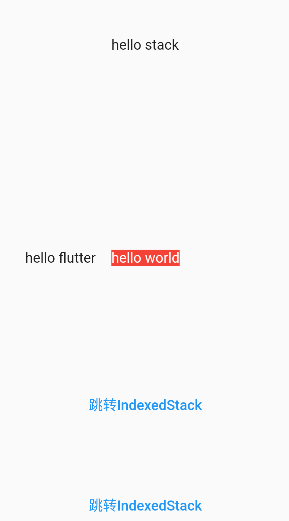
Stack(
    //设置未定位组件的对齐方式
    alignment: Alignment.center,
    //未定位的如何适应Stack空间
    fit: StackFit.loose,
    children: [
        Container(
            color: Colors.red,
            child: Text(
                "hello world",
                style: TextStyle(color: Colors.white),
            ),
        ),
        Positioned(
            child: Text("hello flutter"),
            left: 50,
        ),
        Positioned(
            child: Text("hello stack"),
            top: 50,
        ),
        Align(
            alignment: Alignment.bottomCenter,
            child: TextButton(
                child: Text("跳转IndexedStack"),
                onPressed: () {
                    Navigator.push(
                        context,
                        MaterialPageRoute(builder: (BuildContext context) {
                            return IndexedStackPage();
                        }),
                    );
                },
            ),
        ),
        Positioned(
            bottom: 100,
            child: TextButton(
                child: Text("跳转IndexedStack"),
                onPressed: () {
                    Navigator.push(
                        context,
                        MaterialPageRoute(builder: (BuildContext context) {
                            return IndexedStackPage();
                        }),
                    );
                },
            ),
        ),
    ],
)
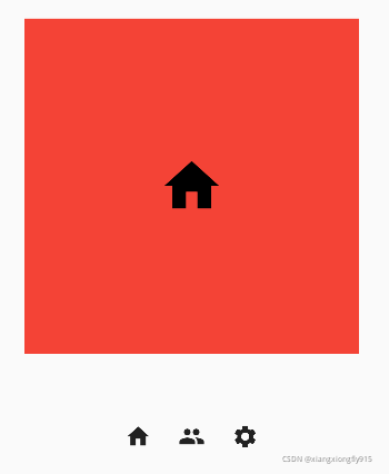
IndexedStack
IndexedStack是Stack的子类,通过index索引显示子组件。
class IndexedStackPage extends StatefulWidget {
    const IndexedStackPage({Key? key}) : super(key: key);

    @override
    State<StatefulWidget> createState() {
        return _IndexedStackPageState();
    }
}

class _IndexedStackPageState extends State<IndexedStackPage> {
    int _index = 0;

    @override
    Widget build(BuildContext context) {
        return Scaffold(
            appBar: AppBar(title: const Text("IndexedStack")),
            body: Column(
                children: [
                    SizedBox(height: 50),
                    buildFrame(),
                    SizedBox(height: 50),
                    buildSwitch(),
                ],
            ),
        );
    }

    buildFrame() {
        return IndexedStack(
            index: _index,
            children: [
                Center(
                    child: Container(
                        height: 300,
                        width: 300,
                        color: Colors.red,
                        alignment: Alignment.center,
                        child: Icon(Icons.home, color: Colors.black, size: 60),
                    ),
                ),
                Center(
                    child: Container(
                        height: 300,
                        width: 300,
                        color: Colors.green,
                        alignment: Alignment.center,
                        child: Icon(Icons.people, color: Colors.black, size: 60),
                    ),
                ),
                Center(
                    child: Container(
                        height: 300,
                        width: 300,
                        color: Colors.blue,
                        alignment: Alignment.center,
                        child: Icon(Icons.settings, color: Colors.black, size: 60),
                    ),
                ),
            ],
        );
    }

    buildSwitch() {
        return Row(
            mainAxisAlignment: MainAxisAlignment.center,
            children: [
                IconButton(
                    onPressed: () {
                        setState(() {
                            _index = 0;
                        });
                    },
                    icon: Icon(Icons.home),
                ),
                IconButton(
                    onPressed: () {
                        setState(() {
                            _index = 1;
                        });
                    },
                    icon: Icon(Icons.people),
                ),
                IconButton(
                    onPressed: () {
                        setState(() {
                            _index = 2;
                        });
                    },
                    icon: Icon(Icons.settings),
                ),
            ],
        );
    }
}
相对定位
Align
Align组件可以调整子组件的位置。
alignment:设置子组件在父组件中的起始位置。
widthFactor和heightFactor:用于确定Align组件自身的宽高,这两个属性是缩放因子,会分别乘以子元素的宽高,最终结果是Align组件的宽高。
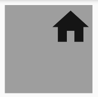
Container(
    height: 120,
    width: 120,
    color: Colors.grey,
    child: Align(
        alignment: Alignment.topRight,
        child: Icon(
            Icons.home,
            size: 60,
        ),
    ),
)
//如果没有设置Container宽高,也可以通过widthFactor和heightFactor缩放因子达到同样效果
Container(
    color: Colors.grey,
    child: Align(
        widthFactor: 2,
        heightFactor: 2,
        alignment: Alignment.topRight,
        child: Icon(
            Icons.home,
            size: 60,
        ),
    ),
)
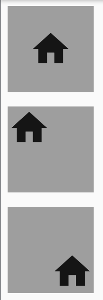
Alignment
在Flutter中Widget会以矩形的中心点为坐标原点,Alignment(0,0)表示居中即Alignment.center,Alignment(-1, -1)表示左上角即Alignment.topLeft,Alignment(1, 1)表示右下角即Alignment.bottomRight。
转换公式:
(Alignment.x*childWidth/2+childWidth/2, Alignment.y*childHeight/2+childHeight/2)
childWidth为子元素宽度
childHeight为子元素高度
Padding(
    padding: EdgeInsets.all(10),
    child: Container(
        color: Colors.grey,
        child: Align(
            widthFactor: 2,
            heightFactor: 2,
            alignment: Alignment(0, 0),
            child: Icon(
                Icons.home,
                size: 60,
            ),
        ),
    ),
),
Padding(
    padding: EdgeInsets.all(10),
    child: Container(
        color: Colors.grey,
        child: Align(
            widthFactor: 2,
            heightFactor: 2,
            alignment: Alignment(-1, -1),
            child: Icon(
                Icons.home,
                size: 60,
            ),
        ),
    ),
),
Padding(
    padding: EdgeInsets.all(10),
    child: Container(
        color: Colors.grey,
        child: Align(
            widthFactor: 2,
            heightFactor: 2,
            alignment: Alignment(1, 1),
            child: Icon(
                Icons.home,
                size: 60,
            ),
        ),
    ),
)
Padding(
    padding: EdgeInsets.all(50),
    child: Container(
        color: Colors.grey,
        child: Align(
            widthFactor: 2,
            heightFactor: 2,
            alignment: Alignment(2, 2),
            child: Icon(
                Icons.home,
                size: 60,
            ),
        ),
    ),
)
FractionalOffset
FractionalOffset的坐标原点为矩形的左上点。
实际偏移 = (FractionalOffse.x * childWidth, FractionalOffse.y * childHeight)
Padding(
    padding: EdgeInsets.all(50),
    child: Container(
        color: Colors.grey,
        child: Align(
            widthFactor: 2,
            heightFactor: 2,
            alignment: FractionalOffset(0.5, 0.5),
            child: Icon(
                Icons.home,
                size: 60,
            ),
        ),
    ),
)
Align与Stack对比
- Align:Align只能有一个子元素,通过alignment确定坐标原点,再通过转换公式定位。
- Stack:Stack可以有多个子元素,通过Positioned进行定位。
Center
Center组建继承于Align,常用于居中子元素。

DecoratedBox(
    decoration: BoxDecoration(color: Colors.red),
    child: Center(
        child: Text("ABC"),
    ),
),
SizedBox(height: 10),
DecoratedBox(
    decoration: BoxDecoration(color: Colors.red),
    child: Center(
        widthFactor: 1,
        heightFactor: 1,
        child: Text("EFG"),
    ),
),
SizedBox(height: 10),
DecoratedBox(
    decoration: BoxDecoration(color: Colors.red),
    child: Center(
        widthFactor: 2,
        heightFactor: 2,
        child: Text("EFG"),
    ),
)