目录
Bootstrap排版的文档和示例,包括全局设置、标题、正文、列表等。
1、全局设置
Bootstrap设置基本的全局显示、排版和链接样式。
- 使用native font stack(本机字体堆栈),为每个操作系统和设备选择最佳的
font-family。 - 我们使用浏览器默认的根字体大小(通常是16px),这样访问者就可以根据需要定制他们的浏览器默认值。
- 使用
$font-family-base、$font-size-base和$line-height-base属性作为应用于<body>的排版基础。 - 通过
$link-color设置全局链接颜色,并只在:hover上应用链接下划线。 - 使用
$body-bg为<body>设置背景色(默认为#fff)。
这些样式可以在reboot.scss找到。全局变量定义在variable . Scss中。确保设置$font-size-base。
2、标题
所有的html标题<h1>到<h6>都是可用的。
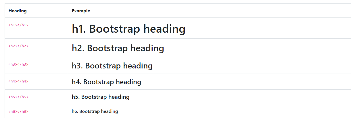
<h1>h1. Bootstrap heading</h1>
<h2>h2. Bootstrap heading</h2>
<h3>h3. Bootstrap heading</h3>
<h4>h4. Bootstrap heading</h4>
<h5>h5. Bootstrap heading</h5>
<h6>h6. Bootstrap heading</h6>
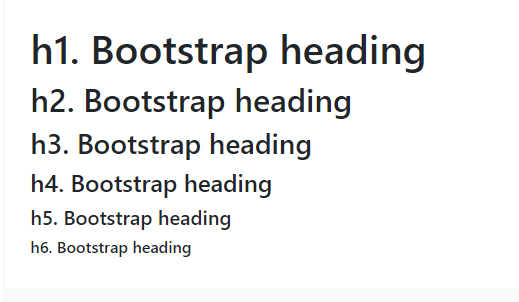
.h1到.h6类也可用,用于当你想匹配标题的字体样式但不能使用相关的HTML元素时。
<p class="h1">h1. Bootstrap heading</p>
<p class="h2">h2. Bootstrap heading</p>
<p class="h3">h3. Bootstrap heading</p>
<p class="h4">h4. Bootstrap heading</p>
<p class="h5">h5. Bootstrap heading</p>
<p class="h6">h6. Bootstrap heading</p>
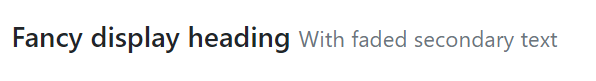
2.1、自定义标题
使用包含的实用程序类从Bootstrap 3重新创建小的次要标题文本。
<h3>
  Fancy display heading
  <small class="text-muted">With faded secondary text</small>
</h3>
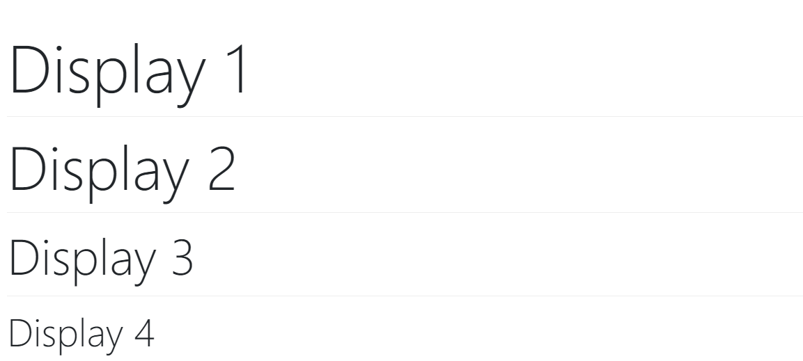
3、显示标题
传统的标题元素被设计成最好的页面内容。当你需要一个突出的标题时,考虑使用一个更大的,稍微有个性的标题风格的显示标题。请记住,这些标题在默认情况下是不响应的,但可以启用响应字体大小。
<h1 class="display-1">Display 1</h1>
<h1 class="display-2">Display 2</h1>
<h1 class="display-3">Display 3</h1>
<h1 class="display-4">Display 4</h1>
4、Lead
通过添加.lead来突出段落。
<p class="lead">
  This is a lead paragraph. It stands out from regular paragraphs.
</p>

5、内联文本元素
通用内联HTML5元素的样式。
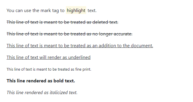
<p>You can use the mark tag to <mark>highlight</mark> text.</p>
<p><del>This line of text is meant to be treated as deleted text.</del></p>
<p><s>This line of text is meant to be treated as no longer accurate.</s></p>
<p><ins>This line of text is meant to be treated as an addition to the document.</ins></p>
<p><u>This line of text will render as underlined</u></p>
<p><small>This line of text is meant to be treated as fine print.</small></p>
<p><strong>This line rendered as bold text.</strong></p>
<p><em>This line rendered as italicized text.</em></p>
.mark和.small类也可以应用与<mark>和<small>相同的样式,同时避免标签可能带来的任何不必要的语义含义。虽然上面没有显示,但在HTML5中可以随意使用<b>和<i>。<b>用于突出单词或短语,不传达额外的重要性,而<i>主要用于语音、技术术语等。
6、文本处理
使用文本工具和颜色工具更改文本对齐、转换、样式、粗细和颜色。
7、Abbreviations
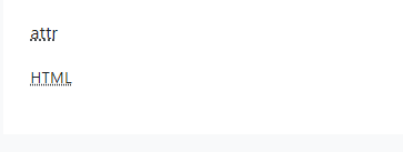
HTML的<abbr>元素的模式化实现,用于缩写和首字母缩略词在悬停时显示扩展版本。缩写有一个默认下划线,并获得一个帮助光标,以便在悬停时为辅助技术的用户提供额外的上下文。
将.initialism添加到一个略小的字体大小的缩写。
<p><abbr title="attribute">attr</abbr></p>
<p><abbr title="HyperText Markup Language" class="initialism">HTML</abbr></p>
8、Blockquotes
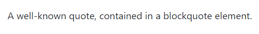
用于引用文档中其他来源的内容块。将<blockquote class="blockquote">括在任何HTML上作为引用。
<blockquote class="blockquote">
  <p class="mb-0">A well-known quote, contained in a blockquote element.</p>
</blockquote>
8.1、Naming a source
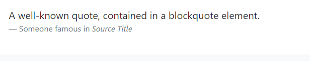
添加一个<footer class="blockquote-footer">来标识源。在<cite>中包装源工作的名称。
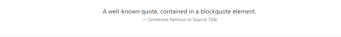
<blockquote class="blockquote">
  <p class="mb-0">A well-known quote, contained in a blockquote element.</p>
  <footer class="blockquote-footer">Someone famous in <cite title="Source Title">Source Title</cite></footer>
</blockquote>
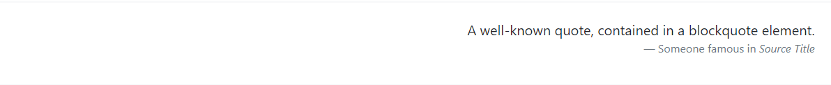
8.2、Alignment
根据需要使用文本工具来更改区块引用的对齐方式
<blockquote class="blockquote text-center">
  <p class="mb-0">A well-known quote, contained in a blockquote element.</p>
  <footer class="blockquote-footer">Someone famous in <cite title="Source Title">Source Title</cite></footer>
</blockquote>
<blockquote class="blockquote text-right">
  <p class="mb-0">A well-known quote, contained in a blockquote element.</p>
  <footer class="blockquote-footer">Someone famous in <cite title="Source Title">Source Title</cite></footer>
</blockquote>
9、Lists
9.1、Unstyled
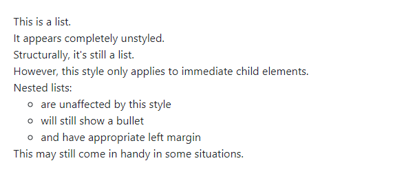
删除默认的列表样式和列表项的左边空白(仅限直接的子元素)。这只适用于直接的子列表项,这意味着您也需要为任何嵌套列表添加类。
<ul class="list-unstyled">
  <li>This is a list.</li>
  <li>It appears completely unstyled.</li>
  <li>Structurally, it's still a list.</li>
  <li>However, this style only applies to immediate child elements.</li>
  <li>Nested lists:
    <ul>
      <li>are unaffected by this style</li>
      <li>will still show a bullet</li>
      <li>and have appropriate left margin</li>
    </ul>
  </li>
  <li>This may still come in handy in some situations.</li>
</ul>
9.2、Inline
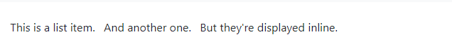
删除列表的项目符号,并结合使用.list-inline和.list-inline-item两个类应用一些浅边距。
<ul class="list-inline">
  <li class="list-inline-item">This is a list item.</li>
  <li class="list-inline-item">And another one.</li>
  <li class="list-inline-item">But they're displayed inline.</li>
</ul>
9.3、Description list alignment
通过使用网格系统的预定义类(或语义mixins)水平对齐术语和描述。对于较长的术语,可以选择添加.text-truncate类,以使用省略号截断文本。
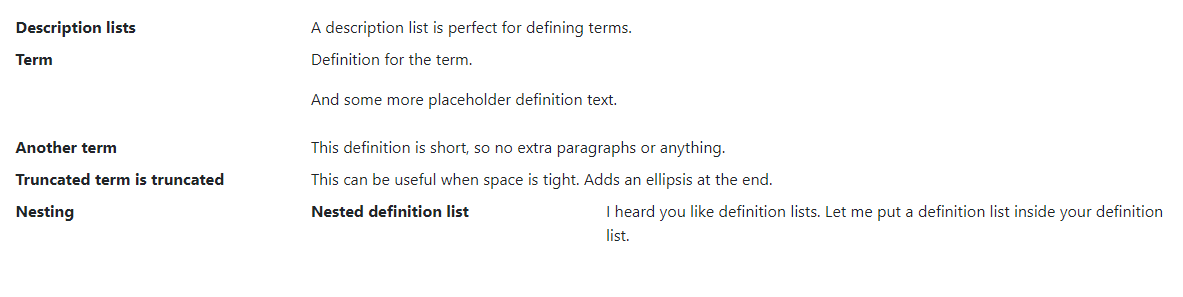
<dl class="row">
  <dt class="col-sm-3">Description lists</dt>
  <dd class="col-sm-9">A description list is perfect for defining terms.</dd>

  <dt class="col-sm-3">Term</dt>
  <dd class="col-sm-9">
    <p>Definition for the term.</p>
    <p>And some more placeholder definition text.</p>
  </dd>

  <dt class="col-sm-3">Another term</dt>
  <dd class="col-sm-9">This definition is short, so no extra paragraphs or anything.</dd>

  <dt class="col-sm-3 text-truncate">Truncated term is truncated</dt>
  <dd class="col-sm-9">This can be useful when space is tight. Adds an ellipsis at the end.</dd>

  <dt class="col-sm-3">Nesting</dt>
  <dd class="col-sm-9">
    <dl class="row">
      <dt class="col-sm-4">Nested definition list</dt>
      <dd class="col-sm-8">I heard you like definition lists. Let me put a definition list inside your definition list.</dd>
    </dl>
  </dd>
</dl>
10、Responsive font sizes
在4.3.0版本中,Bootstrap提供了响应式字体大小的选项,允许文本在设备和视口大小之间更自然地缩放。可以通过将$enable- response -font-size Sass变量更改为true并重新编译Bootstrap来启用RFS。
为了支持RFS,我们使用Sass mixin来替换我们的常规字体大小属性。响应式字体大小将被编译成calc()函数,并混合使用rem和viewport单元,以实现响应式缩放行为。关于RFS及其配置的更多信息可以在其GitHub存储库中找到。
后记
如果你感觉文章不咋地
//(ㄒoㄒ)//,就在评论处留言,作者继续改进;o_O???
如果你觉得该文章有一点点用处,可以给作者点个赞;\\*^o^*//
如果你想要和作者一起进步,可以微信扫描二维码,关注前端老L;~~~///(^v^)\\\~~~
谢谢各位读者们啦(^_^)∠※!!!
