matplotlib学习笔记
跟着莫烦老师的B站课程记的matplotlib学习笔记,分享给大家^ ^
# 导入要使用的库
import matplotlib.pyplot as plt
import numpy as np
基本用法
x = np.linspace(-1,1,50)
y = x**2
plt.plot(x,y) #绘制点线图
plt.show()

figure图像
#画在两个figure里
x = np.linspace(-3,3,50)
y1 = 2*x+1
y2 = x**2
plt.figure()
plt.plot(x,y1)

plt.figure()
plt.plot(x,y2)

plt.show()


#画在一个figure里
x = np.linspace(-3,3,50)
y1 = 2*x+1
y2 = x**2
plt.figure()
plt.plot(x,y1,color = 'blue',linewidth = 1.0,linestyle = '-')
plt.plot(x,y2,color = 'red',linewidth = 3.0,linestyle = '--')
plt.show()

设置坐标轴
x = np.linspace(-3,3,50)
y1 = 2*x+1
y2 = x**2
plt.figure()
plt.plot(x,y1,color = 'blue',linewidth = 1.0,linestyle = '-')
plt.plot(x,y2,color = 'red',linewidth = 2.0,linestyle = '--')
##设置坐标轴取值范围
plt.xlim((-1,2))
plt.ylim((-2,3))
##设置轴名称
plt.xlabel("I am x")
plt.ylabel("I am y")
##设置坐标轴刻度
new_ticks = np.linspace(-1,2,5)
print('new_ticks:',new_ticks)
plt.xticks(new_ticks)
plt.yticks([-2,-1.8,-1,1.22,3],
          ['$really\ bad$',r'$bad\ \alpha$','$normal$','really good'])

# gca = 'get cuurent axis'
ax = plt.gca() #获取当前figure的轴(共4个:'bottom','left','top','right')
#设置轴的颜色
ax.spines['right'].set_color('none') #隐藏'right'轴
ax.spines['top'].set_color('none') #隐藏'top'轴
#设置轴上标尺的位置
ax.xaxis.set_ticks_position('bottom') #设置x轴上标尺显示的位置
ax.yaxis.set_ticks_position('left') #设置y轴上标尺显示的位置
#设置轴的位置
ax.spines['bottom'].set_position(('data',0))
ax.spines['left'].set_position(('data',0))

plt.show()
new_ticks: [-1. -0.25 0.5 1.25 2. ]

图例
x = np.linspace(-3,3,50)
y1 = 2*x+1
y2 = x**2
plt.figure()
l1,=plt.plot(x,y1,label = 'up',color = 'blue',linewidth = 1.0,linestyle = '-')
l2,=plt.plot(x,y2,label = 'down',color = 'red',linewidth = 2.0,linestyle = '--')
plt.legend(handles=[l1,],labels=['aaa',],loc='best')
plt.show()

注解
x = np.linspace(-3,3,50)
y = 2*x+1
plt.figure()
plt.plot(x,y,color = 'blue',linewidth = 1.0,linestyle = '-')

ax = plt.gca()
ax.spines['right'].set_color('none')
ax.spines['top'].set_color('none')
ax.xaxis.set_ticks_position('bottom')
ax.yaxis.set_ticks_position('left')
ax.spines['bottom'].set_position(('data',0))
ax.spines['left'].set_position(('data',0))

x0=1
y0=2*x0 + 1
plt.scatter(x0,y0) #绘制散点图
plt.plot([x0,x0],[y0,0],'k--',lw=2.5)

# method 1
##############################
plt.annotate(r'$2x+1=%s$' % y0,xy=(x0,y0),xycoords='data',xytext=(+30,-30),textcoords='offset points',
            fontsize=16,arrowprops=dict(arrowstyle='->',connectionstyle='arc3,rad=.2'))

#method 2
##############################
plt.text(-3.7,3,r'$This\ is\ the\ some\ text. \mu\ \sigma_i\ \alpha_t$',
        fontdict={

    'size':16,'color':'r'})

plt.show()

坐标轴刻度能见度
x = np.linspace(-3,3,50)
y = 0.1*x

plt.figure()
plt.plot(x,y,color = 'blue',linewidth = 10.0,linestyle = '-')
plt.ylim(-2,2)
ax = plt.gca()
ax.spines['right'].set_color('none')
ax.spines['top'].set_color('none')
ax.xaxis.set_ticks_position('bottom')
ax.yaxis.set_ticks_position('left')
ax.spines['bottom'].set_position(('data',0))
ax.spines['left'].set_position(('data',0))

for label in ax.get_xticklabels() + ax.get_yticklabels():
    label.set_fontsize(12)
    label.set_bbox(dict(facecolor='white',edgecolor='None',alpha=0.7))
## 以上操作并未达到预想效果

plt.show()

scatter散点图
n = 1024
X = np.random.normal(0,1,n)
Y = np.random.normal(0,1,n)
T = np.arctan2(Y,X) #for color value

plt.scatter(X,Y,s=75,c=T,alpha=0.5)

plt.xlim((-1.5,1.5))
plt.ylim((-1.5,1.5))

##隐藏刻度
plt.xticks(())
plt.yticks(())

plt.show()

Bar 柱状图
n = 12
X = np.arange(n)
Y1 = (1-X/float(n))*np.random.uniform(0.5,1.0,n)
Y2 = (1-X/float(n))*np.random.uniform(0.5,1.0,n)

plt.bar(X,+Y1,facecolor='#9999ff',edgecolor='white')
plt.bar(X,-Y2,facecolor='#ff9999',edgecolor='white')

for x,y in zip(X,Y1):
    # ha = horizontal alignment
    plt.text(x,y+0.05,'%.2f' % y,ha='center',va='bottom')

for x,y in zip(X,Y2):
    # ha = horizontal alignment
    plt.text(x,-y-0.05,'%.2f' % y,ha='center',va='top')

plt.xlim(-.5,n)
plt.xticks(())
plt.ylim(-1.25,1.25)
plt.yticks(())

plt.show()

contour 等高线图
def f(x,y):
    return (1-x/2+x**5+y**3)*np.exp(-x**2-y**2)

n = 256
x = np.linspace(-3,3,n)
y = np.linspace(-3,3,n)
X,Y = np.meshgrid(x,y)

#填充颜色
plt.contourf(X,Y,f(X,Y),8,alpha = 0.75,cmap=plt.cm.hot)
#a添加等高线
C = plt.contour(X,Y,f(X,Y),8,colors='black',linewidth=.5)
#adding label
plt.clabel(C,inline=True,fontsize=10)

plt.xticks(())
plt.yticks(())
plt.show()
/home/guoych/anaconda3/lib/python3.7/site-packages/ipykernel_launcher.py:12: UserWarning: The following kwargs were not used by contour: 'linewidth'
  if sys.path[0] == '':

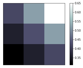
Image 图片
a = np.array([0.31,0.36,0.42,
             0.36,0.43,0.52,
             0.42,0.52,0.65]).reshape(3,3)

plt.imshow(a,interpolation='nearest',cmap='bone',origin='lower')
plt.colorbar()

plt.xticks(())
plt.yticks(())
plt.show()
3D数据
# 3D绘图需要额外导入这个库
from mpl_toolkits.mplot3d import Axes3D
fig = plt.figure()
ax = Axes3D(fig)
# X,Y value
X = np.arange(-4,4,0.25)
Y = np.arange(-4,4,0.25)
X,Y = np.meshgrid(X,Y)
R = np.sqrt(X**2 + Y**2)
# height value
Z = np.sin(R)

ax.plot_surface(X,Y,Z,rstride=1,cstride=1,cmap=plt.get_cmap('rainbow'))
ax.contourf(X,Y,Z,zdir='z',offset = -2,cmap='rainbow')
ax.set_zlim(-2,2)

plt.show()

subplot 多个显示
plt.figure()

plt.subplot(2,2,1)
plt.plot([0,1],[0,1])

plt.subplot(2,2,2)
plt.plot([0,1],[0,2])

plt.subplot(2,2,3)
plt.plot([0,1],[0,3])

plt.subplot(224)
plt.plot([0,1],[0,4])

plt.show()

subplot in grid 分格显示
import matplotlib.gridspec as gridspec
#method 1:
######################################################
plt.figure()
ax1 = plt.subplot2grid((3,3),(0,0),colspan=3,rowspan=1)
ax1.plot([1,2],[1,2])
ax1.set_title('ax1_title')
ax2 = plt.subplot2grid((3,3),(1,0),colspan=2,rowspan=1)
ax3 = plt.subplot2grid((3,3),(1,2),colspan=1,rowspan=2)
ax4 = plt.subplot2grid((3,3),(2,0),colspan=1,rowspan=1)
ax5 = plt.subplot2grid((3,3),(2,1),colspan=1,rowspan=1)

plt.show()

#method 2:
######################################################
plt.figure()
gs = gridspec.GridSpec(3,3)
ax1 = plt.subplot(gs[0,:])
ax2 = plt.subplot(gs[1,:2])
ax3 = plt.subplot(gs[1:,2])
ax4 = plt.subplot(gs[-1,0])
ax5 = plt.subplot(gs[-1,-2])

plt.show()

#method 3:
######################################################
f,((ax11,ax12),(ax21,ax22))=plt.subplots(2,2,sharex=True,sharey=True)
ax11.scatter([1,2],[1,2])

plt.tight_layout()
plt.show()

plot in plot 图中图
fig = plt.figure()
x = [1,2,3,4,5,6,7]
y = [1,3,4,2,5,8,6]

left, bottom, width, height = 0.1,0.1,0.8,0.8
ax1 = fig.add_axes([left,bottom,width,height])
ax1.plot(x,y,'r')
ax1.set_xlabel('x')
ax1.set_ylabel('y')
ax1.set_title('title')

left, bottom, width, height = 0.2,0.6,0.25,0.25
ax1 = fig.add_axes([left,bottom,width,height])
ax1.plot(x,y,'b')
ax1.set_xlabel('x')
ax1.set_ylabel('y')
ax1.set_title('title inside 1')

plt.axes([0.6,0.2,0.25,0.25])
plt.plot(y[::-1],x,'g')
plt.xlabel('x')
plt.ylabel('y')
plt.title('title inside 2')

plt.show()

次坐标
x = np.arange(0,10,0.1)
y1 = 0.05 * x**2
y2 = -1 * y1

fig,ax1 = plt.subplots()
ax2 = ax1.twinx()
ax1.plot(x,y1,'g-')
ax2.plot(x,y2,'b--')

ax1.set_xlabel('X data')
ax1.set_ylabel('Y1',color='g')
ax2.set_ylabel('Y2',color='b')

plt.show()

animation 动画
from matplotlib import animation
fig,ax=plt.subplots()

x = np.arange(0,2*np.pi,0.01)
line,=ax.plot(x,np.sin(x))

def animate(i):
    line.set_ydata(np.sin(x+i/10))
    return line,

def init():
    line.set_ydata(np.sin(x))
    return line,

ani = animation.FuncAnimation(fig=fig,func=animate,frames=100,init_func=init,interval=20,blit=True)
plt.show()
