(未完)
第一章 Matplotlib 简介
1.1 为什么用 Matplotlib
python中的画图包,方便大量数据的呈现
简称plt
1.2 Matplotlib 安装
必须先安装numpy再安装matplotlib
sudo apt-get install python3-matplotlib #python3第二章 基本使用
2.1 基本用法
import matplotlib.pyplot as plt
import numpy as np

x = np.linspace(-1, 1, 50)
y = 2*x + 1

plt.figure() #新建一个画布/窗口,默认为figure1
plt.plot(x, y) #描点并绘图
plt.show() #显示绘图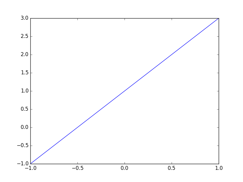
2.2 figure 图像
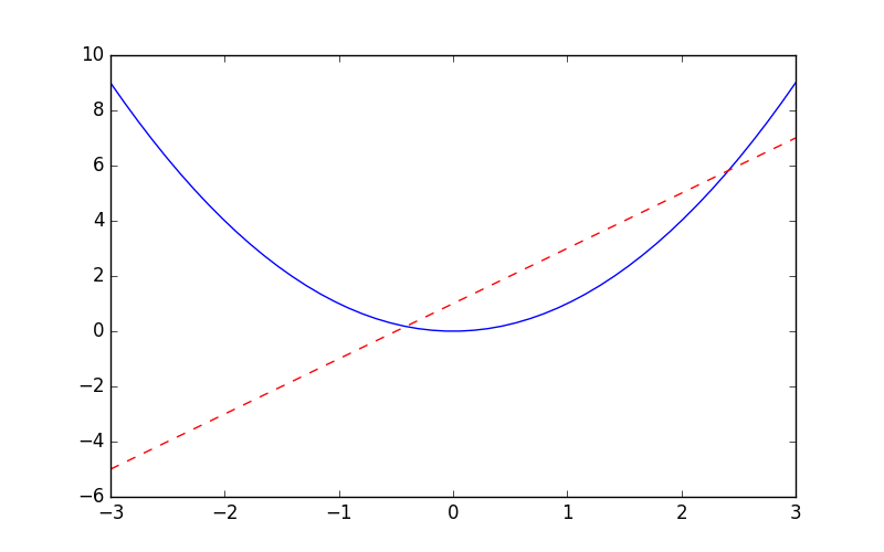
import matplotlib.pyplot as plt
import numpy as np

x = np.linspace(-3, 3, 50)
y1 = 2*x + 1
y2 = x**2

plt.figure() #新建画布/窗口,默认为figure1
plt.plot(x, y1)
plt.show()

plt.figure() #新建画布/窗口,接着上面的,默认为figure2
plt.plot(x, y1)
plt.show()

plt.figure(num=5, figsize=(8, 5),) #新建画布,命名为figure5,画布大小初定为长8宽5
plt.plot(x, y2)
plt.plot(x, y1, color='red', linewidth=1.0, linestyle='--') #红色的虚线,线的宽度为1.0
plt.show() #一张画布上画一个坐标系,一个坐标系中画了两个曲线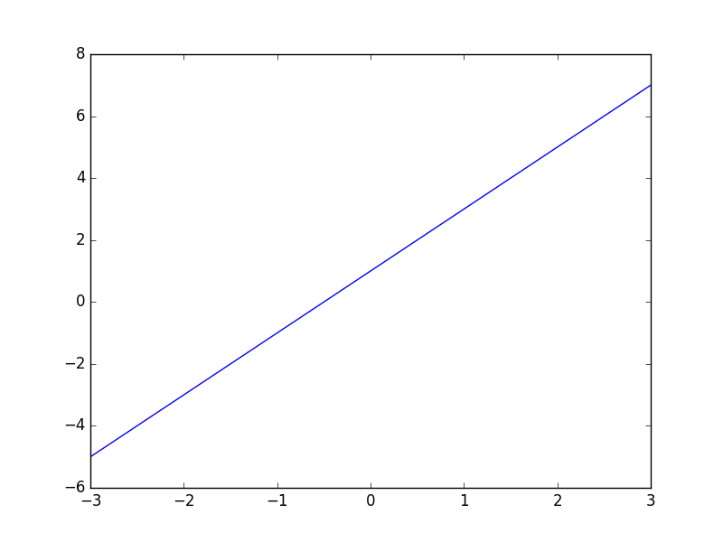
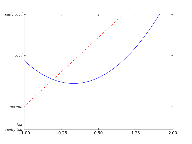
2.3 设置坐标轴1
import matplotlib.pyplot as plt
import numpy as np

x = np.linspace(-3, 3, 50)
y1 = 2*x + 1
y2 = x**2

plt.figure()
plt.plot(x, y2)
plt.plot(x, y1, color='red', linewidth=1.0, linestyle='--')

plt.xlim((-1, 2)) #设置X轴的取值范围
plt.ylim((-2, 3))
plt.xlabel('I am x') #设置X轴的轴名称
plt.ylabel('I am y')
plt.show()
#----------------------------------------------------
#自定义X轴刻度plt.xticks()
new_ticks = np.linspace(-1, 2, 5)
plt.xticks(new_ticks)

#自定义y轴刻度及名称
plt.yticks([-2, -1.8, -1, 1.22, 3],[r'$really\ bad$', r'$bad$', r'$normal$', r'$good$', r'$really\ good$'])
plt.show()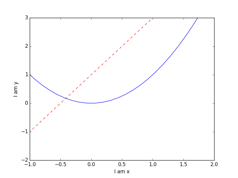
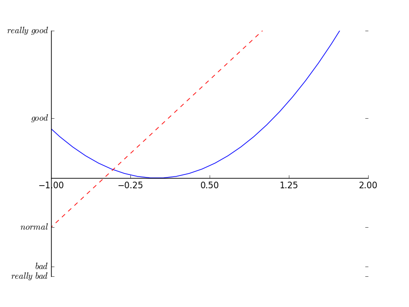
2.4 设置坐标轴2
gca = get current axis
坐标轴所有位置:top, bottom, left, right, both, default, none
位置所有属性:outward, axes, data
移动坐标轴/坐标原点的位置
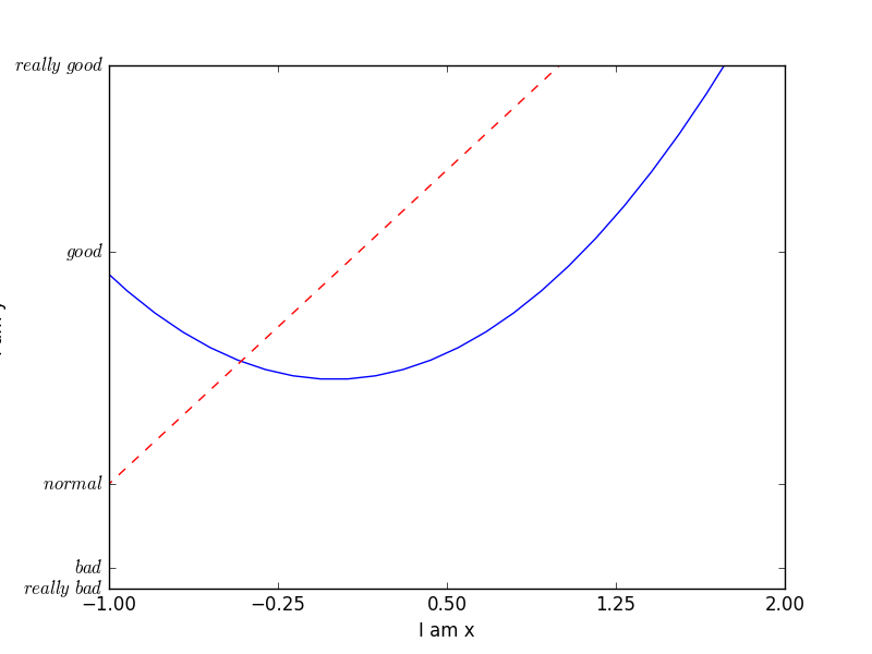
import matplotlib.pyplot as plt
import numpy as np
x = np.linspace(-3, 3, 50)
y1 = 2*x + 1
y2 = x**2
plt.figure()
plt.plot(x, y2)
plt.plot(x, y1, color='red', linewidth=1.0, linestyle='--')
plt.xlim((-1, 2))
plt.ylim((-2, 3))
new_ticks = np.linspace(-1, 2, 5)
plt.xticks(new_ticks)
plt.yticks([-2, -1.8, -1, 1.22, 3],['$really\ bad$', '$bad$', '$normal$', '$good$', '$really\ good$'])
#---------------------------------------------------------
#本节课新内容
ax = plt.gca() #获取当前坐标轴的信息
ax.spines['right'].set_color('none') #设置右边框颜色为白/空
ax.spines['top'].set_color('none')
plt.show()
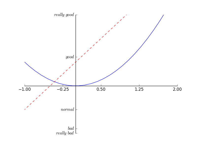
#-----------------------------------------------------------
ax.xaxis.set_ticks_position('bottom') #设置x轴的位置
ax.spines['bottom'].set_position(('data',0)) #让x轴与y轴的0刻度对齐,data表示y轴的刻度,位置所有属性:outward,axes,data
plt.show()
#----------------------------------------------------------
ax.yaxis.set_ticks_position('left')
ax.spines['left'].set_position(('data',0)) #让y轴与x轴的0刻度对齐,data表示x轴的刻度
plt.show()
#---------------------------------------------------------