最近在写后台管理系统,遇到一个需求就是 中国地图根据数值 展示深浅颜色。
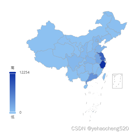
效果图如下:
直接上代码:
1.html部分
<div id="Map"></div>
2.css部分——一定要设置尺寸
#Map {


  width: 100%;
  height: 400px;
}
3.js部分
3.1 安装echarts插件——不要安装最新版本,要指定版本,我这边是5.4.1版本
npm install [email protected]
如果npm失败,则可以使用cnpm试一下
cnpm install [email protected] --save
3.2 在main.js中挂载到vue原型上——先引入,再挂载
//main.js中的内容
import echarts from 'echarts';
Vue.prototype.$echarts = echarts;
3.3 在其他页面使用——引入地图数据
import regions from '@/utils/china';
引入的地图数据可以通过 3d中国地图数据:http://t.csdn.cn/63wZB 里面,在评论区留下邮箱,然后我看到后,会把数据发到指定邮箱里面。
3.4 echarts使用地图数据
var chart = this.$echarts.init(document.getElementById('Map'));
this.$echarts.registerMap('china', regions); // 注册矢量地图数据
getProvinceDataAll().then((res) => {

    //这个接口是为了拿全中国的数据,需要替换成自己的数据来源
  let maxArr = res.sort(this.sortBy('value'));//sortBy是根据value字段对对象数组进行排序
  console.log('maxArr', maxArr);
  var option = {


    backgroundColor: '#fff', //画布背景颜色
    tooltip: {


      show: true,
      trigger: 'item',
      formatter: (data) => {


        return `<h3>${

      data}</h3>`;
      },
      data: maxArr,
    },
    visualMap: {


      min: 0,
      max: maxArr[0].value,
      text: ['高', '低'],
      realtime: false,
      calculable: true,
      inRange: {


        color: ['#8dc1f1', '#0e31a4'],
      },
      textStyle: {


        color: '#333',
      },
      left: 20,
      bottom: 10,
    },
    // geo: {


    //   map: 'china',
    //   //   roam: true,
    //   zoom: 1.2,
    //   viewControl: {


    //     rotateSensitivity: 0, //禁止旋转地图
    //     //下面的四个参数 可以实现禁止缩放地图
    //     projection: 'orthographic',
    //     orthographicSize: 110,
    //     maxOrthographicSize: 110,
    //     minOrthographicSize: 110,
    //   },
    //   label: {


    //     normal: {


    //       show: false,
    //       textStyle: {


    //         color: 'rgba(0,0,0,0.4)',
    //       },
    //     },
    //   },
    //   itemStyle: {


    //     normal: {


    //       borderColor: '#999',
    //       shadowColor: '#f90',
    //     },
    //     emphasis: {


    //       show: true,
    //       areaColor: '#f90',
    //       label: {


    //         show: true,
    //       },
    //       shadowOffsetX: 0,
    //       shadowOffsetY: 0,
    //       shadowBlur: 20,
    //       borderWidth: 0,
    //       shadowColor: 'rgba(0, 0, 0, 0.5)',
    //     },
    //   },
    // },
    series: [
      {


        name: '浏览量',
        type: 'map',
        map: 'china',
        // roam: true,
        // coordinateSystem: 'geo',
        geoIndex: 0,
        tooltip: {

     show: false },
        label: {


          normal: {


            formatter: '{b}\r\n{c}',
            position: 'right',
            show: false,
          },
          emphasis: {


            show: true,
          },
        },
        data: maxArr,
      },
    ],
  };
  chart.setOption(option);
});
3.5 对象数组排序
sortBy(field) {


  return function (a, b) {


    return b[field] - a[field];
  };
},
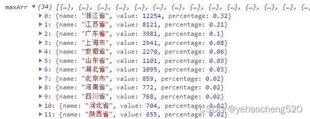
最终展示的数据结构如下:
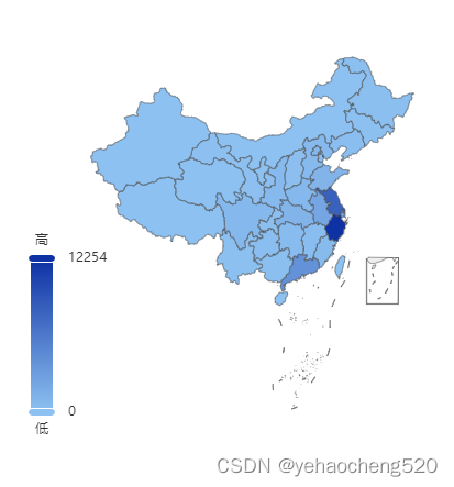
最终效果图如下:
鼠标移入后的效果如下:

完成!!!