CSS本质是用来修饰HTML标签的
常用CSS属性
(1)字体及文本属性
文字相关效果
| 属性 | 含义 |
| font | 字体及其属性(复合属性,不建议直接使用) |
| font-family | 设置文本字体,电脑中存在字体 |
| font-size | 字体大小 |
| font-weight | 字体粗细 |
| font-style | 字体样式 |
| text | 文本相关 |
| text-algin | 文本对齐方式 |
| text-decoration | 下划线 |
| text-overflow:ellipsis | 文本显示超出省略 |
| text-indent | 首行缩进 |
| text-transform | 字母大小写转换 |
示例:
<!DOCTYPE html>
<html lang="en">
<head>
<meta charset="UTF-8">
<meta http-equiv="X-UA-Compatible" content="IE=edge">
<meta name="viewport" content="width=device-width, initial-scale=1.0">
<title>字体及文本效果</title>
<link rel="stylesheet" href="css/i.css">
</head>
<body>
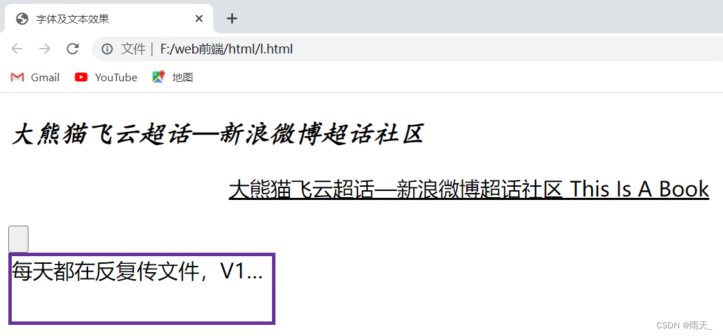
<p class="box">大熊猫飞云超话—新浪微博超话社区</p>
<p class="box2">大熊猫飞云超话—新浪微博超话社区 this is a book</p>
<button class="btn">book</button>
<div class="msg">每天都在反复传文件,V1、V2、终版3、终版5?在飞书文档可以实时协同编辑,看到的永远都是最新版。文档中还可以@同事、添加评论、插入任务列表等多种类型的内容,岂止于文档,更是丰富的创作工具。</div>
</body>
</html>.box{
font-family: 楷体;
font-size: 20px;
font-weight: 600;
/* font-weight:加粗。bold/bloder */
font-style: italic;
/* 字体加斜 */
}
.box2{
text-align: center;/* 文本对齐方式 */
text-decoration: underline;/* 下划线 */
text-transform: capitalize;/* 让字体产生变化。uppercase:字体大写。capitalize:单词首字母大写 */
text-indent: 32px;/* 字体缩进,文本软化效果 */
}
.btn{
text-indent: -99px;
/* 使得文字无法显示 */
}
.msg{
height: 50px;
width: 200px;
border: 3px solid rebeccapurple;
/* 字体内容超过div标签时,以下三个结合使用使得内容超出隐藏 */
text-overflow: ellipsis;/* 内容超出,加... */
white-space: nowrap;/* 保证超出内容不换行 */
overflow: hidden;/* 超出隐藏 */
}
(2)标签大小样式:
| 属性 | 含义 |
| weight | 宽 |
| height | 高 |
| border | 边线 |
| border-radius | 边线弧度 |
| color | 前景色 |
| background | 背景色 |
| opacity |
前景色和背景色都实现透明 |
rgb函数:rgb(red,green,blue)。每种颜色的取值范围:[0,255]
示例:
<!DOCTYPE html>
<html lang="en">
<head>
<meta charset="UTF-8">
<meta http-equiv="X-UA-Compatible" content="IE=edge">
<meta name="viewport" content="width=device-width, initial-scale=1.0">
<link rel="stylesheet" href="css/j.css">
<title>样式修饰</title>
</head>
<body>
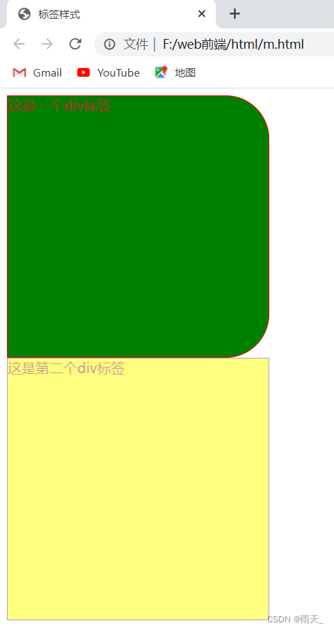
<div class="box">
这是一个div标签
</div>
<div class="box1">
这是第二个div标签
</div>
</body>
</html>.box{
width: 300px;
height: 300px;
border: 1px solid red;
/* border-radius: 10px;将弧度改为10px */
border-top-right-radius: 50px;
/* 将右上弧度改为50px */
border-bottom-right-radius: 50px;
/* 将右下弧度改为50px */
color: brown;
/* 将标签内容颜色变为brown */
/* background:green; */
background-color: green;
/* 将背景色设置为green */
}
.box1{
width: 300px;
height: 300px;
border: 1px solid rebeccapurple;
background-color: yellow;
color: brown;
opacity: 0.5;
/* rgba() --- 函数中的alpha,第四个参数表示透明度 */
}
(3)阴影效果
| 属性 | 含义 |
| box-shadow | 盒子阴影 |
| text-shadow | 文本阴影 |
示例:
<!DOCTYPE html>
<html lang="en">
<head>
    <meta charset="UTF-8">
    <meta http-equiv="X-UA-Compatible" content="IE=edge">
    <meta name="viewport" content="width=device-width, initial-scale=1.0">
    <link rel="stylesheet" href="css/k.css">
    <title>阴影效果</title>
</head>
<body>
    <div class="box">
        <img src="img/123.png" alt="">
    </div>

    <div class="box1">火</div>

</body>
</html>
.box{
width: 300px;
height: 300px;
border: 1px solid red;
box-shadow: 20px 20px 0px skyblue;
/* box-shaodw:往左偏移20px,往下偏移20px,模糊度为0px */
box-shadow: 0px 10px 20px red,
10px 0px 20px rebeccapurple,
0px -10px 20px brown,
-10px 0px 20px forestgreen;
overflow: scroll;
}
.box1{
width: 300px;
height: 300px;
border: 1px solid rebeccapurple;
font-size: 50px;/* 设置大小 */
font-weight: bold;/* 加粗 */
color: rosybrown;/* 设置颜色 */
text-align: center;/* 居中 */
/* line-height: 300px; 行高为盒子高度 */
text-shadow:0px 0px 10px firebrick ;/* 阴影效果 */
}
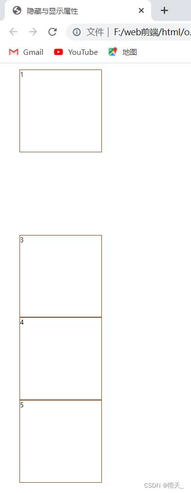
(4)隐藏与显示:(子元素大小超出父元素大小问题)
| 属性 | 含义 |
| overflow:hidden; |
超出隐藏 |
| overflow-y:scroll; | y轴出现滚动条 |
| overflow-x:scroll; | x轴出现滚动条 |
| display:none; |
隐藏标签 |
| visbility:hidden; | 隐藏标签,占据位置 |
示例:
<!DOCTYPE html>
<html lang="en">
<head>
    <meta charset="UTF-8">
    <meta http-equiv="X-UA-Compatible" content="IE=edge">
    <meta name="viewport" content="width=device-width, initial-scale=1.0">
    <link rel="stylesheet" href="css/l.css">
    <title>隐藏与显示属性</title>
</head>
<body>
    <ul class="news">
        <li>1</li>
        <li>2</li>
        <li>3</li>
        <li>4</li>
        <li>5</li>
    </ul>
</body>
</html>
ul,ol{
list-style: none;
}
li{
width: 200px;
height: 200px;
border: 1px solid saddlebrown;
}
ul.news>li:nth-child(2){
/* display: none;隐藏 */
visibility: hidden;/* 隐藏 */
}
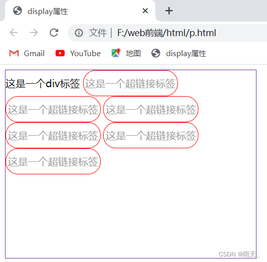
(5)display属性:
<1> 隐藏和显示标签
<2> 修改标签的默认属性(块标签/行内标签)
块标签【block】、行内标签【inline】。行内快标签【inline-block】
示例:
<!DOCTYPE html>
<html lang="en">
<head>
    <meta charset="UTF-8">
    <meta http-equiv="X-UA-Compatible" content="IE=edge">
    <meta name="viewport" content="width=device-width, initial-scale=1.0">
    <link rel="stylesheet" href="css/m.css">
    <title>display属性</title>
</head>
<body>
    <div class="box">
        这是一个div标签
        <a href="#">这是一个超链接标签</a>
        <a href="#">这是一个超链接标签</a>
        <a href="#">这是一个超链接标签</a>
        <a href="#">这是一个超链接标签</a>
        <a href="#">这是一个超链接标签</a>
        <a href="#">这是一个超链接标签</a>
        <!-- 超链接标签是行内标签 -->
    </div>
</body>
</html>
.box{
width: 400px;
height: 300px;
border: 1px solid rebeccapurple;
/* display: none;标签隐藏 */
/* display: inline;将其转为行内标签 */
}
.box>a{
width: 150px;
height: 40px;
border: 1px solid red;
/* display: block; 将行内标签转为块标签 */
/* display: flex; 弹性盒子 */
display: inline-block;
text-decoration: none;/* 不再显示下划线 */
color: #999;
text-align: center;/* 字体居中 */
line-height: 40px;
border-radius: 20px;
}
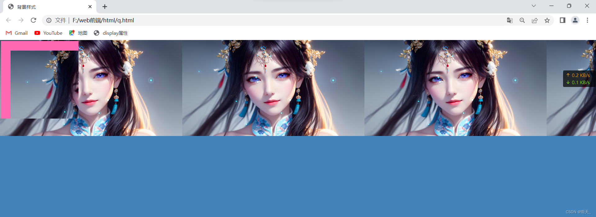
(6)背景属性
| 属性 | 含义 |
| background | 背景(简写,不建议直接使用) |
| background-color | 背景颜色 |
| background-image | 背景图片 |
| background-repeat | 背景图片重复方式 |
| background-position | 背景图片的显示位置 |
| background-attachment | 背景图片是否跟随滚动 |
| background-size | 背景大小 |
示例:
<!DOCTYPE html>
<html lang="en">
<head>
    <meta charset="UTF-8">
    <meta http-equiv="X-UA-Compatible" content="IE=edge">
    <meta name="viewport" content="width=device-width, initial-scale=1.0">
    <link rel="stylesheet" href="css/n.css">
    <title>背景样式</title>
</head>
<body>
    <div class="box">

    </div>
</body>
</html>
body{
background-image: url(../img/123.png);
background-color: #4383bc;
background-repeat: repeat-x;
}
.box{
width: 800px;
height: 800px;
/* background: red url(../img/123.png) no-repeat; */
/* 当图片较小,内容含量较大,则图片会进行复制。no-repeat:图片不再进行复制复制 */
background-color: hotpink;
background-image: url(../img/123.png);
/* background-repeat: no-repeat;不开启复制 */
background-repeat: no-repeat;/* 在x轴进行复制,则y轴不会进行复制 */
background-position:100px 100px ;
/* 背景图片的位置 */
/* 如果给定两个值,表示的是背景图片的坐标;也可透视精灵图/雪碧图 */
}
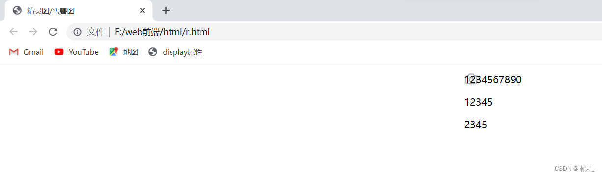
附:
精灵图和雪碧图:很多张图片放在一张图片上,用户只需请求一张图片就可以拿到所有需要的图片。开发人员利用背景图的位置去显示不同位置的图片,这是前端图片优化的一种方式。
示例:
<!DOCTYPE html>
<html lang="en">
<head>
    <meta charset="UTF-8">
    <meta http-equiv="X-UA-Compatible" content="IE=edge">
    <meta name="viewport" content="width=device-width, initial-scale=1.0">
    <link rel="stylesheet" href="css/o.css">
    <title>精灵图/雪碧图</title>
</head>
<body>
    <div class="box">
        <p>1234567890</p>
        <p>12345</p>
        <p>2345</p>
    </div>
</body>
</html>
.body{
background-attachment: fixed;
/* 背景图保持不变,文字实现拖动效果 */
}
.box{
margin: auto;
width: 25px;
height: 20px;
background-image:url(../img/234.png);
background-position: 0px -50px;
background-repeat: no-repeat;
}
.box:hover{
background-position: 0px -75px;
/* 也可用来透视精灵图或者雪碧图。也可用英文表示:center表示居中 */
/* background-size: 200px 300px;指定大小 */
/* background-size: cover;实现自动缩放,通常与background-position联用,保证作背景图片 */
/* cover:自动覆盖所有面积 */
}