文章目录
1.基础柱状图
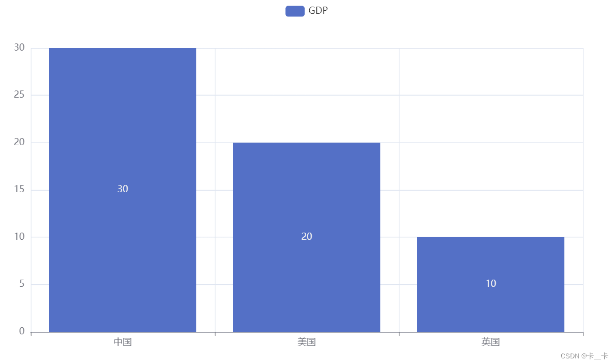
from pyecharts.charts import Bar
bar = Bar()  # 构建柱状图对象
bar.add_xaxis(["中国","美国","英国"])
bar.add_yaxis("GDP",[30,20,10])
bar.render()
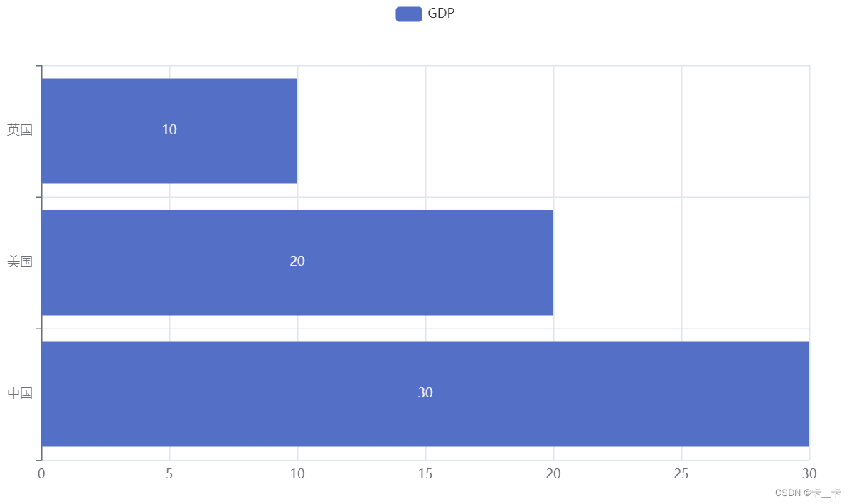
反转xy轴
bar.reversal_axis()
from pyecharts.charts import Bar
bar = Bar()  # 构建柱状图对象
bar.add_xaxis(["中国","美国","英国"])
bar.add_yaxis("GDP",[30,20,10])
bar.reversal_axis() # 【反转】
bar.render()
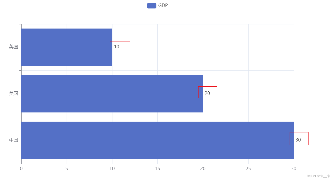
若将数字(10、20、30)移到右侧
from pyecharts.options import LabelOpts
label_opts=LabelOpts(position=“right”)
from pyecharts.charts import Bar
from pyecharts.options import LabelOpts  # 【新增】
bar = Bar()  # 构建柱状图对象
bar.add_xaxis(["中国","美国","英国"])
bar.add_yaxis("GDP",[30,20,10],label_opts=LabelOpts(position="right"))  # 【修改】
bar.reversal_axis() # 反转
bar.render()
2.基础时间线柱状图
from pyecharts.charts import Bar, Timeline
from pyecharts.options import LabelOpts

bar1 = Bar()  # 构建柱状图对象
bar1.add_xaxis(["中国","美国","英国"])
bar1.add_yaxis("GDP",[30,20,10],label_opts=LabelOpts(position="right"))
bar1.reversal_axis()

bar2 = Bar()  # 构建柱状图对象
bar2.add_xaxis(["中国","美国","英国"])
bar2.add_yaxis("GDP",[50,40,30],label_opts=LabelOpts(position="right"))
bar2.reversal_axis()

bar3 = Bar()  # 构建柱状图对象
bar3.add_xaxis(["中国","美国","英国"])
bar3.add_yaxis("GDP",[60,20,50],label_opts=LabelOpts(position="right"))
bar3.reversal_axis()

timeline=Timeline()
timeline.add(bar1,"点1")
timeline.add(bar2,"点2")
timeline.add(bar3,"点3")
timeline.render()

为效果图设置自动播放
timeline.add_schema(
    play_interval=500,  # 每1000毫秒自动切换下一个点
    is_timeline_show=True,  # 显示时间线
    is_auto_play=True,  # 是否自动播放
    is_loop_play=True  # 是否循环播放
)
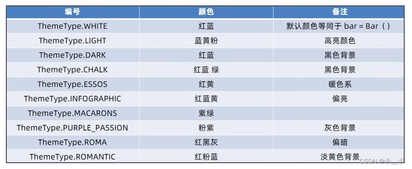
为效果图设置颜色
from pyecharts.globals import ThemeType
timeline=Timeline({

    "theme":ThemeType.LIGHT})  # 设置主题theme
完整代码
from pyecharts.charts import Bar, Timeline
from pyecharts.globals import ThemeType
from pyecharts.options import LabelOpts

bar1 = Bar()
bar1.add_xaxis(["中国","美国","英国"])
bar1.add_yaxis("GDP",[30,20,10],label_opts=LabelOpts(position="right"))
bar1.reversal_axis()

bar2 = Bar()
bar2.add_xaxis(["中国","美国","英国"])
bar2.add_yaxis("GDP",[50,40,30],label_opts=LabelOpts(position="right"))
bar2.reversal_axis()

bar3 = Bar()
bar3.add_xaxis(["中国","美国","英国"])
bar3.add_yaxis("GDP",[60,20,50],label_opts=LabelOpts(position="right"))
bar3.reversal_axis()

timeline=Timeline({

    "theme":ThemeType.LIGHT})  # 设置颜色
timeline.add(bar1,"点1")
timeline.add(bar2,"点2")
timeline.add(bar3,"点3")

timeline.add_schema(  # 自动切换
    play_interval=500,  # 每1000毫秒自动切换下一个点
    is_timeline_show=True,  # 显示时间线
    is_auto_play=True,  # 是否自动播放
    is_loop_play=True  # 是否循环播放
)

timeline.render()
效果图

3.动态柱状图
(1)sort方法
a=[["a",5],["b",3],["c",9]]  # 数据a是由列表组成的列表

def f(x):  # 对列表的1号下标(数字)排序
    return x[1]

a.sort(key=f,reverse=True)
# 用key指明排序函数,明确参照哪个数据对列表排序
# reverse=True 表示由大到小排序

print(a)  # [['c', 9], ['a', 5], ['b', 3]]
也可使用匿名函数书写
a=[["a",5],["b",3],["c",9]]  # 由列表组成的列表

a.sort(key=lambda x:x[1],reverse=True)

print(a)  # [['c', 9], ['a', 5], ['b', 3]]
(2)数据下载
数据下载
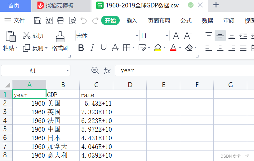
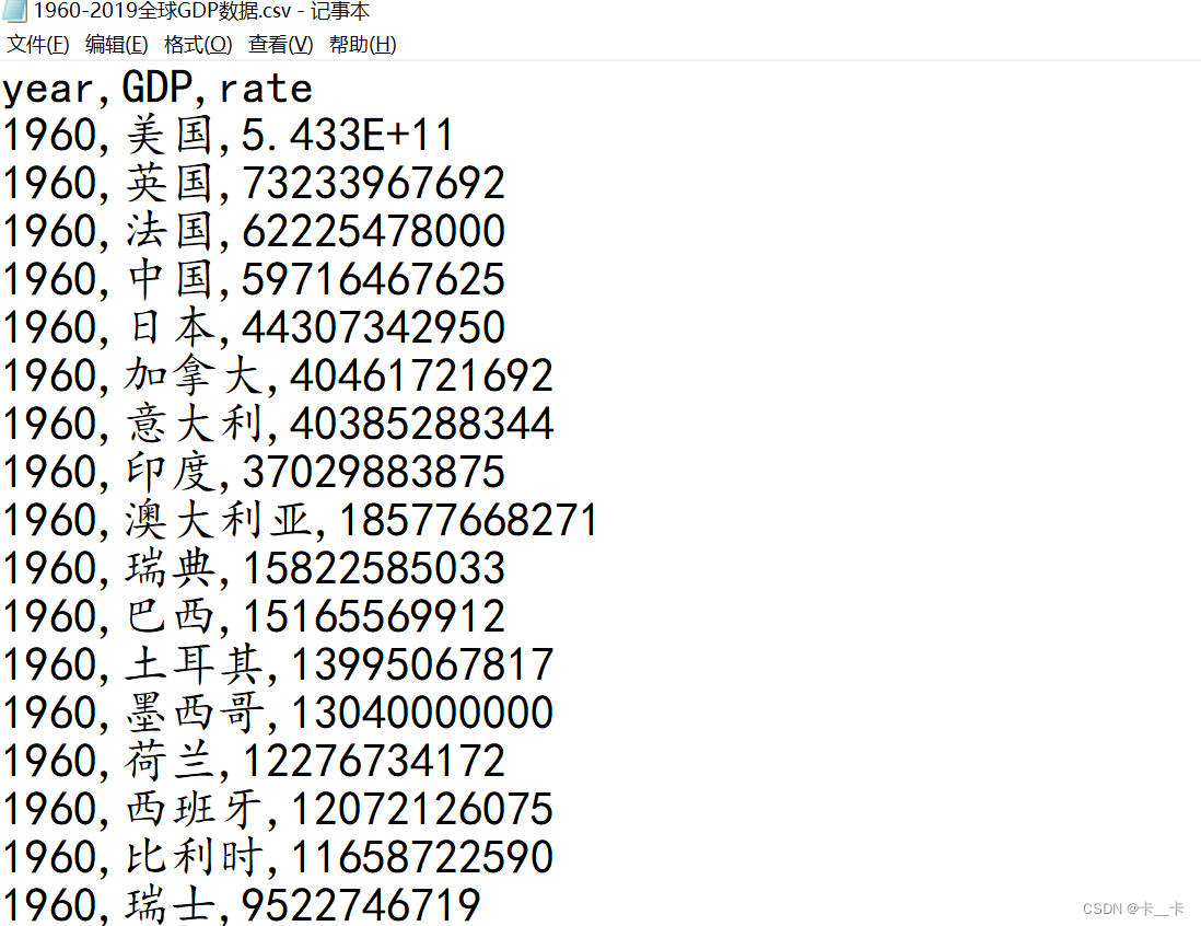
使用记事本打开(第一行无效数据)
(3)数据处理与绘图
from pyecharts.charts import Bar, Timeline
from pyecharts.globals import ThemeType
from pyecharts.options import LabelOpts, TitleOpts

f=open("D:/1960-2019全球GDP数据.csv","r",encoding="GB2312")  # 注意编码,与源文档一致
data_lines=f.readlines()
# readlines按照行的方式把整个文件中的内容进行一次性读取,返回一个列表,其中每一行的数据为一个元素
f.close()
data_lines.pop(0)  # 删除第一条数据

"""
将数据转换为字典,格式为
{1960:[[美国,123],[中国,456]],1961:[[xxx],[xxx]]}
"""
data_dict={

    }  # 空字典
for x in data_lines:
    year=int(x.split(",")[0]) # 根据逗号切割,0号下标是年份,1号国家,2号GDP
    country=x.split(",")[1]
    GDP=float(x.split(",")[2])  # 使用float将科学计数法转化为数字

    try:  # 如果当前年份的列表存在,进行追加
        data_dict[year].append([country,GDP])
    except KeyError:  # KeyError表示当前数据不存在。年份不存在应创建新列表
        data_dict[year]=[]
        data_dict[year].append([country,GDP])  # 创建完列表再添加数据

# 创建时间线,设置颜色主题
timeline=Timeline({

    "theme":ThemeType.LIGHT})

# 将每一年的数据都构造为一个图表
# 字典是乱序的,需要取出年份并排序
sort_year_list = sorted(data_dict.keys())  # .key取出字典的键(年份),sorted默认从小到大排序
# 输出:[1960, 1961, 1962, ...]

for year in sort_year_list:
# 最终图表只要前八,需要进行排序
    data_dict[year].sort(key=lambda x: x[1],reverse=True) # 对该年的数据,根据GDP由大到小排序
    year_data = data_dict[year][0:8]  # 切片取前八
    x_data=[]  # x轴数据的空列表,存放国家
    y_data=[]  # y轴数据的空列表,存放GDP
    for y in year_data:
        x_data.append(y[0])  # 下标0是国家
        y_data.append(y[1]/100000000)  # 下标1是GDP,GDP以亿为单位

# 构建柱状图
    bar=Bar()

    x_data.reverse()  # x轴数据反转,原来最大的在最下面,反转后到最上面
    y_data.reverse()  # 要保证x和y轴数据对应,y也要反转

    bar.add_xaxis(x_data)
    bar.add_yaxis("GDP(亿)",y_data,label_opts=LabelOpts(position="right"))  # 以亿为单位,数据右侧显示
    bar.reversal_axis()  # 反转xy轴

    # 设置每一年的图表标题
    bar.set_global_opts(
        title_opts=TitleOpts(title=f"{

      year}年全球前八GDP数据")
    )

    # 添加到时间线,add(bar对象,鼠标聚焦显示的内容(年份))
    timeline.add(bar,str(year))

# 自动播放
timeline.add_schema(
    play_interval=500,
    is_timeline_show=True,
    is_auto_play=True,
    is_loop_play=False
)

# 生成
timeline.render("1960-2019全球GDP前8国家.html")
效果图(文件大小有限,3.1倍速播放)
