uniapp官方tabbar:
-
打开项目中的
pages.json文件。 -
在 JSON 对象中添加一个名为
tabBar的字段,并设置其值为一个对象。 -
在
tabBar对象中,配置color和selectedColor字段来定义 TabBar 的默认颜色和选中项的颜色。示例:
"tabBar": { "color": "#999999", //默认颜色 "selectedColor": "#FF0000" //选中项的颜色 } -
添加一个名为
list的数组字段,用于定义 TabBar 的每个选项。 -
在
list数组中,每个对象表示一个选项,可以设置pagePath、text、iconPath和selectedIconPath字段来定义选项的路径、文本、默认图标和选中图标。示例:
"tabBar": {
  "color": "#999999", //tab 上的文字默认颜色
  "selectedColor": "#FF0000", //tab 上的文字选中时的颜色
  "borderStyle": "black", //bat上边框颜色
  "backgroundColor": "#fff", //tab的背景色
  "list": [
    {
      "pagePath": "pages/index/index",  //页面路径,必须在 pages 中先定义
      "text": "首页",                    //tab 上按钮文字
      "iconPath": "static/tabbar/home.png", //默认图片路径
      "selectedIconPath": "static/tabbar/home-selected.png" //选中时的图片路径
    },
    {
      "pagePath": "pages/cart/cart",//页面路径,必须在 pages 中先定义
      "text": "购物车",             //tab 上按钮文字
      "iconPath": "static/tabbar/cart.png", //默认图片路径
      "selectedIconPath": "static/tabbar/cart-selected.png" //选中时的图片路径
    },
    {
      "pagePath": "pages/profile/profile", //页面路径,必须在 pages 中先定义
      "text": "个人中心", //tab 上按钮文字
      "iconPath": "static/tabbar/profile.png",//默认图片路径
      "selectedIconPath": "static/tabbar/profile-selected.png" //选中时的图片路径
    }
  ]
}
配置完毕后,保存
pages.json文件
uniapp自定义tabbar组件
在 pages.json 文件中配置自定义 TabBar。在tabbar中加上"custom": true,就变成了自定义tabbar。代码如下:
"tabBar": {
  "custom": true,     //改为自定义tabbar
  "color": "#999999", //tab 上的文字默认颜色
  "selectedColor": "#FF0000", //tab 上的文字选中时的颜色
  "borderStyle": "black", //bat上边框颜色
  "backgroundColor": "#fff", //tab的背景色
  "list": [
    {
      "pagePath": "pages/index/index",  //页面路径,必须在 pages 中先定义
      "text": "首页",                    //tab 上按钮文字
      "iconPath": "static/tabbar/home.png", //默认图片路径
      "selectedIconPath": "static/tabbar/home-selected.png" //选中时的图片路径
    },
    {
      "pagePath": "pages/cart/cart",//页面路径,必须在 pages 中先定义
      "text": "购物车",             //tab 上按钮文字
      "iconPath": "static/tabbar/cart.png", //默认图片路径
      "selectedIconPath": "static/tabbar/cart-selected.png" //选中时的图片路径
    },
    {
      "pagePath": "pages/profile/profile", //页面路径,必须在 pages 中先定义
      "text": "个人中心", //tab 上按钮文字
      "iconPath": "static/tabbar/profile.png",//默认图片路径
      "selectedIconPath": "static/tabbar/profile-selected.png" //选中时的图片路径
    }
  ]
}
然后在下边加上usingComponents字段
"tabBar": {
  "custom": true,     //改为自定义tabbar
  "color": "#999999", //tab 上的文字默认颜色
  "selectedColor": "#FF0000", //tab 上的文字选中时的颜色
  "borderStyle": "black", //bat上边框颜色
  "backgroundColor": "#fff", //tab的背景色
  "list": [
    {
      "pagePath": "pages/index/index",  //页面路径,必须在 pages 中先定义
      "text": "首页",                    //tab 上按钮文字
      "iconPath": "static/tabbar/home.png", //默认图片路径
      "selectedIconPath": "static/tabbar/home-selected.png" //选中时的图片路径
    },
    {
      "pagePath": "pages/cart/cart",//页面路径,必须在 pages 中先定义
      "text": "购物车",             //tab 上按钮文字
      "iconPath": "static/tabbar/cart.png", //默认图片路径
      "selectedIconPath": "static/tabbar/cart-selected.png" //选中时的图片路径
    },
    {
      "pagePath": "pages/profile/profile", //页面路径,必须在 pages 中先定义
      "text": "个人中心", //tab 上按钮文字
      "iconPath": "static/tabbar/profile.png",//默认图片路径
      "selectedIconPath": "static/tabbar/profile-selected.png" //选中时的图片路径
    }
  ]
},
 //usingComponents字段是在页面的 JSON 配置文件(如 pages.json)中使用的,用于声明并引入自定义组件。

  "usingComponents": {
	    "customtabbar": "custom-tab-bar/index"。//引入自定义组件,键为组件名,值为组件路径
	  },
这样代码写完就是在pages.json里配置完成了,然后封装一个组件名字为custom-tab-bar的tabbar文件
文件里包含四个文件复制即可如下:
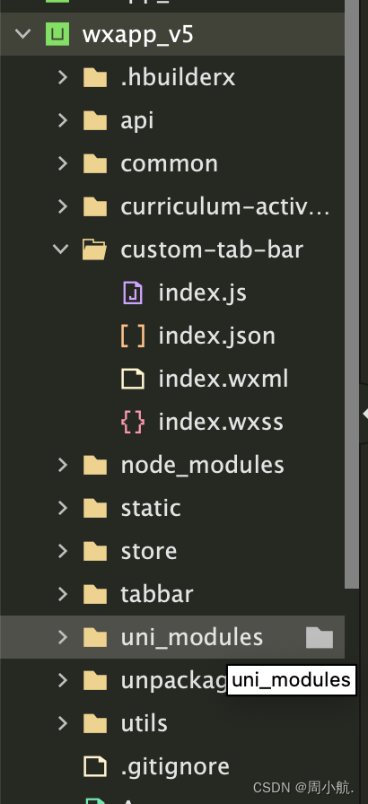
index.js:
Component({
	data: {
		selected: null,
		color: '#78747F',
		selectedColor: '#007AFF',
		list: [{
			pagePath: '/tabbar/home/index',
			iconPath: '/static/icons/img/home.png',
			selectedIconPath: '/static/icons/img/home2.png',
			text: '首页'
		}, {
			pagePath: '/tabbar/me/index',
			iconPath: '/static/icons/img/me.png',
			selectedIconPath: '/static/icons/img/me2.png',
			text: '我的'
		}]
	},
	attached() { },
	methods: {
		switchTab(e) {
			const data = e.currentTarget.dataset
			const url = data.path
			console.log(data);
			console.log(url);
				wx.switchTab({
					url  //就是要跳转的tabbar页面
				})
		},

	}
})
index.json:
{
  "component": true
}
index.wxml:这个是tabbar html页面 list是tabbar里定义的对象
<!--miniprogram/custom-tab-bar/index.wxml-->
<view class="tab-bar">
  <view class="tab-bar-border"></view>
  <view wx:for="{

   {list}}" wx:key="index" class="{

   {!item.text ? 'big' : ''}} tab-bar-item flex-1 item{

   {index}}" data-path="{

   {item.pagePath}}" data-index="{

   {index}}" bindtap="switchTab">
	<image wx-if="{

   {selected === index}}"  src="{

   {item.selectedIconPath}}" mode="aspectFit"></image>
	<image wx-if="{

   {selected !== index}}"  src="{

   {item.iconPath}}" mode="aspectFit"></image>
    <view class="btn-box" wx-if="{

   {item.text}}" style="color: {

   {selected === index ? selectedColor : color}}">
		{

   {item.text}}
	<!-- 	<button wx-if="{

   {index === 4}}" class="btn" type="default" open-type="getUserInfo" bindgetuserinfo="auth"></button> -->
	</view>
  </view>
</view>
index.wxss:
.tab-bar {
  position: fixed;
  bottom: 0;
  left: 0;
  right: 0;
  height:55px;
  background: white;
  display: flex;
  padding-bottom: env(safe-area-inset-bottom);
  z-index:-1;
}

.tab-bar-border {
  background-color: rgba(0, 0, 0, 0.33);
  position: absolute;
  left: 0;
  top: 0;
  width: 100%;
  height: 1px;
  transform: scaleY(0.5);
}

.tab-bar-item {
  flex: 1;
  text-align: center;
  display: flex;
  justify-content: center;
  align-items: center;
  flex-direction: column;
  font-size: 13px;
}
.tab-bar-item image {
  width:36.23rpx;
  height:48rpx;
}

/* .tab-bar-item-image-0 {
  width:36.23rpx;
  height:48rpx;
} */

/* .tab-bar-item-image-1 {
  width:100rpx;
  height:48rpx !important;
} */

.tab-bar-item.big image{
	width: 61.59rpx;
	height: 61.59rpx;
}
.tab-bar-item cover-image {
  width: 48.91rpx;
  height: 48.91rpx;
}

.tab-bar-item cover-view {
  font-size: 10px;
}
.tab-bar-item  {
	position: relative;
}
.tab-bar-item .btn-box .btn {
	opacity: 0;
	padding: 0;
	height: 50px;
	width: 100%;
	position: absolute;
	left: 0;
	top: 0;
}
封装完以后在每个tabbar页面中加一下代码:
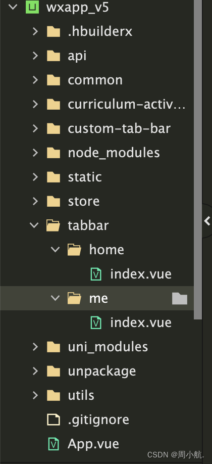
home页面
onShow() {
			const page = this.$mp.page
			console.log(page.getTabBar(),'page');
			if (typeof page.getTabBar === 'function' && page.getTabBar()) {
				page.getTabBar().setData({
					selected: 0 这个下标就是封装tabbar中list数组中的数据下标
				})
			}

		},


//page 是通过 this.$mp.page 获取的当前页面实例
//typeof page.getTabBar === 'function' 是用于检查 page.getTabBar 是否为一个函数,以确保可以调用 getTabBar 方法。
//page.getTabBar() 调用 getTabBar 方法,返回当前页面所属的 TabBar 实例。
//page.getTabBar().setData({ selected: 0 }) 调用 TabBar 实例的 setData 方法,将选中项的索引设置为 0。这样就会使 TabBar 中索引为 0 的项高亮显示,表示当前选中的项。
me页面
onShow() {
const page = this.$mp.page
console.log(page.getTabBar(),'page');
if (typeof page.getTabBar === 'function' && page.getTabBar()) {
page.getTabBar().setData({
selected: 1 //这个下标就是封装tabbar中list数组中的数据下标
})
}
},
//page 是通过 this.$mp.page 获取的当前页面实例
//typeof page.getTabBar === 'function' 是用于检查 page.getTabBar 是否为一个函数,以确保可以调用 getTabBar 方法。
//page.getTabBar() 调用 getTabBar 方法,返回当前页面所属的 TabBar 实例。
//page.getTabBar().setData({ selected: 1 }) 调用 TabBar 实例的 setData 方法,将选中项的索引设置为 1。这样就会使 TabBar 中索引为 1 的项高亮显示,表示当前选中的项。这样自定义tabbar就好了!!!