系列文章目录
第一章 定制上中下(顶部菜单、底部区域、中间主区域显示)三层结构首页
第二章 使用Vue3、Element-plus菜单组件构建菜单
第三章 使用Vue3、Element-plus走马灯组件构建轮播图
第四章 使用Vue3、Element-plus tabs组件构建选项卡功能
第五章 使用Vue3、Element-plus 构建组图文章
前言
在第一章节,我们把博物馆管理系统打了个地基,基本的产品架构和框架已经都落实到位;
第二章节,使用Vue3、Element-plus菜单组件构建顶部区域的菜单,包括父子菜单;
第三章节,使用Vue3、Element-plus走马灯组件构建轮播图;
第四章节,使用Vue3、Element-plus tabs组件构建选项卡功能;
那么本章节,我们使用Vue3、Element-plus构建组图文章;
1、学习Element-plus 的Layout 布局
1.1、Layout 布局
通过基础的 24 分栏,迅速简便地创建布局。
1.2、基础布局
使用单一分栏创建基础的栅格布局。
通过 row 和 col 组件,并通过 col 组件的 span 属性我们就可以自由地组合布局。
<template>
	<el-row>
	  <el-col :span="24"><div class="grid-content bg-purple-dark"></div></el-col>
	</el-row>
	<el-row>
	  <el-col :span="12"><div class="grid-content bg-purple"></div></el-col>
	  <el-col :span="12"><div class="grid-content bg-purple-light"></div></el-col>
	</el-row>
	<el-row>
	  <el-col :span="8"><div class="grid-content bg-purple"></div></el-col>
	  <el-col :span="8"><div class="grid-content bg-purple-light"></div></el-col>
	  <el-col :span="8"><div class="grid-content bg-purple"></div></el-col>
	</el-row>
	<el-row>
	  <el-col :span="6"><div class="grid-content bg-purple"></div></el-col>
	  <el-col :span="6"><div class="grid-content bg-purple-light"></div></el-col>
	  <el-col :span="6"><div class="grid-content bg-purple"></div></el-col>
	  <el-col :span="6"><div class="grid-content bg-purple-light"></div></el-col>
	</el-row>
	<el-row>
	  <el-col :span="4"><div class="grid-content bg-purple"></div></el-col>
	  <el-col :span="4"><div class="grid-content bg-purple-light"></div></el-col>
	  <el-col :span="4"><div class="grid-content bg-purple"></div></el-col>
	  <el-col :span="4"><div class="grid-content bg-purple-light"></div></el-col>
	  <el-col :span="4"><div class="grid-content bg-purple"></div></el-col>
	  <el-col :span="4"><div class="grid-content bg-purple-light"></div></el-col>
	</el-row>
</template>
1.3、分栏间隔
分栏之间存在间隔。

Row 组件 提供 gutter 属性来指定每一栏之间的间隔,默认间隔为 0。
<template>
	<el-row :gutter="20">
	  <el-col :span="6"><div class="grid-content bg-purple"></div></el-col>
	  <el-col :span="6"><div class="grid-content bg-purple"></div></el-col>
	  <el-col :span="6"><div class="grid-content bg-purple"></div></el-col>
	  <el-col :span="6"><div class="grid-content bg-purple"></div></el-col>
	</el-row>
</template>
1.4、混合布局
通过基础的 1/24 分栏任意扩展组合形成较为复杂的混合布局。
<template>
	<el-row :gutter="20">
	  <el-col :span="16"><div class="grid-content bg-purple"></div></el-col>
	  <el-col :span="8"><div class="grid-content bg-purple"></div></el-col>
	</el-row>
	<el-row :gutter="20">
	  <el-col :span="8"><div class="grid-content bg-purple"></div></el-col>
	  <el-col :span="8"><div class="grid-content bg-purple"></div></el-col>
	  <el-col :span="4"><div class="grid-content bg-purple"></div></el-col>
	  <el-col :span="4"><div class="grid-content bg-purple"></div></el-col>
	</el-row>
	<el-row :gutter="20">
	  <el-col :span="4"><div class="grid-content bg-purple"></div></el-col>
	  <el-col :span="16"><div class="grid-content bg-purple"></div></el-col>
	  <el-col :span="4"><div class="grid-content bg-purple"></div></el-col>
	</el-row>
</template>
1.5、Row 属性
| 属性名 | 说明 | 类型 | 可选值 | 默认值 |
|---|---|---|---|---|
| gutter | 栅格间隔 | number | — | 0 |
| type | 布局模式,可选 flex,现代浏览器下有效 | string | — | — |
| justify | flex 布局下的水平排列方式 | string | start/end/center/space-around/space-between | start |
| align | flex 布局下的垂直排列方式 | string | top/middle/bottom | top |
| tag | 自定义元素标签 | string | * | div |
1.6、Col 属性
| 属性名 | 说明 | 类型 | 可选值 | 默认值 |
|---|---|---|---|---|
| span | 栅格占据的列数 | number | — | 24 |
| offset | 栅格左侧的间隔格数 | number | — | 0 |
| push | 栅格向右移动格数 | number | — | 0 |
| pull | 栅格向左移动格数 | number | — | 0 |
| xs | <768px 响应式栅格数或者栅格属性对象 | number/object (例如: {span: 4, offset: 4}) | — | — |
| sm | ≥768px 响应式栅格数或者栅格属性对象 | number/object (例如: {span: 4, offset: 4}) | — | — |
| md | ≥992px 响应式栅格数或者栅格属性对象 | number/object (例如: {span: 4, offset: 4}) | — | — |
| lg | ≥1200px 响应式栅格数或者栅格属性对象 | number/object (例如: {span: 4, offset: 4}) | — | — |
| xl | ≥1920px 响应式栅格数或者栅格属性对象 | number/object (例如: {span: 4, offset: 4}) | — | — |
| tag | 自定义元素标签 | string | * | div |
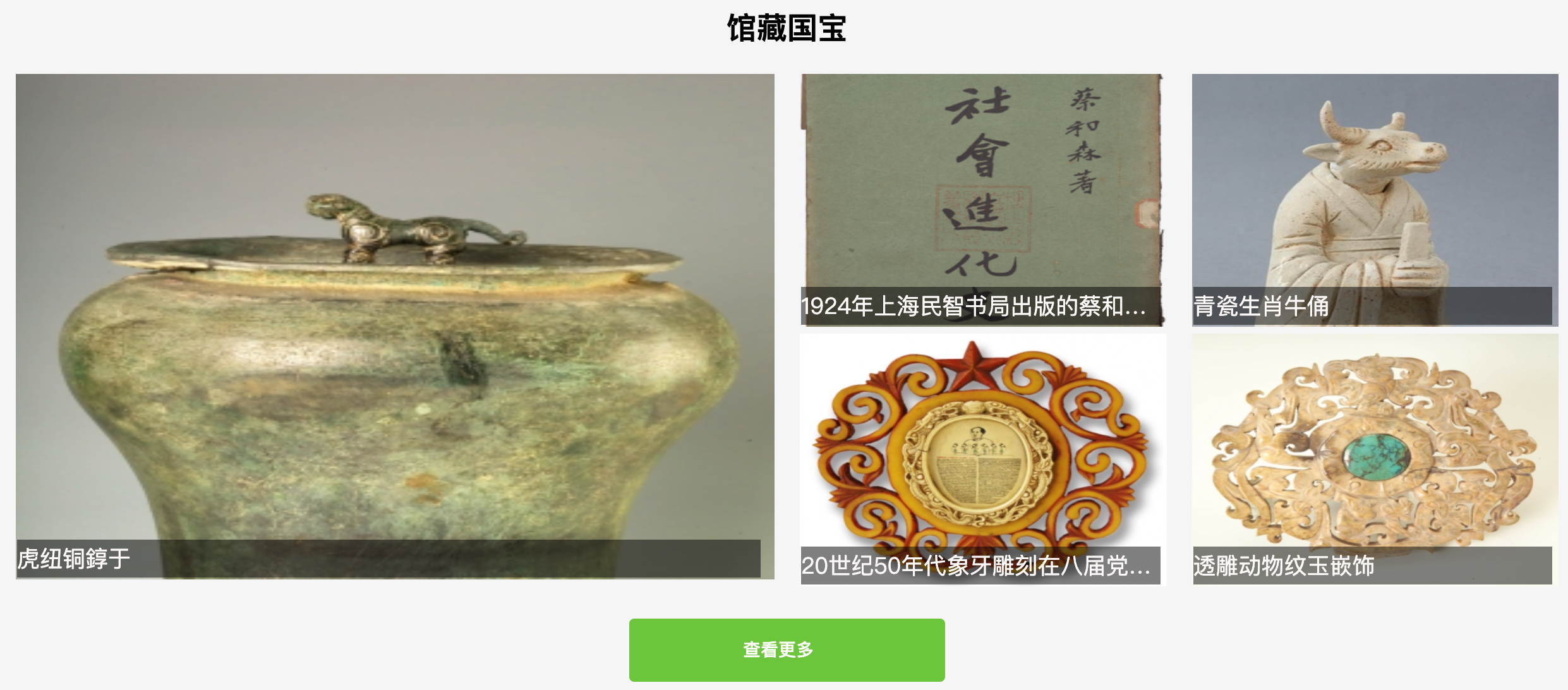
2、博物馆管理系统数据展示
2.1、产品原型图
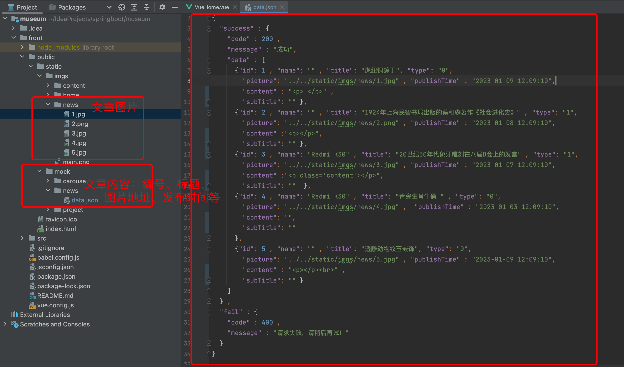
2.2、准备mock数据
mock数据是JSON格式的数据,会使用axios去加载,解析后放置到Layout 布局里去显示
2.3、通过axios加载数据
<template>
  <div class="main-box">
    <div class="main">

      <!-- 新闻动态  -->
      <div style="text-align: center;margin: 60px 2px 20px 2px">
        <h1>馆藏国宝</h1>
<!--        <div style="margin: 20px 0; color: #6a737d">
          <h3>公司近期新闻动态,行业热点资讯</h3>
        </div>-->

        <!-- 新闻动态 内容区域 -->
        <div class="flex" style="margin: 20px 0; position: relative; " >
          <el-row :gutter="20">
            <el-col :span="12" style="position: relative; ">
              <div style="width: 100%; position: relative; " v-for="item in newList.slice(0,1)">
                <div class="pic_item" style="position: relative; ">
                  <img :src="item.picture" style="width: 100%;height: 400px;" alt=""/>
                </div>
                <div class="pic_title_bottom">{

   {item.title}}</div>
              </div>
            </el-col>
            <el-col :span="6" style="position: relative; ">
              <div style="width: 100%; position: relative;" v-for="item in newList.slice(1,3)">
                <div class="pic_item" style="position: relative; ">
                  <img :src="item.picture" style="width: 100%;height: 200px;" alt=""/>
                </div>
                <span class="pic_title_bottom" style="z-index: 2">{

   {item.title}}</span>
              </div>
            </el-col>
            <el-col :span="6" style="position: relative; ">
              <div style="width: 100%; position: relative; " v-for="item in newList.slice(3,5)">
                <div class="pic_item" style="position: relative; ">
                  <img :src="item.picture" style="width: 100%;height: 200px;" alt=""/>
                </div>
                <span class="pic_title_bottom">{

   {item.title}}</span>
              </div>
            </el-col>
          </el-row>
        </div>

        <p style="margin: 20px 0;">
          <router-link to="/news">
            <el-button type="success" style="width: 250px; line-height: 50px; height: 50px; ">
              查看更多 <el-icon><Right /></el-icon>
            </el-button>
          </router-link>
        </p>
      </div>
      <!-- 新闻动态END -->

    </div>
  </div>
</template>

<script>

import axios from "axios";

export default {


  name: 'VueHome',
  data() {


    return {


      carouseData : [],
      carouseProjectData: [],
      newList: "" , //新闻列表
    }
  },
  created() {


    //获取新闻数据
    this.getData("newList"  ,  "../../static/mock/news/data.json");

  },
  methods: {


    getData(val , url){


      axios.get( url ).then((response) => {


        this[val] = response.data.success.data;
      });
    },
  }
}
</script>


<!-- Add "scoped" attribute to limit CSS to this component only -->
<style scoped>
@import "@/assets/css/index.css";

.pic_item span.title {


  position: absolute;
  left: 2rem;
  top: 2rem;
  color: snow;
  font-size: 40px;
}


.pic_title_bottom {


  position: absolute;
  color: snow;
  font-size: 18px;
  left: 1px;
  bottom: 7px;
  background: rgba(0,0,0,.5);
  line-height: 30px;
  text-align: left;
  white-space: nowrap;
  overflow: hidden;
  text-overflow: ellipsis;
  width: 98%;
}

.pic_item span.subTitle {


  position: absolute;
  left: 2rem;
  top: 7rem;
  color: snow;
  font-size: 22px;
}

.title {


  left: 2rem;
  top: 2rem;
  color: #2f2f2f;
  font-size: 40px;
}

.subTitle {


  left: 2rem;
  top: 7rem;
  color: #2f2f2f;
  font-size: 16px;
}

</style>
总结
效果可见页面中的【馆藏国宝】模块:http://139.159.230.49/
以上就是今天要讲的内容,本文介绍了在Vue3里,如何使用Element-plus 的Layout 布局构建组图文章功能,如何使用axios去加载Vue项目里的JSON格式文件数据填充到 Layout 布局里。