前言
近期公司投放在展厅大屏中演示的大数据页面,出现了文字、图表、表格等多类组件显示错乱的情况,大部分原因还是适配问题。
我们做数据大屏时,因为显示器尺寸不同,会导致展示的时候有留白区域,效果不好,所以得做一个适配方案,网上大致找了一圈,特此总结一下解决方案。
方案1:rem 方式
在vue项目中的index.html中加上
functiongetRem() {


	var html = document.getElementsByTagName("html")[0];
	var oWidth = document.body.clientWidth || document.documentElement.clientWidth;
	html.style.fontSize = 1 * (oWidth / 1920) + "px";
}
window.onload = function() {

     * /\*初始化\*/ * getRem(); * /\*getRem绑定监听\*/ * window.addEventListener("resize", getRem, false);
};
然后在大屏中相关的尺寸单位使用rem 即可,注意:1rem=根标签(html)的fontSize,
通过上面的设置,如果设计图宽是1920px,则大小按设计图来就行,只是单位为rem,
比如设计图中是20px,那编写时改成20rem就行。
当然这种方法比较死板,每次写还得手动换算px和rem的关系。
建议使用下面的轮子,在vue里面自动转。写代码的时候不用自己算px转rem。
自动px转rem工具:postcss-pxtorem
移动端开发项目的时候单位为rem,一般常使用postcss-pxtorem 将px转化为rem。
1.postcss-pxtorem
这是一个postcss的插件,可以不用自己计算rem的值,直接按照设计稿开发,然后自动编译转换成rem;
2. 安装
npm install postcss-pxtorem -D
3. 配置
在webpack.config.js中配置
module.exports = {


  module: {


    rules: [
      {


        test: /\.css$/,
        exclude: /node_modules/,
        use: [
          {


            loader: 'style-loader',
          },
          {


            loader: 'css-loader',
            options: {


              importLoaders: 1,
            }
          },
          {


            loader: 'postcss-loader'
          }
        ]
      }
    ]
  }
}
在vue.config.js中配置:
const path = require("path");
const px2rem = require("postcss-px2rem");
const postcss = px2rem({


		remUnit: 75 //基准大小basesize,需要和rem.jst});
		const resolve = dir = > {


			return path.join(__dirname, dir);
		};
		module.exports - {


			pages: {

    …}.
			assetsDir: "static",
			configurewebpack: …,
			chainwebpack: config = > {

    …},
			css: {


				loaderOptions: {


                    //这里配置postcss
					postcss: {


						plugins: [postcss]
					}
					sass: data: `@import "styles/_variable.scss"`;
				}
			}
		},
		devServer: {


			compress: true,
			disableHostCheck: true,
			port: 8186

}};
4.处理窗口大小变化
src/libs/目录下创建一个rem.js文件,配置如下图所示
其中baseSize设置是自己定的,当设计稿为750px的时候,1rem=100px(物理像素)
//基准大小
const basesize = 75;
//设置rem函数
function setRem() {


	/当前页面宽度相对于750宽的缩放比例,可根据自己需要修改。
    let scale = document.documentElement.clientwidth /375;
	if (window.orientation == 180 ||  window.orientation == 0) {


		scale = document.documentElement.clientwidth / 375;
	}
	if (window.orientation = -90 || window.orientation == -90) {


        scale = document.documentElement.clientwidth / 667;
	}
	// 设置页面根节点字体大小
	document.documentElement.style.fontsize = baseSize * Math.min(scale, 2) + “px";
}
//初始化
setRem();
//改变窗口大小时重新设置rem
window.onresize = function(){

    setRem();}
5.css的值是不变的,但是font-size的值在随着屏幕变化
这样我们只关注375*667屏幕下的css设计就好。rem = css/font-size,这个时候需要使用postcss-pxtorem,将css的px自动转化为对应的rem即可。
6.说到rem值就要提到逻辑像素、物理像素以及二倍屏的概念:
物理像素(px):就是屏幕上实际的像素点,它是ui设计时以及切图时所使用的单位。
逻辑像素(pt):根据不同的设备存在着差异(下图所示),也就是我们前端中css的像素。
#二倍屏:就是指物理像素/逻辑像素,就是一个逻辑像素单位中有多少个物理像素,一般都是二倍屏幕。
一般来说ui设计师根据物理像素设计设计稿,前端工程师根据逻辑像素(css)设计页面。
参考文章:https://blog.csdn.net/weixin_43957184/article/details/103621350
下面还有一种是用JAVA转文件的,需要装JAVA环境,有一定JAVA基础。
JAVA实现vue 代码转换工具
用代码转换工具将写死的像素值乘以缩放比例。 gitee 代码连接
1.读取vue文件, 定义文件行链表 class的映射
    fileReader = new FileReader(url);
    // 读取文件
    bufferedReader = new BufferedReader(fileReader);

    // 结果文本
    StringBuilder resultText = new StringBuilder();

    // 行链表 用于查找 class样式名称
    LinkedList<String> lineList = new LinkedList<>();
    // class样式映射
    Map<String, Map<String, String>> classMap = new HashMap<>();
2.遍历行, 定义样式识别的正则表达式
    // 每行插入链表头
    lineList.addFirst(line);
    // class样式 识别正则
    Matcher classMatcher = Pattern.compile(".*?-?.*?:.*?px.*?;").matcher(line);
    // id class 绑定样式 识别正则
    Matcher classUseMatcher = Pattern.compile("(class|id)=\"([0-9a-z-])*?\"").matcher(line);
3.处理style 有px的位置乘以 rate
    if (line.contains("style=\"")) {

     // 处理style
        // 行文本头部加入结果文本
        resultText.append(line, 0, line.indexOf("style=\""));
        // style 代码正则
        Pattern pattern = Pattern.compile("style=\".*?\"");
        Matcher matcher = pattern.matcher(line);
        // 将 style="name:value;"  转为 :style="[{name:value}]"
        resultText.append(":style=\"");
        while (matcher.find()) {


            String styleStr = matcher.group();
            styleStr = styleStr.replace("style=\"", "").replace("\"", "");
            resultText.append(parseStyleList(styleStr));
        }
        resultText.append("\"");
        String[] tailArr = pattern.split(line);
        // 行文本尾部 加入结果文本
        if (tailArr.length != 0 && tailArr.length > 1) {


            resultText.append(tailArr[1]);
        }
    }
4.处理class样式 class 样式表转为 hashMap 有px乘以 rate
if (classMatcher.find()) {

     // 处理class样式
    // 遍历查找 class 名称
    for (String classNameLine : lineList) {


        // 查询  .class-name #id-name 样式定义 不支持 tag-name
        if (classNameLine.contains("{") && (classNameLine.contains(".") || classNameLine.contains("#"))) {


            String className = classNameLine.trim().replace(".", "").replace("#", "").replace("{", "");
            // 横线转驼峰
            className = lineToHump(className);
            // 如果是多重定义的class 只保留一个
            if (className.contains(" ")) {


                className = className.split(" ")[0];
            }
            // 处理样式键值对
            String styleStr = classMatcher.group().trim().replace(";", "");
            String[] styleArr = parseStyle(styleStr).replace(",", "").split(":");
            // class 键值对映射
            Map<String, String> innerClassMap = classMap.get(className);
            if (innerClassMap == null) {


                innerClassMap = new HashMap<>();
            }
            // class 键值对映射加入 class样式映射
            innerClassMap.put(styleArr[0], styleArr[1]);
            classMap.put(className, innerClassMap);
            break;
        }
    }
}
5.使用 class="class-name" 的地方 加入 :class="className"
if (classUseMatcher.find()) {


    String classUseStr = classUseMatcher.group();
    String classUseHumpStr = lineToHump(classUseStr.replace("class=", "").replace("id=", "").replaceAll("\"", ""));
    // 行文本头部加入结果文本
    resultText.append(line, 0, line.indexOf(classUseStr));
    resultText.append(classUseStr);
    resultText.append(" :class=\"");
    // class 转 v-bind:class 横线命名转驼峰
    resultText.append(classUseHumpStr);
    resultText.append("\"");
    // 行文本尾部加入结果文本
    resultText.append(line, line.indexOf(classUseStr) + classUseStr.length(), line.length());
}
6.vue data中加入 缩放比率 rate 组件中 有 rate 会自动缩放
    StringBuffer dataBuffer = new StringBuffer();
    Matcher dataMatcher = Pattern.compile("data.*?\n.*?return.*?\\{", Pattern.MULTILINE).matcher(resultText);
    if (dataMatcher.find()) {


        dataMatcher.appendReplacement(dataBuffer, "data: function () {\n" +
                "      return {\n" +
                "        rate,\n");
        for (String key : classMap.keySet()) {


            Map<String, String> innerClassMap = classMap.get(key);
            dataBuffer.append("        ");
            dataBuffer.append(key);
            dataBuffer.append(": {");
            for (String innerKey : innerClassMap.keySet()) {


                dataBuffer.append(innerKey);
                dataBuffer.append(": ");
                dataBuffer.append(innerClassMap.get(innerKey));
                dataBuffer.append(",");
            }
    //                    stringBuffer.append("        ");
            dataBuffer.append("},\n");
        }
    }
    dataMatcher.appendTail(dataBuffer);
    resultText = new StringBuilder(dataBuffer);
7.常量加入script中
String rateDefineStr = "\n" +
           "  const scale = 16 / 9\n" +
           "  const headerHeight = 47;\n" +
           "  const tabHeight = 27;\n" +
           "  const tabPadding = 5;\n" +
           "  const designHeight=1080;\n" +
           "  const marginTop = headerHeight + tabHeight + tabPadding;\n" +
           "  const marginBottom = tabPadding;\n" +
           "  const clientWidth = document.body.clientWidth\n" +
           "  const windowHeight = document.body.clientHeight;\n" +
           "  const clientHeight = windowHeight - marginTop - marginBottom;\n" +
           "  const innerHeight = clientHeight;\n" +
           "  const rate = innerHeight / designHeight\n" +
           "  const centerWidth = clientHeight * scale;\n" +
           "  const paddingWidth = (((clientWidth - 5 - 5) - (clientHeight * scale)) / 2);" +
           "\n  ;\n";
    StringBuffer constBuffer = new StringBuffer();
    Matcher constMatcher = Pattern.compile("export default \\{", Pattern.MULTILINE).matcher(resultText);

    if (constMatcher.find()) {


       constMatcher.appendReplacement(constBuffer, rateDefineStr);
       constBuffer.append("  export default {");
       constMatcher.appendTail(constBuffer);
       System.out.println(constBuffer);
    }
8.ecahrts 中的参数可以乘以 rate 常量
let option = {


  title: {


    subtextStyle: {

     lineHeight: 30 * rate , fontSize: 15 * rate }
  },
}}
坑点
仅能满足一些特定的小场景,大屏中的实施非常不友好:
- 我们覆盖element表格中的为
font-size:0.5rem。此时投放到大屏,字体是自适应的,但其组件的多种默认属性用px为单位。如line-height的设置为22px,此时覆盖样式后的字体过大,并不能适应行高,就会出现文字重叠等错乱问题。 - 如果项目中途改用rem,此时页面中有其他已经开发有其他的元素,如导航文字, 设置
fontSize时会影响到页面中已经写好的内容,工作量比较大,相当于之前写的大半样式白写了。 - 页面中使用了
echarts图表, 里面的参数没办法应用rem的比例。 - 手动px转rem很麻烦,不过使用轮子可以省略这一步。
方案2: 媒体查询
媒体查询是比较常见的屏幕适配方案了, 可以根据不同的屏幕大小提供不同的样式方案, 媒体查询可以很好的支持多数的pc端网页布局需要了.
@media only screen and (max-width: 1000px) {


    .div-class {


        width: 720px;
    }
}
坑点
媒体查询的问题也比较明显:
- 大量书写媒体查询代码, 比较繁琐,工期很赶的不建议用媒体查询。
- 针对多种屏幕进行适配, 也无法保证完全兼容所有的屏幕。
- 无法支持
echarts图表中的参数进行适配。
方案3: viewpoint 视口
viewpoint 基本是目前多数移动端开发都会使用的适配方式, 可以设置对移动端设备的的界面进行整体的缩放, 这种方式的适配是最佳的方案.。
用mate标签来得到理想的视口布局:
<meta name="viewport" content="target-densitydpi=high-dpi" />
坑点
这种方案缺点很明显,只能在移动端进行 viewpoint 适配, 我们目前的数据大屏项目就没办法用了。
方案4:flex + 百分比 + vh
最基本的大屏,纯flex够了。至于UI会不会挑毛病那就另一回事了。
1.百分比布局
百分比布局,也叫流式布局
百分比布局特点:宽度自适应,高度固定。
**流式布局简单来说,不管在哪种设备中,页面始终都是满屏。**例如携程移动网页中,导航在iphone4中导航5等分,在iphoneX中也是5等分,下图是ipnoneX中5等分的效果
[外链图片转存失败,源站可能有防盗链机制,建议将图片保存下来直接上传(img-Lb0BluSr-1667791413664)(https://pics6.baidu.com/feed/a50f4bfbfbedab64a8026a813fa0c0c578311e9f.jpeg@f_auto?token=ab47e91071167b9057d58de374ee1404)]
代码很简单,就是用百分比写width:
2.vh的使用
当然我们这里是数据大屏,高度如果写固定的px会有问题,放全屏以后高度会不够,所以这里推荐使用vh作为高度单位。
vh就是当前屏幕可见高度的1%,也就是说:
height:100vh == height:100%
区别:当元素没有内容时候,设置height:100%该元素不会被撑开,但是设置height:100vh,该元素会被撑开和屏幕高度一致。
代码中使用:
height:100vh;

// 这里可以加也可以减
height:calc(100vh + 55px);
3.flex布局
flex布局极大的提高了我们布局的效率,更简单、灵活。
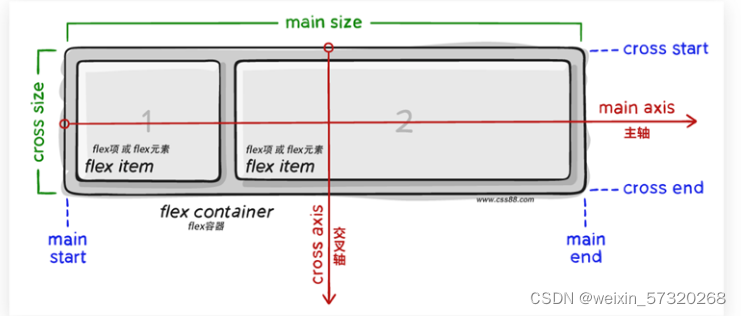
display: flex;
一定要给父盒子加。
4.伸缩比——flex:1
把父盒子分为若干份数,每个子盒子各占几份。
语法:
flex: 1;
比如有一个父盒子里面有三个子盒子,每个子盒子写 flex:1; 此时每个子盒子各占三分之一。
注意:中间flex: 1; 和 width 有冲突。 优先执行 flex:1;
5.圣杯布局
所谓的圣杯布局就是左右两边大小固定不变,中间宽度自适应。
一般这种布局方式适用于各种移动端顶部搜索部分,这是最常见的,如京东手机版主页面顶部搜索
核心思路:
两侧盒子写固定大小
中间盒子 flex: 1; 占满剩余空间
.top {


    display: flex;
    justify-content: center;
}

.top div:first-child {


    width: 50px;
    height: 50px;
    background-color: red;
}

.top div:last-child {


    width: 50px;
    height: 50px;
    background-color: red;
}

.top div:nth-child(2) {


    flex: 1;
    height: 50px;
    background-color: pink;
}
坑点
- flex存在浏览器兼容性问题,如果不考虑兼容性可以大量使用,具体可以看mdn,如果是移动端则不用考虑直接flex。
- echarts没法用,给vh等单位样式不好调,只能给px。
- 仅能处理盒子的宽高适配,不能处理字体大小,字体大小的屏幕适配还得靠rem。
方案5: scale 方式
我们整个大屏的尺寸设置和设计图一样,只是通过css的scale放大缩小属性,来控制实际展示的大小。
通过监听浏览器窗口的大小,来改变scale的比例,从而实现数据大屏适配。(百度、网易等大数据适配的解决方案均是这个)
封装组件及使用
封装一个组件,命名为ScreenAdapter
-
我们的设计稿宽高比是
1920 * 960
由于这个数据可视化的项目是适配宽屏的, 我可以先铺满高然后屏幕左右可能会有空白, 空白的部分用背景图片填充就好了. 画面的布局像素依然使用设计标注的像素值然后再乘屏幕缩放比。页面适配样例代码(vue) :
<template>
  <div class="outContainer" :style="{height:boxHeight,width:boxWidth}">
    <div
        class="ScreenAdapter"
        :style="style"
    >
        <slot />
    </div>
  </div>

</template>
<script>
export default {


  name: '',
  //参数注入
  props: {


    width: {


      type: String,
      default: '1920'
    },
    height: {


      type: String,
      default: '1080'
    }
  },
  data() {


    return {


        boxWidth:this.width,
        boxHeight:this.height,
        style: {


            width: this.width + 'px',
            height: this.height + 'px',
            transform: 'scale(1) translate(-50%, -50%)'
        }
    }
  },
  mounted() {


    this.setScale()
    window.onresize = this.Debounce(this.setScale, 200)
    // window.οnresize=this.setScale
  },
  destroyed(){


    window.removeEventListener("resize",this.Debounce(this.setScale, 200));
  },
  methods: {


    Debounce: (fn, t) => {


      const delay = t || 500
      let timer
      return function() {


        const args = arguments
        if (timer) {


          clearTimeout(timer)
        }
        const context = this
        timer = setTimeout(() => {


          timer = null
          fn.apply(context, args)
        }, delay)
      }
    },
    // 获取放大缩小比例
    getScale() {


        //容器高度
        this.boxWidth=(document.body.clientWidth)+'px'
        this.boxHeight=(document.body.clientHeight)+'px'

        let w;
        w = (document.body.clientWidth)/ this.width

        return w
    },
    // 设置比例
    setScale() {


      this.style.transform = 'scale(' + this.getScale() + ') translate(0, 0)'

	  //解决改变窗口大小时,意外出现滚动条问题
      this.$nextTick(()=>{


           this.style.transform = 'scale(' + this.getScale() + ') translate(0, 0)'
        })
    },
  }
}
</script>
<style lang="less" scoped>
.ScreenAdapter {


  overflow-y: scroll;
  scrollbar-width: none; /* firefox */
  -ms-overflow-style: none; /* IE 10+ */
  transform-origin: 0 0;
  position: absolute;
  left: 0;
  right: -17px;
  transition: 0.3s;
}
.ScreenAdapter::-webkit-scrollbar {


  display: none; /* Chrome Safari */
}
.outContainer::-webkit-scrollbar {


  display: none; /* Chrome Safari */
}
.outContainer{


    overflow-y: scroll;
    scrollbar-width: none; /* firefox */
    -ms-overflow-style: none; /* IE 10+ */
    position: relative;
}
</style>
将此组件作为外壳,包在我们搭建的页面上,只包在最外层的父盒子即可:
<ScreenAdapter><div>大家好,我是大屏展示页面<div><ScreenAdapter/>
在ScreenAdapter组件内正常编写即可,尺寸和设计图一样,设计图是20px,就写20px,不需要有其他的考虑(百分百尺寸等),懒人专用!
[外链图片转存失败,源站可能有防盗链机制,建议将图片保存下来直接上传(img-z2yef2aD-1667791413665)(https://p9-juejin.byteimg.com/tos-cn-i-k3u1fbpfcp/c5fe547d4549424db27a39944541e860~tplv-k3u1fbpfcp-zoom-in-crop-mark:4536:0:0:0.awebp)]
随意更改展示尺寸或者按F11进行全屏展示,都会占满宽,高度自适应。如果展示尺寸等于设置时的尺寸(比如1920*1080)那么会刚刚好占满全屏。
如果是vue2的项目,直接复制代码使用即可。
坑点
1.字体拉伸问题,在长宽比跟设计稿的长宽比不一致的情况下,字体会有拉伸的效果,要不变胖了,要不就是变矮了。也不是很完美。这种字体大小的适配就只能用rem处理。
2.放大的时候会出现滚动条,建议style中加个 overflow:hidden。
参考地址 :https://juejin.cn/post/6972416642600927246
方案总结
| 方案 | 好处 | 缺点 | 推荐程度 |
|---|---|---|---|
| rem | 支持各大屏幕尺寸适配,包含间距、字体样式。 | 1.与element组件不兼容,如覆盖样式后的字体过大、文字重叠等错乱问题。 2.如果项目中途改用rem,**工作量比较大,相当于之前写的大半样式白写了。**3. 页面中使用了 echarts 图表, 里面的参数没办法应用 rem 的比例。 4.手动px转rem很麻烦,不过使用轮子可以省略这一步。 |
推荐 |
| 媒体查询 | 支持定制化更改 | 1.大量书写媒体查询代码, 比较繁琐,工期很赶的不建议用媒体查询。2. 针对多种屏幕进行适配, 也无法保证完全兼容所有的屏幕。 3.无法支持 echarts 图表中的参数进行适配。 |
不推荐 |
| viewpoint | 移动端开发都会使用的适配方式 | 只能在移动端进行 viewpoint 适配, 我们目前的数据大屏项目就没办法用了。 |
不推荐 |
| flex + 百分比 +vh | 简单好用,适配较为优秀 | 1. flex存在浏览器兼容性问题,如果不考虑兼容性可以大量使用,具体可以看mdn,如果是移动端则不用考虑直接flex。 2.echarts没法用,给vh等单位样式不好调,只能给px。 3.仅能处理盒子的宽高适配,不能处理字体大小,字体大小的屏幕适配还得靠rem。 | 推荐 |
| scale方式 | 是通过css的scale放大缩小属性,来控制实际展示的大小。百度、网易等大数据适配的解决方案均是这个。 | 1.字体拉伸问题,在长宽比跟设计稿的长宽比不一致的情况下,字体会有拉伸的效果,要不变胖了,要不就是变矮了。这种字体大小的适配就只能用rem处理。2.放大的时候会出现滚动条,建议style中加个 overflow:hidden。 |
推荐 |