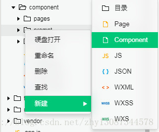
步骤一:新建一个component的文件夹,用来放所有的自定义组件;
步骤二:在该目录下新建一个prompt的文件夹,用来放prompt组件;
步骤三:右击–>新建–>component
直接上代码
wxml
<view class="prompt-box" hidden="{{isHidden}}">
    <view class="prompt-content contentFontColor">
        <view class="prompt-title">{{title}}</view>
        <input class="prompt-input" type="digit" bindinput="_input"  value="{{cost}}" />
        <view class="prompt-btn-group">
            <button class="btn-item prompt-cancel-btn contentFontColor" bind:tap="_cancel">{{btn_cancel}}</button>
            <button class="btn-item prompt-certain-btn" bind:tap="_confirm">{{btn_certain}}</button>
        </view>
    </view>
</view>
js
// components/prompt/prompt.js
Component({
  options: {
    multipleSlots: true // 在组件定义时的选项中启用多slot支持
  },
  /**
   * 组件的属性列表
   */
  properties: {
    title: {
      type: String,
      value: '标题'
    },
    btn_cancel: {
      type: String,
      value: '取消'
    },
    btn_certain: {
      type: String,
      value: '确定'
    }
  },
  data: {
    isHidden: true,
  },
  methods: {
    hidePrompt: function () {
      this.setData({
        isHidden: true
      })
    },
    showPrompt () {
      this.setData({
        isHidden: false
      })
    },
    /*
    * 内部私有方法建议以下划线开头
    * triggerEvent 用于触发事件
    */
    _cancel () {
        //触发cancel事件,即在外部,在组件上绑定cancel事件即可,bind:cancel,像绑定tap一样
      this.triggerEvent("cancel")
    },
    _confirm () {
      this.triggerEvent("confirm");
    },
    _input(e){
        //将参数传出去,这样在getInput函数中可以通过e去获得必要的参数
      this.triggerEvent("getInput",e.detail);
    }
  }
})
json
{
  "component": true,
  "usingComponents": {}
}
wxss
/* components/vas-prompt/vas-prompt.wxss */
.prompt-box {
  position: absolute;
  left: 0;
  top: 0;
  width: 100%;
  height: 100%;
  z-index: 11;
  background: rgba(0, 0, 0, .5);
}

.prompt-content {
  position: absolute;
  left: 50%;
  top: 40%;
  width: 80%;
  max-width: 600rpx;
  border: 2rpx solid #ccc;
  border-radius: 10rpx;
  box-sizing: bordre-box;
  transform: translate(-50%, -50%);
  overflow: hidden;
  background: #fff;
}

.prompt-title {
  width: 100%;
  padding: 20rpx;
  text-align: center;
  font-size: 40rpx;
  border-bottom: 2rpx solid gray;
}
.prompt-input{
  margin: 8%;
  padding: 10rpx 15rpx;
  width: 80%;
  height:85rpx;
  border: 1px solid #ccc;
  border-radius: 10rpx;
}
.prompt-btn-group{
  display: flex;
}

.btn-item {
  width: 35%;
  margin-bottom: 20rpx;
  height: 100rpx;
  line-height: 100rpx;
  background-color: white;
  justify-content: space-around;
}
.prompt-certain-btn{
  color: white;
  background-color: #4FEBDE;
}
.prompt-cancel-btn{
  border: 1px solid #4FEBDE;
}
.contentFontColor {
  color: #868686;
}
使用
例如,在index.html中使用
在json中添加useComponents属性
 "usingComponents": {
    "vas-prompt": "./components/prompt/prompt"
  }
wxml
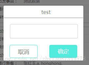
 <prompt id="prompt"
    title='test'
    btn_certain='确定'
    bind:getInput="getInput"
    bind:cancel="cancel"
    bind:confirm="confirm">
</prompt>
<button bindtap="showPrompt">点击弹出prompt</button>
js
//在onReady生命周期函数中,先获取prompt实例
onReady:function(){
    this.prompt = this.selectComponent("#prompt");
},
//显示prompt
showPrompt:function(){
    this.prompt.showPrompt();
},
//将输入的value保存起来
getInput: function (e) {
    this.setData({
      value: e.detail.value
    })
},
confirm: function () {
   let _cost = this.data.value;
   if (_cost == '') {
     console.log('你还未输入');
     return;
   }
   else{
       ....
   }
 },
 cancel: function () {
   this.prompt.hidePrompt();
 },
效果
原理:
将prompt隐藏起来,点击显示的时候则显示,然后通过原生的tap事件,触发自定义事件,在使用该组件的时候,则使用自定义事件.