版权声明:本文为博主原创文章,未经博主允许不得转载。 https://blog.csdn.net/Phone_1070333541/article/details/78976204
最近想写一个斗地主的游戏,就在创作的途中遇到了一个界面上的小问题,怎么让纸牌重叠起来,于是就研究了一下绝对定位和相对定位。
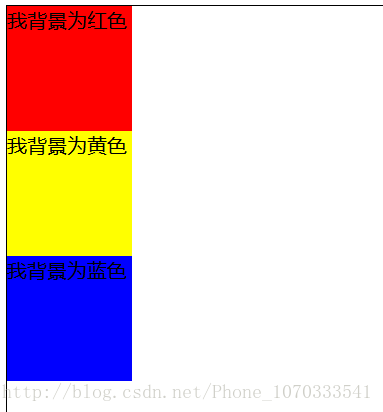
首先,这是 没有加定位 时的代码及效果:
        <style>
            .div-relative {
                color: #000;
                border: 1px solid #000;
                width: 500px;
                height: 400px
            }

            /* css注释说明: 背景为红色 */
            .div-a {
                /*position: relative;*/
                /*left: 30px;*/
                /*top: 30px;*/
                background: #F00;
                width: 100px;
                height: 100px
            }

            /* 背景为黄色 */
            .div-b {

                background: #FF0;
                width: 100px;
                height: 100px
            }

            /* DIV背景颜色为蓝色 */
            .div-c {
                background: #00F;
                width: 100px;
                height: 100px
            }

        </style>

        <div class="div-relative">
            <div class="div-a"></div>
            <div class="div-b"></div>
            <div class="div-c"></div>
        </div>
效果图如下:
当我把注释放开也就是相对定位时,效果如下:
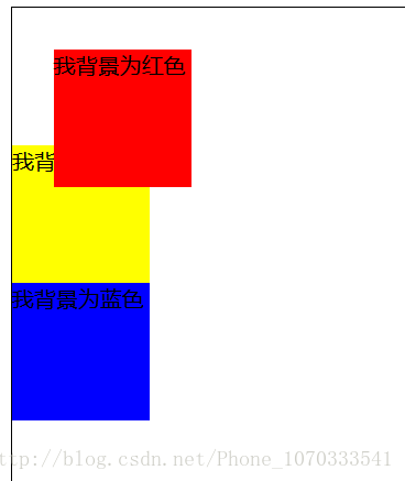
也就是说在我设置相对定位时,元素的位置是 相对于它自己本来的位置 来进行移动,移动的大小是通过 top:30px ; left:30px ;来设置。
而当我设置红色背景是绝对定位时,代码如下:
/* css注释说明: 背景为红色 */
    .div-a {
        position: absolute;
        left: 30px;
        top: 30px;
        background: #F00;
        width: 100px;
        height: 100px
    }
效果如下:
也就是说我在设置了绝对定位后,这个元素就会脱离这个页面变得独立,其他的元素就会认为它不存在,所以其他没有设置元素就顶替了它原来的位置。它相对偏移的元素是它的最近的已经定位的容器,如果没有就会相对与它的父容器,它还有一个好处就是可以指定谁在上谁在下通过 z-index 属性指定一个值,浏览器就通过这个值的大小来确定谁来遮盖谁,(大值的在上面)
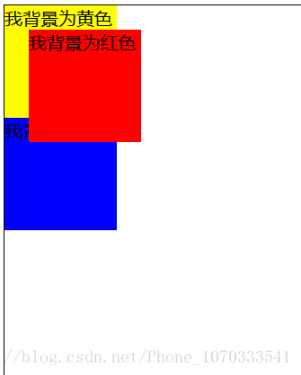
这个时候来个demo测试:
<style>
            .div-relative {
                position: relative;
                left: 300px;
                top:100px;
                color: #000;
                border: 1px solid #000;
                width: 500px;
                height: 400px
            }

            /* css注释说明: 背景为红色 */
            .div-a {
                position: absolute;
                left: 30px;
                top: 30px;
                z-index: 90;
                background: #F00;
                width: 100px;
                height: 100px
            }

            /* 背景为黄色 */
            .div-b {
                position: absolute;
                left: 60px;
                top: 60px;
                z-index: 80;
                background: #FF0;
                width: 100px;
                height: 100px
            }

            /* DIV背景颜色为蓝色 */
            .div-c {
                position: absolute;
                left: 90px;
                top: 90px;
                z-index: 70;
                background: #00F;
                width: 100px;
                height: 100px
            }

        </style>
效果如下:
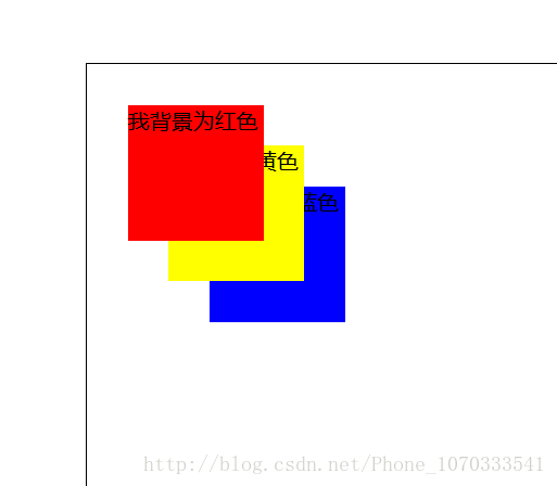
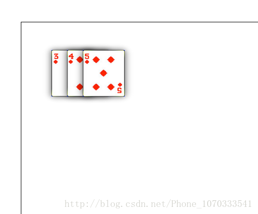
哇塞,很酷炫对不对,肯定用它来设置我的纸牌啦,emmmm:
<style>
    .div-relative {
        position: relative;
        left: 300px;
        top:100px;
        color: #000;
        border: 1px solid #000;
        width: 500px;
        height: 400px;
    }

    .div-a {
        position: absolute;
        left: 30px;
        top: 30px;
        z-index: 1;
        background-image: url(img/1.png);
        width: 100px;
        height: 100px;
        background-repeat: round;
    }

    .div-b {
        position: absolute;
        left: 55px;
        top: 30px;
        z-index: 2;
        background-image: url(img/2.png);
        width: 100px;
        height: 100px;
        background-repeat: round;
    }

    .div-c {
        position: absolute;
        left: 80px;
        top: 30px;
        z-index: 3;
        background-image: url(img/3.png);
        width: 100px;
        height: 100px;
        background-repeat: round;
    }

</style>