分享一下我老师大神的人工智能教程!零基础,通俗易懂!http://blog.csdn.net/jiangjunshow
也欢迎大家转载本篇文章。分享知识,造福人民,实现我们中华民族伟大复兴!
转载请标明出处:
http://blog.csdn.net/lmj623565791/article/details/46405409;
本文出自:【张鸿洋的博客】
一、概述
Google I/O 2015 给大家带来了Android Design Support Library,对于希望做md风格的app的来说,简直是天大的喜讯了~大家可以通过Android Design Support Library该文章对其进行了解,也可以直接在github上下载示例代码运行学习。为了表达我心中的喜悦,我决定针对该库写一系列的文章来分别介绍新增加的控件。
ok,那么首先介绍的就是NavigationView。
注意下更新下as的SDK,然后在使用的过程中,在build.gradle中添加:
compile 'com.android.support:design:22.2.0'
- 1
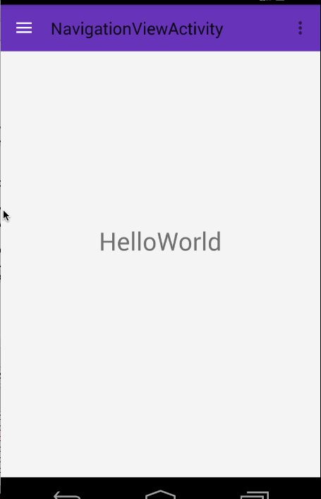
在md风格的app中,例如如下风格的侧滑菜单非常常见:
在之前的设计中,你可能需要考虑如何去布局实现,例如使用ListView;再者还要去设计Item的选中状态之类~~

but,现在,google提供了NavigationView,你只需要写写布局文件,这样的效果就ok了,并且兼容到Android 2.1,非常值得去体验一下。接下来我们来介绍如何去使用这个NavigationView!
二、使用
使用起来very simple ,主要就是写写布局文件~
(一)布局文件
<?xml version="1.0" encoding="utf-8"?><android.support.v4.widget.DrawerLayout android:id="@+id/id_drawer_layout" xmlns:android="http://schemas.android.com/apk/res/android" xmlns:app="http://schemas.android.com/apk/res-auto" android:layout_width="match_parent" android:layout_height="match_parent" android:fitsSystemWindows="true" > <RelativeLayout android:layout_width="match_parent" android:layout_height="match_parent"> <android.support.v7.widget.Toolbar android:id="@+id/id_toolbar" android:layout_width="match_parent" android:layout_height="?attr/actionBarSize" android:background="?attr/colorPrimary" app:layout_scrollFlags="scroll|enterAlways" app:popupTheme="@style/ThemeOverlay.AppCompat.Light"/> <TextView android:id="@+id/id_tv_content" android:layout_width="wrap_content" android:layout_height="wrap_content" android:layout_centerInParent="true" android:text="HelloWorld" android:textSize="30sp"/> </RelativeLayout> <android.support.design.widget.NavigationView android:id="@+id/id_nv_menu" android:layout_width="match_parent" android:layout_height="match_parent" android:layout_gravity="left" android:fitsSystemWindows="true" app:headerLayout="@layout/header_just_username" app:menu="@menu/menu_drawer" /></android.support.v4.widget.DrawerLayout>
- 1
- 2
- 3
- 4
- 5
- 6
- 7
- 8
- 9
- 10
- 11
- 12
- 13
- 14
- 15
- 16
- 17
- 18
- 19
- 20
- 21
- 22
- 23
- 24
- 25
- 26
- 27
- 28
- 29
- 30
- 31
- 32
- 33
- 34
- 35
- 36
- 37
- 38
- 39
- 40
- 41
- 42
- 43
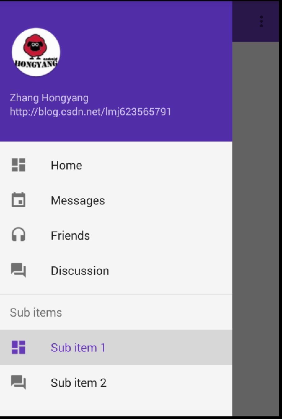
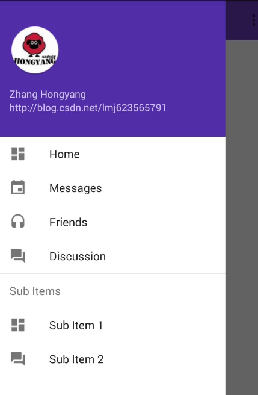
可以看到我们的最外层是DrawerLayout,里面一个content,一个作为drawer。我们的drawer为NavigationView。
注意这个view的两个属性app:headerLayout="@layout/header_just_username"和app:menu="@menu/menu_drawer",分别代表drawer布局中的header和menuitem区域,当然你可以根据自己的情况使用。
接下来看看header的布局文件和menu配置文件:
<?xml version="1.0" encoding="utf-8"?><RelativeLayout xmlns:android="http://schemas.android.com/apk/res/android" android:layout_width="match_parent" android:layout_height="192dp" android:background="?attr/colorPrimaryDark" android:orientation="vertical" android:padding="16dp" android:theme="@style/ThemeOverlay.AppCompat.Dark"> <TextView android:id="@+id/id_link" android:layout_width="wrap_content" android:layout_height="wrap_content" android:layout_alignParentBottom="true" android:layout_marginBottom="16dp" android:text="http://blog.csdn.net/lmj623565791"/> <TextView android:id="@+id/id_username" android:layout_width="wrap_content" android:layout_height="wrap_content" android:layout_above="@id/id_link" android:text="Zhang Hongyang"/> <ImageView android:layout_width="72dp" android:layout_height="72dp" android:layout_above="@id/id_username" android:layout_marginBottom="16dp" android:src="@mipmap/icon"/></RelativeLayout>
- 1
- 2
- 3
- 4
- 5
- 6
- 7
- 8
- 9
- 10
- 11
- 12
- 13
- 14
- 15
- 16
- 17
- 18
- 19
- 20
- 21
- 22
- 23
- 24
- 25
- 26
- 27
- 28
- 29
- 30
- 31
- 32
- 33
- 34
- 35
- 36
<?xml version="1.0" encoding="utf-8"?><menu xmlns:android="http://schemas.android.com/apk/res/android"> <group android:checkableBehavior="single"> <item android:id="@+id/nav_home" android:icon="@drawable/ic_dashboard" android:title="Home"/> <item android:id="@+id/nav_messages" android:icon="@drawable/ic_event" android:title="Messages"/> <item android:id="@+id/nav_friends" android:icon="@drawable/ic_headset" android:title="Friends"/> <item android:id="@+id/nav_discussion" android:icon="@drawable/ic_forum" android:title="Discussion"/> </group> <item android:title="Sub items"> <menu> <item android:icon="@drawable/ic_dashboard" android:title="Sub item 1"/> <item android:icon="@drawable/ic_forum" android:title="Sub item 2"/> </menu> </item></menu>
- 1
- 2
- 3
- 4
- 5
- 6
- 7
- 8
- 9
- 10
- 11
- 12
- 13
- 14
- 15
- 16
- 17
- 18
- 19
- 20
- 21
- 22
- 23
- 24
- 25
- 26
- 27
- 28
- 29
- 30
- 31
- 32
- 33
- 34
别放错文件夹哈~
布局文件写完了,基本就好了,是不是很爽~看似复杂的效果,写写布局文件就ok。
ps:默认的颜色很多是从当前的主题中提取的,比如icon的stateColor,当然你也可以通过以下属性修改部分样式:
app:itemIconTint=""app:itemBackground=""app:itemTextColor=""
- 1
- 2
- 3
(二)Activity
最后是Activity:
package com.imooc.testandroid;import android.os.Bundle;import android.support.design.widget.NavigationView;import android.support.v4.widget.DrawerLayout;import android.support.v7.app.ActionBar;import android.support.v7.app.ActionBarActivity;import android.support.v7.widget.Toolbar;import android.view.MenuItem;public class NavigationViewActivity extends ActionBarActivity{ private DrawerLayout mDrawerLayout; private NavigationView mNavigationView; @Override protected void onCreate(Bundle savedInstanceState) { super.onCreate(savedInstanceState); setContentView(R.layout.activity_navigation_view); mDrawerLayout = (DrawerLayout) findViewById(R.id.id_drawer_layout); mNavigationView = (NavigationView) findViewById(R.id.id_nv_menu); Toolbar toolbar = (Toolbar) findViewById(R.id.id_toolbar); setSupportActionBar(toolbar); final ActionBar ab = getSupportActionBar(); ab.setHomeAsUpIndicator(R.drawable.ic_menu); ab.setDisplayHomeAsUpEnabled(true); setupDrawerContent(mNavigationView); } private void setupDrawerContent(NavigationView navigationView) { navigationView.setNavigationItemSelectedListener( new NavigationView.OnNavigationItemSelectedListener() { @Override public boolean onNavigationItemSelected(MenuItem menuItem) { menuItem.setChecked(true); mDrawerLayout.closeDrawers(); return true; } }); } @Override public boolean onCreateOptionsMenu(Menu menu) { // Inflate the menu; this adds items to the action bar if it is present. getMenuInflater().inflate(R.menu.menu_navigation_view, menu); return true; } @Override public boolean onOptionsItemSelected(MenuItem item) { if(item.getItemId() == android.R.id.home) { mDrawerLayout.openDrawer(GravityCompat.START); return true ; } return super.onOptionsItemSelected(item); }}
- 1
- 2
- 3
- 4
- 5
- 6
- 7
- 8
- 9
- 10
- 11
- 12
- 13
- 14
- 15
- 16
- 17
- 18
- 19
- 20
- 21
- 22
- 23
- 24
- 25
- 26
- 27
- 28
- 29
- 30
- 31
- 32
- 33
- 34
- 35
- 36
- 37
- 38
- 39
- 40
- 41
- 42
- 43
- 44
- 45
- 46
- 47
- 48
- 49
- 50
- 51
- 52
- 53
- 54
- 55
- 56
- 57
- 58
- 59
- 60
- 61
- 62
- 63
- 64
- 65
- 66
- 67
- 68
- 69
- 70
- 71
- 72
- 73
- 74
- 75
- 76
- 77
我们在Activity里面可以通过navigationView去navigationView.setNavigationItemSelectedListener,当selected的时候,menuItem去setChecked(true)。
别忘了设置theme~
<resources> <!-- Base application theme. --> <style name="AppTheme" parent="Theme.AppCompat.Light.DarkActionBar"> <!-- Customize your theme here. --> </style> <style name="Theme.DesignDemo" parent="Base.Theme.DesignDemo"> </style> <style name="Base.Theme.DesignDemo" parent="Theme.AppCompat.Light.NoActionBar"> <item name="colorPrimary">#673AB7</item> <item name="colorPrimaryDark">#512DA8</item> <item name="colorAccent">#FF4081</item> <item name="android:windowBackground">@color/window_background</item> </style></resources><color name="window_background">#FFF5F5F5</color> <activity android:name=".NavigationViewActivity" android:label="@string/title_activity_navigation_view" android:theme="@style/Theme.DesignDemo"></activity>
- 1
- 2
- 3
- 4
- 5
- 6
- 7
- 8
- 9
- 10
- 11
- 12
- 13
- 14
- 15
- 16
- 17
- 18
- 19
- 20
- 21
- 22
- 23
- 24
- 25
- 26
- 27
- 28
ok,到此就搞定了~~
不过存在一个问题,此时你如果点击Sub items里面的Sub item,如果你期望当前选中应该是Sub item,你会发现不起作用。那怎么办呢?
(三)Sub Item支持Cheable
这里可以修改menu的配置文件:
<?xml version="1.0" encoding="utf-8"?><menu xmlns:android="http://schemas.android.com/apk/res/android"> <group> <item android:id="@+id/nav_home" android:checkable="true" android:icon="@drawable/ic_dashboard" android:title="Home"/> <item android:id="@+id/nav_messages" android:checkable="true" android:icon="@drawable/ic_event" android:title="Messages"/> <item android:id="@+id/nav_friends" android:checkable="true" android:icon="@drawable/ic_headset" android:title="Friends"/> <item android:id="@+id/nav_discussion" android:checkable="true" android:icon="@drawable/ic_forum" android:title="Discussion"/> </group> <item android:title="Sub items"> <menu> <item android:checkable="true" android:icon="@drawable/ic_dashboard" android:title="Sub item 1"/> <item android:checkable="true" android:icon="@drawable/ic_forum" android:title="Sub item 2"/> </menu> </item></menu>
- 1
- 2
- 3
- 4
- 5
- 6
- 7
- 8
- 9
- 10
- 11
- 12
- 13
- 14
- 15
- 16
- 17
- 18
- 19
- 20
- 21
- 22
- 23
- 24
- 25
- 26
- 27
- 28
- 29
- 30
- 31
- 32
- 33
- 34
- 35
- 36
- 37
- 38
- 39
- 40
将android:checkableBehavior="single"去掉,然后给每个item项添加android:checkable="true"。
然后在代码中:
navigationView.setNavigationItemSelectedListener( new NavigationView.OnNavigationItemSelectedListener() { private MenuItem mPreMenuItem; @Override public boolean onNavigationItemSelected(MenuItem menuItem) { if (mPreMenuItem != null) mPreMenuItem.setChecked(false); menuItem.setChecked(true); mDrawerLayout.closeDrawers(); mPreMenuItem = menuItem; return true; } });
- 1
- 2
- 3
- 4
- 5
- 6
- 7
- 8
- 9
- 10
- 11
- 12
- 13
- 14
- 15
- 16
- 17
存一下preMenuItem,手动切换。
效果:
ok,哈~其实这个还是参考链接2里面的一个评论说的~~
到此用法就介绍完了有木有一点小激动~ 但是还有个问题,对于app,就像ActionBar最初的出现,一开始大家都欢欣鼓舞,后来发现app中多数情况下需要去定制,尼玛,是不是忽然觉得ActionBar太死板了,恶心死了(当然了现在有了ToolBar灵活度上好多了)对于上述NavigationView可能也会存在定制上的问题,比如我希望选中的Item左边有个高亮的竖线之类的效果。那么,针对于各种需求,想要能解决各种问题,最好的方式就是说对于NavigationView的效果自己可以实现。最好,我们就来看看NavigationView自己实现有多难?
三、自己实现NavigationView效果
其实NavigationView的实现非常简单,一个ListView就可以了,甚至都不需要去自定义,简单写一个Adapter就行了~~
首先观察该图,有没有发现神奇之处,恩,你肯定发现不了,因为我们做的太像了。
其实这个图就是我通过ListView写的一个~是不是和原版很像(~哈~参考了源码的实现,当然像。)
接下来分析,如果说是ListView,那么Item的type肯定不止一种,那我们数一数种类:
- 带图标和文本的
- 仅仅是文本的 Sub Items
- 分割线
你会说还有顶部那个,顶部是headview呀~~
这么分析完成,是不是瞬间觉得没有难度了~
(一)首先布局文件
<?xml version="1.0" encoding="utf-8"?><android.support.v4.widget.DrawerLayout android:id="@+id/id_drawer_layout" xmlns:android="http://schemas.android.com/apk/res/android" xmlns:app="http://schemas.android.com/apk/res-auto" android:layout_width="match_parent" android:layout_height="match_parent" android:fitsSystemWindows="true" > <RelativeLayout android:layout_width="match_parent" android:layout_height="match_parent"> <android.support.v7.widget.Toolbar android:id="@+id/id_toolbar" android:layout_width="match_parent" android:layout_height="?attr/actionBarSize" android:background="?attr/colorPrimary" app:layout_scrollFlags="scroll|enterAlways" app:popupTheme="@style/ThemeOverlay.AppCompat.Light"/> <TextView android:id="@+id/id_tv_content" android:layout_width="wrap_content" android:layout_height="wrap_content" android:layout_centerInParent="true" android:text="HelloWorld" android:textSize="30sp"/> </RelativeLayout> <ListView android:id="@+id/id_lv_left_menu" android:layout_width="match_parent" android:layout_height="match_parent" android:layout_gravity="start" android:paddingTop="0dp" android:background="#ffffffff" android:clipToPadding="false" android:divider="@null" android:listSelector="?attr/selectableItemBackground" /></android.support.v4.widget.DrawerLayout>
- 1
- 2
- 3
- 4
- 5
- 6
- 7
- 8
- 9
- 10
- 11
- 12
- 13
- 14
- 15
- 16
- 17
- 18
- 19
- 20
- 21
- 22
- 23
- 24
- 25
- 26
- 27
- 28
- 29
- 30
- 31
- 32
- 33
- 34
- 35
- 36
- 37
- 38
- 39
- 40
- 41
- 42
- 43
- 44
- 45
布局文件上:和上文对比,我们仅仅把NavigationView换成了ListView.
下面注意了,一大波代码来袭.
(二) Activity
package com.imooc.testandroid;public class NavListViewActivity extends ActionBarActivity{ private ListView mLvLeftMenu; private DrawerLayout mDrawerLayout; @Override protected void onCreate(Bundle savedInstanceState) { super.onCreate(savedInstanceState); setContentView(R.layout.activity_nav_list_view); mDrawerLayout = (DrawerLayout) findViewById(R.id.id_drawer_layout); mLvLeftMenu = (ListView) findViewById(R.id.id_lv_left_menu); Toolbar toolbar = (Toolbar) findViewById(R.id.id_toolbar); setSupportActionBar(toolbar); final ActionBar ab = getSupportActionBar(); ab.setHomeAsUpIndicator(R.drawable.ic_menu); ab.setDisplayHomeAsUpEnabled(true); setUpDrawer(); } private void setUpDrawer() { LayoutInflater inflater = LayoutInflater.from(this); mLvLeftMenu.addHeaderView(inflater.inflate(R.layout.header_just_username, mLvLeftMenu, false)); mLvLeftMenu.setAdapter(new MenuItemAdapter(this)); } @Override public boolean onCreateOptionsMenu(Menu menu) { // Inflate the menu; this adds items to the action bar if it is present. getMenuInflater().inflate(R.menu.menu_nav_list_view, menu); return true; } @Override public boolean onOptionsItemSelected(MenuItem item) { // Handle action bar item clicks here. The action bar will // automatically handle clicks on the Home/Up button, so long // as you specify a parent activity in AndroidManifest.xml. int id = item.getItemId(); //noinspection SimplifiableIfStatement if (id == android.R.id.home) { mDrawerLayout.openDrawer(GravityCompat.START); return true; } return super.onOptionsItemSelected(item); }}
- 1
- 2
- 3
- 4
- 5
- 6
- 7
- 8
- 9
- 10
- 11
- 12
- 13
- 14
- 15
- 16
- 17
- 18
- 19
- 20
- 21
- 22
- 23
- 24
- 25
- 26
- 27
- 28
- 29
- 30
- 31
- 32
- 33
- 34
- 35
- 36
- 37
- 38
- 39
- 40
- 41
- 42
- 43
- 44
- 45
- 46
- 47
- 48
- 49
- 50
- 51
- 52
- 53
- 54
- 55
- 56
- 57
- 58
- 59
- 60
- 61
- 62
- 63
- 64
直接看onCreate中的setUpDrawer(),可以看到我们首先去addHeadView,然后去setAdapter。
那么核心代码就是我们的Adapter了~~
(三)MenuItemAdapter
public class LvMenuItem { public LvMenuItem(int icon, String name) { this.icon = icon; this.name = name; if (icon == NO_ICON && TextUtils.isEmpty(name)) { type = TYPE_SEPARATOR; } else if (icon == NO_ICON) { type = TYPE_NO_ICON; } else { type = TYPE_NORMAL; } if (type != TYPE_SEPARATOR && TextUtils.isEmpty(name)) { throw new IllegalArgumentException("you need set a name for a non-SEPARATOR item"); } L.e(type + ""); } public LvMenuItem(String name) { this(NO_ICON, name); } public LvMenuItem() { this(null); } private static final int NO_ICON = 0; public static final int TYPE_NORMAL = 0; public static final int TYPE_NO_ICON = 1; public static final int TYPE_SEPARATOR = 2; int type; String name; int icon; } public class MenuItemAdapter extends BaseAdapter { private final int mIconSize; private LayoutInflater mInflater; private Context mContext; public MenuItemAdapter(Context context) { mInflater = LayoutInflater.from(context); mContext = context; mIconSize = context.getResources().getDimensionPixelSize(R.dimen.drawer_icon_size);//24dp } private List<LvMenuItem> mItems = new ArrayList<LvMenuItem>( Arrays.asList( new LvMenuItem(R.drawable.ic_dashboard, "Home"), new LvMenuItem(R.drawable.ic_event, "Messages"), new LvMenuItem(R.drawable.ic_headset, "Friends"), new LvMenuItem(R.drawable.ic_forum, "Discussion"), new LvMenuItem(), new LvMenuItem("Sub Items"), new LvMenuItem(R.drawable.ic_dashboard, "Sub Item 1"), new LvMenuItem(R.drawable.ic_forum, "Sub Item 2") )); @Override public int getCount() { return mItems.size(); } @Override public Object getItem(int position) { return mItems.get(position); } @Override public long getItemId(int position) { return position; } @Override public int getViewTypeCount() { return 3; } @Override public int getItemViewType(int position) { return mItems.get(position).type; } @Override public View getView(int position, View convertView, ViewGroup parent) { LvMenuItem item = mItems.get(position); switch (item.type) { case LvMenuItem.TYPE_NORMAL: if (convertView == null) { convertView = mInflater.inflate(R.layout.design_drawer_item, parent, false); } TextView itemView = (TextView) convertView; itemView.setText(item.name); Drawable icon = mContext.getResources().getDrawable(item.icon); setIconColor(icon); if (icon != null) { icon.setBounds(0, 0, mIconSize, mIconSize); TextViewCompat.setCompoundDrawablesRelative(itemView, icon, null, null, null); } break; case LvMenuItem.TYPE_NO_ICON: if (convertView == null) { convertView = mInflater.inflate(R.layout.design_drawer_item_subheader, parent, false); } TextView subHeader = (TextView) convertView; subHeader.setText(item.name); break; case LvMenuItem.TYPE_SEPARATOR: if (convertView == null) { convertView = mInflater.inflate(R.layout.design_drawer_item_separator, parent, false); } break; } return convertView; } public void setIconColor(Drawable icon) { int textColorSecondary = android.R.attr.textColorSecondary; TypedValue value = new TypedValue(); if (!mContext.getTheme().resolveAttribute(textColorSecondary, value, true)) { return; } int baseColor = mContext.getResources().getColor(value.resourceId); icon.setColorFilter(baseColor, PorterDuff.Mode.MULTIPLY); } }
- 1
- 2
- 3
- 4
- 5
- 6
- 7
- 8
- 9
- 10
- 11
- 12
- 13
- 14
- 15
- 16
- 17
- 18
- 19
- 20
- 21
- 22
- 23
- 24
- 25
- 26
- 27
- 28
- 29
- 30
- 31
- 32
- 33
- 34
- 35
- 36
- 37
- 38
- 39
- 40
- 41
- 42
- 43
- 44
- 45
- 46
- 47
- 48
- 49
- 50
- 51
- 52
- 53
- 54
- 55
- 56
- 57
- 58
- 59
- 60
- 61
- 62
- 63
- 64
- 65
- 66
- 67
- 68
- 69
- 70
- 71
- 72
- 73
- 74
- 75
- 76
- 77
- 78
- 79
- 80
- 81
- 82
- 83
- 84
- 85
- 86
- 87
- 88
- 89
- 90
- 91
- 92
- 93
- 94
- 95
- 96
- 97
- 98
- 99
- 100
- 101
- 102
- 103
- 104
- 105
- 106
- 107
- 108
- 109
- 110
- 111
- 112
- 113
- 114
- 115
- 116
- 117
- 118
- 119
- 120
- 121
- 122
- 123
- 124
- 125
- 126
- 127
- 128
- 129
- 130
- 131
- 132
- 133
- 134
- 135
- 136
- 137
- 138
- 139
- 140
- 141
- 142
- 143
- 144
- 145
- 146
- 147
- 148
- 149
- 150
- 151
- 152
- 153
- 154
- 155
- 156
- 157
- 158
- 159
- 160
- 161
- 162
- 163
- 164
- 165
- 166
首先我们的每个Item对应于一个LvMenuItem,包含icon、name、type,可以看到我们的type分为3类。
那么adapter中代码就很简单了,多Item布局的写法。
这样就完成了,我们自己去书写NavigationView,是不是很简单~~如果你的app需要类似效果,但是又与NavigationView的效果并非一模一样,可以考虑按照上面的思路自己写一个。
最后贴一下用到的Item的布局文件:
- design_drawer_item_subheader.xml
<?xml version="1.0" encoding="utf-8"?><TextView xmlns:android="http://schemas.android.com/apk/res/android" android:layout_width="match_parent" android:layout_height="?attr/listPreferredItemHeightSmall" android:gravity="center_vertical|start" android:maxLines="1" android:paddingLeft="?attr/listPreferredItemPaddingLeft" android:paddingRight="?attr/listPreferredItemPaddingRight" android:textAppearance="?attr/textAppearanceListItem" android:textColor="?android:textColorSecondary"/>
- 1
- 2
- 3
- 4
- 5
- 6
- 7
- 8
- 9
- 10
- 11
- design_drawer_item_separator.xml
<?xml version="1.0" encoding="utf-8"?><FrameLayout xmlns:android="http://schemas.android.com/apk/res/android" android:layout_width="match_parent" android:layout_height="wrap_content"> <View android:layout_width="match_parent" android:layout_height="1dp" android:background="?android:attr/listDivider"/></FrameLayout>
- 1
- 2
- 3
- 4
- 5
- 6
- 7
- 8
- 9
- 10
- 11
- 12
- design_drawer_item,xml:
<?xml version="1.0" encoding="utf-8"?><TextView xmlns:android="http://schemas.android.com/apk/res/android" android:layout_width="match_parent" android:layout_height="?attr/listPreferredItemHeightSmall" android:paddingLeft="?attr/listPreferredItemPaddingLeft" android:paddingRight="?attr/listPreferredItemPaddingRight" android:drawablePadding="32dp" android:gravity="center_vertical|start" android:maxLines="1" android:textAppearance="?attr/textAppearanceListItem" android:textColor="?android:attr/textColorPrimary"/>
- 1
- 2
- 3
- 4
- 5
- 6
- 7
- 8
- 9
- 10
- 11
- 12
ok,其实上述ListView的写法也正是NavigationView的源码实现~~item的布局文件直接从源码中拖出来的,还是爽爽哒~
源码点击下载
~~hava a nice day ~~
微信公众号:hongyangAndroid
(欢迎关注,第一时间推送博文信息)

参考链接
给我老师的人工智能教程打call!http://blog.csdn.net/jiangjunshow