Google在2015的IO大会上,给我们带来了更加详细的Material Design设计规范,同时,也给我们带来了全新的Android Design Support Library,在这个support库里面,Google给我们提供了更加规范的MD设计风格的控件。最重要的是,Android Design Support Library的兼容性更广,直接可以向下兼容到Android 2.2。这不得不说是一个良心之作。接下来我们就来看下Android Support Design Library里面的一些控件的解释和使用。
1、CoordinatorLayout
CoordinatorLayout可以理解为一个协调布局,通常做为一个上层的ViewGroup,把CoordinatorLayout当成一个通信的桥梁,来连接不同的子View。这些子View 的具体响应动作都是通过Behavior实现。CoordinatorLayout单独使用没啥效果,要配合直接子View对应的Behavior来实现各种各样的效果。
CoordinatorLayout布局属性
| CoordinatorLayout布局属性 | 解释 |
|---|---|
| app:keylines | 设置了keylines(整数数组)后,可以为子View设置layout_keyline=”i”使其的水平位置根据对应keylines[i]进行layout(用的比较少,不管他) |
| android:background | 状态栏背景颜色 |
CoordinatorLayout LayoutParams 属性(在CoordinatorLayout的直接子View中可以设置的属性)
| CoordinatorLayout LayoutParams 属性 | 解释 |
|---|---|
| android:layout_gravity | 设置View对应的位置 |
| app:layout_behavior | 设置View对应的Behavior。这可是Behavior关键的部分了 |
| app:layout_anchor | 当前View依附于哪个View |
| app:layout_keyline | 设置了keylines(整数数组)后,可以为子View设置layout_keyline=”i”使其的水平位置根据对应keylines[i]进行layout(用的比较少,不管他) |
| app:layout_anchorGravity | 当前View依附于哪个View的位置 |
| app:layout_insetEdge | 用于避免布局之间互相遮盖 |
| app:layout_dodgeInsetEdges | 用于避免布局之间互相遮盖 |
2、AppBarLayout
AppBarLayout是ViewGroup容器组件,继承自LinerLayout,默认是垂直方向的。AppBarLayout的作用是把AppBarLayout包裹的内容都作为AppBar(Material Design设计的App Bar)。AppBarLayout单独使用没有啥特别的效果,要配合CoordinatorLayout实现滚动收缩效果。
AppBarLayout布局属性
| AppBarLayout布局属性 | 解释 |
|---|---|
| app:expanded | AppBarLayout实现滚动收缩的时候,展开还是收起 |
AppBarLayout LayoutParams属性
| AppBarLayout LayoutParams属性 | 解释 |
|---|---|
| app:layout_scrollFlags | 属性来确定哪个组件是可滑动的,以及滑动的方式 |
| app:layout_scrollInterpolator | 滑动的时候,释放手指回到指定位置的插值器 |
AppBarLayout LayoutParams属性里面其中layout_scrollFlags对应的值有以下几个情况:
- scroll: 所有想滚动出屏幕的view都需要设置这个flag-没有设置这个flag的view将被固定在屏幕顶部。
- enterAlways: 这个flag让任意向下的滚动都会导致该view变为可见,启用快速“返回模式”。
- enterAlwaysCollapsed: 当你的视图已经设置minHeight属性又使用此标志时,你的视图只能以最小高度进入,只有当滚动视图到达顶部时才扩大到完整高度。
- exitUntilCollapsed: 滚动退出屏幕,最后折叠在顶端。
AppBarLayout单独使用没有啥特别的效果。一般会配合CoordinatorLayout来使用。在CoordinatorLayout布局下包裹一个实现了NestedScrollingChild可滑动的类( RecyclerView,NestedScrollView)和AppBarLayout,来实现AppBarLayout里面某个子View的收缩和展开。
我们用一个实例来做简单的介绍:CoordinatorLayout + RecyclerView(ViewPager里面放置的是RecyclerView) + AppBarLayout 实现AppBarLayout里面Toolbar的收缩和展开
<?xml version="1.0" encoding="utf-8"?>
<android.support.design.widget.CoordinatorLayout
    xmlns:android="http://schemas.android.com/apk/res/android"
    xmlns:app="http://schemas.android.com/apk/res-auto"
    android:layout_width="match_parent"
    android:layout_height="match_parent"
    android:background="@color/colorActivity">

    <android.support.design.widget.AppBarLayout
        android:layout_width="match_parent"
        android:layout_height="wrap_content"
        android:theme="@style/ThemeOverlay.AppCompat.Dark.ActionBar">

        <android.support.v7.widget.Toolbar
            android:id="@+id/toolbar"
            android:layout_width="match_parent"
            android:layout_height="?attr/actionBarSize"
            android:background="?attr/colorPrimary"
            app:layout_scrollFlags="scroll"
            app:popupTheme="@style/ThemeOverlay.AppCompat.Light">

            <TextView
                android:layout_width="match_parent"
                android:layout_height="match_parent"
                android:layout_gravity="center"
                android:textColor="@android:color/white"
                android:gravity="center"
                android:text="自定义标题"
                android:textSize="18sp" />

        </android.support.v7.widget.Toolbar>

        <android.support.design.widget.TabLayout
            android:id="@+id/tab_layout_title"
            android:layout_width="match_parent"
            android:layout_height="wrap_content"
            style="@style/AppTheme.TabStyle"
            app:tabMode="scrollable"
            app:tabGravity="fill" />

    </android.support.design.widget.AppBarLayout>

    <android.support.v4.view.ViewPager
        android:id="@+id/page_collapsing"
        android:layout_width="match_parent"
        android:layout_height="match_parent"
        app:layout_behavior="@string/appbar_scrolling_view_behavior" />

</android.support.design.widget.CoordinatorLayout>
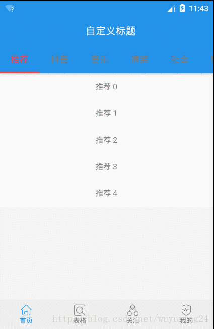
CoordinatorLayout + RecyclerView(ViewPager里面放置的是RecyclerView) + AppBarLayout 实现AppBarLayout里面Toolbar的收缩和展开效果图
虽然看到效果了,但是有时候也会很好奇,这个收缩和展开的里面倒是是咋个工作的。我们还是在上面的基础上来说一说大概的流程。首先最外层是CoordinatorLayout布局,CoordinatorLayout里面有两个子布局AppBarLayout + ViewPager。第一点:ViewPager指定了app:layout_behavior=”@string/appbar_scrolling_view_behavior”这个是一定要指定的,这个behavior是用来指导ViewPager layout, 确定ViewPager在CoordinatorLayout里面位置的。第二点:ViewPager里面一定要有实现了NestedScrollView的布局,我们例子里面每个ViewPager都是一个RecyclerView。当RecyclerView有滑动事件的时候会通过NestedScrollView传递到CoordinatorLayout里面去。这个时候CoordinatorLayout拿到事件了那得指导AppBarLayout里面某个或者某些View来做相应的展开和收缩处理了。这个就是第三点的内容了。第三点:AppBarLayout默认的behavior(AppBarLayout.Behavior)里面onNestedScroll函数来指导AppBarLayout里面指定View收缩和展开。第四点:咱们CoordinatorLayout里面不是又两个子View么AppBarLayout是收缩和展开了,但是AppBarLayout收缩和展开的时候ViewPager不是也会相应的上移和下移么。这一部分是哪里做到的呢,ViewPager不是设置了app:layout_behavior=”@string/appbar_scrolling_view_behavior”么, 这个behavior(AppBarLayout.ScrollingViewBehavior)里面onDependentViewChanged()函数ViewPager会随AppBarLayout上移和下移。
针对AppBarLayout的收缩和展开,还实现了其他的一种效果,直接在AppBarLayout里面放了一个图标控件,效果图如下:
3、CollapsingToolbarLayout
CollapsingToolbarLayout是工具栏包装器,用来实现“折叠效果”的工具栏。通常包含在AppBarLayout中使用。
CollapsingToolbarLayout布局属性
| CollapsingToolbarLayout布局属性 | 解释 |
|---|---|
| app:contentScrim | CollapsingToolbarLayout完全折叠后的背景颜色 |
| app:titleEnabled | 是否显示标题 |
| app:title | 标题 |
| app:toolbarId | toolbar 对应的view id |
| app:statusBarScrim | 折叠后状态栏的背景 |
| app:scrimVisibleHeightTrigger | 设置收起多少高度时,显示ContentScrim的内容 |
| app:scrimAnimationDuration | 展开状态和折叠状态之间,内容转换的动画时间 |
| app:expandedTitleTextAppearance | 布局张开的时候title的样式 |
| app:expandedTitleMarginTop | 布局张开的时候title的margin top |
| app:expandedTitleMarginStart | 布局张开的时候title的margin start |
| app:expandedTitleMarginEnd | 布局张开的时候title的margin end |
| app:expandedTitleMarginBottom | 布局张开的时候title的margin bottom |
| app:expandedTitleMargin | 布局张开的时候title的margin |
| app:expandedTitleGravity | 布局张开的时候title的位置 |
| app:collapsedTitleTextAppearance | 布局折叠的时候title的样式 |
| app:collapsedTitleGravity | 布局折叠的时候title的gravity |
CollapsingToolbarLayout Param 属性,CollapsingToolbarLayout的直接子View才能设置
| CollapsingToolbarLayout Param 属性 | 解释 |
|---|---|
| app:layout_collapseMode | 折叠模式:none 跟随滚动的手势进行折叠,parallax 视差滚动,搭配layout_collapseParallaxMultiplier(视差因子)使用,pin 固定不动 |
| app:layout_collapseParallaxMultiplier | 视差因子,范围:0-1,默认0.5 |
CollapsingToolbarLayout的使用的得配合CoordinatorLayout + 实现了NestedScrollView的View + AppBarLayout + CollapsingToolbarLayout 实现CollapsingToolbarLayout收缩和展开
<?xml version="1.0" encoding="utf-8"?>
<android.support.design.widget.CoordinatorLayout xmlns:android="http://schemas.android.com/apk/res/android"
    xmlns:app="http://schemas.android.com/apk/res-auto"
    android:layout_width="match_parent"
    android:layout_height="match_parent">

    <android.support.design.widget.AppBarLayout
        android:id="@+id/appbar"
        android:layout_width="match_parent"
        android:layout_height="wrap_content">

        <android.support.design.widget.CollapsingToolbarLayout
            android:layout_width="match_parent"
            android:layout_height="wrap_content"
            app:contentScrim="?attr/colorPrimary"
            app:layout_scrollFlags="scroll|exitUntilCollapsed">

            <ImageView
                android:id="@+id/main.backdrop"
                android:layout_width="wrap_content"
                android:layout_height="250dp"
                android:scaleType="centerCrop"
                android:src="@drawable/bg_gaoan"
                app:layout_collapseMode="parallax"
                app:layout_collapseParallaxMultiplier="0"
                android:contentDescription="@null" />

            <android.support.v7.widget.Toolbar
                android:id="@+id/toolbar"
                android:layout_width="match_parent"
                android:layout_height="?android:attr/actionBarSize"
                app:title="@string/text_title"
                app:navigationIcon="@drawable/ic_arrow_back_white_24dp"
                app:titleTextColor="@android:color/holo_red_dark"
                app:layout_collapseMode="pin">
            </android.support.v7.widget.Toolbar>
        </android.support.design.widget.CollapsingToolbarLayout>

    </android.support.design.widget.AppBarLayout>

    <android.support.v4.widget.NestedScrollView
        android:layout_width="match_parent"
        android:layout_height="wrap_content"
        app:layout_behavior="@string/appbar_scrolling_view_behavior">

        <TextView
            android:layout_width="match_parent"
            android:layout_height="wrap_content"
            android:text="@string/text_info"
            android:textSize="20sp" />
    </android.support.v4.widget.NestedScrollView>

    <android.support.design.widget.FloatingActionButton
        android:layout_width="wrap_content"
        android:layout_height="wrap_content"
        android:layout_marginRight="8dp"
        android:layout_marginEnd="8dp"
        android:src="@android:drawable/ic_dialog_email"
        app:layout_anchor="@id/appbar"
        app:layout_anchorGravity="end|bottom|right" />
</android.support.design.widget.CoordinatorLayout>
效果图

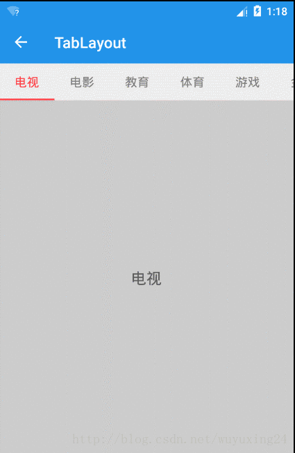
4、TabLayout
在开发中,我们常常需要ViewPager结合Fragment一起使用。这个时候通常会有一个Tab栏来显示当前切换到了那个Fragment。这个Tab栏的布局就是是用TabLayout来实现的。
TabLayout布局属性
| TabLayout布局属性 | 解释 |
|---|---|
| app:tabIndicatorColor | 改变指示器下标的颜色 |
| app:tabIndicatorHeight | 改变指示器下标的高度 |
| app:tabBackground | 改变整个TabLayout的颜色 |
| app:tabContentStart | TabLayout开始位置的偏移量 |
| app:tabMaxWidth | 设置最大的tab宽度 |
| app:tabMinWidth | 设置最小的tab宽度 |
| app:tabPadding | 改变tab的padding |
| app:tabPaddingBottom | 改变tab的paddingBottom |
| app:tabPaddingEnd | 改变tab的paddingEnd |
| app:tabPaddingStart | 改变tab的paddingStart |
| app:tabPaddingTop | 改变tab的paddingTop |
| app:tabSelectedTextColor | 改变选中字体的颜色 |
| app:tabTextAppearance | 改变TabLayout内部字体 |
| app:tabTextColor | 改变未选中字体的颜色 |
| app:tabMode | tab是否可以滑动.有scrollable,fixed(默认)两个值 |
| app:tabGravity | tab对齐方式,有fill和center两个值 |
app:tabGravity属性只有在tabMode设置为fixed的情况下有效.比如当tab个数比较少时,让tab现实在TabLayout的中间.
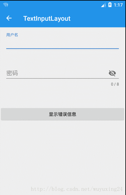
5、TextInputLayout
TextInputLayout用于辅助显示提示信息(也包括错误信息), 要和EditText(或EditText的子类)结合使用,并且只能包含一个EditText(或EditText的子类)。有一点要特别注意如果你在TextInputLayout里面准备使用EditText的话推荐使用TextInputEditText替换.因为TextInputEditText相对于EditText修复了一个bug(当键盘弹出布局被顶上去的时候TextInputEditText表现更好点)。
TextInputLayout布局属性
| TextInputLayout布局属性 | 解释 |
|---|---|
| app:counterEnabled | 开启计数 |
| app:counterMaxLength | 最大输入限制数 |
| app:counterOverflowTextAppearance | 当计数个数超过限制的时候,计数文字显示形式 |
| app:counterTextAppearance | 计数文字未超过限制的时候,计数文字显示形式 |
| app:errorEnabled | 开启错误提示 |
| app:errorTextAppearance | 错误提示的信息样式 |
| app:hintAnimationEnabled | 是否开启动画,获得焦点的时候hint提示会动画地移动上去 |
| app:hintEnabled | 是否方显示hint提示信息 |
| app:hintTextAppearance | hint文字表现形式 |
| app:passwordToggleContentDescription | 密码查看按钮对应的content description |
| app:passwordToggleDrawable | 密码查看按钮对应的drawable |
| app:passwordToggleEnabled | EditText的类型是密码形式的时候,是否显示查看密码按钮 |
| app:passwordToggleTint | 密码查看按钮对应的tint |
| app:passwordToggleTintMode | 密码查看按钮对应的tintmode |
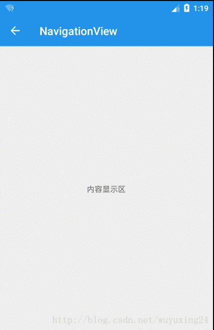
6、NavigationView
NavigationView是导航视图,一般会配合DrawerLayout来使用做抽屉菜单.
NavigationView布局属性
| NavigationView布局属性 | 解释 |
|---|---|
| app:headerLayout | 用来展示NavigationView的头布局 |
| app:menu | 引用一个menu作为下面的点击项 |
| app:itemTextColor | 设置每个menu item文字颜色 |
| app:itemBackground | 设置每个menu item背景颜色 |
| app:itemIconTint | 设置每个menu item icon tint着色 |
| app:itemTextAppearance | 设置每个menu item文字样式 |
7、FloatingActionButton
悬浮按钮。一般用来配合CoordinatorLayout使用,实现跟随某个(AppBarLayout)移动。
FloatingActionButton布局属性
| FloatingActionButton布局属性 | 解释 |
|---|---|
| app:backgroundTint | 按钮的背景颜色,不设置,默认使用theme中colorAccent的颜色 |
| app:borderWidth | 该属性如果不设置0dp,那么在4.1的sdk上FAB会显示为正方形,而且在5.0以后的sdk没有阴影效果。所以设置为borderWidth=”0dp” |
| app:fabSize | 设置大小,该属性有两个值,分别为normal和mini,对应的大小分别为56dp和40dp |
| app:backgroundTintMode | 按钮背景颜色的模式 |
| app:elevation | 默认状态下阴影大小 |
| app:pressedTranslationZ | 按钮按下去的状态下的阴影大小 |
| app:rippleColor | 设置点击时的背景颜色 |
| app:useCompatPadding | 是否使用兼容的填充大小 |
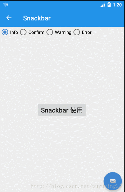
8、Snackbar
Snackbar提供了一个介于Toast和AlertDialog之间轻量级控件,它可以很方便的提供消息的提示和动作反馈。Snackbar源码分析