Flex布局
Flex 布局教程:实例篇
转自:http://www.ruanyifeng.com/blog/2015/07/flex-examples.html
你会看到,不管是什么布局,Flex往往都可以几行命令搞定。
我只列出代码,详细的语法解释请查阅《Flex布局教程:语法篇》。我的主要参考资料是Landon Schropp的文章和Solved by Flexbox。
一、骰子的布局
骰子的一面,最多可以放置9个点。
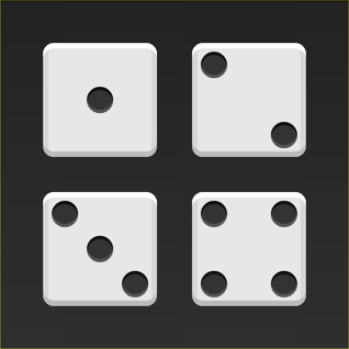
下面,就来看看Flex如何实现,从1个点到9个点的布局。你可以到codepen查看Demo。
如果不加说明,本节的HTML模板一律如下。
<div class="box"> <span class="item"></span> </div>
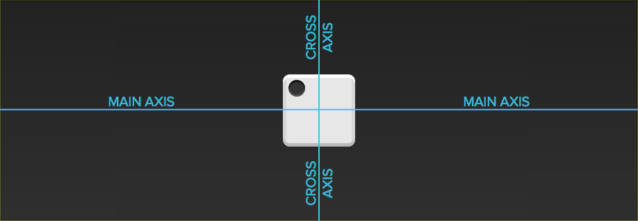
上面代码中,div元素(代表骰子的一个面)是Flex容器,span元素(代表一个点)是Flex项目。如果有多个项目,就要添加多个span元素,以此类推。
1.1 单项目
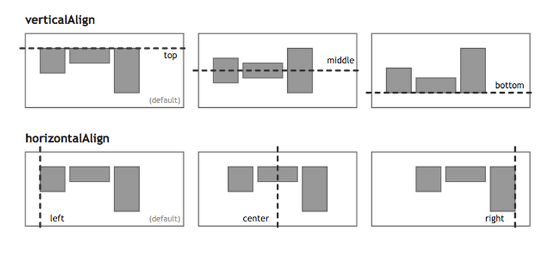
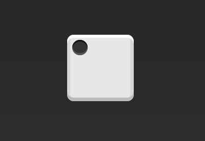
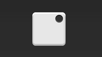
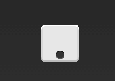
首先,只有左上角1个点的情况。Flex布局默认就是首行左对齐,所以一行代码就够了。
.box {
  display: flex; }
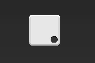
设置项目的对齐方式,就能实现居中对齐和右对齐。
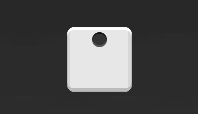
.box {
  display: flex; justify-content: center; }
.box {
  display: flex; justify-content: flex-end; }
设置交叉轴对齐方式,可以垂直移动主轴。
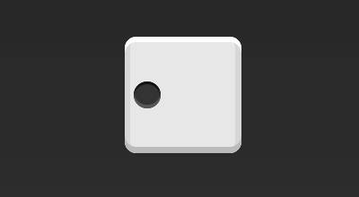
.box {
  display: flex; align-items: center; }
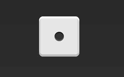
.box {
  display: flex; justify-content: center; align-items: center; }
.box {
  display: flex; justify-content: center; align-items: flex-end; }
.box {
  display: flex; justify-content: flex-end; align-items: flex-end; }
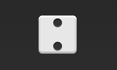
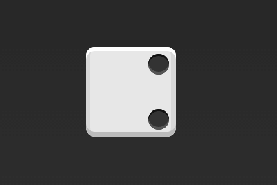
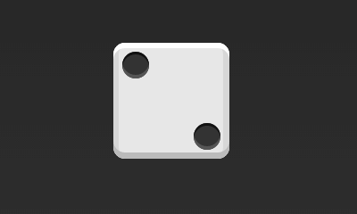
1.2 双项目
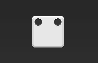
.box {
  display: flex; justify-content: space-between; }
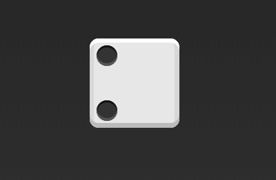
.box {
  display: flex; flex-direction: column; justify-content: space-between; }
.box {
  display: flex; flex-direction: column; justify-content: space-between; align-items: center; }
.box {
  display: flex; flex-direction: column; justify-content: space-between; align-items: flex-end; }
.box {
  display: flex; } .item:nth-child(2) { align-self: center; }
.box {
  display: flex; justify-content: space-between; } .item:nth-child(2) { align-self: flex-end; }
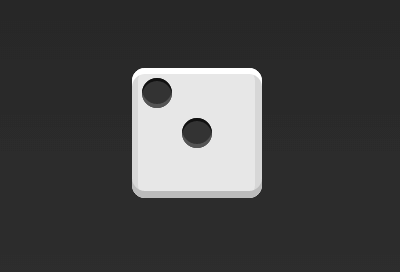
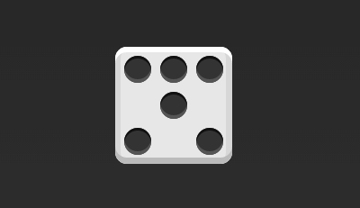
1.3 三项目
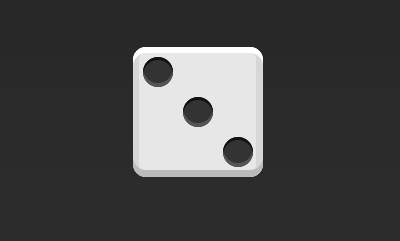
.box {
  display: flex; } .item:nth-child(2) { align-self: center; } .item:nth-child(3) { align-self: flex-end; }
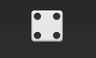
1.4 四项目
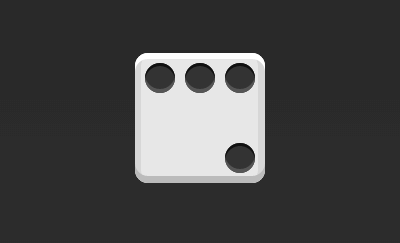
.box {
  display: flex; flex-wrap: wrap; justify-content: flex-end; align-content: space-between; }
HTML代码如下。
<div class="box"> <div class="column"> <span class="item"></span> <span class="item"></span> </div> <div class="column"> <span class="item"></span> <span class="item"></span> </div> </div>
CSS代码如下。
.box {
  display: flex; flex-wrap: wrap; align-content: space-between; } .column { flex-basis: 100%; display: flex; justify-content: space-between; }
1.5 六项目
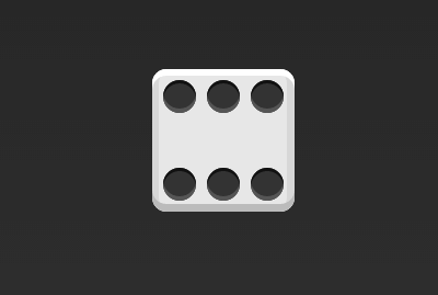
.box {
  display: flex; flex-wrap: wrap; align-content: space-between; }
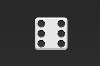
.box {
  display: flex; flex-direction: column; flex-wrap: wrap; align-content: space-between; }
HTML代码如下。
<div class="box"> <div class="row"> <span class="item"></span> <span class="item"></span> <span class="item"></span> </div> <div class="row"> <span class="item"></span> </div> <div class="row"> <span class="item"></span> <span class="item"></span> </div> </div>
CSS代码如下。
.box {
  display: flex; flex-wrap: wrap; } .row{ flex-basis: 100%; display:flex; } .row:nth-child(2){ justify-content: center; } .row:nth-child(3){ justify-content: space-between; }
1.6 九项目
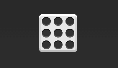
.box {
  display: flex; flex-wrap: wrap; }
二、网格布局
2.1 基本网格布局
最简单的网格布局,就是平均分布。在容器里面平均分配空间,跟上面的骰子布局很像,但是需要设置项目的自动缩放。
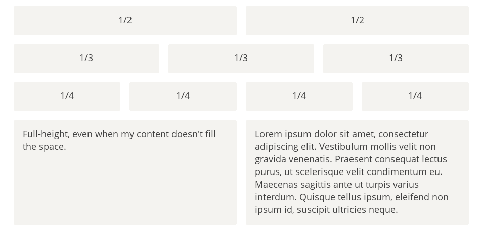
HTML代码如下。
<div class="Grid"> <div class="Grid-cell">...</div> <div class="Grid-cell">...</div> <div class="Grid-cell">...</div> </div>
CSS代码如下。
.Grid {
  display: flex; } .Grid-cell { flex: 1; }
2.2 百分比布局
某个网格的宽度为固定的百分比,其余网格平均分配剩余的空间。
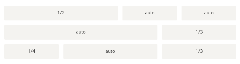
HTML代码如下。
<div class="Grid"> <div class="Grid-cell u-1of4">...</div> <div class="Grid-cell">...</div> <div class="Grid-cell u-1of3">...</div> </div>
.Grid {
  display: flex; } .Grid-cell { flex: 1; } .Grid-cell.u-full { flex: 0 0 100%; } .Grid-cell.u-1of2 { flex: 0 0 50%; } .Grid-cell.u-1of3 { flex: 0 0 33.3333%; } .Grid-cell.u-1of4 { flex: 0 0 25%; }
三、圣杯布局
圣杯布局(Holy Grail Layout)指的是一种最常见的网站布局。页面从上到下,分成三个部分:头部(header),躯干(body),尾部(footer)。其中躯干又水平分成三栏,从左到右为:导航、主栏、副栏。
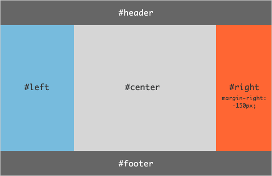
HTML代码如下。
<body class="HolyGrail"> <header>...</header> <div class="HolyGrail-body"> <main class="HolyGrail-content">...</main> <nav class="HolyGrail-nav">...</nav> <aside class="HolyGrail-ads">...</aside> </div> <footer>...</footer> </body>
CSS代码如下。
.HolyGrail {
  display: flex; min-height: 100vh; flex-direction: column; } header, footer { flex: 1; } .HolyGrail-body { display: flex; flex: 1; } .HolyGrail-content { flex: 1; } .HolyGrail-nav, .HolyGrail-ads { /* 两个边栏的宽度设为12em */ flex: 0 0 12em; } .HolyGrail-nav { /* 导航放到最左边 */ order: -1; }
如果是小屏幕,躯干的三栏自动变为垂直叠加。
@media (max-width: 768px) { .HolyGrail-body { flex-direction: column; flex: 1; } .HolyGrail-nav, .HolyGrail-ads, .HolyGrail-content { flex: auto; } }
四、输入框的布局
我们常常需要在输入框的前方添加提示,后方添加按钮。
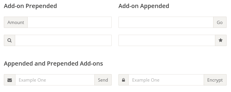
HTML代码如下。
<div class="InputAddOn"> <span class="InputAddOn-item">...</span> <input class="InputAddOn-field"> <button class="InputAddOn-item">...</button> </div>
CSS代码如下。
.InputAddOn {
  display: flex; } .InputAddOn-field { flex: 1; }
五、悬挂式布局
有时,主栏的左侧或右侧,需要添加一个图片栏。
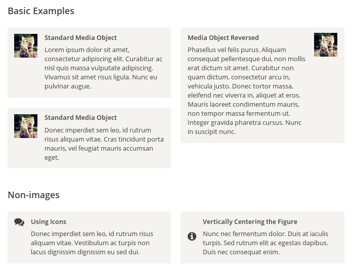
HTML代码如下。
<div class="Media"> <img class="Media-figure" src="" alt=""> <p class="Media-body">...</p> </div>
CSS代码如下。
.Media {
  display: flex; align-items: flex-start; } .Media-figure { margin-right: 1em; } .Media-body { flex: 1; }
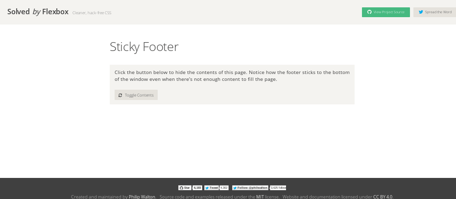
六、固定的底栏
有时,页面内容太少,无法占满一屏的高度,底栏就会抬高到页面的中间。这时可以采用Flex布局,让底栏总是出现在页面的底部。
HTML代码如下。
<body class="Site"> <header>...</header> <main class="Site-content">...</main> <footer>...</footer> </body>
CSS代码如下。
.Site {
  display: flex; min-height: 100vh; flex-direction: column; } .Site-content { flex: 1; }
七,流式布局
每行的项目数固定,会自动分行。
CSS的写法。
.parent {
  width: 200px; height: 150px; background-color: black; display: flex; flex-flow: row wrap; align-content: flex-start; } .child { box-sizing: border-box; background-color: white; flex: 0 0 25%; height: 50px; border: 1px solid red; }
(完)
Flex 布局教程:实例篇
转自:http://www.ruanyifeng.com/blog/2015/07/flex-examples.html
你会看到,不管是什么布局,Flex往往都可以几行命令搞定。
我只列出代码,详细的语法解释请查阅《Flex布局教程:语法篇》。我的主要参考资料是Landon Schropp的文章和Solved by Flexbox。
一、骰子的布局
骰子的一面,最多可以放置9个点。
下面,就来看看Flex如何实现,从1个点到9个点的布局。你可以到codepen查看Demo。
如果不加说明,本节的HTML模板一律如下。
<div class="box"> <span class="item"></span> </div>
上面代码中,div元素(代表骰子的一个面)是Flex容器,span元素(代表一个点)是Flex项目。如果有多个项目,就要添加多个span元素,以此类推。
1.1 单项目
首先,只有左上角1个点的情况。Flex布局默认就是首行左对齐,所以一行代码就够了。
.box {
  display: flex; }
设置项目的对齐方式,就能实现居中对齐和右对齐。
.box {
  display: flex; justify-content: center; }
.box {
  display: flex; justify-content: flex-end; }
设置交叉轴对齐方式,可以垂直移动主轴。
.box {
  display: flex; align-items: center; }
.box {
  display: flex; justify-content: center; align-items: center; }
.box {
  display: flex; justify-content: center; align-items: flex-end; }
.box {
  display: flex; justify-content: flex-end; align-items: flex-end; }
1.2 双项目
.box {
  display: flex; justify-content: space-between; }
.box {
  display: flex; flex-direction: column; justify-content: space-between; }
.box {
  display: flex; flex-direction: column; justify-content: space-between; align-items: center; }
.box {
  display: flex; flex-direction: column; justify-content: space-between; align-items: flex-end; }
.box {
  display: flex; } .item:nth-child(2) { align-self: center; }
.box {
  display: flex; justify-content: space-between; } .item:nth-child(2) { align-self: flex-end; }
1.3 三项目
.box {
  display: flex; } .item:nth-child(2) { align-self: center; } .item:nth-child(3) { align-self: flex-end; }
1.4 四项目
.box {
  display: flex; flex-wrap: wrap; justify-content: flex-end; align-content: space-between; }
HTML代码如下。
<div class="box"> <div class="column"> <span class="item"></span> <span class="item"></span> </div> <div class="column"> <span class="item"></span> <span class="item"></span> </div> </div>
CSS代码如下。
.box {
  display: flex; flex-wrap: wrap; align-content: space-between; } .column { flex-basis: 100%; display: flex; justify-content: space-between; }
1.5 六项目
.box {
  display: flex; flex-wrap: wrap; align-content: space-between; }
.box {
  display: flex; flex-direction: column; flex-wrap: wrap; align-content: space-between; }
HTML代码如下。
<div class="box"> <div class="row"> <span class="item"></span> <span class="item"></span> <span class="item"></span> </div> <div class="row"> <span class="item"></span> </div> <div class="row"> <span class="item"></span> <span class="item"></span> </div> </div>
CSS代码如下。
.box {
  display: flex; flex-wrap: wrap; } .row{ flex-basis: 100%; display:flex; } .row:nth-child(2){ justify-content: center; } .row:nth-child(3){ justify-content: space-between; }
1.6 九项目
.box {
  display: flex; flex-wrap: wrap; }
二、网格布局
2.1 基本网格布局
最简单的网格布局,就是平均分布。在容器里面平均分配空间,跟上面的骰子布局很像,但是需要设置项目的自动缩放。
HTML代码如下。
<div class="Grid"> <div class="Grid-cell">...</div> <div class="Grid-cell">...</div> <div class="Grid-cell">...</div> </div>
CSS代码如下。
.Grid {
  display: flex; } .Grid-cell { flex: 1; }
2.2 百分比布局
某个网格的宽度为固定的百分比,其余网格平均分配剩余的空间。
HTML代码如下。
<div class="Grid"> <div class="Grid-cell u-1of4">...</div> <div class="Grid-cell">...</div> <div class="Grid-cell u-1of3">...</div> </div>
.Grid {
  display: flex; } .Grid-cell { flex: 1; } .Grid-cell.u-full { flex: 0 0 100%; } .Grid-cell.u-1of2 { flex: 0 0 50%; } .Grid-cell.u-1of3 { flex: 0 0 33.3333%; } .Grid-cell.u-1of4 { flex: 0 0 25%; }
三、圣杯布局
圣杯布局(Holy Grail Layout)指的是一种最常见的网站布局。页面从上到下,分成三个部分:头部(header),躯干(body),尾部(footer)。其中躯干又水平分成三栏,从左到右为:导航、主栏、副栏。
HTML代码如下。
<body class="HolyGrail"> <header>...</header> <div class="HolyGrail-body"> <main class="HolyGrail-content">...</main> <nav class="HolyGrail-nav">...</nav> <aside class="HolyGrail-ads">...</aside> </div> <footer>...</footer> </body>
CSS代码如下。
.HolyGrail {
  display: flex; min-height: 100vh; flex-direction: column; } header, footer { flex: 1; } .HolyGrail-body { display: flex; flex: 1; } .HolyGrail-content { flex: 1; } .HolyGrail-nav, .HolyGrail-ads { /* 两个边栏的宽度设为12em */ flex: 0 0 12em; } .HolyGrail-nav { /* 导航放到最左边 */ order: -1; }
如果是小屏幕,躯干的三栏自动变为垂直叠加。
@media (max-width: 768px) { .HolyGrail-body { flex-direction: column; flex: 1; } .HolyGrail-nav, .HolyGrail-ads, .HolyGrail-content { flex: auto; } }
四、输入框的布局
我们常常需要在输入框的前方添加提示,后方添加按钮。
HTML代码如下。
<div class="InputAddOn"> <span class="InputAddOn-item">...</span> <input class="InputAddOn-field"> <button class="InputAddOn-item">...</button> </div>
CSS代码如下。
.InputAddOn {
  display: flex; } .InputAddOn-field { flex: 1; }
五、悬挂式布局
有时,主栏的左侧或右侧,需要添加一个图片栏。
HTML代码如下。
<div class="Media"> <img class="Media-figure" src="" alt=""> <p class="Media-body">...</p> </div>
CSS代码如下。
.Media {
  display: flex; align-items: flex-start; } .Media-figure { margin-right: 1em; } .Media-body { flex: 1; }
六、固定的底栏
有时,页面内容太少,无法占满一屏的高度,底栏就会抬高到页面的中间。这时可以采用Flex布局,让底栏总是出现在页面的底部。
HTML代码如下。
<body class="Site"> <header>...</header> <main class="Site-content">...</main> <footer>...</footer> </body>
CSS代码如下。
.Site {
  display: flex; min-height: 100vh; flex-direction: column; } .Site-content { flex: 1; }
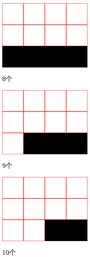
七,流式布局
每行的项目数固定,会自动分行。
CSS的写法。
.parent {
  width: 200px; height: 150px; background-color: black; display: flex; flex-flow: row wrap; align-content: flex-start; } .child { box-sizing: border-box; background-color: white; flex: 0 0 25%; height: 50px; border: 1px solid red; }
(完)