React Native
React Native 看起来很像 React,只不过其基础组件是原生组件而非 web 组件。要理解 React Native 应用的基本结构,首先需要了解一些基本的 React 的概念,比如 JSX 语法、组件、state状态以及props属性。如果你已经了解了 React,那么还需要掌握一些 React Native 特有的知识,比如原生组件的使用。这篇教程可以供任何基础的读者学习,不管你是否有 React 方面的经验。
TextInput
通过 value 属性指定文本内容, 通过 onChangeText 属性监听文本的变化事件
从TextInput谈绑定this传参数
我们在使用TextInput发现每次输入完后;输入的都无效;这是因为要改变没有更改数据源
- 使用箭头函数实现;这样不会改变this的指向
import React from 'react';
import { View,  TextInput, StyleSheet } from 'react-native';
export default class ElseStudy extends React.Component{
    constructor(props){
        super(props)
        this.state = {myText:'Useless Placeholder'}
    }
    render(){
        return (
            <View>
                <TextInput
                    value={this.state.myText}
                    onChangeText={(text)=>this.changeTextHandle(text)}
                    ></TextInput>
            </View>
        )
    }
    changeTextHandle(newText){
        this.setState({
            myText:newText
        })
    }
}
- 当然代码少,我们可以不用声明一个函数,直接写在
{}
        return (
            <View>
                <TextInput
                    value={this.state.myText}
                    onChangeText={(myText)=>this.setState({myText})}
                    ></TextInput>
            </View>
        )
- 使用bind改变this的指向
    render(){
        return (
            <View>
                <TextInput
                    value={this.state.myText}
                    onChangeText={this.changeTextHandle.bind(this)}
                    ></TextInput>
            </View>
        )
    }
    changeTextHandle(newText){
        this.setState({
            myText:newText
        })
    }
ScrollView
- 默认情况下, 超出屏幕的内容是看不到的, 不像浏览器环境下会自动添加滚动条
- 如果需要滚动, 可以使用这个组件把要相应的内容包裹起来, 被包裹的内容就会处于滚动条中
- 滚动的过程中,可以通过onScroll绑定回调,每帧最多调用一次回调
import React from 'react';
import { StyleSheet, Text, View,ScrollView } from 'react-native';
export default class ScrollViewStudy extends React.Component{
    constructor(props) {
        super(props);
        this.state = {
            list: ["red", "yellow", "pink", "orange", "blue", "skyblue"]
        }
    }
    render(){
        return (
            <View>
            {
                this.state.list.map(color => (
                    <View
                        key={color}
                        style={{backgroundColor: color, width: 300, height: 180}}>
                        <Text>{color}</Text>
                    </View>
                ))
            }
            </View>
        )
    }
}
我们使用View包裹着每个View组件;发现手机只显示中间部分的组件;并不能滚动;我们可以使用scrollView进行包裹
    <ScrollView>
            {
                this.state.list.map(color => (
                    <View
                        key={color}
                        style={{backgroundColor: color, width: '100%', height: 180}}>
                        <Text>{color}</Text>
                    </View>
                ))
            }
            </ScrollView>
ScrollView实现轮播
import React from 'react'
import { StyleSheet, View,ScrollView,Text } from 'react-native';
const Dimensions = require('Dimensions');
const screenSize = Dimensions.get("window");
export default class Lunbotu extends React.Component{
    constructor(props){
        super(props)
        this.state = {
            list: ["red", "yellow", "pink", "orange"]
        }
    }
    getList(){
        return this.state.list.map((color,i) => (
            <View
            key={i}
            style={[styles.swipeItem, {backgroundColor: color}]}
            >
            <Text>i</Text>
            </View>
        ))
    }
    render(){
        return (
            <ScrollView
            horizontal={ true }
            pagingEnabled={ true }
            showsHorizontalScrollIndicator={ false }
            >

                {this.getList()}
            </ScrollView>
        )
    }
}
const styles = StyleSheet.create({
    swipeItem:{
        width: screenSize.width,
        height: 200
    }
})
- Dimensions可以动态获取屏幕的宽高,用这个宽高我们可以根据需求自己计算。使用它的时候,主要是因为我们不能确定父盒子的宽高与屏幕的关系
- horizontal属性可设置列表水平排列,pagingEnabled属性能够让列表一页一页切换,showsHorizontalScrollIndicator属性控制滚动条显示隐藏
- 其实我们只是让每一个子元素(轮播容器swiper-item)水平排列,请求去掉滚动条;然后在滑动一下显示一页即可
FastList
高性能的简单列表组件
使用方法
import React, { Component } from "react";
import { StyleSheet, View, Text, FlatList } from 'react-native';
export default class FlatListTest extends Component {
    render() {
        return (
            <View>
                <FlatList
                    data={[
                        {key: 'Devin'},
                        {key: 'Jackson'},
                        {key: 'James'},
                        {key: 'Joel'},
                        {key: 'John'},
                        {key: 'Jillian'},
                        {key: 'Jimmy'},
                        {key: 'Julie'}
                    ]}
                    renderItem={(e) => <Text style={styles.item}>{e.index + ":" + e.item.key}</Text>}
                />
            </View>
        );

    }
}

const styles = StyleSheet.create({
    item: {
        padding: 10,
        fontSize: 18,
        height: 44,
    },
});
ActivityIndicator
- 展示一个小圆形的loading
- 通过属性 animating 控制显示隐藏, color 设置颜色
- 我们可以用它来做数据的加载等等…
import React, { Component } from "react";
import { StyleSheet, View, Text, ActivityIndicator } from 'react-native';
export default class FlatListTest extends Component {
    render(){
        return (
            <ActivityIndicator
            animating={true}
            color="green"
            size="large" />
        )
    }
}
触控系列组件
在需要捕捉用户点击操作时,可以使用Touchable开头的一系列组件。这些组件通过onPress属性设置点击事件的处理函数。当在本组件上按下手指并且抬起手指时也没有移开到组件外时,此函数会被调用。Touchable组件最大的特点是附带反馈效果。
import React from 'react'
import {
    StyleSheet,
    View,
    Image,
    Text,
    TouchableHighlight,
    TouchableOpacity,
    TouchableNativeFeedback
} from 'react-native';
export default class TouchableStudy extends React.Component{
    render(){
        return (
            <View>
                <TouchableOpacity
                activeOpacity={0.5}
                >
                    <Text style={styles.baseFont}>透明按钮</Text>
                </TouchableOpacity>
                <TouchableHighlight
                underlayColor="#fal33j"
                    activeOpacity={0.5}>
                    <Text style={styles.baseFont}>高亮按钮</Text>
                </TouchableHighlight>
                <TouchableNativeFeedback
                    background={TouchableNativeFeedback.SelectableBackground()}
                    >
                    <View style={styles.base}>
                        <Text style={styles.baseFont}>原生按钮</Text>
                    </View>
                </TouchableNativeFeedback>
            </View>
        )
    }
}
const styles = StyleSheet.create({
    base: {
        margin: 10,
        width: 300,
        height: 100,
        borderRadius: 5,
        backgroundColor: 'green',
        justifyContent: 'center',
    },
    baseFont: {
        color: "orange",
        textAlign: "center",
        lineHeight: 50
    }
})
使用原生状态渲染反馈效果,比如涟漪,只能放置一个view子组件;效果有三个可选方法:SelectableBackground、SelectableBackgroundBorderless、Ripple(color)
Alter
import React from 'react'
import {
Alert,
Button,
} from 'react-native';
export default class AlertStudy extends React.Component{
alertHandle(){
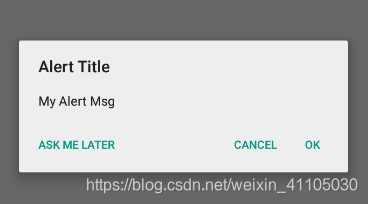
Alert.alert(
'Alert Title',
'My Alert Msg',
[
{text: 'Ask me later', onPress: () => console.log('Ask me later pressed')},
{text: 'Cancel', onPress: () => console.log('Cancel Pressed'), style: 'cancel'},
{text: 'OK', onPress: () => console.log('OK Pressed')},
],
{ cancelable: false }
)
}
render(){
return(
<Button title="点我弹框" onPress={()=>this.alertHandle()}></Button>
)
}
}
看界面一下子就能知道它的各个含义: 配置一个按钮是确定,两个按钮是取消与确定,三个按钮是稍后再试、取消与确定
Dimensions
const Dimensions = require('Dimensions');
const screenSize = Dimensions.get("window");

const styles = StyleSheet.create({
    container: {
        width: screenSize.width,
        height: screenSize.height
    }
});
本模块用于获取设备屏幕的宽高。尽管尺寸信息立即就可用,但它可能会在将来被修改(譬如设备的方向改变),所以基于这些常量的渲染逻辑和样式应当每次render之后都调用此函数,而不是将对应的值保存下来。
样式
StyleSheet
- 所有RN中的样式都必须用这个Api创建
- 所有样式名称都必须是驼峰命名
- RN中所有的组件默认display属性都是flex,而且主轴方向是column
- 每个元素可以通过数组设置多种样式,如果遇到相同的样式,后面样式的优先级大于前面
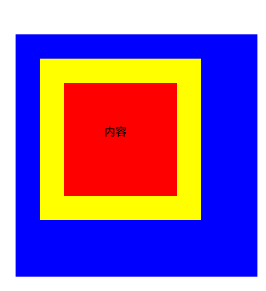
RN的盒子模型
- 在RN中的元素同样拥有盒子模型:宽高、内边距、边框、外边距。
- 需要注意在RN中的样式大小不需要单位,同时没有css的复合样式,比如border、background、font,在RN中border宽度、颜色、圆角等样式需要一个一个设置,background和font也一样。
- 关于padding与margin,在css中可以赋予多个值来设置四边不一样的大小,在RN中只能给定一个值,指定相同的大小,如果四边大小不一样,就需要按照方向一个一个设置。同时RN也提供了paddingHorizontal、marginHorizontal、paddingVertical、marginVertical同时设置左右和上下两个方向的值。
- 另外补充一下,在设置字体时,Android内建的有这么几个: normal、serif、monospace
import React, { Component } from "react";
import { StyleSheet, View, Text } from 'react-native';
export default class LayoutStudy extends React.Component{
    render(){
        return (
            <View style={styles.container}>
                <View style={styles.box}>
                    <Text>内容</Text>
                </View>
            </View>
        )
    }
}
const styles = StyleSheet.create({
    container: {
        width: 300,
        height: 300,
        backgroundColor: "blue"
    },
    box:{
        width: 200,
        height: 200,
        backgroundColor: "red",
        paddingHorizontal: 50,
        paddingVertical: 50,
        borderWidth: 30,
        borderColor: "yellow",
        margin: 30
    }
})

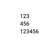
RN的伸缩布局
- ReactNative中组件默认采用flex弹性布局,使用flex可以使其在可利用的空间中动态地扩张或收缩。
- ReactNative中的flex工作原理和web上的CSS基本一致,当然也存在少许差异。首先是默认值不同:flexDirection的默认值是column而不是row,也就是元素纵向排列;而flex也只能指定一个数字值
import React, { Component } from "react";
import { StyleSheet, View, Text } from 'react-native';
export default class FlexLayout extends Component{
    render(){
        return (
            <View>
                <View>
                    <View><Text>123</Text></View>
                    <View><Text>456</Text></View>
                </View>
                {/* 改为横向排列 */}
                <View style={styles.row}>
                    <View><Text>123</Text></View>
                    <View><Text>456</Text></View>
                </View>
            </View>
        )
    }
}
const styles = StyleSheet.create({
    row:{
        flexDirection: 'row'
    }
})
fetch
React Native 提供了和 web 标准一致的Fetch API,用于满足开发者访问网络的需求。如果你之前使用过XMLHttpRequest(即俗称的 ajax)或是其他的网络 API,那么 Fetch 用起来将会相当容易上手。这篇文档只会列出 Fetch 的基本用法,并不会讲述太多细节,你可以使用你喜欢的搜索引擎去搜索fetch api关键字以了解更多信息。
https://developer.mozilla.org/en-US/docs/Web/API/Fetch_API
发送请求获取数据
import React, { Component } from "react";
import { View, Text } from 'react-native';
export default class AjaxStudy extends Component{
    render(){
        return (
            <View>
                <Text>fetch的使用</Text>
            </View>
        )
    }
    componentWillMount(){
        fetch('http://www.liulongbin.top:3005/api/getprodlist')
        .then((response) => response.json())
        .then((responseJson) => {
            console.log(responseJson);
        })
        .catch((error) => {
            console.error(error);
        });
    }
}
第三方插件
react-native-swiper
这是一个可实现典型的轮播效果或翻页效果插件,该插件只提供了一个组件Swiper,全部功能由该组件提供。该插件在内部对android与ios系统提供了不同的实现方式,如果是android系统才采用ViewPagerAndroid组件实现,ios系统则采用ScrollView实现。
- 需要注意,Swiper组件的高度依赖与父元素,所以在使用时嵌套一个View标签控制Swiper展示高度
- 另外该库的源码使用了一个叫
Arial的字体,模拟器中可以没有这个字体导致报错,可以修改为normal、serif、monospace中的任意一个字体,或者删除该样式也可以。
github react-native-swiper
安装:yarn add react-native-swiper -S
import React, { Component } from 'react';
import {
StyleSheet,
Text,
View
} from 'react-native';
import Swiper from 'react-native-swiper';
export default class SwiperTest extends Component {
render(){
let height = this.props.height || 200;
return (
<View style={[styles.wrapper, {height: height}]}>
{/* showsButtons控制左右箭头显示,autoplay控制自动轮播 */}
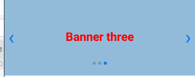
<Swiper showsButtons={true} autoplay={true}>
<View style={[styles.item, styles.item1]}>
<Text style={styles.text}>Banner one</Text>
</View>
<View style={[styles.item, styles.item2]}>
<Text style={styles.text}>Banner two</Text>
</View>
<View style={[styles.item, styles.item3]}>
<Text style={styles.text}>Banner three</Text>
</View>
</Swiper>
</View>
);
}
}
const styles = StyleSheet.create({
wrapper: {
marginTop: 24
},
item: {
flex: 1,
justifyContent: 'center',
alignItems: 'center',
},
item1: {
backgroundColor: '#9DD6EB',
},
item2: {
backgroundColor: '#97CAE5',
},
item3: {
backgroundColor: '#92BBD9',
},
text: {
color: 'red',
fontSize: 30,
fontWeight: 'bold',
}
});
react-navigation(更)
在 web 浏览器中, 你可以使用 (
<a>) 标签作为锚点,链接到不同的页面。 当用户单击某个链接时, 该 URL 就会被推送到浏览器历史记录堆栈。 当用户点击返回按钮时, 浏览器会从历史堆栈顶部删除正在访问的页面, 因此当前页现在就成了以前访问过的页面。 React Native没有像Web浏览器那样的内置全局历史堆栈的想法 – 这就是 React Navigation 存在的意义
- 通常我们开发的App是由多个页面构成的,那么我们就需要一种或多种方式去管理这些页面,在Web开发中,比较常见的管理方式有:Tab栏单页嵌多内容,或者路由管理多页面切换。
- react-navigation便是实现这种需求的RN插件,同时它还是官方推荐使用的第三方导航插件,可实现单页多内容切换,也可以实现路由跳转。
- react-navigation提供了几种不同类型或者效果的导航组件,每个组件都由对应的工厂函数来创建,这些工厂函数在调用时通常都需要两个参数,第一个参数统一为路由配置对象,第二个参数则是一个个性化的配置对象,不同组件的配置项存在差异。
使用
# 安装两套包
yarn add react-navigation
yarn add react-native-gesture-handler