1.水平居中margin 0 auto;(浮动元素除外)
这个属性在网页制作的过程中是经常被用到的,一般情况下页面的版心你就可以看到它。
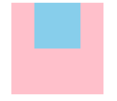
<style>
        .father {
            width: 400px;
            height: 400px;
            background-color: pink;
        }
        .son {
            width: 200px;
            height: 200px;
            background-color: skyblue;
            margin: 0 auto;
        }
    </style>
</head>
<body>
    <div class="father">
        <div class="son">

        </div>
    </div>
</body>
效果图:
2.position定位实现垂直居中(一);
position具有兼容性好的特点,在网页布局中建议能使用定位,最好不要选择浮动来布局。下面这个方法局限性在于宽高。
<style>
        .father {
            position: relative;
            width: 200px;
            height: 200px;
            margin: 0 auto; /* 父盒子居中 */
            background-color: pink;
        }
        .son {
            position: absolute;
            width: 100px;
            height: 100px;
            top: 50%;
            left: 50%;
            margin-top: -50px;
            margin-left: -50px;
            background: skyblue;
        }
    </style>
</head>
<body>
    <div class="father">
        <div class="son">

        </div>
    </div>
</body>
3.position定位实现垂直居中(二);
这个方法不用受到宽高的限制,非常好用,我布局的时候经常用到它
    <style>
        .father {
            position: relative;
            width: 200px;
            height: 200px;
            margin: 0 auto; /* 父盒子居中 */
            background-color: pink;
        }
        .son {
            position: absolute;
            width: 100px;
            height: 100px;
            top: 0;
            left: 0;
            right: 0;
            bottom: 0;
            margin: auto;
            background: skyblue;
        }
    </style>
</head>
<body>
    <div class="father">
        <div class="son">

        </div>
    </div>
</body>
4.position定位实现垂直居中(三);
在这之前我还不会使用这个方法 ,我是看别人的博客学习到的,在这里感谢他了。
<style>
        .father {
            position: relative;
            width: 200px;
            height: 200px;
            margin: 0 auto; /* 父盒子居中 */
            background-color: pink;
        }
        .son {
            position: absolute;
            width: 100px;
            height: 100px;
            top: 50%;
            left: 50%;
            transform: translate(-50%,-50%);
            background: skyblue;
        }
    </style>
</head>
<body>
    <div class="father">
        <div class="son">

        </div>
    </div>
</body>
效果图都是一样的,在这里我就上传一张了啦 。有的朋友可能会问:‘你把盒子里的内容换成图片,内容就不一样了鸭‘。开始我是打算把里面的内容换成图片的,原谅我偷懒了。

5.CSS3新特性居中:
<style>
        .father {
            display: flex;
            justify-content: center;
            align-items: center;
            width: 200px;
            height: 200px;
            margin: 0 auto; /*父盒子居中 */
            background-color: pink;
        }
        .son {
            width: 100px;
            height: 100px;

            background: skyblue;
        }
    </style>
</head>
<body>
    <div class="father">
        <div class="son">

        </div>
    </div>
</body>
小结:我这里分享的是一些比较常用的CSS居中方式,没有说到的可以到评论区留言 谢谢大家。