添加箭头
.tooltip .tooltiptext::after {
    content: "";
    position: absolute;
    bottom: 100%;
    left: 50%;
    margin-left: -5px;
    border-width: 5px;
    border-style: solid;
    border-color: transparent transparent black transparent;
}
*1 底部提示框/顶部箭头
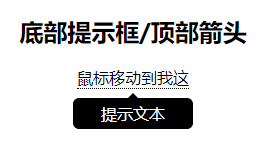
<div class="tooltip">鼠标移动到我这
  <span class="tooltiptext">提示文本</span>
</div>
<style>
.tooltip {
    position: relative;
    display: inline-block;
    border-bottom: 1px dotted black;
}

.tooltip .tooltiptext {
    visibility: hidden;
    width: 120px;
    background-color: black;
    color: #fff;
    text-align: center;
    border-radius: 6px;
    padding: 5px 0;
    position: absolute;
    z-index: 1;
    top: 150%;
    left: 50%;
    margin-left: -60px;
}

.tooltip .tooltiptext::after {
    content: "";
    position: absolute;
    bottom: 100%;
    left: 50%;
    margin-left: -5px;
    border-width: 5px;
    border-style: solid;
    border-color: transparent transparent black transparent;
}

.tooltip:hover .tooltiptext {
    visibility: visible;
}
</style>
2 顶部提示框,底部箭头
<style>
.tooltip {
	position: relative;
	display: inline-block;
	/*border-bottom: 1px dotted black;*/
}

.tooltip .tooltiptext {
	visibility: hidden;
	width: 120px;
	background-color: black;
	color: #fff;
	text-align: center;
	border-radius: 6px;
	padding: 5px 0;
	position: absolute;
	z-index: 1;
	top: -150%;
	left: 50%;
	margin-left: -60px;
}

.tooltip .tooltiptext::after {
	content: " ";
	position: absolute;
	top: 100%; /* 提示工具底部 */
	left: 50%;
	margin-left: -5px;
	border-width: 5px;
	border-style: solid;
	border-color: black transparent transparent transparent;
}

.tooltip:hover .tooltiptext {
	visibility: visible;
}
</style>
3 右侧提示框/左侧箭头

.tooltip {
    position: relative;
    display: inline-block;
    border-bottom: 1px dotted black;
}

.tooltip .tooltiptext {
    visibility: hidden;
    width: 120px;
    background-color: black;
    color: #fff;
    text-align: center;
    border-radius: 6px;
    padding: 5px 0;
    position: absolute;
    z-index: 1;
    top: -5px;
    left: 110%;
}

.tooltip .tooltiptext::after {
    content: "";
    position: absolute;
    top: 50%;
    right: 100%;
    margin-top: -5px;
    border-width: 5px;
    border-style: solid;
    border-color: transparent black transparent transparent;
}
.tooltip:hover .tooltiptext {
    visibility: visible;
}
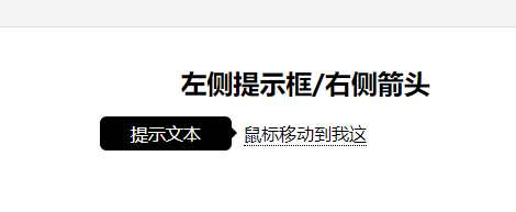
4 左侧提示框/右侧箭头
<style>
.tooltip {
    position: relative;
    display: inline-block;
    border-bottom: 1px dotted black;
}

.tooltip .tooltiptext {
    visibility: hidden;
    width: 120px;
    background-color: black;
    color: #fff;
    text-align: center;
    border-radius: 6px;
    padding: 5px 0;
    position: absolute;
    z-index: 1;
    top: -5px;
    right: 110%;
}

.tooltip .tooltiptext::after {
    content: "";
    position: absolute;
    top: 50%;
    left: 100%;
    margin-top: -5px;
    border-width: 5px;
    border-style: solid;
    border-color: transparent transparent transparent black;
}
.tooltip:hover .tooltiptext {
    visibility: visible;
}
</style>