1. CSS的继承性:字体、字号、颜色、行距等字体、文本属性可以在body中统一设置,然后通过继承影响文本中的文本,而边框、外边距、内边距、背景、定位、元素高等容器属性不可继承。
CSS样式的3大特性:层叠性、继承性、优先性(特殊性)
CSS的3种定位机制:标准流(普通流)、浮动、定位
2. 外边距实现普通盒子(不是绝对定位,见19)水平居中 .header{ width:960px; margin:0 auto; }
前提:
a) 块级元素,不是行内元素(比如span标签为行内元素)
b) 盒子要指定宽度
3. 设置line-height等于height,使行内元素垂直居中
<style>
nav{
height: 41px;
background-color: #FCFCFC;
border-top: 3px solid #FF8500;
border-bottom: 1px solid #EDEEF0;
}
nav a{
font-size: 14px;
color: #4C4C4C;
text-decoration: none;/*去a标签的下划线*/
padding: 0 15px;/*使各个a标签保持一定水平间隔*/
display: inline-box;/*a链接是行内元素没有大小,设为行内块元素才有大小*/
height: 41px;
line-height: 41px;/*使行内元素垂直居中*/
}
nav a:hover{
background-color: #eee;
}
</style>
<html>
<nav>
<a href="#">首页</a>
<a href="#">手机新浪网</a>
<a href="#">网站导航</a>
<a href="#">设置</a>
</nav>
</html>
4. 清除元素的默认内外边距,css初始化
*{
padding:0;
margin:0;
}
注:行内元素只有左右外边距(margin-left, margin-right),没有上下外边距(margin-top, margin-bottom)
5. 外边距的合并(外边距的坍塌)
a)上下相邻块元素垂直外边距的合并:上面元素的margin-bottom遇到下面元素的margin-top,以最大的外边距为上下元素的间距。
解决方法:避免。
b) 嵌套块元素垂直外边距的合并: 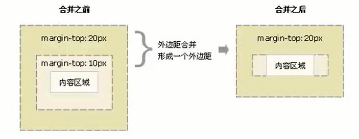
解决方法:
<style>
.father{
height: 300px;
width: 300px;
background-color: pink;
margin-top: 100px;
/*法一:为父元素定义边框*/
/*border: 1px solid red; */
/*法二:为父元素定义内边距*/
/*padding: 1px; */
/*法三:BFC */
/*overflow: hidden; */
}
.son{
height: 200px;
width: 200px;
background-color: purple;
margin-top: 30px;
}
</style>
<body>
<div class="father">
<div class="son"></div>
</div>
</body>
6. 计算盒子尺寸
注:宽度和高度属性只适用于块元素,行内元素无效(img、input标签除外);
块元素没有指定宽高或者继承父元素的宽高时,padding不影响盒子大小。
box-sizing: content-box;
外盒尺寸(元素空间大小)= content height/width + padding +border +margin
内盒尺寸(元素大小)= content height/width + padding +border
box-sizing: border-box;
盒子大小就是width/height, padding和border不撑开盒子大小。
<html>
<head>
<style>
div{
width: 74px;
height:33px;
line-height: 33px;/*使块内元素垂直居中*/
border: 1px solid #C1C1C1;
margin: 200px;
font-size: 16px;
color: #666;
border-radius: 5px 0 0 5px;
}
</style>
</head>
<body>
<div >新闻</div>
</body>
</html>
7. 盒子模型布局稳定性优先级:width>padding>margin
8. 阴影
文字阴影:
<style>
h1{
font-size: 100px;
/* text-shadow:水平距离 垂直距离 模糊 阴影颜色*/
text-shadow:3px 3px 3px rgba( 0, 0, 0, 0.3);
}
</style>
盒子阴影:
<style>
div{
width: 74px;
height:33px;
border: 1px
/* box-shadow:水平位置 垂直位置 模糊距离 阴影尺寸 阴影颜色 内/外阴影(默认外阴影,需要内阴影再设inset)*/
box-shadow:5px 5px 3px 4px rgba( 0, 0, 0, 0.4);
/* box-shadow:0 15px 30px rgba( 0, 0, 0, 0.4); */
}
</style>
9. 背景图片
background: 背景颜色 图片地址 平铺 附着/滚动 背景水平位置 背景垂直位置
background: rgba(255, 255, 255, 0.5) url(image.jpg) repeat-y/un-repeat fixed/scroll center 100px;
10. 粗体
fontweight: bold/normal;
11. display: inline-block;可以转为行内块元素,有宽度高度,但块之间有空隙,不方便处理,因此需要float浮动。
关于float(使多个块元素一行显示):
a)浮动首先需要设置标准流的包含块(标准流的父级元素),浮动元素总是寻找最近的父级元素对齐,但不超过内边距padding。
b)浮动元素排列位置与上一个块级元素有关,若上一个元素为浮动,则与上一个元素顶部对齐;若上一个元素为标准流,则与上一个元素底部对齐。
因此,如果一个盒子里有多个子盒子,若某个子级为浮动,其他子级都应设为浮动,才能在一行内对齐显示。
c)元素添加浮动后,具有行内块元素的特性,大小取决于定义的大小或者默认的内容多少。
12. 居中对齐
文字:text-align: center;
盒子(固定宽度):margin: 0, auto;
13. 两列左窄右宽型布局
<html>
<head>
<style>
*{
padding:0;
margin:0;
}
.top,.banner,.main,.footer{
width: 960px;
margin: 0 auto;
text-align: center;/*虚线*/
border: 1px dashed #ccc;
background-color: #eee;
margin-bottom: 8px;
}
.top{
height:80px;
}
.banner{
height:150px;
}
.main{
height:500px;
}
.left{
width: 360px;
height:500px;/*高度不继承父元素,需要另设*/
float: left;
margin-right: 8px;
}
.right{
width: 592px; /* 600-8=592 */
height:500px;/*高度不继承父元素,需要另设*/
float: left;
}
.foot{
height:120px;
}
</style>
</head>
<body>
<div class="top"></div>
<div class="banner"></div>
<div class="left"></div>
<div class="right"></div>
<div class="main"></div>
<div class="footer"></div>
</body>
</html>
14. 通栏平均分布型布局
<html>
<head>
<style>
*{
padding:0;
margin:0;
}
ul {
list-style:none;
}
.top{
height:80px;
text-align: center;
border: 1px dashed #aaa;
background-color: #eee;
}
.banner{
height:150px;
width: 960px;
margin: 10px auto;
border: 1px dashed #aaa; /*虚线*/
background-color: #eee;
}
.small{
height:100px;
width: 960px;
margin: 0 auto;
margin-bottom: 10px;
/*background-color: pink;*/
/*设置颜色便于调试*/
}
.small ul li{
width: 230px;
height:100px;
border: 1px dashed #aaa;
background-color: #eee;
float: left;
margin-left: 10px;
}
/* 用.small增加.nomargin的权重 */
.small .nomargin{
margin-left: 10px;
}
.foot{
height:120px;
margin-left: 10px;
border: 1px dashed #aaa;
background-color: #eee;
}
</style>
</head>
<body>
<div class="top"></div>
<div class="banner"></div>
<div class="small">
<ul>
<li class="nomargin">1</li>
<li>2</li>
<li>3</li>
<li>4</li>
</ul>
</div>
<div class="small">
<ul>
<li class="nomargin">1</li>
<li>2</li>
<li>3</li>
<li>4</li>
</ul>
</div>
<div class="small">
<ul>
<li class="nomargin">1</li>
<li>2</li>
<li>3</li>
<li>4</li>
</ul>
</div>
<div class="small">
<ul>
<li class="nomargin">1</li>
<li>2</li>
<li>3</li>
<li>4</li>
</ul>
</div>
<div class="footer"></div>
</body>
</html>
15. 去掉无序列表前的小点标记
<style>
ul {
list-style:none;
}
</style>
16. 清除浮动(闭合浮动):解决父级元素因为子级元素浮动引起的高度为0的问题。
a) 额外标签法: 在浮动元素末尾添加空标签,例如<div style="clear:both"></div>,或者其他标签br。
b) 在父元素样式里添加 overflow: hidden | auto | scroll; (触发BFC)
缺点:内容增多溢出时会被隐藏
c)after伪元素清除浮动
.clearfix:after{
content:"."; /* 伪元素里必有content属性,尽量不要为空,否则旧版浏览器有空隙,会生成空格 */
dispaly: block;
height: 0;
visibility: hidden;
clear: both;
}
.clearfix{ /* ie6和ie7不支持after的处理方式 */
*zoom: 1;
/* 带星号的属性只有ie6和ie7能识别,zoom是ie6和ie7清除浮动的方法 */
}
d)双伪元素(推荐)
.clearfix:before, .clearfix:after{
content:"."; /* 伪元素里必有content属性,尽量不要为空,否则旧版浏览器有空隙,会生成空格 */
dispaly: table;
}
.clearfix:after{
clear: both;
}
.clearfix{ /* ie6和ie7不支持after的处理方式 */
*zoom; 1;
/* 带星号的属性只有ie6和ie7能识别,zoom是ie6和ie7清除浮动的方法 */
}
17. 定位属性:边偏移(top/bottom/left/right)+定位模式(static/relative/absolute/fixed)
a) static: 静态/自动/默认定位,标准流特性,边偏移无效
b) relative:相对定位,相对在标准流中位置定位,保留原来占有的位置,不脱离标准流
c)absolute:绝对定位,完全脱标,不占有位置,移动位置取决于父元素
- 若父元素没有定位,以浏览器、document文档为准对齐,且不占有原来位置
- 若父元素有定位(position:relative | absolute),以父元素为准对齐
常用的是,子元素为绝对定位(不占有位置,可以放到父亲盒子的任何位置),父元素为相对定位(需要占有位置)
<style>
div{
height:190px;
width: 310px;
margin: 50px auto;
border: 1px bordered #ccc;
padding: 10px;
position: relative;
}
.topIcon{
position: absolute;
top: 0;
left: 0;
}
.bottomIcon{
position: absolute;
bottom: 0;
right: 0;
}
</style>
<body>
<div >
<img src="#" class="topIcon">
<img src="#" class="">
<img src="#" class="bottomIcon">
</div>
</body>
d)fixed:
18. display: inline | block | inline-block
a) display:block
1. block元素会独占一行,多个block元素会各自新起一行。默认情况下,block元素宽度自动填满其父元素宽度。
2. block元素可以设置width,height属性。块级元素即使设置了宽度,仍然是独占一行。
3. block元素可以设置margin和padding属性。
b) display:inline
1. inline元素不会独占一行,多个相邻的行内元素会排列在同一行里,直到一行排列不下,才会新换一行,其宽度随元素的内容而变化。
2. inline元素设置width,height属性无效。
3. inline元素的margin和padding属性,水平方向的padding-left, padding-right, margin-left, margin-right都产生边距效果;但竖直方向的padding-top, padding-bottom, margin-top, margin-bottom不会产生边距效果。
c) display:inline-block
1. 简单来说就是将对象呈现为inline对象,但是对象的内容作为block对象呈现。之后的内联对象会被排列在同一行内。比如我们可以给一个link(a元素)inline-block属性值,使其既具有block的宽度高度特性又具有inline的同行特性。
19. 绝对定位的盒子水平、垂直居中
1)left:50%父盒子的宽度
2)自身外边距负的一半的自身宽度
<style>
.father{
height: 800px;
width: 400px;
background-color: pink;
margin: 40px auto;
position: relative;
}
.son{
height: 100px;
width: 40px;
background-color: purple;
margin-top: 30px;
position: absolute;
left:50%; /*left父盒子宽度的一半,50%是相对父元素来算*/
margin-left: -50px; /*左走自己宽度的一半*/
top:50%;
margin-top: -50px;
}
</style>
<body>
<div class="father">
<div class="son"></div>
</div>
</body>
20. 定位模式的转换
元素添加绝对定位、固定定位、浮动后,元素模式都会自动转为行内块元素。比如行内元素(例如span、a)添加了绝对定位或者固定定位,可以不用转换模式(display:inline-block | block),直接给宽度和高度。
浮动盒子(比如float: left;)没给宽度时,宽度为内容宽度。
21. 叠放次序(z-index):调整重叠定位元素的叠放次序,默认为0,值越大,定位元素叠放越居上,不加单位(font-weight也不加单位)。只有相对定位、绝对定位、固定定位有此属性,标准流、浮动、静态定位没有此属性。
22. 元素的显示与隐藏
CSS的三个显示和隐藏的单词:display visibility 和 overflow,主要目的是让一个元素在页面中消失,但是不在文档源码中删除, 最常见的是网站广告,当我们点击类似关闭不见了,但是我们重新刷新页面,它们又会出现。
a) display 显示
display 设置或检索对象是否及如何显示。
display : none 隐藏对象 与它相反的是 display:block 除了转换为块级元素之外,同时还有显示元素的意思。
特点: 隐藏之后,不再保留位置。
b) visibility 可见性
设置或检索是否显示对象。
visible : 对象可视
hidden : 对象隐藏
特点: 隐藏之后,继续保留原有位置。
c) overflow 溢出
检索或设置当对象的内容超过其指定高度及宽度时如何管理内容。
visible : 不剪切内容也不添加滚动条。
auto : 超出自动显示滚动条,不超出不显示滚动条
hidden : 不显示超过对象尺寸的内容,超出的部分隐藏掉
scroll : 不管超出内容否,总是显示滚动条
以下是CSS高级技巧:
23. cursor : default 小白 | pointer 小手 | move 移动 | text 文本
<ul>
<li style="cursor:default">我是小白</li>
<li style="cursor:pointer">我是小手</li>
<li style="cursor:move">我是移动</li>
<li style="cursor:text">我是文本</li>
</ul>
24. 轮廓 outline
是绘制于元素周围的一条线,位于边框边缘的外围,可起到突出元素的作用。
~~~css
outline : outline-color ||outline-style || outline-width
~~~
但是我们都不关心可以设置多少,我们平时都是去掉的。
最直接的写法是 : outline: 0;
```html
<input type="text" style="outline: 0;"/>
```
### 防止拖拽文本域resize
resize:none 这个单词可以防止 火狐 谷歌等浏览器随意的拖动 文本域。
右下角可以拖拽:
<textarea></textarea>
右下角不可以拖拽:
```html
<textarea style="resize: none;"></textarea>
```