前面已经讲解了一些常用的布局方式、常用 Widget 组件以及 Dart 语法。那么这节博客我们就来一个小总结,通过一个实例小页面来复习巩固我们之前学过的知识,理论结合实践。本课练习篇主要是完成两个完整的页面的编写,将会涉及到前面学习过的布局 Widget 和组件 Widget ,一起来学习吧,很简单!
以下的例子会涉及到: Scaffold、Container、Expand、Column、Row、AppBar、Text、Image、AlertDialog、Icon、RaisedButton、Form、TextFormField 等 Widget。
1.仿写 Instagram 列表页
效果图如下:
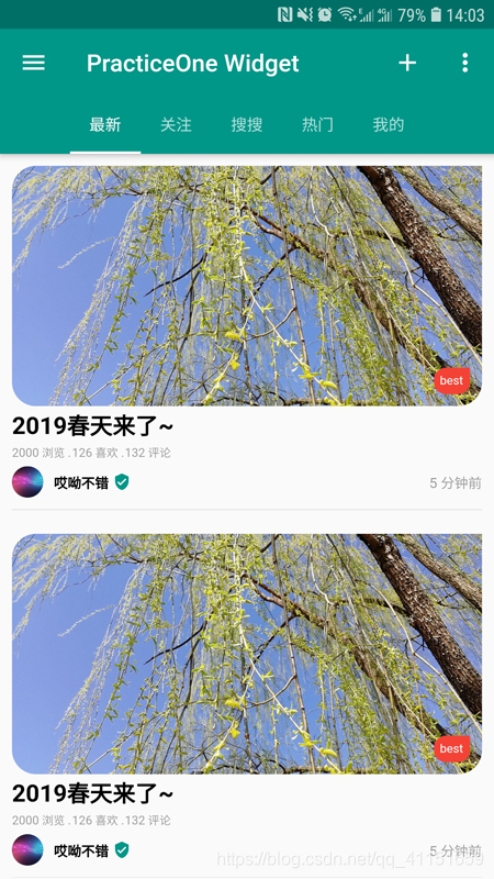
首先看下第一个例子页面,仿写一个 Instagram 列表页,我们主要是进行 Item 页面的绘制和顶部 Tab 页的效果绘制。我们这里可以使用 Scaffold 构建页面布局框架,然后使用 TabBar 实现顶部的 Tab 页效果。TabBar 的切换页面的 body 显示部分,使用 TabBarView 实现。
Item 的布局结构部分,我们通过效果图可以看出,外层可以使用Column纵向线性布局 Widget,图片圆角部分处理美化,使用 ClipRRect 和 BoxDecoration 进行圆角处理。
具体实现代码如下:
// 仿照Instagram列表页
import 'package:flutter/material.dart';
import 'package:flutter_samples/samples/practice_one_login.dart';

class PracticeOneSamples extends StatefulWidget {
  @override
  State<StatefulWidget> createState() {
    return PracticeOneSamplesState();
  }
}

class PracticeOneSamplesState extends State<PracticeOneSamples>
    with SingleTickerProviderStateMixin {
  TabController _tabController;
  String imageUrl =
      'https://gss0.bdstatic.com/94o3dSag_xI4khGkpoWK1HF6hhy/baike/c0%3Dbaike272%2C5%2C5%2C272%2C90/sign=eaad8629b0096b63951456026d5aec21/342ac65c103853431b19c6279d13b07ecb8088e6.jpg';
  @override
  void initState() {
    super.initState();
    _tabController = TabController(initialIndex: 0, length: 5, vsync: this);
  }

  @override
  Widget build(BuildContext context) {
    // 用Scaffold构建页面布局框架
    return Scaffold(
      // AppBar构建页面标题栏
      appBar: AppBar(
        title: Text('PracticeOne Widget'),
        primary: true,
        leading: IconButton(
          icon: const Icon(Icons.menu),
          onPressed: () {
            Scaffold.of(context).openDrawer();
          },
        ),
        // 点击跳转页面
        actions: <Widget>[
          IconButton(
              icon: Icon(Icons.add),
              onPressed: () {
                gotoPage();
              }),
          PopupMenuButton(
            itemBuilder: (BuildContext context) => <PopupMenuItem<String>>[
                  PopupMenuItem<String>(
                    child: Text("热度"),
                    value: "hot",
                  ),
                  PopupMenuItem<String>(
                    child: Text("最新"),
                    value: "new",
                  ),
                ],
            onSelected: (String action) {
              switch (action) {
                case "hot":
                  print("hot");
                  break;
                case "new":
                  print("new");
                  break;
              }
            },
            onCanceled: () {
              print("onCanceled");
            },
          )
        ],
        // 加入TabBar功能
        bottom: TabBar(
          controller: _tabController,
          isScrollable: true,
          tabs: <Widget>[
            Tab(
              text: "最新",
            ),
            Tab(
              text: "关注",
            ),
            Tab(
              text: "搜搜",
            ),
            Tab(
              text: "热门",
            ),
            Tab(
              text: "我的",
            ),
          ],
        ),
      ),
      // 主体内容布局
      body: TabBarView(
        controller: _tabController,
        children: <Widget>[
          Center(
            child: Column(
              children: <Widget>[
                getTabOne(),
                getTabOne(),
              ],
            ),
          ),
          Center(
            child: Text("data2"),
          ),
          Center(
            child: Text("data3"),
          ),
          Center(
            child: Text("data4"),
          ),
          Center(
            child: Text("data5"),
          ),
        ],
      ),
    );
  }

  // 主体内容布局
  Widget getTabOne() {
    return Padding(
      // 四周加入内容页内边距
      padding: EdgeInsets.only(top: 10,left: 10,right: 10,),
      // 使用Column纵向线性布局
      child: Column(
        children: <Widget>[
          // 对图片进行个性化圆角美化处理
          ClipRRect(
            // 使用Stack层叠布局实现右下角红色Tag标签角标
            child: Stack(
              alignment: Alignment.bottomRight,
              children: <Widget>[
                Image.network(
                  imageUrl,
                  fit: BoxFit.fitWidth,
                  width: MediaQuery.of(context).size.width,
                  height: 200,
                ),
                // 右下角红色Tag标签角标
                Container(
                  padding: EdgeInsets.all(5),
                  decoration: BoxDecoration(
                    color: Colors.red,
                    shape: BoxShape.rectangle,
                    borderRadius: BorderRadius.only(
                        topLeft: Radius.circular(10),
                        bottomLeft: Radius.circular(10),
                        bottomRight: Radius.circular(10)),
                  ),
                  margin: EdgeInsets.all(10),
                  child: Text(
                    'best',
                    style: TextStyle(color: Colors.white, fontSize: 10),
                  ),
                )
              ],
            ),
            // 个性化圆角处理
            borderRadius: BorderRadius.only(
              topLeft: Radius.circular(20),
              bottomLeft: Radius.circular(20),
              bottomRight: Radius.circular(20),
            ),
          ),
          // 标题设置,居左居中
          Container(
            alignment: Alignment.centerLeft,
            child: Text(
              '2019春天来了~',
              style: TextStyle(
                  color: Colors.black,
                  fontWeight: FontWeight.bold,
                  fontSize: 20),
            ),
          ),
          // 用Row横向线性布局来实现数据展示
          Row(
            children: <Widget>[
              Text(
                '2000 浏览 .',
                style: TextStyle(color: Colors.grey, fontSize: 10),
              ),
              Text(
                '126 喜欢 .',
                style: TextStyle(color: Colors.grey, fontSize: 10),
              ),
              Text(
                '132 评论',
                style: TextStyle(color: Colors.grey, fontSize: 10),
              ),
            ],
          ),
          // 设置间隔
          SizedBox(
            height: 5,
          ),
          Row(
            children: <Widget>[
              // 圆形头像
              Container(
                width: 26,
                height: 26,
                child: CircleAvatar(
                  backgroundImage: AssetImage("assets/assets_image.png"),
                  radius: 50.0,
                ),
              ),
              // 昵称
              Text(
                '   哎呦不错 ',
                style: TextStyle(
                    color: Colors.black,
                    fontWeight: FontWeight.bold,
                    fontSize: 12),
              ),
              // 认证图标Icon
              Icon(
                Icons.verified_user,
                size: 15,
                color: Colors.teal,
              ),
              // 用Expanded来实现发表时间居右显示,宽度占用横向剩余空间
              Expanded(
                child: Container(
                  alignment: Alignment.centerRight,
                  child: Text(
                    ' 5 分钟前',
                    style: TextStyle(color: Colors.grey, fontSize: 12),
                  ),
                ),
              ),
            ],
          ),
          // 分隔线
          Container(
            margin: EdgeInsets.only(top: 10, bottom: 10),
            width: MediaQuery.of(context).size.width,
            height: 0.2,
            color: Colors.grey,
          )
        ],
      ),
    );
  }
  // 页面跳转,跳转到登录页
  void gotoPage() {
    Navigator.push(context, MaterialPageRoute(builder: (context) {
      return PracticeOneLoginSamples();
    }));
  }
}
2.仿写登录页
效果图如下:

登录页面主要由这几个元素构成:标题栏、用户名输入框、密码输入框、登录按钮等。 依然使用Scaffold来构建页面布局框架,由于是有多个输入框,为了方便这里外层用Form来包裹输入框相关Widget,用户名和密码输入框使用TextFormField Widget。然后设置好输入框相关的属性配置即可,使用RaisedButton来实现登录按钮。当我们点击RaisedButton登录时候,通过Form表单来获取输入的用户名和密码信息进行显示。
很简单,接下来看下登录页例子实例代码:
// 仿写登录页面

import 'package:flutter/material.dart';

class PracticeOneLoginSamples extends StatefulWidget {
  @override
  State<StatefulWidget> createState() {
    return PracticeOneLoginSamplesState();
  }
}

class PracticeOneLoginSamplesState extends State<PracticeOneLoginSamples> {
  // 用于Form表单的状态管理控制
  GlobalKey<FormState> _formKey = new GlobalKey<FormState>();
  FormState _formState;
  String _name;
  String _password;

  @override
  void initState() {
    super.initState();
  }

  @override
  Widget build(BuildContext context) {
    // 使用Scaffold来构建页面布局框架
    return Scaffold(
      // AppBar设置页面标题栏
      appBar: AppBar(
          title: Text('PracticeOne Login Samples'),
          backgroundColor: Colors.teal,
          primary: true),
      // 主体内容,设置了页面内边距,当然后面可以用SafeArea
      body: Padding(
        padding: EdgeInsets.only(left: 20, right: 20, top: 60),
        // 用Form表单来管理组件
        child: Form(
          key: _formKey,
          child: Column(
            children: <Widget>[
              // 用户名输入框相关
              Container(
                // 用户名输入框底部分隔横线
                decoration: BoxDecoration(
                  border: Border(
                      bottom: BorderSide(color: Colors.grey, width: 0.2)),
                ),
                // 用户名输入框
                child: TextFormField(
                  maxLines: 1,
                  keyboardType: TextInputType.emailAddress,
                  style: TextStyle(fontSize: 18),
                  // 光标颜色
                  cursorColor: Colors.grey,
                  // 保存
                  onSaved: (String value) {
                    _name = value;
                  },
                  // 验证
                  validator: (String value) {
                    return value.contains('@') ? null : '要使用邮箱格式';
                  },
                  // 装饰输入框相关属性配置
                  decoration: InputDecoration(
                      hintText: '请输入邮箱帐号...',
                      labelText: '用户名',
                      // 无边框
                      border: InputBorder.none,
                      // 前缀图标
                      prefixIcon: Icon(Icons.person)),
                ),
              ),
              // 设置间隔
              SizedBox(
                height: 20,
              ),
              // 密码输入框相关配置
              Container(
                decoration: BoxDecoration(
                  border: Border(
                      bottom: BorderSide(color: Colors.grey, width: 0.2)),
                ),
                child: TextFormField(
                  obscureText: true,
                  cursorColor: Colors.grey,
                  maxLines: 1,
                  onSaved: (value) {
                    _password = value;
                  },
                  onFieldSubmitted: (value) {},
                  keyboardType: TextInputType.numberWithOptions(),
                  style: TextStyle(fontSize: 18),
                  // 装饰输入框相关属性配置
                  decoration: InputDecoration(
                      hintText: '请输入密码...',
                      labelText: '密码',
                      border: InputBorder.none,
                      // 前缀图标
                      prefixIcon: Icon(Icons.lock)),
                ),
              ),
              // 设置间隔
              SizedBox(
                height: 30,
              ),
              // 登录按钮
              Container(
                width: MediaQuery.of(context).size.width,
                // 使用RaisedButton
                child: RaisedButton(
                  padding: EdgeInsets.all(13),
                  // 圆角配置
                  shape: RoundedRectangleBorder(
                      borderRadius: BorderRadius.all(Radius.circular(6))),
                  color: Colors.teal[500],
                  child: Text(
                    "登录",
                    style: TextStyle(
                      color: Colors.white,
                      fontSize: 18,
                    ),
                  ),
                  // 登录按钮点击事件
                  onPressed: () {
                    showLogin(context);
                  },
                ),
              )
            ],
          ),
        ),
      ),
    );
  }

  // 登录按钮点击执行的方法
  Future<void> showLogin(BuildContext context) async {
    final _formState = _formKey.currentState;
    // Form表单验证通过
    if (_formState.validate()) {
      // 调用save方法回调获取输入框内值
      _formState.save();
      // 弹出对话框AlerDialog
      return showDialog<void>(
          context: context,
          // 点击周围空白区域对话框是否消失
          barrierDismissible: false,
          builder: (BuildContext context) {
            // 弹出对话框AlerDialog
            return AlertDialog(
              title: Text("提示"),
              content: new Text("用户名:'$_name' \n 密码:'$_password'"),
              actions: <Widget>[
                new FlatButton(
                    onPressed: () => Navigator.of(context).pop(false),
                    child: new Text("取消")),
                new FlatButton(
                    onPressed: () {
                      Navigator.of(context).pop(true);
                    },
                    child: new Text("确定"))
              ],
            );
          });
    }
  }
}
3.总结
这样就实现了两个简单的页面,涵盖了我们前面所学习的Widget。相信通过这样一个综合小实例,大家可以对Flutter的页面绘制、应用开发有了一个更深入的了解。
也可以在这个Flutter案例网站进行学习和查看: https://itsallwidgets.com/
