前面讲解了 Flutter 的几个基础组件,这节课将讲解跟布局相关的 Widget。
每个平台的应用都有其自己的布局方式,例如 Android 有线性布局、相对布局、绝对布局、帧布局、表格布局等等,HTML 前端也有自己的布局方式。Flutter 当然也不例外。那么这节课就带领大家对 Flutter 的基础布局 Widget 中的几个典型的布局Widget进行详细分析,并结合案例进行详细的用法讲解。
1.基本布局
1.1 Scaffold
Flutter 布局系列的 Widget 一般分为两种,一种是只有单个子元素的布局 Widget,也就是SingleChildRenderObjectWidget;另一个种是具有多个子元素的布局 Widget,一般都有 children 参数,继承自MultiChildRenderObjectWidget。非布局系列 Widget 也有无子元素的 Widget,如 Text、Image 组件,这些无子元素的 Widget 属于 LeafRenderObjectWidget。Flutter 中不同的布局 Widget 对子 Widget 的排列渲染方式不同。接下来我们看下其中比较常用的一个布局 Widget——Scaffold。
Scaffold 是一个页面布局脚手架,实现了基本的 Material 布局,继承自 StatefulWidget,是有状态组件。我们知道大部分的应用页面都是含有标题栏,主体内容,底部导航菜单或者侧滑抽屉菜单等等构成,那么每次都重复写这些内容会大大降低开发效率,所以 Flutter 提供了 Material 风格的 Scaffold 页面布局脚手架,可以很快地搭建出这些元素部分:
Scaffold 有下面几个主要属性。
- appBar:显示在界面上的一个标题栏 AppBar。
- body: 当前页面的主体内容 Widget。
- floatingActionButton:页面的主要功能按钮,不配置就不会显示。
- persistentFooterButtons:固定显示在下方的按钮,比如对话框下方的确定、取消按钮。
- drawer:侧滑抽屉菜单控件。
- backgroundColor:body 内容的背景颜色。
- bottomNavigationBar:显示在页面底部的导航栏。
- resizeToAvoidBottomPadding:类似于 Android 中的 android:windowSoftInputMode=‘adjustResize’,避免类似弹出键盘这种操作遮挡布局使用的。
- bottomSheet:底部拉出菜单。
具体可配置的属性参数,我们看下看下 Scaffold 构造方法:
const Scaffold({
    Key key,
    // 标题栏
    this.appBar,
    // 中间主体内容部分
    this.body,
    // 悬浮按钮
    this.floatingActionButton,
    // 悬浮按钮位置
    this.floatingActionButtonLocation,
    // 悬浮按钮动画
    this.floatingActionButtonAnimator,
    // 固定在下方显示的按钮
    this.persistentFooterButtons,
    // 侧滑抽屉菜单
    this.drawer,
    this.endDrawer,
    // 底部菜单
    this.bottomNavigationBar,
    // 底部拉出菜单
    this.bottomSheet,
    // 背景色
    this.backgroundColor,
    this.resizeToAvoidBottomPadding,
    // 重新计算body布局空间大小,避免被遮挡
    this.resizeToAvoidBottomInset,
    // 是否显示到底部,默认为true将显示到顶部状态栏
    this.primary = true,
    this.drawerDragStartBehavior = DragStartBehavior.down,
  })
如果想显示 Snackbar 或 bottomSheet,可以这样调用:
Scaffold.of(context).showSnackBar(new SnackBar(
      content: Text('Hello!'),
    ));
Scaffold.of(context).showBottomSheet…
接下来看个实例的代码:
import 'package:flutter/material.dart';
import 'package:flutter/widgets.dart';

class ScaffoldSamples extends StatefulWidget {
  @override
  State<StatefulWidget> createState() {
    return ScaffoldSamplesState();
  }
}

class ScaffoldSamplesState extends State<ScaffoldSamples> {
  int _selectedIndex = 0;

  @override
  void initState() {
    super.initState();
  }

  @override
  Widget build(BuildContext context) {
    return scaffoldWidget(context);
  }

  Widget scaffoldWidget(BuildContext context) {
    return Scaffold(
      appBar: AppBar(
        title: Text("标题栏"),
        actions: <Widget>[
          //导航栏右侧菜单
          IconButton(icon: Icon(Icons.share), onPressed: () {}),
        ],
      ),
      body: Text("Body内容部分"),
      //抽屉
      drawer: Drawer(
        child: DrawerHeader(
          child: Text("DrawerHeader"),
        ),
      ),
      // 底部导航
      bottomNavigationBar: BottomNavigationBar(
        items: <BottomNavigationBarItem>[
          BottomNavigationBarItem(icon: Icon(Icons.home), title: Text('Home')),
          BottomNavigationBarItem(
              icon: Icon(Icons.category), title: Text('Cagergory')),
          BottomNavigationBarItem(
              icon: Icon(Icons.person), title: Text('Persion')),
        ],
        currentIndex: _selectedIndex,
        fixedColor: Colors.blue,
        onTap: _onItemTap,
      ),
      floatingActionButton: FloatingActionButton(
        child: Icon(Icons.add),
        onPressed: () {
          _onAdd();
        },
      ),
    );
  }

  void _onItemTap(int index) {
    setState(() {
      _selectedIndex = index;
    });
  }

  void _onAdd() {}
}
这个实例实现效果如前面两张图片所示效果。
1.2 Container
Container 是一个容器类布局 Widget,Container 可以说是多个小组件的一个组合容器,如可以设置 padding、margin、Align、Decoration、Matrix4 等等,可以说用起来很方便,很高效。
我们看下 Container 构造方法相关属性和作用:
Container({
    Key key,
    // 容器子Widget对齐方式
    this.alignment,
    // 容器内部padding
    this.padding,
    // 背景色
    Color color,
    // 背景装饰
    Decoration decoration,
    // 前景装饰
    this.foregroundDecoration,
    // 容器的宽度
    double width,
    // 容器的高度
    double height,
    // 容器大小的限制条件
    BoxConstraints constraints,
    // 容器外部margin
    this.margin,
    // 变换,如旋转
    this.transform,
    // 容器内子Widget
    this.child,
  })
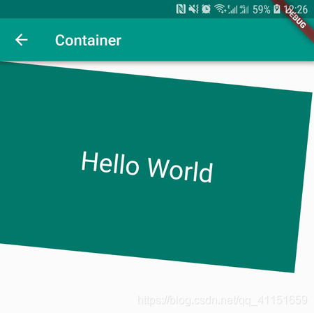
接下来看个实例的代码:
body: Container(
        constraints: BoxConstraints.expand(
          height: Theme.of(context).textTheme.display1.fontSize * 1.1 + 200.0,
        ),
        padding: const EdgeInsets.all(8.0),
        // 背景色
        color: Colors.teal.shade700,
        // 子Widget居中
        alignment: Alignment.center,
        // 子Widget元素
        child: Text('Hello World',
            style: Theme.of(context)
                .textTheme
                .display1
                .copyWith(color: Colors.white)),
        // 前景装饰
        foregroundDecoration: BoxDecoration(
          image: DecorationImage(
            image: NetworkImage('https://www.example.com/images/frame.png'),
            centerSlice: Rect.fromLTRB(270.0, 180.0, 1360.0, 730.0),
          ),
        ),
        // Container旋转
        transform: Matrix4.rotationZ(0.1),
      ),
运行效果如下图所示:
1.3 Center
Center 主要用于对齐,将内部子 Widget 与自身进行居中对齐,并根据子 Widget 的大小自动调整自身大小。
Center Widget 是继承自 Align,Align 继承自 SingleChildRenderObjectWidget,也是单子元素 Widget。
看下 Center 的构造方法:
 Center({
    Key key,
    // 宽度因子
    double widthFactor,
    // 高度因子
    double heightFactor,
    // 子元素
    Widget child
   })
大家可能对这个宽度和高度因子的作用不太明白,其实就是设置 Center 的宽度和高度是子元素宽度和高度的倍数的,widthFactor 和 heightFactor 可以不设置,默认 Center 容器宽度横向充满,高度包裹子元素。如将widthFactor 和 heightFactor 设置为 2.0 的话,则 Center 容器的占用宽度和高度是子元素宽度和高度的 2 倍,但是最大不超过屏幕的宽高。
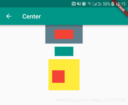
接下来看个实例演示用法:
body: Column(
        children: <Widget>[
          Container(
            color: Colors.blueGrey,
            child: Center(
              widthFactor: 2,
              heightFactor: 2,
              child: Container(
                width: 60,
                height: 30,
                color: Colors.red,
              ),
            ),
          ),
          SizedBox(
            height: 10,
          ),
          Center(
            child: Container(
              width: 60,
              height: 30,
              color: Colors.teal,
            ),
          ),
          SizedBox(
            height: 10,
          ),
          Center(
            child: Container(
              height: 100.0,
              width: 100.0,
              color: Colors.yellow,
              child: Align(
                // 设置对齐位置约束
                alignment: FractionalOffset(0.2, 0.6),
                child: Container(
                  height: 40.0,
                  width: 40.0,
                  color: Colors.red,
                ),
              ),
            ),
          ),
        ],
      ),
运行效果如下图所示:
2.线性布局
2.1 Row
Row 布局组件类似于 Android 中的 LinearLayout 线性布局,它用来做水平横向布局使用,里面的 children 子元素按照水平方向进行排列。
Row 的继承关系如下:
Row -> Flex -> MultiChildRenderObjectWidget -> RenderObjectWidget …
可以看出 Row 是 Flex 的拓展子类,也是多子元素的一个组件之一(内部可以包含多个子元素)。
我们看下 Row 布局组件的大致效果图:
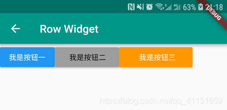
所有元素水平排成一行。
那么接下来我们看下 Row 的构造方法:
Row({
    Key key,
    // 主轴方向上的对齐方式(Row的主轴是横向轴)
    MainAxisAlignment mainAxisAlignment = MainAxisAlignment.start,
    // 在主轴方向(Row的主轴是横向轴)占有空间的值,默认是max
    MainAxisSize mainAxisSize = MainAxisSize.max,
    // 在交叉轴方向(Row是纵向轴)的对齐方式,Row的高度等于子元素中最高的子元素高度
    CrossAxisAlignment crossAxisAlignment = CrossAxisAlignment.center,
    // 水平方向子元素的排列方向:从左到右排列还是反向
    TextDirection textDirection,
    // 表示纵轴(垂直)的对齐排列方向,默认是VerticalDirection.down,表示从上到下。这个参数一般用于Column组件里
    VerticalDirection verticalDirection = VerticalDirection.down,
    // 字符对齐基线方式
    TextBaseline textBaseline,
    // 子元素集合
    List<Widget> children = const <Widget>[],
  })
接下来详细看下 Row 的主轴和交叉轴属性。
MainAxisAlignment(主轴属性:主轴方向上的对齐方式,Row 是横向轴为主轴)
enum MainAxisAlignment {
  // 按照主轴起点对齐,例如:按照靠近最左侧子元素对齐
  start,

  // 将子元素放置在主轴的末尾,按照末尾对齐
  end,

  // 子元素放置在主轴中心对齐
  center,

  // 将主轴方向上的空白区域均分,使得子元素之间的空白区域相等,首尾子元素都靠近首尾,没有间隙。有点类似于两端对齐
  spaceBetween,

  // 将主轴方向上的空白区域均分,使得子元素之间的空白区域相等,但是首尾子元素的空白区域为1/2
  spaceAround,

  // 将主轴方向上的空白区域均分,使得子元素之间的空白区域相等,包括首尾子元素
  spaceEvenly,
}
再看下 Row 的交叉属性。
CrossAxisAlignment(交叉属性:在交叉轴方向的对齐方式,Row 是纵向轴。Row 的高度等于子元素中最高的子元素高度)
enum CrossAxisAlignment {
  // 子元素在交叉轴上起点处展示
  start,

  // 子元素在交叉轴上末尾处展示
  end,

  // 子元素在交叉轴上居中展示
  center,

  // 让子元素填满交叉轴方向
  stretch,

  // 在交叉轴方向,使得子元素按照baseline对齐
  baseline,
}
再看下 MainAxisSize 属性。
MainAxisSize(在主轴方向子元素占有空间的方式,Row 的主轴是横向轴。默认是 max)
enum MainAxisSize {
  // 根据传入的布局约束条件,最大化主轴方向占用可用空间,也就是尽可能充满可用宽度
  max,

  // 与max相反,是最小化占用主轴方向的可用空间
  min,
}
接下来我们通过一个实例来学习下 Row 的布局特点。
Column(
        children: <Widget>[
          // 默认横向排列元素
          Row(
            verticalDirection: VerticalDirection.up,
            textBaseline: TextBaseline.ideographic,
            children: <Widget>[
              RaisedButton(
                color: Colors.blue,
                child: Text(
                  '我是按钮一\n 按钮',
                  style: TextStyle(color: Colors.white),
                ),
                onPressed: () {},
              ),
              RaisedButton(
                color: Colors.grey,
                child: Text(
                  '   我是按钮二  ',
                  style: TextStyle(color: Colors.black),
                ),
                onPressed: () {},
              ),
              RaisedButton(
                color: Colors.orange,
                child: Text(
                  '      我是按钮三    ',
                  style: TextStyle(color: Colors.white),
                ),
                onPressed: () {},
              ),
            ],
          ),
          SizedBox(
            height: 10,
          ),
          // 默认横向排列元素
          Row(
            children: <Widget>[
              const FlutterLogo(),
              const Expanded(
                child: Text(
                    'Flutter\'s hot reload helps you quickly and easily experiment, build UIs, add features, and fix bug faster. Experience sub-second reload times, without losing state, on emulators, simulators, and hardware for iOS and Android.'),
              ),
              const Icon(Icons.sentiment_very_satisfied),
            ],
          ),
          SizedBox(
            height: 10,
          ),
          // 居中排列元素
          Row(
            mainAxisAlignment: MainAxisAlignment.center,
            children: <Widget>[
              Text(
                " 我们居中显示 |",
                style: TextStyle(color: Colors.teal),
              ),
              Text(" Flutter的Row布局组件 "),
            ],
          ),
        ],
    ),
运行效果如下图所示:
2.2 Column
在学习完了 Row 布局组件后,再学习 Column 很容易,Row 是横向排列元素,Column 是纵向排列子元素,可以对比着学习。
Column 的继承关系如下:
Column -> Flex -> MultiChildRenderObjectWidget -> RenderObjectWidget …
Column 也是 Flex 的拓展子类,也是多子元素的一个组件之一(内部可以包含多个子元素)。
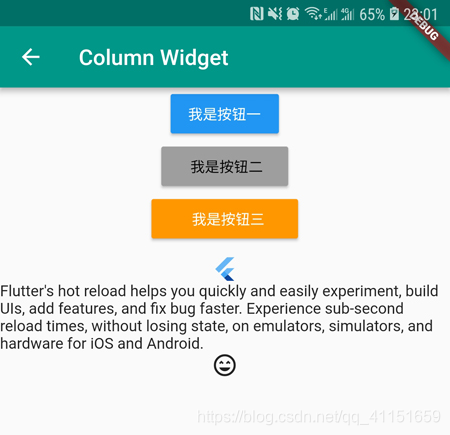
我们看下 Column 布局组件的大致效果图:
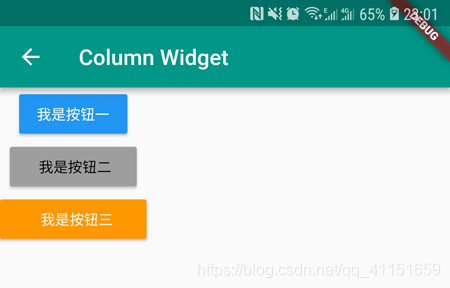
所有元素纵向排成一列。
构造方法是一致的,只不过主轴和交叉轴和 Row 是相反的。这里就不再重复讲解了。
接下来看一个实例:
Column(
        // 纵向排列子元素
        children: <Widget>[
          RaisedButton(
            color: Colors.blue,
            child: Text(
              '我是按钮一',
              style: TextStyle(color: Colors.white),
            ),
            onPressed: () {},
          ),
          RaisedButton(
            color: Colors.grey,
            child: Text(
              '   我是按钮二  ',
              style: TextStyle(color: Colors.black),
            ),
            onPressed: () {},
          ),
          RaisedButton(
            color: Colors.orange,
            child: Text(
              '      我是按钮三    ',
              style: TextStyle(color: Colors.white),
            ),
            onPressed: () {},
          ),
          SizedBox(
            height: 10,
          ),
          const FlutterLogo(),
          Text(
              'Flutter\'s hot reload helps you quickly and easily experiment, build UIs, add features, and fix bug faster. Experience sub-second reload times, without losing state, on emulators, simulators, and hardware for iOS and Android.'),
          const Icon(Icons.sentiment_very_satisfied),
        ],
      ),
运行效果如下图所示:

3.弹性布局
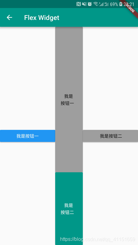
Flex 组件是 Row 和 Column 的父类,主要用于弹性布局,类似于HTML 中的 Flex 弹性盒子布局,可以按照一定比例进行分类布局空间。
Flex 继承自 MultiChildRenderObjectWidget,Flex 也是多子元素的一个组件之一(内部可以包含多个子元素)。
Flex 一般和 Expanded 搭配使用,Expanded 组件从名字就可以看出它的特点,就是让子元素扩展占用 Flex 的剩余空间。
我们看下 Flex 布局组件的大致效果图:
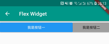
按钮一占用 2/3 的横向空间,按钮二占用剩余 1/3 空间。
我们看下 Flex 构造方法:
Flex({
    Key key,
    // 子元素排列方向:横向还是纵向
    @required this.direction,
    this.mainAxisAlignment = MainAxisAlignment.start,
    this.mainAxisSize = MainAxisSize.max,
    this.crossAxisAlignment = CrossAxisAlignment.center,
    this.textDirection,
    this.verticalDirection = VerticalDirection.down,
    this.textBaseline,
    List<Widget> children = const <Widget>[],
  })
单独看 Flex 组件没有意义,因为一般直接用它的子类 Row 和 Column 来使用。而 Flex 主要是和 Expanded 搭配使用。我们再看下 Expanded 组件构造方法:
const Expanded({
    Key key,
    // 占用空间比重、权重
    int flex = 1,
    // 子元素
    @required Widget child,
  })
我们通过一个实例看下 Flex 和 Expanded 搭配用法:
body: Row(
          children: <Widget>[
            Expanded(
              // flex设置权重,这里是占2/5空间
              flex: 2,
              child: RaisedButton(
                color: Colors.blue,
                child: Text(
                  '我是按钮一',
                  style: TextStyle(color: Colors.white),
                ),
                onPressed: () {},
              ),
            ),
            // flex设置权重,这里是占1/5空间
            Expanded(
              flex: 1,
              child: Column(
                children: <Widget>[
                  Expanded(
                    flex: 2,
                    child: RaisedButton(
                      color: Colors.grey,
                      child: Text(
                        '   我是按钮一  ',
                        style: TextStyle(color: Colors.black),
                      ),
                      onPressed: () {},
                    ),
                  ),
                  Expanded(
                    flex: 1,
                    child: RaisedButton(
                      color: Colors.teal,
                      child: Text(
                        '   我是按钮二  ',
                        style: TextStyle(color: Colors.white),
                      ),
                      onPressed: () {},
                    ),
                  )
                ],
              ),
            ),
            // flex设置权重,这里是占2/5空间
            Expanded(
              flex: 2,
              child: RaisedButton(
                color: Colors.grey,
                child: Text(
                  '   我是按钮二  ',
                  style: TextStyle(color: Colors.black),
                ),
                onPressed: () {},
              ),
            )
          ],
        )
运行效果图如下:
4.层叠布局
Stack 和 IndexStack 都是层叠布局方式,类似于 Android 里的 FrameLayout 帧布局,内部子元素是有层级堆起来的。
Stack 继承自 MultiChildRenderObjectWidget,Stack 也是多子元素的一个组件之一(内部可以包含多个子元素)。
而 IndexedStack 继承自 Stack,扩展了 Stack的一些特性。它的作用是显示第 index 个子元素,其他子元素都是不可见的。所以 IndexedStack 的尺寸永远是跟最大的子元素尺寸一致。
Stack 的布局行为,是根据子元素是 positioned 还是 non-positioned 来区分的:
- 对于 positioned 的子元素,它们的位置会根据所设置的 top、bottom、right 或 left 属性来确定,这几个值都是相对于 Stack 的左上角;
- 对于 non-positioned 的子元素,它们会根据 Stack 的 aligment 来设置位置。
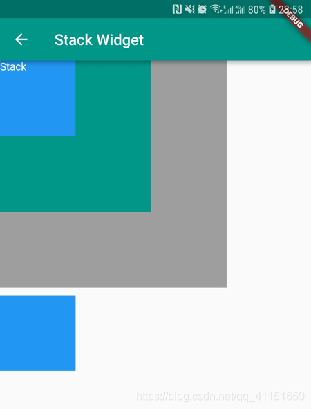
Stack 布局的子元素层级堆叠顺序:最先布局绘制的子元素在最底层,越后绘制的越在顶层。类似于 Web 中的 z-index。
看下 Stack 布局组件的效果图:
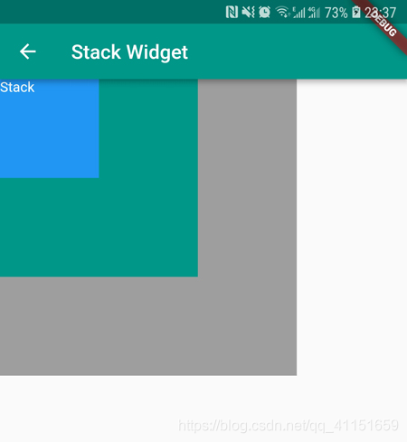
默认按照左上角,有层级的绘制排列。
看下 Stack 的构造方法:
Stack({
    Key key,
    // 对齐方式,默认是左上角(topStart)
    this.alignment = AlignmentDirectional.topStart,
    // 对齐方向
    this.textDirection,
    // 定义如何设置无定位子元素尺寸,默认为loose
    this.fit = StackFit.loose,
    // 超过的部分子元素处理方式
    this.overflow = Overflow.clip,
    // 子元素
    List<Widget> children = const <Widget>[],
  })
我们看下 alignment:
  // 左上角
  static const Alignment topLeft = Alignment(-1.0, -1.0);

  // 主轴顶部对齐,交叉轴居中
  static const Alignment topCenter = Alignment(0.0, -1.0);

  // 主轴顶部对齐,交叉轴偏右
  static const Alignment topRight = Alignment(1.0, -1.0);

  // 主轴居中,交叉轴偏左
  static const Alignment centerLeft = Alignment(-1.0, 0.0);

  // 居中
  static const Alignment center = Alignment(0.0, 0.0);

  // 主轴居中,交叉轴偏右
  static const Alignment centerRight = Alignment(1.0, 0.0);

  // 主轴底部对齐,交叉轴偏左
  static const Alignment bottomLeft = Alignment(-1.0, 1.0);

  // 主轴底部对齐,交叉轴居中
  static const Alignment bottomCenter = Alignment(0.0, 1.0);

  // 主轴底部对齐,交叉轴偏右
  static const Alignment bottomRight = Alignment(1.0, 1.0);
看下 fit 属性:
enum StackFit {
  // 子元素宽松的取值,可以从min到max的尺寸
  loose,

  // 子元素尽可能的占用剩余空间,取max尺寸
  expand,

  // 不改变子元素的约束条件
  passthrough,
}
最后看下 overflow 属性:
enum Overflow {
  // 超出部分不会被裁剪,正常显示
  visible,

  // 超出部分会被裁剪
  clip,
}
我们看下 IndexedStack 构造方法:
IndexedStack({
    Key key,
    AlignmentGeometry alignment = AlignmentDirectional.topStart,
    TextDirection textDirection,
    StackFit sizing = StackFit.loose,
    // 多了一个索引,索引的这个元素显示,其他元素隐藏
    this.index = 0,
    // 子元素
    List<Widget> children = const <Widget>[],
  })
接下来通过一个实例来演示下 Stack 和 IndexedStack 的用法:
body: Column(
          children: <Widget>[
            // Stack层叠布局
            Stack(
              children: <Widget>[
                Container(
                  width: 300,
                  height: 300,
                  color: Colors.grey,
                ),
                Container(
                  width: 200,
                  height: 200,
                  color: Colors.teal,
                ),
                Container(
                  width: 100,
                  height: 100,
                  color: Colors.blue,
                ),
                Text(
                  "Stack",
                  style: TextStyle(color: Colors.white),
                ),
              ],
            ),
            SizedBox(
              height: 10,
            ),
            // IndexedStack层叠布局
            IndexedStack(
              // 指定显示的子元素序号,其余子元素隐藏
              index: 2,
              children: <Widget>[
                Container(
                  width: 300,
                  height: 300,
                  color: Colors.grey,
                ),
                Container(
                  width: 200,
                  height: 200,
                  color: Colors.teal,
                ),
                Container(
                  width: 100,
                  height: 100,
                  color: Colors.blue,
                ),
                Text(
                  "Stack",
                  style: TextStyle(color: Colors.white),
                ),
              ],
            )
          ],
        )
运行效果图如下: