CSS(层叠样式表)
高级语法
(1)选择器分组
- 派生选择器
<!--html-->
<p><strong>派生选择器</strong></p>
    	<ul>
    		<li><strong>我改变了,且不随变化</strong></li>
    	</ul>


<!--css-->
li strong{
	color:red;
}

strong{
	color:#09f013;
}
- id选择器 —— "#"
- 类选择器 —— "."
id 选择器和类选择器的区别
- 属性选择器
<!--HTML-->
<body>
    <p title="t">我是属性选择器</p>
    <p title="tel">我是属性值选择器</p>
  </body>


<!--CSS-->
[title]{
	color:red;
}

[title=tel]{
	color:#aabb0c;
}
(2)继承
.
.
CSS的样式
(1)CSS背景
| 属性 | 描述 |
|---|---|
| background-color : red | 背景颜色 |
| background-image : url(“图片路径”) | 背景图片 |
| background-repeat : no-repeat (repeat-x) | 图片重复设置 |
| background-position : right top | 从哪里开始重复(可是在px或%) |
| background-attachment : true | 不随文字的滚动而动 |
| background-size | 设置图片的像素 |
(2)CSS文本样式
| 属性 | 描述 |
|---|---|
| color | 字体颜色 |
| text-align | 对齐方式 |
| text-shadow : 5px 5px 5px red | 字体阴影(偏移量,清晰度,颜色) |
| font-size | 字体大小 |
| font-family | 字体样式 |
| font-face: | 自定义字体 |
| font-weight | 字体粗细 |
| line-height:50%(normal) | 行高 |
| max-height | 最大高度 |
| max-height | 最小高度 |
| max-width | 最大宽度 |
| max-width | 最大宽度 |
(3)CSS链接
| 属性 | 描述 |
|---|---|
| a:link | 点击前 |
| a:visited | 点击后 |
| a:active | 点击时 |
| a:hover | 鼠标放上去时 |
| text-decoration:none | 去掉下划线 |
(4)CSS列表
| 属性 | 描述 |
|---|---|
| list-style-type | 列表样式 |
| list-style-image : ur(" ") | 设置列表图片 |
(5)CSS表格
| 属性 | 描述 |
|---|---|
| border :1px solid blue | 设置边框大小与颜色 |
| border-collapse : collapse | 设置单边框 |
(6)CSS轮廓
| 属性 | 描述 |
|---|---|
| outline-style | 设置轮廓的样式 |
| outline-color | 设置轮廓的颜色 |
| outline-width | 设置轮廓的宽度 |
(7)CSS的定位
- 普通流
·
- 浮动
| 属性 | 描述 |
|---|---|
| float: | 上下左右(none,inherit) |
| clear: | 去除浮动:both inherit(继承) |
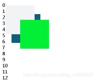
- 绝对布局
| 属性 | 描述 |
|---|---|
| position: | top,left,right,bottom或者 (relation,absolute,fixed,static) z-index:2 // 谁大谁在前面 |
<!--html-->
<body>
    <div id="position1"></div>
    <div id="position2"></div>
    <div id="position3"></div>

    <script>
    	for(var i=0;i<100;i++){
    		document.write(i+"<br/>");
    	}
    </script>
  </body>

<!---css->
#position1{
	width:100px;
	height:100px;
	background:#01f035;
	position:fixed;
	left:70px;
	top:70px;
	z-index:3;
}
#position2{
	width:100px;
	height:100px;
	background:#f2f3f4;
	position:fixed;
	left:20px;
	top:20px;
	z-index:2;
}
#position3{
	width:100px;
	height:100px;
	background:#105f78;
	position:fixed;
	left:40px;
	top:50px;
}
其他的
| 属性 | 描述 |
|---|---|
| cursor: | 鼠标移上去的形状 |
| display: | 对列表的排列进行设置 |
| visibility: | 元素是否可见 |
| margin: | 4px auto(上下 左右对齐) |
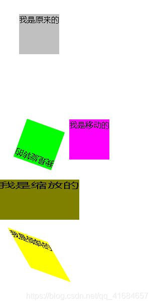
(8)CSS动画
2D转换
| 属性 | 描述 |
|---|---|
| transform-translate( x,y) | 移动效果, 参数为(x轴移动距离,y轴移动距离) |
| transform-rotate(x) | 旋转效果,参数为(旋转度数) |
| transform-scale(x,y) | 缩放效果,参数为(宽的倍数,高的倍数) |
| transform-skew(x,y) | 倾斜效果,参数为(绕x轴倾斜度,绕y轴倾斜度) |
<!--html-->
<body>
    <div class="div">我是原来的</div>
    <div class="translate">我是移动的</div>
    <div class="rotate">我是旋转的</div>
    <div class="scale">我是缩放的</div>
    <div class="skew">我是倾斜的</div>
  </body>

<!--css-->
.div{
	background-color:silver;
	width:80px;
	height:80px;
	margin:30px;
}

.translate{
	background-color:fuchsia;
	width:80px;
	height:80px;
	margin:30px;
	transform:translate(100px,100px);    /* 设置移动效果,参数为(x坐标,y坐标) */
	-webkit-transform:translate(100px,100px);  /* 设置支持的浏览器  Chrome
											-ms (IE)  -o(opera)	 -moz(firefox)*/
}

.rotate{
	background-color:lime;
	width:80px;
	height:80px;
	margin:30px;
	transform:rotate(200deg);  /* 设置旋转效果,参数为(旋转度) */
	-webkit-transform:rotate(200deg);
}

.scale{
	background-color:olive;
	width:80px;
	height:80px;
	margin:30px;
	transform:scale(2,1); /* 设置缩放效果,参数为(宽度倍数,高度倍数) */
	-webkit-transform:scale(2,1);
}

.skew{
	background-color:yellow;
	width:80px;
	height:80px;
	margin:30px;
	transform:skew(30deg,20deg);  /* 设置倾斜效果,参数为(绕x轴旋转度数,绕y轴旋转度数) */
	-webkit-transform:skew(30deg,20deg);
}
过渡
| 属性 | 描述 |
|---|---|
| transition | 定义属性 |
| transition-property | 设置过渡名称 |
| transition-duration | 设置过渡效果发费的时间 |
| transition-timing-function | 设置过渡效果的曲线图 |
| transition-delay | 设置过渡效果的延迟时间 |
<!--html-->
<body>
    <div class="transition"></div>
  </body>

<!--css-->
.transition{
	width:100px;
	height:100px;
	background-color:orange;
	webkit-transition: 2s,height 2s,-webkit-transform 2s;        //设置过渡效果,参数(宽的时间,高的时间,动画效果)
	transition:width 2s,height 2s,transform 2s;
}
.transition:hover{              //鼠标放上去的时候的效果
	width:300px;
	height:300px;
	webkit-transform:rotate(360deg);
	transform:rotate(360deg);
}
由于这里是动图就不截图了
动画
<!--html 同上-->

<!--css-->
.transition{
	width:50px;
	height:50px;
	background-color:maroon;
	position:relative;
	animation:anim 5s infinite alternate;
	-webkit-animation:anim 5s infinite alternate;        //设置动画效果,参数(动画名称,动画时长,循环,自动的效果)
}

@keyframes anim {              //通过keyframs  动画名    来设置效果
	0% {
		background:red;
		left:0px;
		top:0px
	}


	25%{
		 background:red;
		 left:100px;
		 top:0px;
	}
	50%{
		background:red;
		left:100px;
		top:100px;
	}
	75%{
		background:red;
		left:0px;
		top:100px;
	}

	100% {
		background:red;
		left:0px;
		top:0px
	}
}

@-webkit-keyframes anim{
	0%{
		background:red;
		left:0px;
		top:0px
	}

	25%{
		 background:red;
		 left:100px;
		 top:0px;
	}
	50%{
		background:red;
		left:100px;
		top:100px;
	}
	}
	75%{
		background:red;
		left:0px;
		top:100px;
	}

	100% {
		background:red;
		left:0px;
		top:0px
	}
}