示例:
代码:
import numpy as np
import matplotlib.pyplot as plt
import seaborn as sns
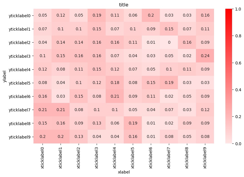
def plot(confusion, xticklabels, yticklabels):
f, ax1 = plt.subplots(figsize=(10, 6),nrows=1)
cmap = sns.light_palette("red", as_cmap=True)
sns.heatmap(confusion, annot=True, ax=ax1, vmax=0, vmin=1, cmap=cmap)
ax1.set_title('title')
ax1.set_xlabel('xlabel')
ax1.set_xticklabels(xticklabels, rotation=90)
ax1.set_ylabel('ylabel')
ax1.set_yticklabels(yticklabels, rotation=0)
f.savefig('heatmap.jpg', bbox_inches='tight')
def normalization(x):
x_sum = np.sum(x, axis = 1, keepdims = True)
result = x / x_sum
return result
if __name__ == '__main__':
n = 10
matrix = np.random.random((n,n))
matrix = normalization(matrix)
matrix = np.round(matrix, 2)
xticklabels = []
yticklabels = []
for i in range(n):
xticklabels.append('xticklabel' + str(i))
yticklabels.append('yticklabel' + str(i))
plot(matrix, xticklabels, yticklabels)
参考:
python如何实现可视化热力图 http://www.php.cn/python-tutorials-391565.html
数据可视化Seaborn从零开始学习教程(二) 颜色调控篇 https://segmentfault.com/a/1190000014966210?utm_source=tag-newest
