一,高度塌陷
 1 <!DOCTYPE html>
 2 <html lang="en">
 3 <head>
 4     <meta charset="UTF-8">
 5     <meta name="viewport" content="width=device-width, initial-scale=1.0">
 6     <meta http-equiv="X-UA-Compatible" content="ie=edge">
 7     <title>Document</title>
 8     <style>
 9         .outer{
10             border: 10px red solid;
11
12             /*
13                 BFC(Block Formatting Context) 块级格式化环境
14                     - BFC是一个CSS中的一个隐含的属性,可以为一个元素开启BFC
15                         开启BFC该元素会变成一个独立的布局区域
16                     - 元素开启BFC后的特点:
17                         1.开启BFC的元素不会被浮动元素所覆盖
18                         2.开启BFC的元素子元素和父元素外边距不会重叠
19                         3.开启BFC的元素可以包含浮动的子元素
20
21                     - 可以通过一些特殊方式来开启元素的BFC:
22                         1、设置元素的浮动(不推荐)
23                         2、将元素设置为行内块元素(不推荐)
24                         3、将元素的overflow设置为一个非visible的值
25                             - 常用的方式 为元素设置 overflow:hidden 开启其BFC 以使其可以包含浮动元素
26
27              */
28
29              /* float: left; */
30              /* display: inline-block; */
31              /* overflow: hidden; */
32         }
33
34         .inner{
35             width: 100px;
36             height: 100px;
37             background-color: #bfa;
38
39             /*
40                 高度塌陷的问题:
41                     在浮动布局中,父元素的高度默认是被子元素撑开的,
42                         当子元素浮动后,其会完全脱离文档流,子元素从文档流中脱离
43                         将会无法撑起父元素的高度,导致父元素的高度丢失
44
45                     父元素高度丢失以后,其下的元素会自动上移,导致页面的布局混乱
46
47                     所以高度塌陷是浮动布局中比较常见的一个问题,这个问题我们必须要进行处理!
48              */
49             float: left;
50         }
51     </style>
52 </head>
53 <body>
54
55     <div class="outer">
56
57         <div class="inner"></div>
58
59     </div>
60
61     <div style="width: 200px;height: 200px;background-color:yellow;"></div>
62
63 </body>
64 </html>
内容
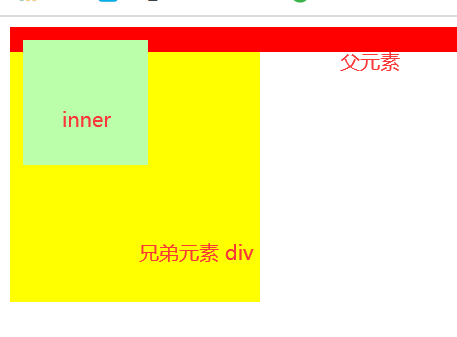
1.父元素outer没有高度时,子元素inner开启了浮动,脱离了文档流,不能撑开父元素,此时,父元素的高度已塌陷了。那么,兄弟元素div就会往上移动,破坏了页面结构
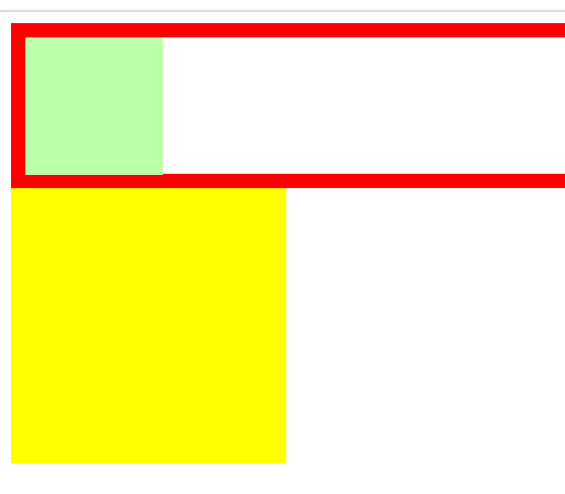
2.处理塌陷问题,父元素outer设置overflow: hidden;,使其开启BFC,则父元素就可以包含子元素inner了,兄弟元素div也不会上移了。
效果
二,上外边距折叠
 1 <!DOCTYPE html>
 2 <html lang="en">
 3 <head>
 4     <meta charset="UTF-8">
 5     <meta name="viewport" content="width=device-width, initial-scale=1.0">
 6     <meta http-equiv="X-UA-Compatible" content="ie=edge">
 7     <title>Document</title>
 8     <style>
 9         .box1{
10             width: 200px;
11             height: 200px;
12             background-color: #bfa;
13             /* float: left; */
14             /* 开启BFC */
15             /* overflow: hidden; */
16         }
17
18         /* .box2{
19             width: 200px;
20             height: 200px;
21             background-color: orange;
22             overflow: hidden;
23         } */
24
25         .box3{
26             width: 100px;
27             height: 100px;
28             background-color: yellow;
29             margin-top: 100px;
30         }
31     </style>
32 </head>
33 <body>
34
margin-top: 100px;
35     <div class="box1">
36
37         <div class="box3"></div>
38     </div>
39
40     <!-- <div class="box2">
41
42     </div> -->
43
44 </body>
45 </html>
内容
1.父元素box1,和子元素box3, 当子元素设置了margin-top: 100px; 此时,父元素和子元素外边距重叠了,子元素和父元素都往下移动了100px
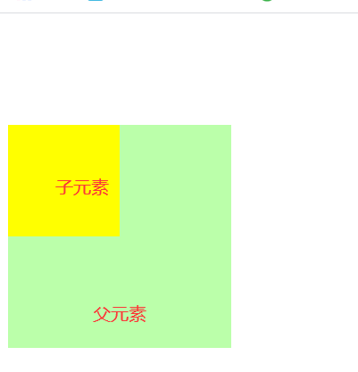
2.此时,父元素设置overflow: hidden;使其开启BFC,即可消除外边距重叠问题。

三,用clear清除浮动带来的影响
 1 <!DOCTYPE html>
 2 <html lang="en">
 3 <head>
 4     <meta charset="UTF-8">
 5     <meta name="viewport" content="width=device-width, initial-scale=1.0">
 6     <meta http-equiv="X-UA-Compatible" content="ie=edge">
 7     <title>Document</title>
 8     <style>
 9
10         div{
11             font-size: 50px;
12         }
13
14         .box1{
15             width: 200px;
16             height: 200px;
17             background-color: #bfa;
18             float: left;
19         }
20
21         .box2{
22             width: 400px;
23             height: 250px;
24             background-color: #ff0;
25             /*float: left;*/
26             /*clear: left;*/
27         }
28
29         /*.box3{
30             width: 200px;
31             height: 200px;
32             background-color: orange;*/
33             /*
34                 由于box1的浮动,导致box3位置上移
35                     也就是box3收到了box1浮动的影响,位置发生了改变
36
37                 如果我们不希望某个元素因为其他元素浮动的影响而改变位置,
38                     可以通过clear属性来清除浮动元素对当前元素所产生的影响
39
40                 clear
41                     - 作用:清除浮动元素对当前元素所产生的影响
42                     - 可选值:
43                         left 清除左侧浮动元素对当前元素的影响
44                         right 清除右侧浮动元素对当前元素的影响
45                         both 清除两侧中最大影响的那侧
46
47                     原理:
48                         设置清除浮动以后,浏览器会自动为元素添加一个上外边距,
49                             以使其位置不受其他元素的影响
50              */
51
52              /*clear: both;*/
53         }
54     </style>
55 </head>
56 <body>
57
58     <div class="box1">1</div>
59     <div class="box2">2</div>
60 <!--    <div class="box3">3</div>-->
61 <!--    <span style="width:500px; height:400px; background-color: red; display: block"></span>-->
62
63 </body>
64 </html>
内容;
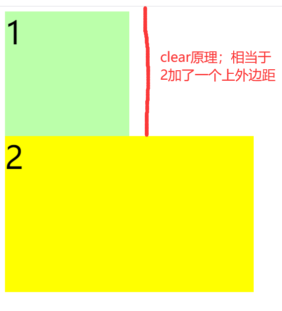
1. box1元素设置float;left, 此时,兄弟元素box2会往上移动,若不想让box2往上移动,这设置clear;left, 清除浮动对box2的影响,此时box2,不会往上移动了,原理;设置清除浮动以后,浏览器会自动为元素添加一个上外边距,以使其位置不受其他元素的影响。
四。高度塌陷最终解决方案
 1 <!DOCTYPE html>
 2 <html lang="en">
 3 <head>
 4     <meta charset="UTF-8">
 5     <meta name="viewport" content="width=device-width, initial-scale=1.0">
 6     <meta http-equiv="X-UA-Compatible" content="ie=edge">
 7     <title>Document</title>
 8     <style>
 9 /* <!--        clear 只针对浮动--> */
10         .box1{
11             border: 10px red solid;
12
13             /* overflow: hidden; */
14         }
15
16         .box2{
17             width: 100px;
18             height: 100px;
19             background-color: #bfa;
20             float: left;
21         }
22
23         .box3{
24             clear: both;
25         }
26
27         .box1::after{
28             content: '';
29             clear: both;
30             display: block;
31         }
32
33     </style>
34 </head>
35 <body>
36
37     <div class="box1">
38         <div class="box2"></div>
39         <!-- <div class="box3"></div> -->
40     </div>
41
42 </body>
43 </html>
内容;
1.父元素box1,子元素box2,
2.
.box1::after{
content: '';
clear: both;
display: block;
}
在父元素的末尾添加一个空字符子元素,让他清除box2的浮动,将他转换成块元素,此时父元素会撑开子元素box2。
五,解决高度塌陷和外边距折叠的最终方案
 1 <!DOCTYPE html>
 2 <html lang="en">
 3 <head>
 4     <meta charset="UTF-8">
 5     <meta name="viewport" content="width=device-width, initial-scale=1.0">
 6     <meta http-equiv="X-UA-Compatible" content="ie=edge">
 7     <title>Document</title>
 8     <style>
 9         .box1{
10             width: 200px;
11             height: 200px;
12             background-color: #bfa;
13         }
14
15         /* .box1::before{
16             content: '';
17             display: table;
18         } */
19
20         .box2{
21             width: 100px;
22             height: 100px;
23             background-color: orange;
24             margin-top: 100px;
25         }
26
27 /* clearfix 这个样式可以同时解决高度塌陷和外边距重叠的问题,当你在遇到这些问题时,直接使用clearfix这个类即可 */
28         .clearfix::before,
29         .clearfix::after{
30             content: '';
31             display: table;
32             clear: both;
33         }
34     </style>
35 </head>
36 <body>
37
38     <div class="box1 clearfix">
39         <div class="box2"></div>
40     </div>
41
42 </body>
43 </html>
内容;
1.解决高度塌陷和外边距折叠的最终方案的经典代码
.clearfix::before,
.clearfix::after{
content: '';
display: table;
clear: both;
}