import matplotlib
import matplotlib.pyplot as plt
import numpy as np
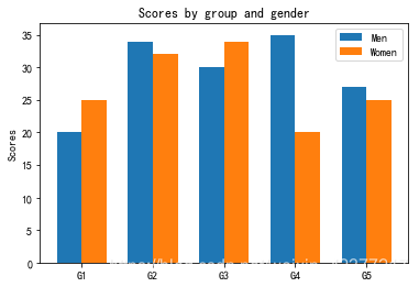
labels = ['G1', 'G2', 'G3', 'G4', 'G5']
men_means = [20, 34, 30, 35, 27]
women_means = [25, 32, 34, 20, 25]
x = np.arange(len(labels)) # the label locations
width = 0.35 # the width of the bars 条形图的宽度
fig, ax = plt.subplots()
#label设置轴的标签,展示图例时使用
rects1 = ax.bar(x - width/2, men_means, width, label='Men')
rects2 = ax.bar(x + width/2, women_means, width, label='Women')
# Add some text for labels, title and custom x-axis tick labels, etc.
#设置两个轴的名称
ax.set_ylabel('Scores')
#设置图片名称
ax.set_title('Scores by group and gender')
#设置X轴
ax.set_xticks(x)
#设置X轴标签
ax.set_xticklabels(labels)
#展示图例
ax.legend()
plt.show()
图片展示: