目录
快速管理布局,对齐和大小的网格列,导航,组件和更多与一个完整的套件响应flexbox实用程序。对于更复杂的实现,定制CSS可能是必要的。
1、flex行为
应用display实用程序创建伸缩容器并将直接子元素转换为伸缩项。Flex容器和item可以通过附加的Flex属性进一步修改。
<div class="d-flex p-2 bd-highlight">I'm a flexbox container!</div>

<div class="d-inline-flex p-2 bd-highlight">I'm an inline flexbox container!</div>

.d-flex和.d-inline-flex也存在响应变化。
.d-flex.d-inline-flex.d-sm-flex.d-sm-inline-flex.d-md-flex.d-md-inline-flex.d-lg-flex.d-lg-inline-flex.d-xl-flex.d-xl-inline-flex
2、方向
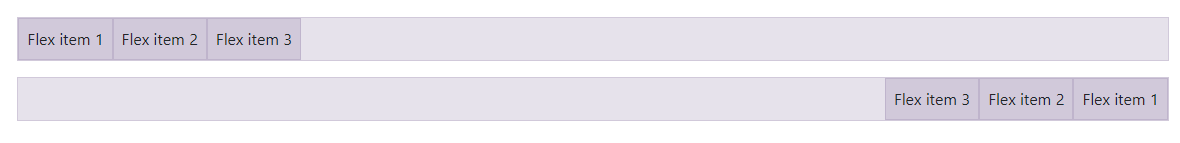
在flex布局中设置伸缩项的方向。在大多数情况下,你可以省略水平类,因为浏览器默认是row。但是,你可能会遇到需要显示设置该值的情况(如响应式布局)。
使用.flex-row来设置水平方向(浏览器的默认值),或者使用.flex-row-reverse来从相反的一侧开始水平方向。
<div class="d-flex flex-row bd-highlight mb-3">
  <div class="p-2 bd-highlight">Flex item 1</div>
  <div class="p-2 bd-highlight">Flex item 2</div>
  <div class="p-2 bd-highlight">Flex item 3</div>
</div>
<div class="d-flex flex-row-reverse bd-highlight">
  <div class="p-2 bd-highlight">Flex item 1</div>
  <div class="p-2 bd-highlight">Flex item 2</div>
  <div class="p-2 bd-highlight">Flex item 3</div>
</div>
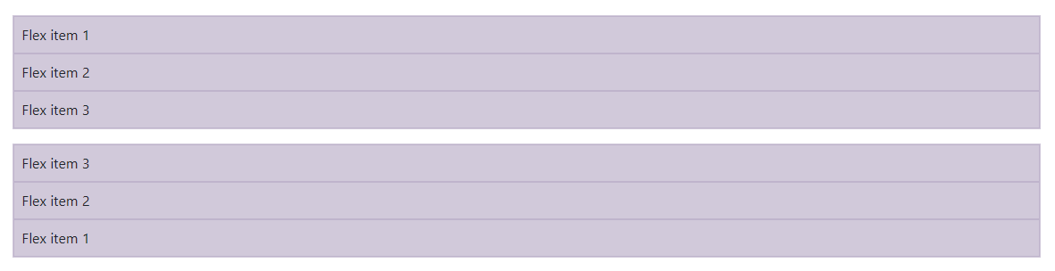
使用.flex-column设置垂直方向,或使用.flex-column-reverse从相反的方向开始设置垂直方向。
<div class="d-flex flex-column bd-highlight mb-3">
  <div class="p-2 bd-highlight">Flex item 1</div>
  <div class="p-2 bd-highlight">Flex item 2</div>
  <div class="p-2 bd-highlight">Flex item 3</div>
</div>
<div class="d-flex flex-column-reverse bd-highlight">
  <div class="p-2 bd-highlight">Flex item 1</div>
  <div class="p-2 bd-highlight">Flex item 2</div>
  <div class="p-2 bd-highlight">Flex item 3</div>
</div>
flex-direction也存在响应变化。
.flex-row.flex-row-reverse.flex-column.flex-column-reverse.flex-sm-row.flex-sm-row-reverse.flex-sm-column.flex-sm-column-reverse.flex-md-row.flex-md-row-reverse.flex-md-column.flex-md-column-reverse.flex-lg-row.flex-lg-row-reverse.flex-lg-column.flex-lg-column-reverse.flex-xl-row.flex-xl-row-reverse.flex-xl-column.flex-xl-column-reverse
3、Justify content
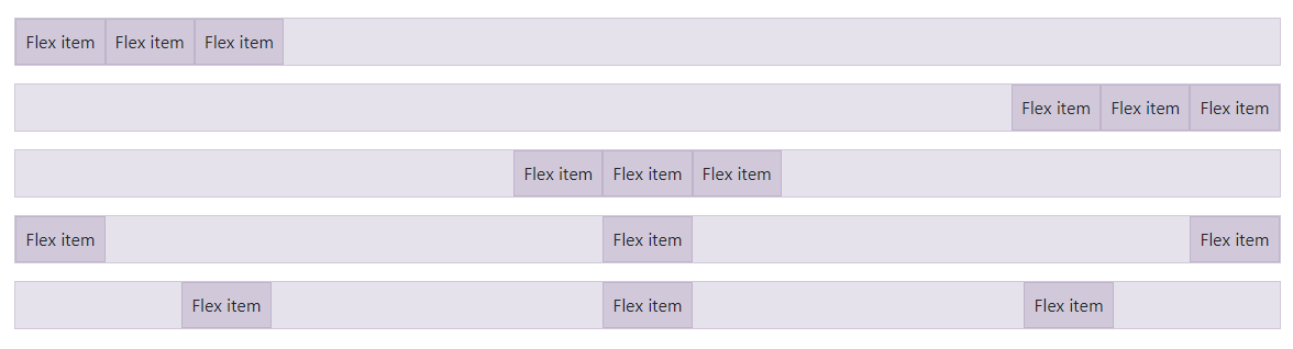
在flex容器上使用justify-content来更改flex item在主轴上的对齐方式(x轴为起始,y轴为伸缩方向:列)。选择 start (浏览器默认), end, center, between, 或者 around。
<div class="d-flex justify-content-start">...</div>
<div class="d-flex justify-content-end">...</div>
<div class="d-flex justify-content-center">...</div>
<div class="d-flex justify-content-between">...</div>
<div class="d-flex justify-content-around">...</div>
响应式变化也存在于justify-content。
.justify-content-start.justify-content-end.justify-content-center.justify-content-between.justify-content-around.justify-content-sm-start.justify-content-sm-end.justify-content-sm-center.justify-content-sm-between.justify-content-sm-around.justify-content-md-start.justify-content-md-end.justify-content-md-center.justify-content-md-between.justify-content-md-around.justify-content-lg-start.justify-content-lg-end.justify-content-lg-center.justify-content-lg-between.justify-content-lg-around.justify-content-xl-start.justify-content-xl-end.justify-content-xl-center.justify-content-xl-between.justify-content-xl-around
4、Align items
在flexbox容器上使用align-items来更改伸缩项目在侧轴上的对齐方式(y轴为起始,x轴为伸缩方向:列)。选择start、end、center、baseline或stretch(浏览器默认)。
<div class="d-flex align-items-start">...</div>
<div class="d-flex align-items-end">...</div>
<div class="d-flex align-items-center">...</div>
<div class="d-flex align-items-baseline">...</div>
<div class="d-flex align-items-stretch">...</div>
响应式变化也存在于align-items。
.align-items-start.align-items-end.align-items-center.align-items-baseline.align-items-stretch.align-items-sm-start.align-items-sm-end.align-items-sm-center.align-items-sm-baseline.align-items-sm-stretch.align-items-md-start.align-items-md-end.align-items-md-center.align-items-md-baseline.align-items-md-stretch.align-items-lg-start.align-items-lg-end.align-items-lg-center.align-items-lg-baseline.align-items-lg-stretch.align-items-xl-start.align-items-xl-end.align-items-xl-center.align-items-xl-baseline.align-items-xl-stretch
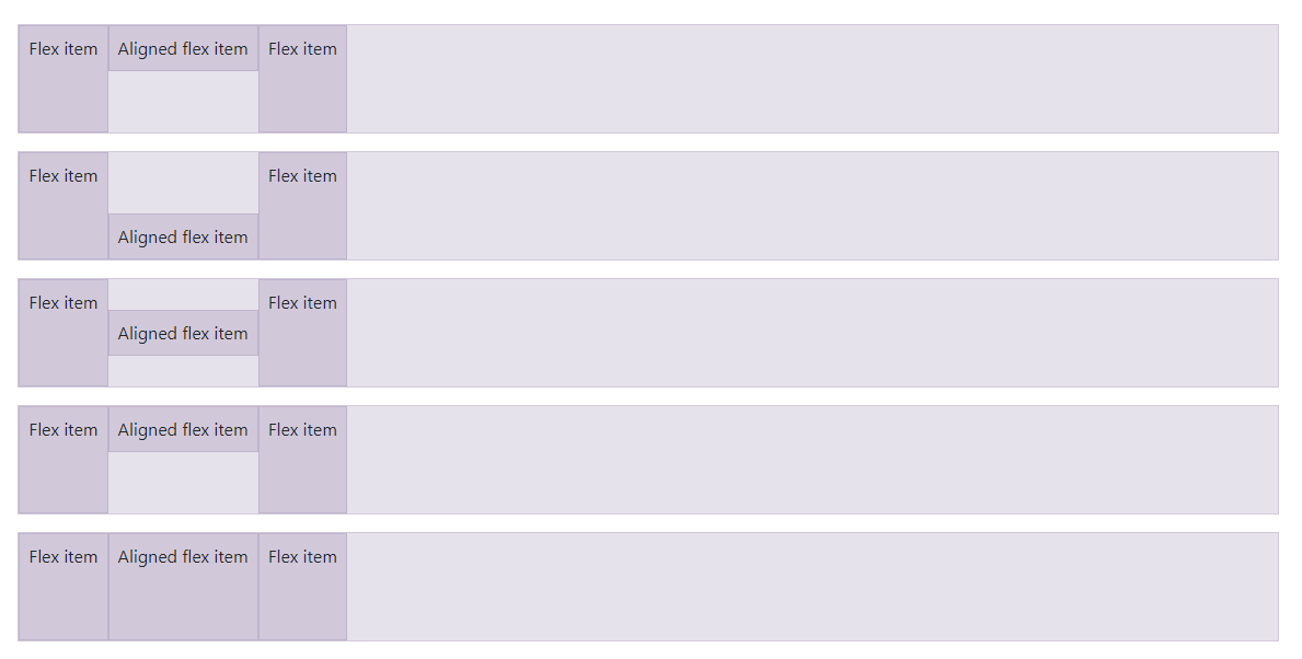
5、Align self
在flexbox项目上使用align-self来单独更改它们在十字轴上的对齐方式(y轴为起始,x轴为flex-direction:列)。选择与对齐项相同的选项:start、end、center、baseline或stretch(浏览器默认)。
<div class="align-self-start">Aligned flex item</div>
<div class="align-self-end">Aligned flex item</div>
<div class="align-self-center">Aligned flex item</div>
<div class="align-self-baseline">Aligned flex item</div>
<div class="align-self-stretch">Aligned flex item</div>
响应式变化也存在于Align self。
.align-self-start.align-self-end.align-self-center.align-self-baseline.align-self-stretch.align-self-sm-start.align-self-sm-end.align-self-sm-center.align-self-sm-baseline.align-self-sm-stretch.align-self-md-start.align-self-md-end.align-self-md-center.align-self-md-baseline.align-self-md-stretch.align-self-lg-start.align-self-lg-end.align-self-lg-center.align-self-lg-baseline.align-self-lg-stretch.align-self-xl-start.align-self-xl-end.align-self-xl-center.align-self-xl-baseline.align-self-xl-stretch
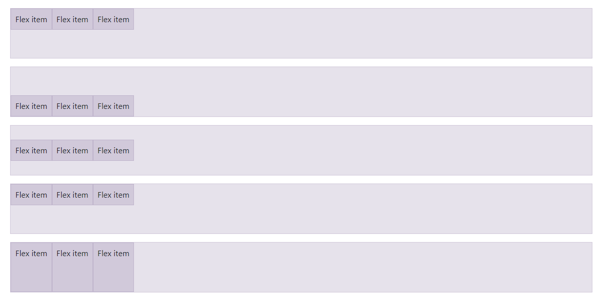
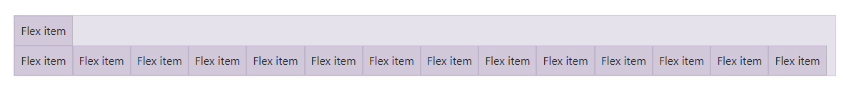
6、Fill
在一系列兄弟元素上使用.flex-fill类强制它们的宽度等于它们的内容(如果它们的内容没有超过它们的边框,则强制它们的宽度等于内容),同时占用所有可用的水平空间。
<div class="d-flex bd-highlight">
  <div class="p-2 flex-fill bd-highlight">Flex item with a lot of content</div>
  <div class="p-2 flex-fill bd-highlight">Flex item</div>
  <div class="p-2 flex-fill bd-highlight">Flex item</div>
</div>

响应式变化也存在于flex-fill。
.flex-fill.flex-sm-fill.flex-md-fill.flex-lg-fill.flex-xl-fill
7、伸长和收缩
使用.flex-grow-* 切换伸缩项目增长以填充可用空间的能力。在下面的例子中,.flex-grow-1元素使用了它能使用的所有可用空间,同时允许其余两个flex项目使用它们所需的空间。
<div class="d-flex bd-highlight">
  <div class="p-2 flex-grow-1 bd-highlight">Flex item</div>
  <div class="p-2 bd-highlight">Flex item</div>
  <div class="p-2 bd-highlight">Third flex item</div>
</div>

如果需要,可以使用.flex-shrink-*来切换伸缩项目的收缩能力。在下面的例子中,第二个带有.flex-shrink-1的伸缩项被迫将其内容换行,以便为前面带有.w-100的伸缩项留出更多的空间。
<div class="d-flex bd-highlight">
  <div class="p-2 w-100 bd-highlight">Flex item</div>
  <div class="p-2 flex-shrink-1 bd-highlight">Flex item</div>
</div>

响应式变化也存在于 flex-grow 和 flex-shrink。
.flex-{grow|shrink}-0.flex-{grow|shrink}-1.flex-sm-{grow|shrink}-0.flex-sm-{grow|shrink}-1.flex-md-{grow|shrink}-0.flex-md-{grow|shrink}-1.flex-lg-{grow|shrink}-0.flex-lg-{grow|shrink}-1.flex-xl-{grow|shrink}-0.flex-xl-{grow|shrink}-1
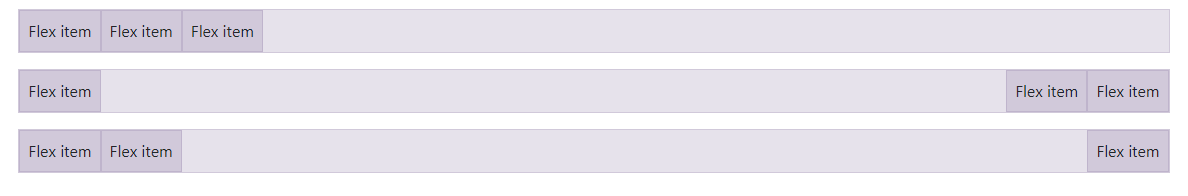
8、Auto margins
Flexbox可以做一些非常棒的事情,当你混合flex对齐和自动边缘。下面展示了三个通过自动页边距控制伸缩项目的例子:默认(没有自动页边距)、向右推两个项目(.mr-auto)和向左推两个项目(.ml-auto)。
不幸的是,IE10和IE11不支持伸缩项的自动边界,因为它的父项具有非默认的正当内容值。
<div class="d-flex bd-highlight mb-3">
  <div class="p-2 bd-highlight">Flex item</div>
  <div class="p-2 bd-highlight">Flex item</div>
  <div class="p-2 bd-highlight">Flex item</div>
</div>

<div class="d-flex bd-highlight mb-3">
  <div class="mr-auto p-2 bd-highlight">Flex item</div>
  <div class="p-2 bd-highlight">Flex item</div>
  <div class="p-2 bd-highlight">Flex item</div>
</div>

<div class="d-flex bd-highlight mb-3">
  <div class="p-2 bd-highlight">Flex item</div>
  <div class="p-2 bd-highlight">Flex item</div>
  <div class="ml-auto p-2 bd-highlight">Flex item</div>
</div>
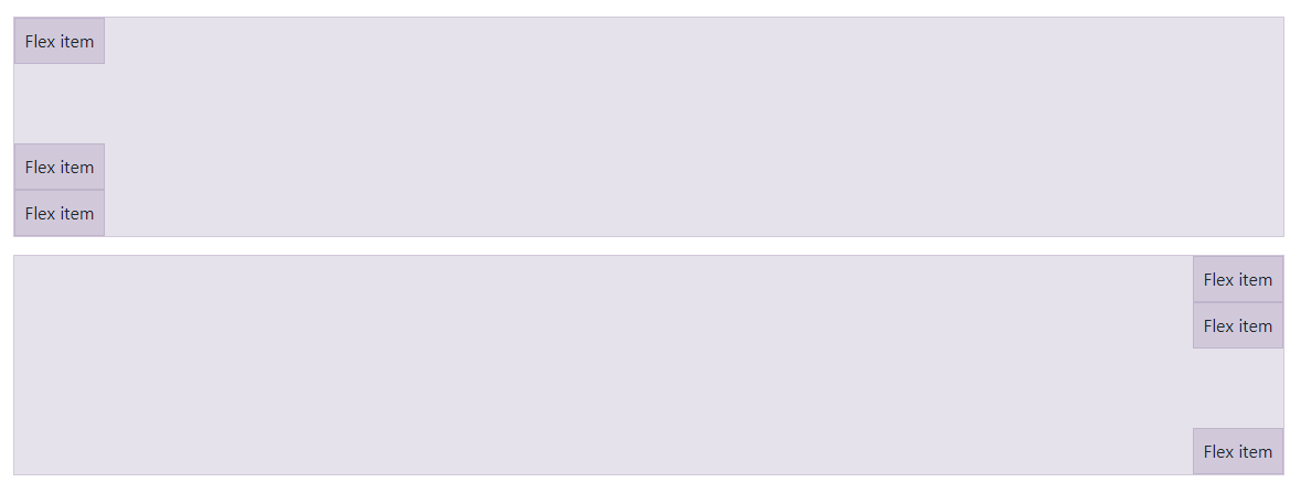
8.1、With align-items
通过混合 align-items、flex-direction: column和margin-top: auto或margin-bottom: auto,将一个伸缩项垂直移动到容器的顶部或底部。
<div class="d-flex align-items-start flex-column bd-highlight mb-3" style="height: 200px;">
  <div class="mb-auto p-2 bd-highlight">Flex item</div>
  <div class="p-2 bd-highlight">Flex item</div>
  <div class="p-2 bd-highlight">Flex item</div>
</div>

<div class="d-flex align-items-end flex-column bd-highlight mb-3" style="height: 200px;">
  <div class="p-2 bd-highlight">Flex item</div>
  <div class="p-2 bd-highlight">Flex item</div>
  <div class="mt-auto p-2 bd-highlight">Flex item</div>
</div>
9、Wrap
更改伸缩项在伸缩容器中封装的方式。选择使用.flex-nowrap完全不换行(浏览器默认),使用.flex-wrap换行,或使用.flex-wrap-reverse换行。
<div class="d-flex flex-nowrap">
  ...
</div>

<div class="d-flex flex-wrap">
  ...
</div>

<div class="d-flex flex-wrap-reverse">
  ...
</div>
响应式变化也存在于 flex-wrap。
.flex-nowrap.flex-wrap.flex-wrap-reverse.flex-sm-nowrap.flex-sm-wrap.flex-sm-wrap-reverse.flex-md-nowrap.flex-md-wrap.flex-md-wrap-reverse.flex-lg-nowrap.flex-lg-wrap.flex-lg-wrap-reverse.flex-xl-nowrap.flex-xl-wrap.flex-xl-wrap-reverse
10、Order
使用少量的order更改特定伸缩项目的视觉顺序。我们只提供了优先或最后创建一个条目的选项,以及使用DOM顺序的重置选项。因为order可以取任何整数值(例如,5),添加自定义CSS为任何需要的额外值。
<div class="d-flex flex-nowrap bd-highlight">
  <div class="order-3 p-2 bd-highlight">First flex item</div>
  <div class="order-2 p-2 bd-highlight">Second flex item</div>
  <div class="order-1 p-2 bd-highlight">Third flex item</div>
</div>

响应式变化也存在于 order。
.order-0.order-1.order-2.order-3.order-4.order-5.order-6.order-7.order-8.order-9.order-10.order-11.order-12.order-sm-0.order-sm-1.order-sm-2.order-sm-3.order-sm-4.order-sm-5.order-sm-6.order-sm-7.order-sm-8.order-sm-9.order-sm-10.order-sm-11.order-sm-12.order-md-0.order-md-1.order-md-2.order-md-3.order-md-4.order-md-5.order-md-6.order-md-7.order-md-8.order-md-9.order-md-10.order-md-11.order-md-12.order-lg-0.order-lg-1.order-lg-2.order-lg-3.order-lg-4.order-lg-5.order-lg-6.order-lg-7.order-lg-8.order-lg-9.order-lg-10.order-lg-11.order-lg-12.order-xl-0.order-xl-1.order-xl-2.order-xl-3.order-xl-4.order-xl-5.order-xl-6.order-xl-7.order-xl-8.order-xl-9.order-xl-10.order-xl-11.order-xl-12
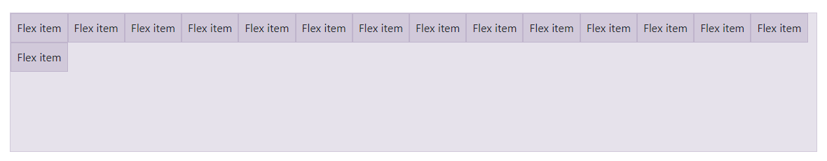
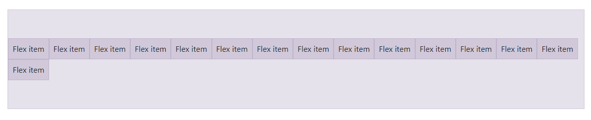
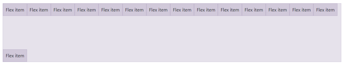
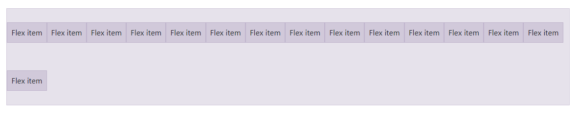
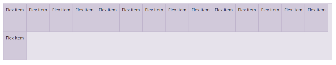
11、Align content
使用flexbox容器上的对齐内容将伸缩项目在侧轴上对齐在一起。选择 start (浏览器默认), end, center, between, 或者 around。为了演示这些实用程序,我们实施了flex-wrap: wrap并增加了flex项目的数量。
小心!此属性对单个伸缩项没有影响。
<div class="d-flex align-content-start flex-wrap">
  ...
</div>
<div class="d-flex align-content-end flex-wrap">...</div>

<div class="d-flex align-content-center flex-wrap">...</div>
<div class="d-flex align-content-between flex-wrap">...</div>
<div class="d-flex align-content-around flex-wrap">...</div>
<div class="d-flex align-content-stretch flex-wrap">...</div>
响应式变化也存在于 align-content。
.align-content-start.align-content-end.align-content-center.align-content-between.align-content-around.align-content-stretch.align-content-sm-start.align-content-sm-end.align-content-sm-center.align-content-sm-between.align-content-sm-around.align-content-sm-stretch.align-content-md-start.align-content-md-end.align-content-md-center.align-content-md-between.align-content-md-around.align-content-md-stretch.align-content-lg-start.align-content-lg-end.align-content-lg-center.align-content-lg-between.align-content-lg-around.align-content-lg-stretch.align-content-xl-start.align-content-xl-end.align-content-xl-center.align-content-xl-between.align-content-xl-around.align-content-xl-stretch
后记
如果你感觉文章不咋地
//(ㄒoㄒ)//,就在评论处留言,作者继续改进;o_O???
如果你觉得该文章有一点点用处,可以给作者点个赞;\\*^o^*//
如果你想要和作者一起进步,可以微信扫描二维码,关注前端老L;~~~///(^v^)\\\~~~
谢谢各位读者们啦(^_^)∠※!!!
