相关文章链接:
二、布局
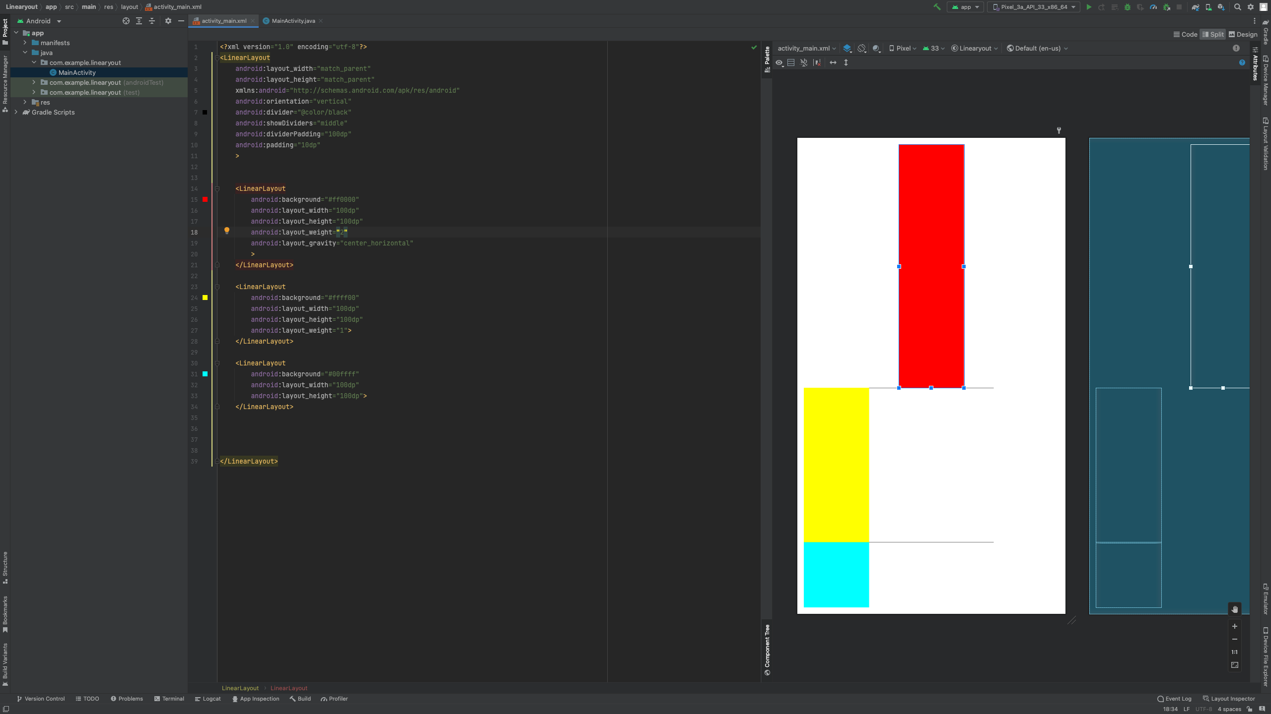
2.1 Linearyout
常见属性 |
说明 |
orientation |
布局中组件的排列方式 |
gravity |
控制组件所包含的子元素的对齐方式,可多个组合 |
layout_gravity |
控制该组件在父容器里的对齐方式 |
background |
为该组件设置一个背景图片,或者是直接用颜色覆盖 |
divider |
分割线 |
showDividers |
设置分割线所在的位置,none(无)begining(开始)end(结束)middle(每两个组件间 |
dividerPadding |
设置分割线的padding |
layout_weight(权重) |
该属性是用来等比例的划分区域 |
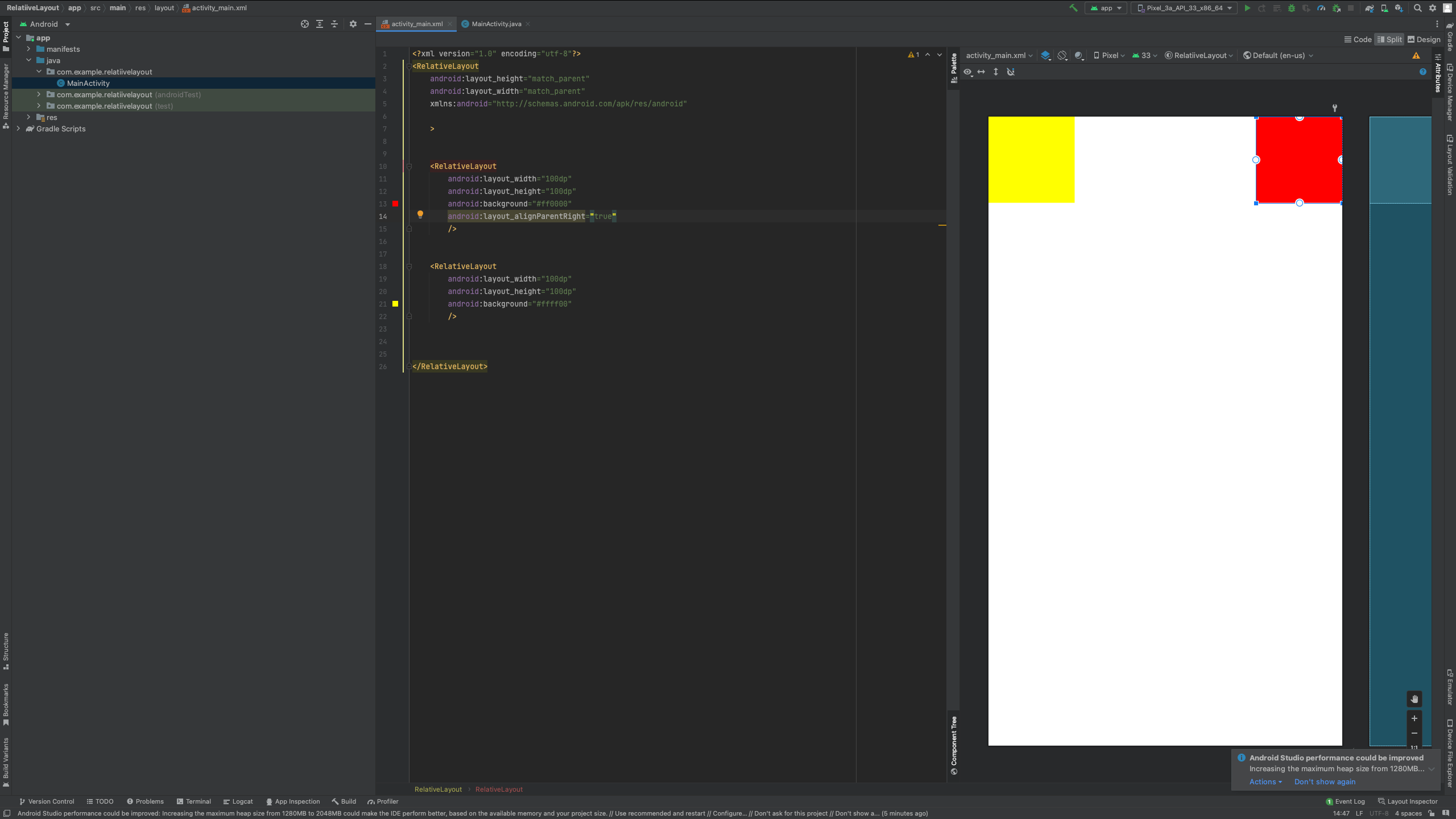
2.2 RelativeLayout
根据父容器定位
属性 |
说明 |
layout_alignParentLeft |
左对齐 |
layout_alignParentRight |
右对齐 |
layout_alignParentTop |
顶部对齐 |
layout_centerParentBottom |
底部对齐 |
layout_centerParentVertical |
垂直居中 |
layout_centerParentHorizontal |
水平居中 |
layout_centerParent |
中间位置 |
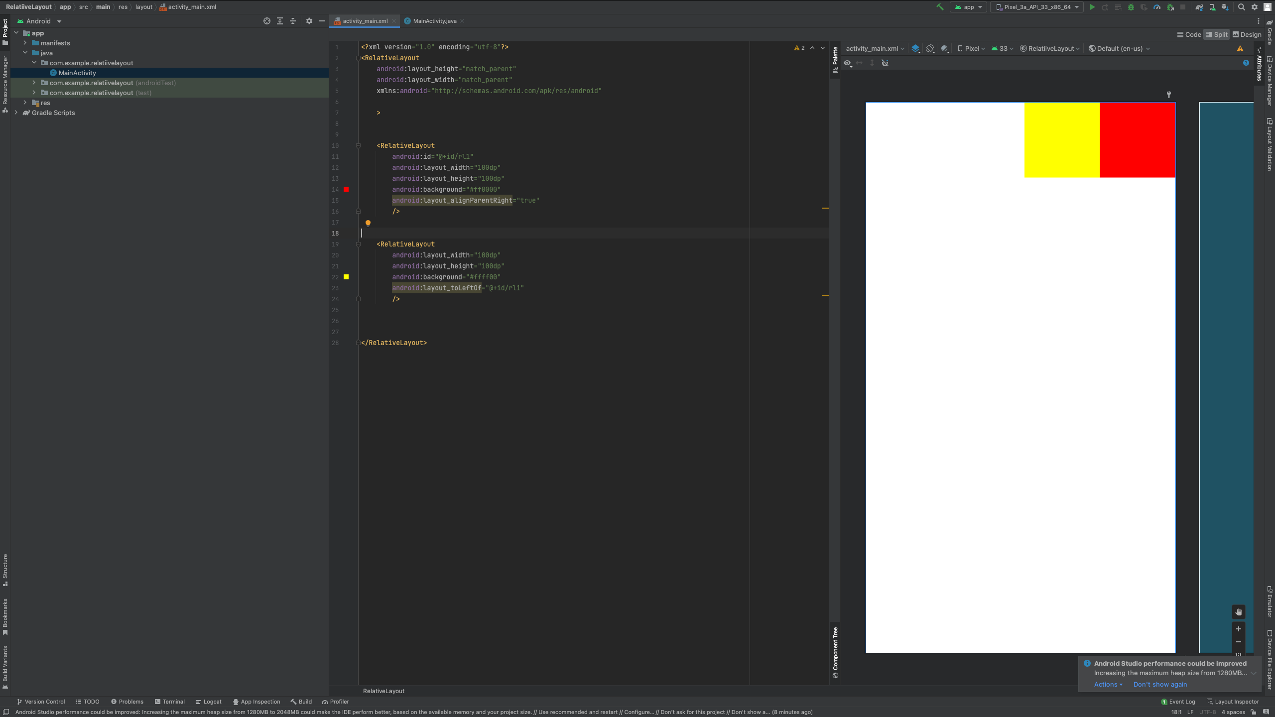
根据兄弟组件定位
属性 |
说明 |
layout_toLeftOf |
放置于参考组件的左边(默认) |
layout_toRightOf |
放置于参考组件的右边 |
layout_above |
放置于参考组件的上方 |
layout_below |
放置于参考组件的下方 |
layout_alignTop |
对齐参考组件的上边界 |
layout_alignBottom |
对齐参考组件的下边界 |
layout_alignLeft |
对齐参考组件的左边界 |
layout_alignRight |
对齐参考组件的右边界 |
通用属性:
margin设置组件与父容器的边距 |
说明 |
layout_margin |
上下左右偏移 |
layout_marginLeft |
|
layout_marginRight |
|
layout_marginTop |
|
layout_marginBottom |
Padding设置组件内部元素的边距
2.3 FrameLayout
android:foreground 设置前景
android:foregroundGravity 设置前景位置
2.4 TableLayout
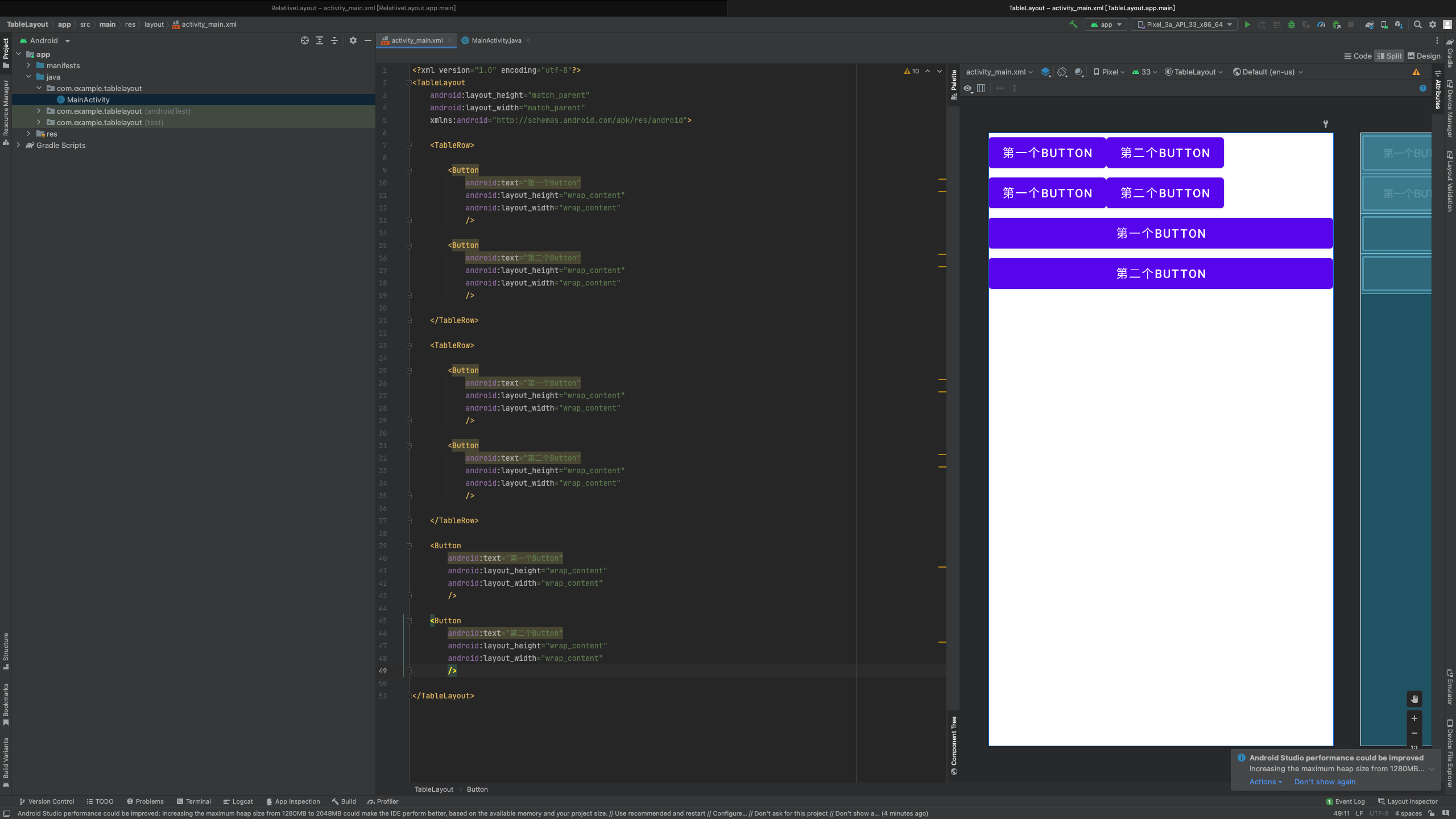
常见属性:
属性 |
说明 |
android:collapseColumns |
设置需要被隐藏的列的序号,从0开始 |
android:stretchColumns |
设置允许被拉伸的列的序号,从0开始 |
android:shrinkColumns |
设置允许被收缩的列的序号,从0开始 |
子控件设置属性:
属性 |
说明 |
android:layout_column |
显示在第几列 |
Android:layout_span |
横向跨几列 |
2.5 GridLayout
常见属性 |
说明 |
android:orientation |
设置水平显示还是垂直显示 |
android:columnCount |
设置行的显示个数 |
android:rowCount |
设置列的显示个数 |
子控件属性 |
说明 |
android:layout_column |
显示在第几列 |
android:layout_columnSpan |
横向跨几列 |
android:layout_columnWeight |
横向剩余空间分配方式 |
android:layout_gravity |
在网格中的显示位置 |
android:layout_rowSpan |
横向跨几行 |
android:layout_row |
显示在第几行 |
android:layout_rowWeight |
纵向剩余空间分配方式 |
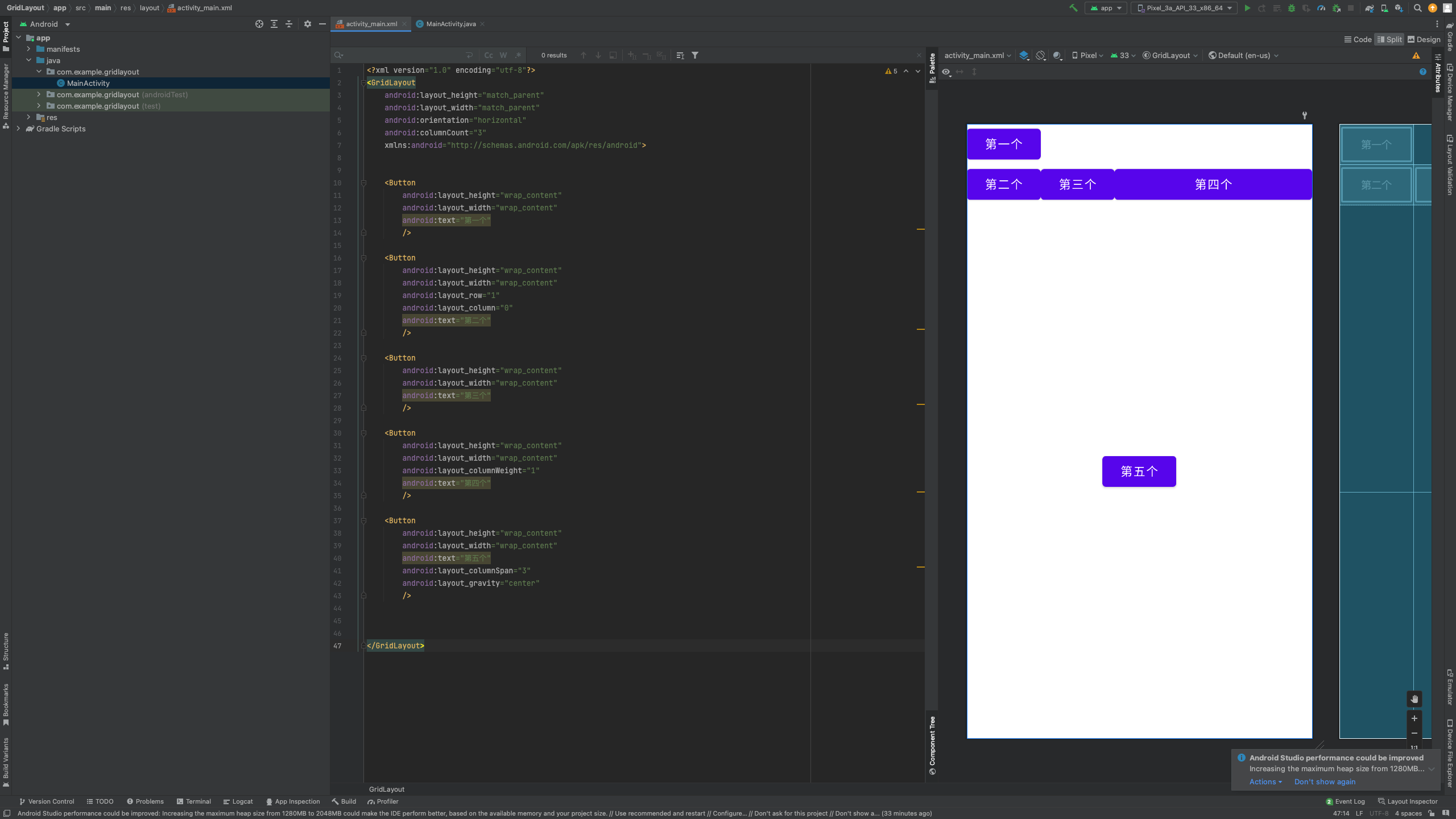
<?xml version="1.0" encoding="utf-8"?>
<GridLayout
android:layout_height="match_parent"
android:layout_width="match_parent"
android:orientation="horizontal"
android:columnCount="3"
xmlns:android="http://schemas.android.com/apk/res/android">
<Button
android:layout_height="wrap_content"
android:layout_width="wrap_content"
android:text="第一个"
/>
<Button
android:layout_height="wrap_content"
android:layout_width="wrap_content"
android:layout_row="1"
android:layout_column="0"
android:text="第二个"
/>
<Button
android:layout_height="wrap_content"
android:layout_width="wrap_content"
android:text="第三个"
/>
<Button
android:layout_height="wrap_content"
android:layout_width="wrap_content"
android:layout_columnWeight="1"
android:text="第四个"
/>
<Button
android:layout_height="wrap_content"
android:layout_width="wrap_content"
android:text="第五个"
android:layout_columnSpan="3"
android:layout_gravity="center"
/>
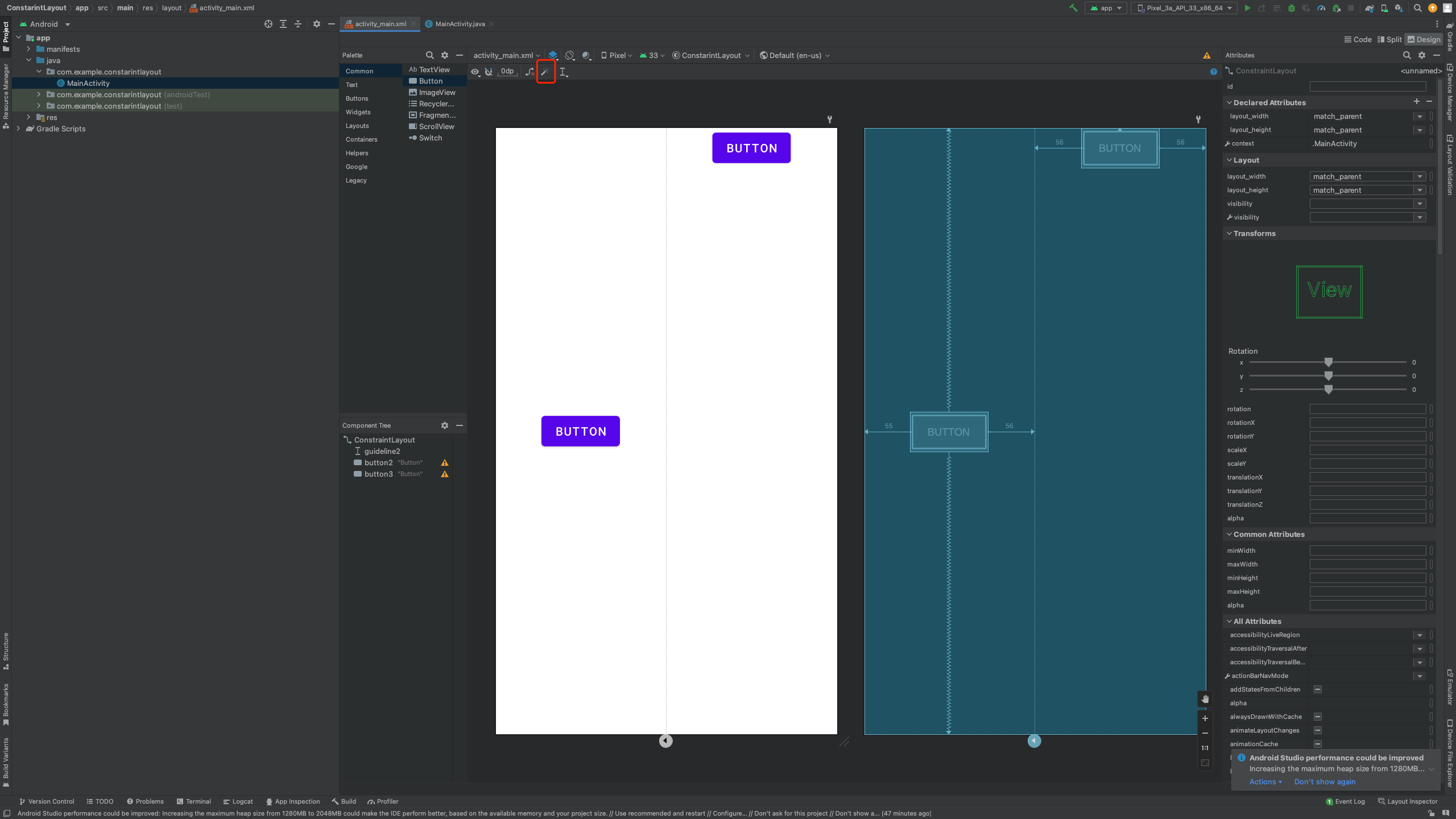
</GridLayout>2.6 ConstraintLayout
ConstraintLayout——约束布局
在design界面进行约束的调整
infer constraint推导约束:根据控件的布局,自动推导相应约束。(推荐)