CSS3 转换可以对元素进行移动、缩放、转动、拉长或拉伸。
下面我们来介绍2D的转换:
一、移动(translate)根据左(X轴)和顶部(Y轴)位置给定的参数,从当前元素位置移动,可以改变元素在页面中的位置,类似于定位。
1、语法:
transform:translate(x,y);或者分开写也是可以的
transform:translateX(n);
transform:translateY(n);
2、重点:
- 定义2D转换中的移动,沿看X,Y轴元素移动;
- translate最大的优点就是不会影响其他元素的位置;
- translate自身的百分比是相对于自身元素translate(50%,50%);
- 对行内标签没有效果;
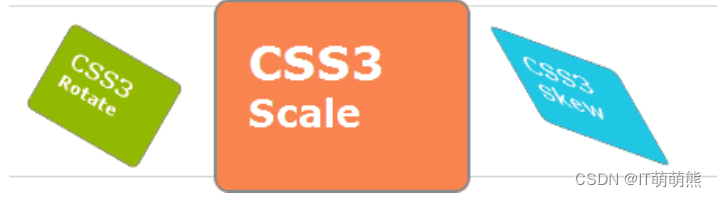
二、旋转(rotate):
rotate()方法,在一个给定度数顺时针旋转的元素。负值是允许的,这样是元素逆时针旋转。
语法:transfrom:rotate(旋转的度数)
重点:
- rotate(度数),单位是deg例如:rotate(45deg);
- 角度是正为顺时针,是负为逆时针;
- 默认顺时针的中心点为元素的中心点;
三、2D转换中心点transform-origin:
语法:transform-origin:x y;
重点:
- 注意后面x,y用空格隔开;
- x y默认的中心点是元素的中心点(50% 50%);
- 还可以给x y设定像素或者方向名词(right left center bottom top);
四、缩放 scale():
scale()方法,该元素增加或减少的大小,取决于宽度(X轴)和高度(Y轴)的参数:
- 修改元素的大小,放大或者缩小元素
- 为负数会颠倒
- scale(a) scale(x,y)
五、倾斜 skew():
包含两个参数值,分别表示X轴和Y轴倾斜的角度,如果第二个参数为空,则默认为0,参数为负表示向相反方向倾斜。
- skewX(<angle>);表示只在X轴(水平方向)倾斜。
- skewY(<angle>);表示只在Y轴(垂直方向)倾斜。
- 让元素在不同方向上倾斜
- skew(a) 等于 skew(a,0)
- skew(x,y)
- 单位 角度deg
六、 matrix():
matrix()方法和2D变换方法合并成一个。
matrix 方法有六个参数,包含旋转,缩放,移动(平移)和倾斜功能。
用矩阵表达变换量 matrix(a,b,c,d,x,y)
- a c x
- b d y
- 0 0 1
下面运用一个具体案例来实践一下:
如图效果:

代码如下:
<!DOCTYPE html>
<html lang="en">
<head>
    <meta charset="UTF-8">
    <meta http-equiv="X-UA-Compatible" content="IE=edge">
    <meta name="viewport" content="width=device-width, initial-scale=1.0">
    <title>Document</title>
    <style>
        body{
            margin: 100px;
        }
        .transformElement{
            width:200px;
            height:200px;
            background-color: red;
            transition:all 1s linear;
            float: left;
            position: relative;
            left: 0;
            color: #FFF;
            /* transform-origin: left top; */
        }

        .transformElement2{
            width:200px;
            height:200px;
            background-color: blue;
            transition:all 1s linear;
            float: left;
        }

        .transformElement:hover{
            /* transform: translate(200px,0) rotate(360deg) scale(2); */
            /* left: 100px; */
            /* transform: scale(2,0.5) */
            transform: skew(-45deg,45deg);
        }

        .clock{
            width: 400px;
            height: 400px;
            border-radius: 50%;
            background-color: #Faa;
            position: relative;

        }
        .stick{
            width: 4px;
            height: 200px;
            background-color: blue;
            position: absolute;
            left: 198px;
            top: 0;
            transition: all 12s linear;
            transform-origin: center bottom;
        }
        .stickshort{
            width: 8px;
            height: 100px;
            background-color: rgb(142, 21, 248);
            position: absolute;
            left: 196px;
            top: 100px;
            transition: all 12s linear;
            transform-origin: center bottom;
            z-index: 2;
        }
        .clock:hover .stick{
            transform: rotate(4320deg);
        }
        .clock:hover .stickshort{
            transform: rotate(360deg);
        }
    </style>
</head>
<body>


     <!-- <div class="transformElement"></div>
     <div class="transformElement2"></div> -->

     <div class="clock">
        <div class="stick"></div>
        <div class="stickshort"></div>
     </div>
</body>
</html>
可以根据自己的要求来变换改动多动手,发挥自己的想象能力。