1.Collapse折叠面板
可以折叠/展开的内容区域。
2.何时使用
·对复杂区域进行分组和隐藏,保持页面的整洁。
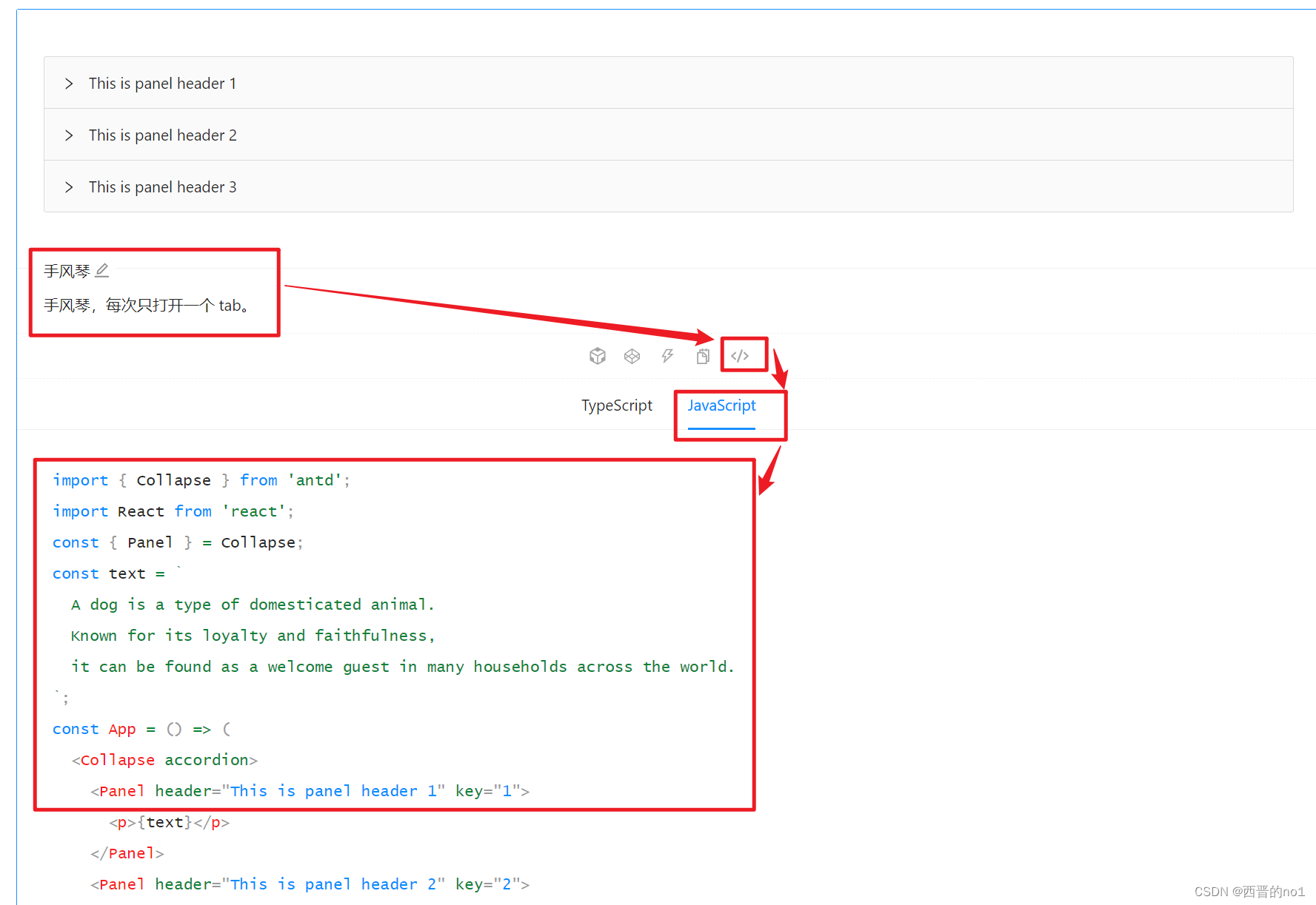
·手风琴 是一种特殊的折叠面板,只允许单个内容区域展开。
组件代码来自: 折叠面板 Collapse - Ant Design
3.本地验证前的准备
参考文章【react项目+antd组件-demo:hello-world react项目+antd组件-demo:hello-world_西晋的no1的博客-CSDN博客】,将 折叠面板 Collapse - Ant Design 中需要在本地使用的代码复制覆盖App2.js中的全部代码,启动代码,可在本地查看现象和更改代码。
4.本地验证Collapse的简单用法。
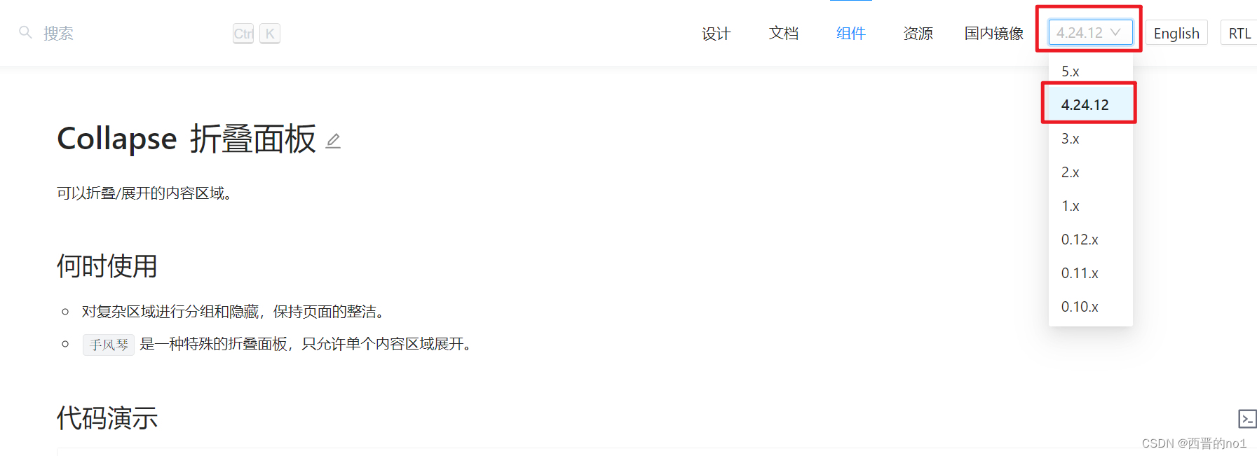
注意:需要选择与本地验证适合的版本,否则,达不到预期效果。
复制下图所示代码,了解Collapse的简单用法-可同时打开多个面板,首次运行默认打开第一个。

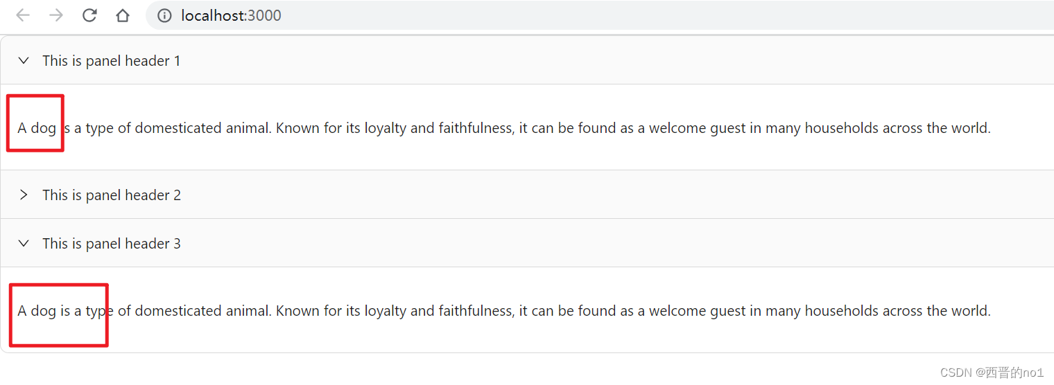
5.默认展开多个
在上一步的基础上增加defaultActiveKey的值, '3'
最终App2.js中的全部代码如下:
import {Collapse} from 'antd';
import React from 'react';

const {Panel} = Collapse;
const text = `
  A dog is a type of domesticated animal.
  Known for its loyalty and faithfulness,
  it can be found as a welcome guest in many households across the world.
`;
const App = () => {
    const onChange = (key) => {
        console.log(key);
    };
    return (
        <Collapse defaultActiveKey={['1', '3']} onChange={onChange}>
            <Panel header="This is panel header 1" key="1">
                <p>{text}</p>
            </Panel>
            <Panel header="This is panel header 2" key="2">
                <p>{text}</p>
            </Panel>
            <Panel header="This is panel header 3" key="3">
                <p>{text}</p>
            </Panel>
        </Collapse>
    );
};
export default App;
效果图如下:
6.手风琴的简单用法
复制下图所示代码,了解Collapse手风琴的简单用法。
本文仅介绍了组件Collapse的部分内容,更多内容请参阅官方文档: 折叠面板 Collapse - Ant Design