import matplotlib.pyplot as plt
import pandas as pd
path=r"E:\北风\数据科学脚本\Python_book\5Preprocessing\sale.csv"
info=open(path)
info_1=pd.read_csv(info)
print(info_1)
del info_1["year"]
print(info_1)
info_1.drop("sale",axis=1)
year market sale profit
0 2010 东 33912 2641
1 2010 南 32246 2699
2 2010 西 34792 2574
3 2010 北 31884 2673
4 2011 东 31651 2437
5 2011 南 30572 2853
6 2011 西 34175 2877
7 2011 北 30555 2749
8 2012 东 31619 2106
9 2012 南 32443 3124
10 2012 西 32103 2593
11 2012 北 31744 2962
market sale profit
0 东 33912 2641
1 南 32246 2699
2 西 34792 2574
3 北 31884 2673
4 东 31651 2437
5 南 30572 2853
6 西 34175 2877
7 北 30555 2749
8 东 31619 2106
9 南 32443 3124
10 西 32103 2593
11 北 31744 2962
| market | profit | |
|---|---|---|
| 0 | 东 | 2641 |
| 1 | 南 | 2699 |
| 2 | 西 | 2574 |
| 3 | 北 | 2673 |
| 4 | 东 | 2437 |
| 5 | 南 | 2853 |
| 6 | 西 | 2877 |
| 7 | 北 | 2749 |
| 8 | 东 | 2106 |
| 9 | 南 | 3124 |
| 10 | 西 | 2593 |
| 11 | 北 | 2962 |
fig,ax=plt.subplots()
ax.scatter(info_1[“market”],info_1[“profit”])
ax.set_xlable(“aa”)
ax.set_ylable(“bb”)
plt.show()
#散点图
fig,ax=plt.subplots()
ax.scatter(info_1["market"],info_1["profit"])#.scatter(横坐标,纵坐标值)
ax.set_xlabel("market")
ax.set_ylabel("profit")
plt.show()

#条形图
import numpy as np
print(info_1)
bar_height=info_1["profit"][0:5].values#高度
print(bar_height)
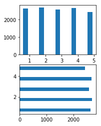
fig=plt.figure()
bar_position=np.arange(5)+0.75#横坐标
ax=fig.add_subplot(2,2,1)
ax1=fig.add_subplot(2,2,3)#分子图
ax.bar(bar_position,bar_height,0.3)#.bar(纵坐标,柱形的高度,柱的宽度)
ax1.barh(bar_position,bar_height,0.3)#barh 横着的柱状图
plt.show() market sale profit
0 东 33912 2641
1 南 32246 2699
2 西 34792 2574
3 北 31884 2673
4 东 31651 2437
5 南 30572 2853
6 西 34175 2877
7 北 30555 2749
8 东 31619 2106
9 南 32443 3124
10 西 32103 2593
11 北 31744 2962
[2641 2699 2574 2673 2437]

#柱形图
import matplotlib.pyplot as plt
fig,ax=plt.subplots()

ax.hist(info_1["profit"],range(2400,3000),bins=12)#hist(柱形图的值,bins=将柱形图分成多少分,range(限制从a到b的柱形图))
ax.set_xlabel("proft")
plt.show()


#盒图
fig,ax=plt.subplots()
ax.boxplot(info_1[["profit","sale"]].values)#boxplot(值)
ax.set_xticklabels(["profit","sale"])#横坐标
ax.tick_params(bottom="off",top="off",left="off",right="off")#k可以把坐标上的凸出来的横杠去掉
#ax.set_visible(True)#画的图像是否可视,False整个图像就被隐藏,True整个图像可视
plt.show()
