一、查看数据
import pandas as pd
# 数据集的信息是关于电影评分,第一列为电影名称,其余几列为各公司对电影的评分数据。
reviews = pd.read_csv('fandango_scores.csv')
cols = ['FILM', 'RT_user_norm', 'Metacritic_user_nom', 'IMDB_norm', 'Fandango_Ratingvalue', 'Fandango_Stars']
norm_reviews = reviews[cols]
print(norm_reviews.head())

                           FILM  RT_user_norm  Metacritic_user_nom  \
0  Avengers: Age of Ultron (2015)           4.3                 3.55
1               Cinderella (2015)           4.0                 3.75
2                  Ant-Man (2015)           4.5                 4.05
3          Do You Believe? (2015)           4.2                 2.35
4   Hot Tub Time Machine 2 (2015)           1.4                 1.70

   IMDB_norm  Fandango_Ratingvalue  Fandango_Stars
0       3.90                   4.5             5.0
1       3.55                   4.5             5.0
2       3.90                   4.5             5.0
3       2.70                   4.5             5.0
4       2.55                   3.0             3.5
二、绘画条形图
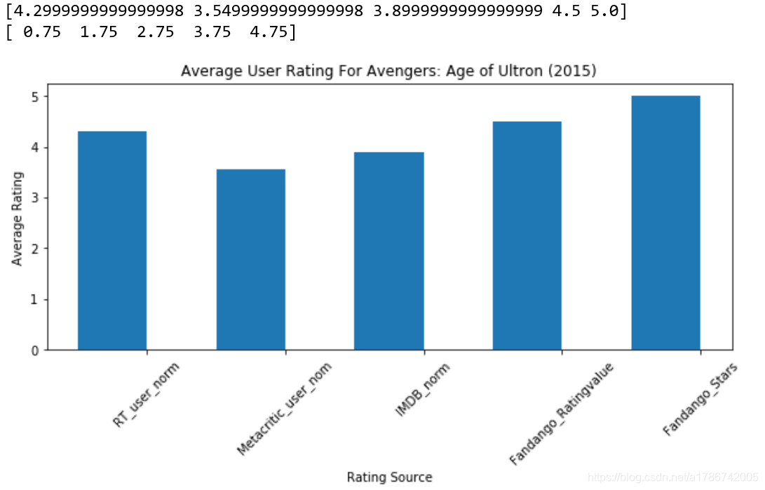
2.1 绘画竖立的条形图
# 绘画竖立的条形图
import matplotlib.pyplot as plt
from numpy import arange
# 评分值的索引
num_cols = ['RT_user_norm', 'Metacritic_user_nom', 'IMDB_norm', 'Fandango_Ratingvalue', 'Fandango_Stars']
# 柱形图的值
bar_heights = norm_reviews.ix[0, num_cols].values
print(bar_heights)
# 柱形图距离原点的距离
bar_positions = arange(5) + 0.75
print(bar_positions)
# 初始化画布
fig, ax = plt.subplots(figsize=(10,4))
# 第三个参数为柱的宽度
ax.bar(bar_positions, bar_heights, 0.5)
# 设置x轴数据标签
tick_positions = range(1,6)
ax.set_xticks(tick_positions)
ax.set_xticklabels(num_cols, rotation=45)
# 设置名称
ax.set_xlabel('Rating Source')
ax.set_ylabel('Average Rating')
ax.set_title('Average User Rating For Avengers: Age of Ultron (2015)')
plt.show()
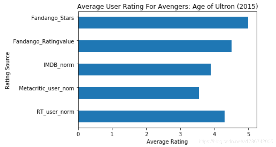
2.2 绘画横着的条形图
# 绘画横着的条形图,只需要把ax.bar()改为ax.barh()
import matplotlib.pyplot as plt
from numpy import arange
num_cols = ['RT_user_norm', 'Metacritic_user_nom', 'IMDB_norm', 'Fandango_Ratingvalue', 'Fandango_Stars']

bar_widths = norm_reviews.ix[0, num_cols].values
bar_positions = arange(5) + 0.75
tick_positions = range(1,6)
fig, ax = plt.subplots()
ax.barh(bar_positions, bar_widths, 0.5)

ax.set_yticks(tick_positions)
ax.set_yticklabels(num_cols)
ax.set_ylabel('Rating Source')
ax.set_xlabel('Average Rating')
ax.set_title('Average User Rating For Avengers: Age of Ultron (2015)')
plt.show()
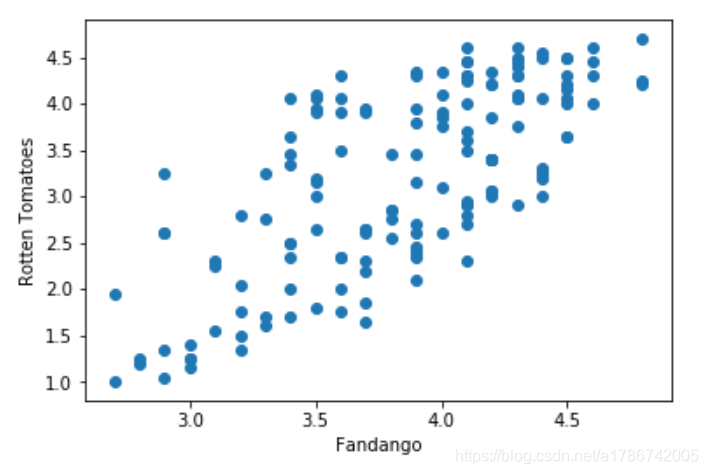
三、绘画散点图
# 散点图的绘制,类似于柱状图
fig, ax = plt.subplots()
ax.scatter(norm_reviews['Fandango_Ratingvalue'], norm_reviews['RT_user_norm'])
ax.set_xlabel('Fandango')
ax.set_ylabel('Rotten Tomatoes')
plt.show()
四、数据集的地址
https://pan.baidu.com/s/1S3EMXsjv_B-mqd3wmOsZug
