matplotlib是数据分析工具在python上的实现。
其内容非常丰富,在此仅对入门级别的绘图进行介绍。
更多内容可参阅官方开发文档:已上传CSDN资源
文章目录
散点图
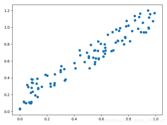
- 反应相关性
例1:num2的产生是与num1相关的,以num1为X、num2为Y绘制散点图可观察相关性
num1 = np.random.rand(100)
num2 = np.random.rand(100)*0.3+num1

plt.scatter(num1, num2)
plt.show()
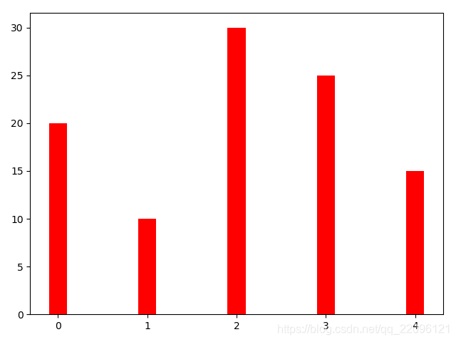
条形图(柱状图)
- 能够使人们一眼看出各个数据的大小。
- 易于比较数据之间的差别。
例1:绘制条形图
y = [20, 10, 30, 25, 15]

index = np.arange(5)
pl = plt.bar(x=index, height=y, color='r', width=0.2)
plt.show()
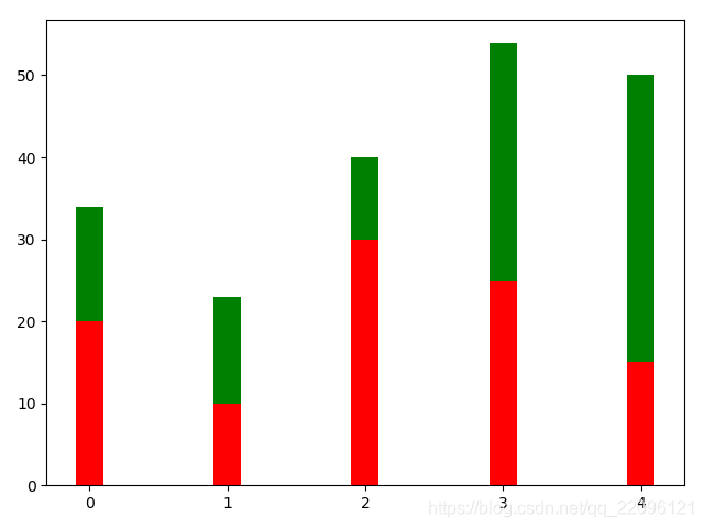
例2:绘制叠加条形图
增加参数bottom使图形上移完成叠加
y = [20, 10, 30, 25, 15]
z = [14, 13, 10, 29, 35]

index = np.arange(5)
pl = plt.bar(x=index, height=y, color='r', width=0.2)
pl = plt.bar(x=index, bottom=y, height=z, color='g', width=0.2)
plt.show()
例3:绘制对比条形图
将x坐标偏移形状宽度
y = [20, 10, 30, 25, 15]
z = [14, 13, 10, 29, 35]


index = np.arange(5)
pl = plt.bar(x=index, height=y, color='r', width=0.2)
pl = plt.bar(x=index+0.2, height=z, color='g', width=0.2)

plt.show()

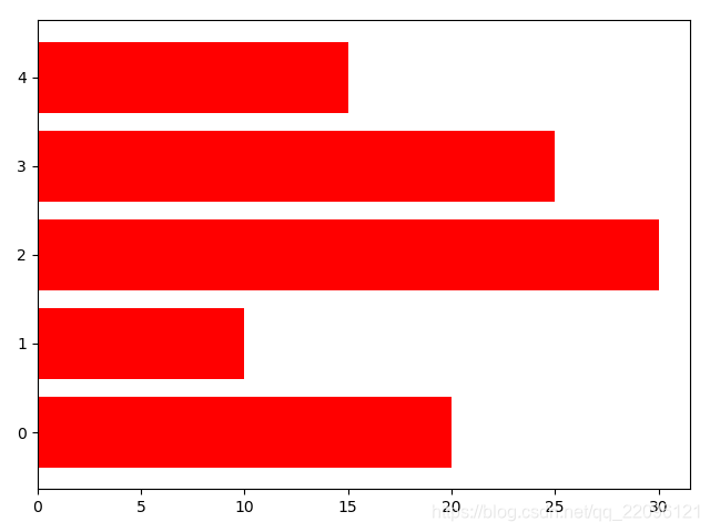
例4:绘制水平条形图
注意参数变化
y = [20, 10, 30, 25, 15]
index = np.arange(5)
pl = plt.barh(y=index, width=y, color='r')

plt.show()
直方图(质量分布图)
- 反应质量分布频度(用于检验是否满足正态分布)
- 注意与条形图区别(直方图通常为连续变量)
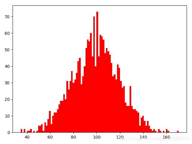
例1:绘制直方图
bins:条数(bins越大曲线越平滑),density:是否显示为比例(True:按比例为坐标,False:按个数为坐标)
mu = 100 # mean of distribution
sigma = 20 # standard deviation of distribution

x = mu + sigma * np.random.randn(2000)

plt.hist(x, bins=100, color='red', density=False)

plt.show()
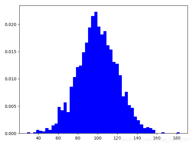
例2:不同参数直方图
注意纵坐标轴变化
mu = 100 # mean of distribution
sigma = 20 # standard deviation of distribution

x = mu + sigma * np.random.randn(2000)

plt.hist(x, bins=50, color='b', density=True)

plt.show()
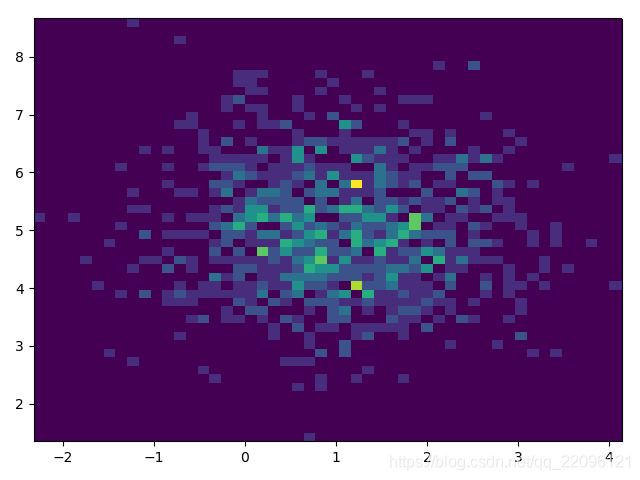
例3:二维直方图
用于检验两组变量的联合分布密度
x = np.random.randn(1000)+1
y = np.random.randn(1000)+5

plt.hist2d(x,y,bins=50)
plt.show()
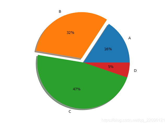
饼状图
- 反应各部分数据占总量的比值
例1:绘制饼状图
autopct:显示占比数值,explode:突出分离某部分,shadow:图像显示阴影
labels = 'A', 'B', 'C', 'D'
fracs = [15, 30, 45, 5]

plt.axes(aspect=1)
plt.pie(x = fracs, labels=labels, autopct='%.0f%%', explode=[0, 0.1, 0, 0], shadow=True)

plt.show()
盒须图(盒式图、盒状图或箱线图)
- 是一种用作显示一组数据分散情况资料的统计图。
- 它能显示出一组数据的最大值、最小值、中位数、及上下四分位数。
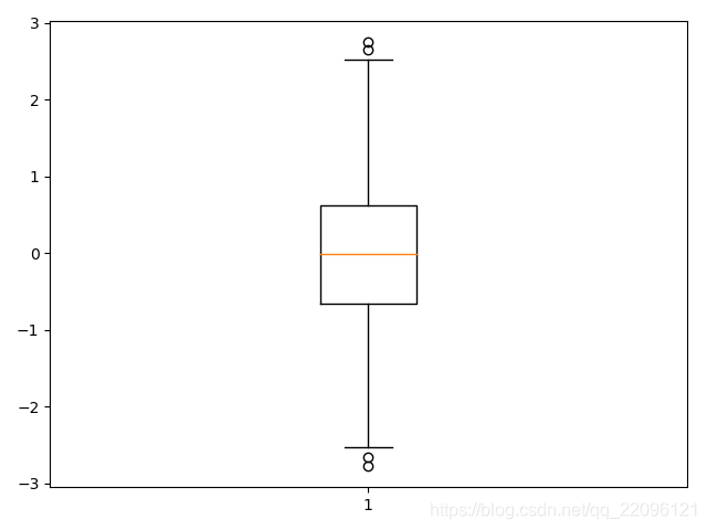
例1:绘制一个盒式图
data = np.random.normal(size=1000, loc=0, scale=1)

# sym:调整异常值样式,whis:上下边缘长度比例
plt.boxplot(data, sym='o', whis=1.5)
plt.show()
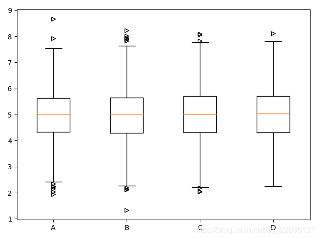
例2:多盒图像
data = np.random.normal(size=(1000,4), loc=5, scale=1)
labels = ['A', 'B', 'C', 'D']
# sym:调整异常值样式,whis:上下边缘长度
plt.boxplot(x=data, labels=labels, sym='>')
plt.show()
Style
颜色
matplotlib提供了多种设置颜色的方法
最常用的是指定颜色/RGB/十六进制代码几个方法
- an RGB or RGBA (red, green, blue, alpha) tuple of float values in [0, 1] (e.g., (0.1, 0.2,
0.5) or (0.1, 0.2, 0.5, 0.3));- a hex RGB or RGBA string (e.g., ‘#0f0f0f’ or ‘#0f0f0f80’; case-insensitive);
- a string representation of a float value in [0, 1] inclusive for gray level (e.g., ‘0.5’);
- one of {‘b’, ‘g’, ‘r’, ‘c’, ‘m’, ‘y’, ‘k’, ‘w’};
- a X11/CSS4 color name (case-insensitive);
- a name from the xkcd color survey, prefixed with ‘xkcd:’ (e.g., ‘xkcd:sky blue’; case
insensitive);
220 Chapter 2. Tutorials
Matplotlib, Release 3.1.1- one of the Tableau Colors from the ’T10’ categorical palette (the default color
cycle): {‘tab:blue’, ‘tab:orange’, ‘tab:green’, ‘tab:red’, ‘tab:purple’, ‘tab:brown’,
‘tab:pink’, ‘tab:gray’, ‘tab:olive’, ‘tab:cyan’} (case-insensitive);- a ”CN” color spec, i.e. ‘C’ followed by a number, which is an index into the default property
cycle (matplotlib.rcParams[‘axes.prop_cycle’]); the indexing is intended to occur at
rendering time, and defaults to black if the cycle does not include color.
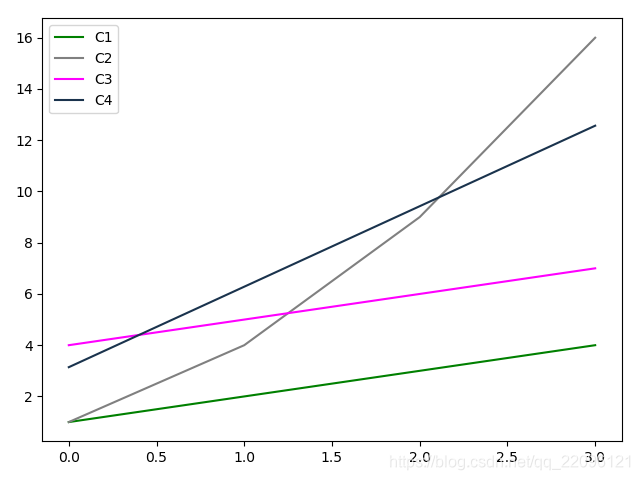
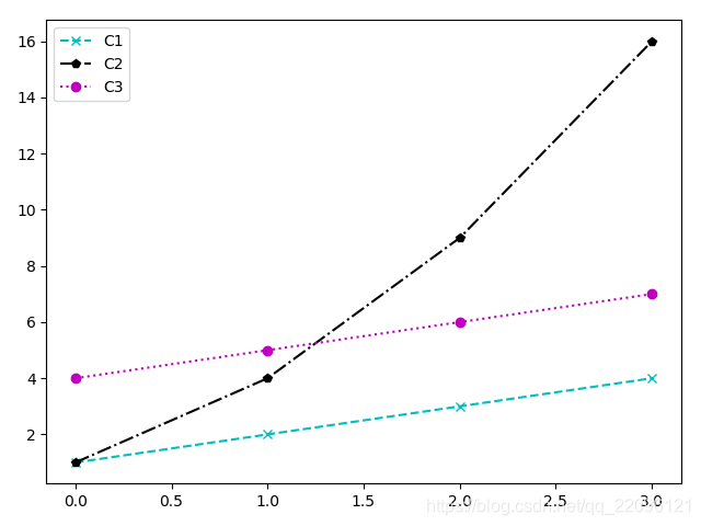
例1:指定颜色
y = np.arange(1,5)
# 指定颜色
plt.plot(y,color='green', label='C1')
# 指定灰度
plt.plot(y**2,color='0.5', label='C2')
# 十六进制代码
plt.plot(y+3,color='#FF00FF', label='C3')
# RGB代码
plt.plot(y*np.pi,color=(0.1, 0.2, 0.3), label='C4')
plt.legend()
plt.show()
线的样式
例1:指定linestyle
# 点线
plt.plot(y,'.', label='C1')
# 点划线
plt.plot(y**2,'.-', label='C2')
# 默认
plt.plot(y+3,'', label='C3')
# 虚线
plt.plot(y*np.pi,'--', label='C4')

plt.legend()
plt.show()
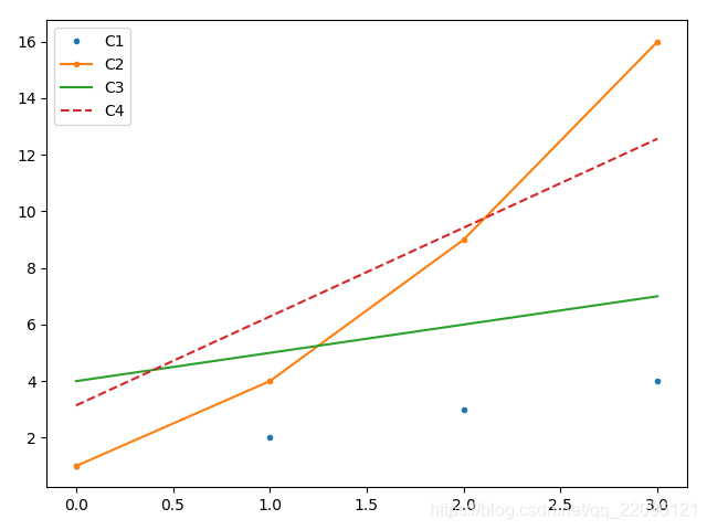
点的样式
例1:指定点样式 marker
用marker指定点样式会带有连线(如:C1,C3),否则不带连线
plt.plot(y,marker='o', label='C1')

plt.plot(y**2,'.', label='C2')

plt.plot(y+3,marker='D', label='C3')

plt.plot(y*np.pi,'*', label='C4')


plt.legend()
plt.show()

样式字符串
例1:通过字符串同时指定 ‘颜色 点型 线型’
plt.plot(y,'cx--',label='C1')
plt.plot(y**2,'kp-.',label='C2')

plt.plot(y+3,'mo:',label='C3')

plt.legend()
plt.show()
matplotlib编程三种方式
- pyplot:经典高层封装
- pylib:将Matplotlib和Numpy合并的模块,模拟Matlab的编程环境
- 面向对象的方式:matplotlib的精髓,更基础和底层的方式
三种方式的优劣
- pyplot:简单易用。交互使用时方便,可以根据命令实时作图。但底层定制能力不足。
- pylab:完全封装,环境最接近Matlab。不推荐使用。
- 面向对象的方式:基础和底层的方式,难度稍大但定制能力强,而且是matplotlib的精髓。
- 总结:实战中推荐,根据需求,综合使用pyplot和OO的方式,显示导入numpy
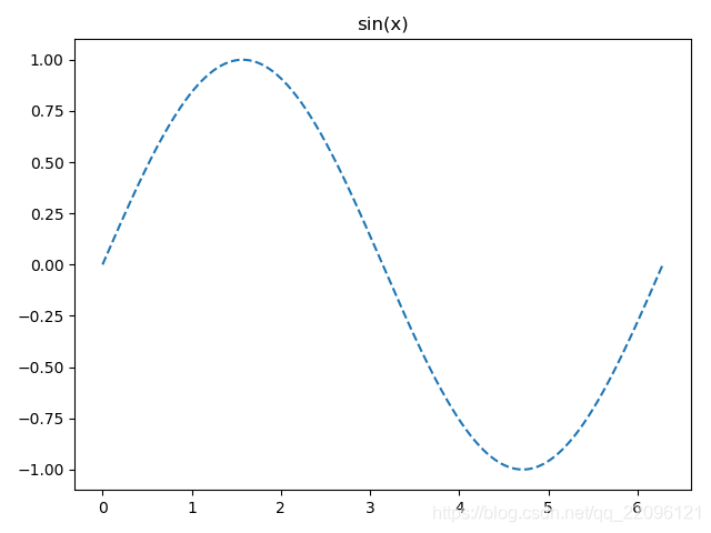
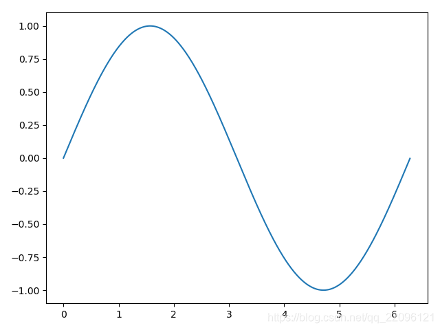
例1:用面向对象的方式绘制sin函数
x = np.arange(0, 2*np.pi, 0.01)
y = np.sin(x)

fig = plt.figure()

ax=fig.add_subplot(111)

l,= plt.plot(x,y)
l.set_linestyle('--')
ax.set_title('sin(x)')
plt.show()
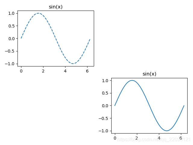
面向对象简介
- FigureCanvas:画布
- Figure:图
- Axes:坐标轴
ax = fig.add_subplot(111)
- 返回Axes实例
- 参数一:子图总行数
- 参数二:子图总列数
- 参数三:子图位置
- 在Figure上添加Axes的常用方法
x = np.arange(0, 2*np.pi, 0.01)
y = np.sin(x)

fig = plt.figure()

ax1=fig.add_subplot(221)

ax2=fig.add_subplot(224)

l,= ax1.plot(x,y)
ax2.plot(x,y)

l.set_linestyle('--')

ax1.set_title('sin(x)')
ax2.set_title('sin(x)')

plt.show()
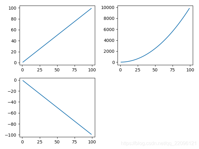
例2:pyplot方式绘制多子图
命令行交互模式
import numpy as np
import matplotlib.pyplot as plt
n=np.arange(1,100)
plt.subplot(221)
Out[7]: <matplotlib.axes._subplots.AxesSubplot at 0x239beb2a588>
plt.plot(n,n)
Out[8]: [<matplotlib.lines.Line2D at 0x239bedb2048>]
plt.subplot(222)
Out[9]: <matplotlib.axes._subplots.AxesSubplot at 0x239bedb25f8>
plt.plot(n,n*n)
Out[10]: [<matplotlib.lines.Line2D at 0x239bede4b70>]
plt.subplot(223)
Out[11]: <matplotlib.axes._subplots.AxesSubplot at 0x239beb50e48>
plt.plot(n,-n)
Out[12]: [<matplotlib.lines.Line2D at 0x239bee19208>]
plt.show()
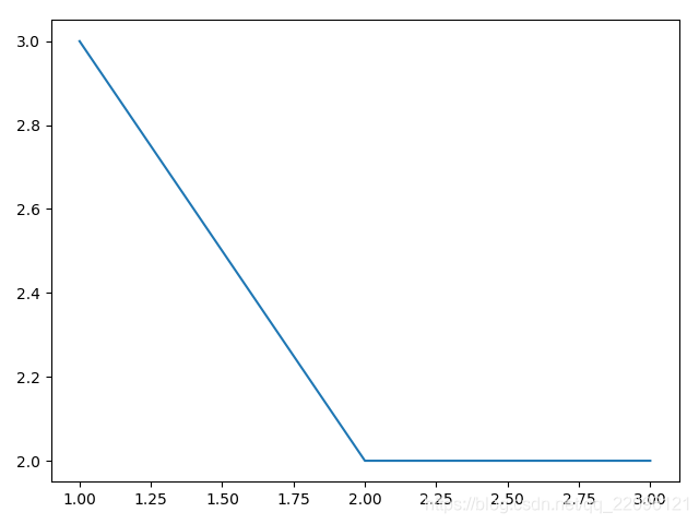
多图同时显示
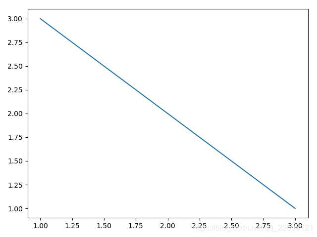
例1:本质构造多个figure对象,每个都是一张图
fig1 = plt.figure()
ax1 = fig1.add_subplot(111)
ax1.plot([1,2,3],[3,2,1])


fig2 = plt.figure()
ax2 = fig2.add_subplot(111)
ax2.plot([1,2,3],[3,2,2])

plt.show()
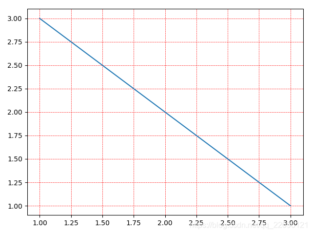
grid 网格
例1:绘制带网格的
fig1 = plt.figure()
ax1 = fig1.add_subplot(111)
ax1.plot([1,2,3],[3,2,1])

# 以面向对象的方式设置网格
# ax1.grid(color='g')

plt.grid(True, color='r',linestyle='--', linewidth=0.5)
plt.show()
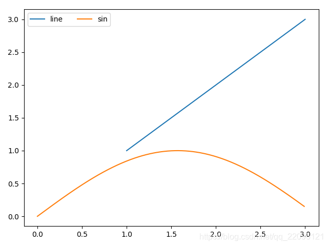
legend图例
例1:使用legend方法添加图例
fig1 = plt.figure()
ax1 = fig1.add_subplot(111)
# ax1.plot([1,2,3],[1,2,3],label='line')

x = np.arange(0,3,0.01)
# ax1.plot(x, np.sin(x), label='sin')
l,=ax1.plot([1,2,3],[1,2,3])
ax1.plot(x, np.sin(x))
# loc设置legend的位置, ncol设置列的个数
ax1.legend(['line','sin'],loc=0,ncol=2)

# 如果不在ax上设置label也可以在plt.legend中设置
# plt.legend(['line','sin'])
plt.show()
调整坐标轴axis()
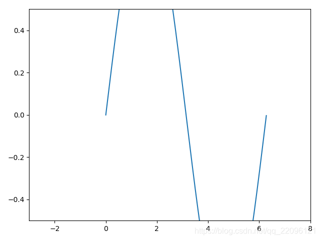
例1:调整坐标轴前后对比
x = np.arange(0, 2*np.pi, 0.01)
y = np.sin(x)

fig = plt.figure()

ax = fig.add_subplot(111)
ax.plot(x,y)

# 查看坐标轴(x最小,x最大,y最小,y最大)
print(ax.axis())
print(plt.xlim())
print(plt.ylim())

[Out:]
(-0.31400000000000006, 6.594, -1.0999969878536957, 1.0999995243978122)
(-0.31400000000000006, 6.594)
(-1.0999969878536957, 1.0999995243978122)

# 解开注释调整坐标轴
# ax.axis([-3, 8, -0.5, 0.5])

plt.show()
调整前
调整后
调整坐标轴刻度
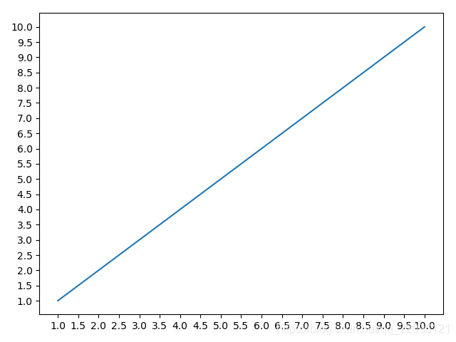
例1:修改坐标轴刻度
x = np.arange(1,11,1)
plt.plot(x,x)

# get current axis
ax = plt.gca()

# 指定坐标轴分隔数
# ax.locator_params(nbins=20)

# ax.locator_params('x',nbins=10)

# 交互模式下一般用plt, 面向对象编程不支持交互式修改
# plt.locator_params(nbins=10)
plt.show()
修改前

x = np.arange(1,11,1)
plt.plot(x,x)
ax = plt.gca()

ax.locator_params(nbins=20)

plt.show()
修改后
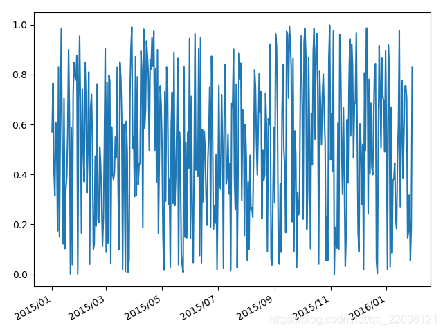
例2:生成日期为轴坐标的图
import matplotlib as mlp
import datetime as dt
import matplotlib.dates as mdates
from pandas.plotting import register_matplotlib_converters
# register_matplotlib_converters()

start = dt.datetime(2015,1,1)
end = dt.datetime(2016,1,30)
delta = dt.timedelta(days=1)

fig = plt.figure()

dates = mlp.dates.drange(start,end,delta)

y = np.random.rand(len(dates))

# 格式化日期格式
date_formate = mlp.dates.DateFormatter('%Y/%m')
ax = plt.gca()
ax.xaxis.set_major_formatter(date_formate)
ax.plot_date(dates,y,'-')

# 时x坐标自适应位置避免重叠
fig.autofmt_xdate()

plt.show()
增加坐标轴
例1:增加y轴
x = np.arange(2,20,1)

y1 = x**2
y2 = np.log(x)

fig = plt.figure()

ax1 = fig.add_subplot(111)

ax1.set_ylabel('Y1')

ax2 = ax1.twinx()

ax2.set_ylabel('Y2')

ax2.plot(x,y2,'r')

ax1.set_xlabel('Compare Y1 and Y2')

ax1.plot(x, y1)

plt.show()

# 交互式的方式:
# plt.plot(x,y1)
#
# # plt.twinx()
# # plt.twiny()
# plt.plot(x, y2, 'r')
#
# plt.show()

