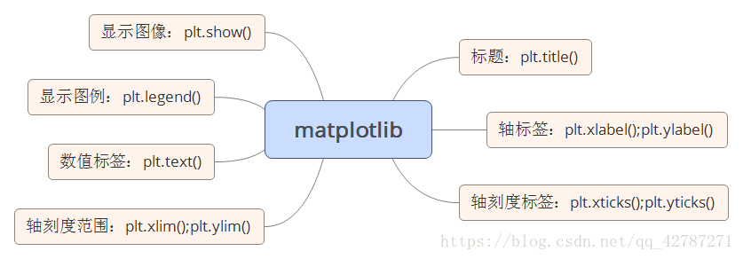
plt.bar(left, height, width, color, align, yerr)函数:绘制柱形图。
left为x轴的位置序列,一般采用arange函数产生一个序列;
height为y轴的数值序列,也就是柱形图的高度,一般就是我们需要展示的数据;
width为柱形图的宽度,一般这是为1即可.一般默认,除非在交错图中会用到;
color为柱形图填充的颜色;
align设置plt.xticks()函数中的标签的位置,一般是center;
yerr让柱形图的顶端空出一部分。
*plt.title(‘图的标题’)函数:为图形添加标题。
plt.legend(*args, **kwargs)函数:添加图例。参数必须为元组legend((line1, line2, line3), (‘label1’, ‘label2’,‘label3’))
plt.xlim(a,b)函数:设置x轴的范围。
plt.ylim(a,b)函数:设置y周的范围。
Plt.xticks(*args, *kwargs)函数:获取或者设置X轴当前刻度的标签。Tuple1,tuple2长度相等,tuple1为对应的刻度,tuple2为对应刻度的标签。
#条形图
#导入绘图模块
import matplotlib.pyplot as plt
import numpy as np
import pandas as pd
#中文乱码处理
plt.rcParams["font.sans-serif"]=['Microsoft YaHei']
plt.rcParams['axes.unicode_minus']=False
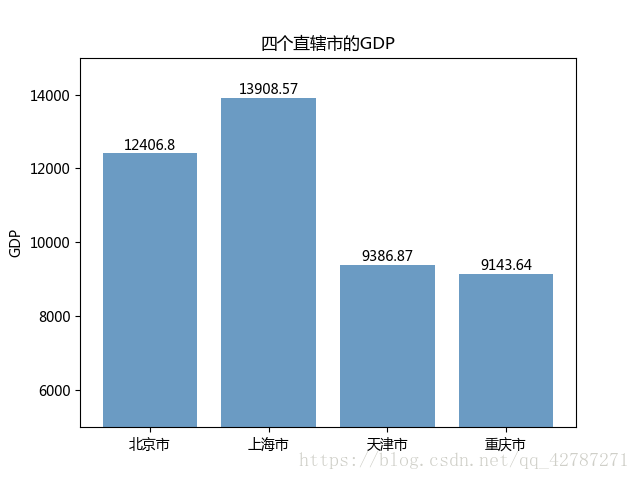
#案例1:直辖市GDP水平
#构建数据
GDP=[12406.8, 13908.57, 9386.87, 9143.64]
#绘图
plt.bar(range(4),GDP, align='center',color='steelblue',alpha=0.8)
#添加轴标签
plt.ylabel('GDP')
#添加标题
plt.title('四个直辖市的GDP')
#添加刻度标签
plt.xticks(range(4),['北京市','上海市','天津市','重庆市'])
#设置y轴的范围
plt.ylim([5000,15000])
#为每一个图形加数值标签
for x,y in enumerate(GDP):
plt.text(x,y+100,y,ha='center')
#显示图形
plt.show()
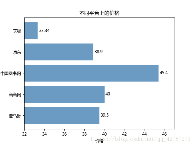
#水平条形图
#案例2:不同平台上数的价格

price=[39.5,40,45.4,38.9,33.34]
plt.barh(range(5),price,align='center',color='steelblue',alpha=0.8)
plt.xlabel('价格')
plt.title('不同平台上的价格')
plt.yticks(range(5),['亚马逊','当当网','中国图书网','京东','天猫'])
plt.xlim([32,47])

for x,y in enumerate(price):
    plt.text(y+0.1,x,"%s"%y,va='center')

plt.show()
#水平交错图
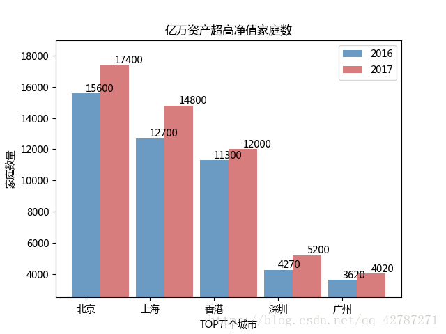
#案例3:胡润财富榜:亿万资产超高净值家庭数
#构建数据
y2016=[15600,12700,11300,4270,3620]
y2017=[17400,14800,12000,5200,4020]
labels=['北京','上海','香港','深圳','广州']
bar_width=0.45
plt.bar(np.arange(5),y2016,label='2016',color='steelblue',alpha=0.8,width=bar_width)
plt.bar(np.arange(5)+bar_width,y2017,label='2017',color='indianred',alpha=0.8,width=bar_width)
plt.xlabel('TOP五个城市')
plt.ylabel('家庭数量')
plt.title('亿万资产超高净值家庭数')
plt.xticks(np.arange(5),labels)
plt.ylim([2500,19000])
for x2016,y2016 in enumerate(y2016):
plt.text(x2016,y2016+100,"%s"%y2016)
for x2017,y2017 in enumerate(y2017):
plt.text(x2017+bar_width,y2017+100,'%s'%y2017)
plt.legend()
plt.show()
#4.垂直堆叠条形图
#案例4:2017年物流运输量情况分部

data=pd.read_excel('E:\李明霞\货运.xls')

plt.bar(np.arange(8),data.loc[0,:][1:],label='铁路',color='red',alpha=0.8,align='center')
plt.bar(np.arange(8),data.loc[1,:][1:],bottom=data.loc[0,:][1:],label='公路',color='green',alpha=0.8,align='center')
plt.bar(np.arange(8),data.loc[2,:][1:],bottom=data.loc[0,:][1:]+data.loc[1,:][1:],label='水运',color='m',alpha=0.8,align='center')
plt.bar(np.arange(8),data.loc[3,:][1:],bottom=data.loc[0,:][1:]+data.loc[1,:][1:]+data.loc[2,:][1:],label='民航',color='black',alpha=0.8,align='center')

#添加轴标签
plt.xlabel('月份')
plt.ylabel('货运量(万吨)')
#添加标题
plt.title('2017年各月份运输量')
#添加刻度标签
plt.xticks(np.arange(8),data.columns[1:])
#添加y轴的刻度范围
plt.ylim([0,500000])

#为每个条形图添加数值标签
for x_t,y_t in enumerate(data.loc[0,:][1:]):
    plt.text(x_t,y_t/2,'%sW'%(round(y_t/10000,2)),ha='center',color='white')

for x_g,y_g in enumerate(data.loc[1,:][1:]+data.loc[0,:][1:]):
    plt.text(x_g,y_g/2,'%sW'%(round(y_g/10000,2)),ha='center',color='white')

for x_s,y_s in enumerate(data.loc[0,:][1:]+data.loc[1,:][1:]+data.loc[2,:][1:]):
    plt.text(x_s,y_s-20000,'%sW'%(round(y_s/10000,2)),ha='center',color='white')

plt.legend(loc='upper center',ncol=4)
plt.show()
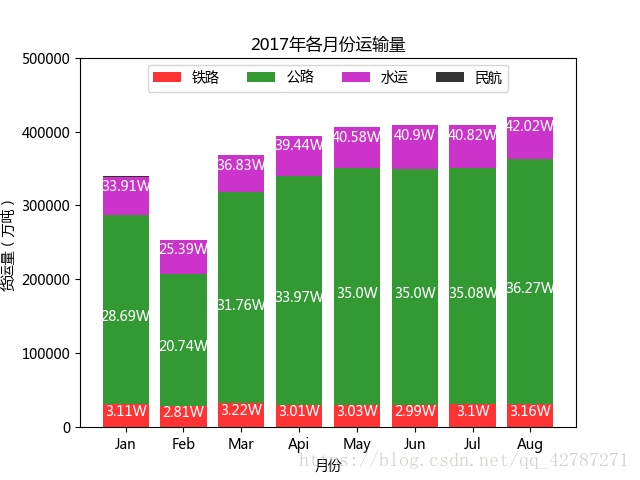
注:
bottom参数:垂直堆叠条形图的设置不仅仅需要提供xy的数值,还需要提供bottom参数,目的就是在某个条形图顶端的基础上,绘制其他条形图,以此类推可以绘制多个堆叠条形图。
legend函数:图例的位置,在文中选择了正上方,且绘制列数为4,表面图例为一排的形式展现
堆叠条形图的数值标签,仍然按照y轴方向堆叠的思想,贴上数值标签值