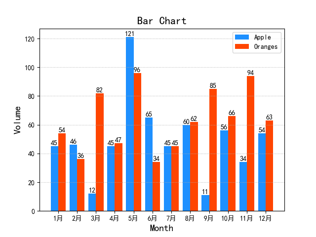
import numpy as np
import matplotlib.pyplot as mp

# 设置中文字体
mp.rcParams['font.sans-serif'] = ['SimHei']
# mp.rcParams['axes.unicode_minus'] = False


apples = np.array([45, 46, 12, 45, 121, 65, 45, 60, 11, 56, 34, 54])
oranges = np.array([54, 36, 82, 47, 96, 34, 45, 62, 85, 66, 94, 63])
mp.figure('Bar Chart', facecolor='lightgray')
mp.title('Bar Chart', fontsize=16)
mp.xlabel('Month', fontsize=14)
mp.ylabel('Volume', fontsize=14)
mp.tick_params(labelsize=10)
mp.grid(linestyle=':', axis='y')
x = np.arange(12)
a = mp.bar(x - 0.2, apples, 0.4, color='dodgerblue', label='Apple', align='center')
b = mp.bar(x + 0.2, oranges, 0.4, color='orangered', label='Oranges', align='center')
# 设置标签
for i in a + b:
    h = i.get_height()
    mp.text(i.get_x() + i.get_width() / 2, h, '%d' % int(h), ha='center', va='bottom')
mp.xticks(x, ['1月', '2月', '3月', '4月', '5月', '6月', '7月', '8月', '9月', '10月', '11月', '12月'])

mp.legend()
mp.show()