Flutter中通过Row和Column来实现线性布局,类似于Android中的LinearLayout控件。Row和Column都继承自Flex,弹性布局Flex允许子组件按照一定比例来分配父容器空间。超出屏幕显示范围会自动折行的布局称为流式布局。Flutter中通过Wrap和Flow来支持流式布局。层叠布局和Android中的Frame布局是相似的,子组件可以根据距父容器四个角的位置来确定自身的位置。绝对定位允许子组件堆叠起来(按照代码中声明的顺序)。Flutter中使用Stack和Positioned这两个组件来配合实现绝对定位。Stack允许子组件堆叠,而Positioned用于根据Stack的四个角来确定子组件的位置。
一、线性布局
1.1 主轴和交叉轴
对于线性布局,有主轴和交叉轴之分,如果布局是沿水平方向,那么主轴就是指水平方向,而交叉轴即垂直方向;如果布局沿垂直方向,那么主轴就是指垂直方向,而交叉轴就是水平方向。在线性布局中,有两个定义对齐方式的枚举类MainAxisAlignment和CrossAxisAlignment,分别代表主轴对齐和交叉轴对齐。
主轴对齐 ---- MainAxisAlignment
交叉轴对齐 ---- CrossAxisAlignment
下面是MainAxisAlignment,它也是一个枚举类。
enum MainAxisAlignment {
  start,
  end,
  center,
  spaceBetween,
  spaceAround,
  spaceEvenly,
}
start ---- 将子Widget放置在尽可能靠近主轴起点的位置。如果在水平方向上使用此值,则[TextDirection]必须可用以确定起点是左侧还是右侧;如果在垂直方向上使用此值,则[VerticalDirection]必须可用以确定起点是顶部还是底部。
end ---- 将子Widget放置在尽可能靠近主轴末端的位置。如果在水平方向上使用此值,则[TextDirection]必须可用以确定结尾是左侧还是右侧;如果在垂直方向上使用此值,则必须使用[VerticalDirection]来确定末端是顶部还是底部。
center ---- 将子Widget放置在尽可能靠近主轴中心的位置。
spaceBetween ---- 将空闲空间均匀地放在子Widget之间。
spaceAround ---- 在子Widget之间以及第一个和最后一个子Widget之前和之后的一半空间之间均匀地放置可用空间。这段文字有点绕,接下来看实例就非常清晰了。
spaceEvenly ---- 将空闲空间均匀地放在子Widget之间以及第一个和最后一个子Widget子之前和之后。
下面是CrossAxisAlignment,它也是一个枚举类。
enum CrossAxisAlignment {
  start,
  end,
  center,
  stretch,
  baseline,
}
start ---- 将子项的起始边缘与交叉轴的起始侧对齐。如果在水平方向上使用此值,则[TextDirection]必须可用以确定起点是左侧还是右侧;如果在垂直方向上使用此值,则[VerticalDirection]必须可用以确定起点是顶部还是底部。
end ---- 将子Widget放置在尽可能靠近交叉轴末端的位置。如果在水平方向上使用此值,则[TextDirection]必须可用以确定结尾是左侧还是右侧;如果在垂直方向上使用此值,则必须使用[VerticalDirection]来确定末端是顶部还是底部。
center ---- 放置子Widget使其中心与交叉轴的中心对齐。这是默认的横轴对齐方式。
stretch ---- 要求子Widget填满交叉轴。
baseline ---- 沿交叉轴放置子Widget,使其基线匹配。如果主轴是垂直的,则将此值视为[start](因为基线始终是水平的)。
1.2 Row 和 Column
Flutter中通过Row和Column来实现线性布局。
1.2.1 Row
Row也就是行布局。
Row({
    Key key,
    MainAxisAlignment mainAxisAlignment = MainAxisAlignment.start,
    MainAxisSize mainAxisSize = MainAxisSize.max,
    CrossAxisAlignment crossAxisAlignment = CrossAxisAlignment.center,
    TextDirection textDirection,
    VerticalDirection verticalDirection = VerticalDirection.down,
    TextBaseline textBaseline,
    List<Widget> children = const <Widget>[],
  })
mainAxisAlignment ---- 表示子组件在Row所占用的水平空间内对齐方式,如果mainAxisSize值为MainAxisSize.min,则此属性无意义,因为子组件的宽度等于Row的宽度。只有当mainAxisSize的值为MainAxisSize.max时,此属性才有意义。
textDirection ---- 表示水平方向子组件的布局顺序(是从左往右还是从右往左),默认为系统当前Locale环境的文本方向(如中文、英语都是从左往右,而阿拉伯语是从右往左)。
mainAxisSize ---- 表示Row在主轴(水平)方向占用的空间,默认是MainAxisSize.max,表示尽可能多的占用水平方向的空间,此时无论子widgets实际占用多少水平空间,Row的宽度始终等于水平方向的最大宽度;而MainAxisSize.min表示尽可能少的占用水平空间,当子组件没有占满水平剩余空间,则Row的实际宽度等于所有子组件占用的的水平空间。
verticalDirection ---- 表示Row垂直的对齐方向,默认是VerticalDirection.down,表示从上到下。
crossAxisAlignment ---- 表示子组件在纵轴方向的对齐方式,Row的高度等于子组件中最高的子元素高度。
children ---- 子组件数组。
textBaseline ---- 用于对齐文本的水平线。
TextBaseline是一个枚举类,它包括alphabetic和ideographic。
enum TextBaseline {
  alphabetic,
  ideographic,
}
alphabetic ---- 用于对齐字母字符的字形底部的水平线。
ideographic ---- 用于对齐表意字符的水平线。
1.2.2 Column
和Row类似,Column是列布局。
Column({
    Key key,
    MainAxisAlignment mainAxisAlignment = MainAxisAlignment.start,
    MainAxisSize mainAxisSize = MainAxisSize.max,
    CrossAxisAlignment crossAxisAlignment = CrossAxisAlignment.center,
    TextDirection textDirection,
    VerticalDirection verticalDirection = VerticalDirection.down,
    TextBaseline textBaseline,
    List<Widget> children = const <Widget>[],
  })
下面来看一个例子。
import 'package:flutter/material.dart';
void main() => runApp(MyApp());
class MyApp extends StatelessWidget {
// This widget is the root of your application.
@override
Widget build(BuildContext context) {
return MaterialApp(
title: 'Flutter Demo',
theme: ThemeData(
primarySwatch: Colors.blue,
),
home: MyHomePage(),
);
}
}
class MyHomePage extends StatefulWidget {
@override
_MyHomePageState createState() => _MyHomePageState();
}
class _MyHomePageState extends State<MyHomePage> {
@override
Widget build(BuildContext context) {
return Scaffold(
appBar: AppBar(
title: Text("Home Page"),
),
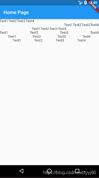
body: Column(mainAxisAlignment: MainAxisAlignment.start, children: <
Widget>[
Row(mainAxisAlignment: MainAxisAlignment.start, children: <Widget>[
Text(
'Test1',
),
Text(
'Test2',
),
Text(
'Test3',
),
Text(
'Test4',
)
]),
Row(mainAxisAlignment: MainAxisAlignment.end, children: <Widget>[
Text(
'Test1',
),
Text(
'Test2',
),
Text(
'Test3',
),
Text(
'Test4',
)
]),
Row(mainAxisAlignment: MainAxisAlignment.center, children: <Widget>[
Text(
'Test1',
),
Text(
'Test2',
),
Text(
'Test3',
),
Text(
'Test4',
)
]),
Row(
mainAxisAlignment: MainAxisAlignment.spaceBetween,
children: <Widget>[
Text(
'Test1',
),
Text(
'Test2',
),
Text(
'Test3',
),
Text(
'Test4',
)
]),
Row(
mainAxisAlignment: MainAxisAlignment.spaceAround,
children: <Widget>[
Text(
'Test1',
),
Text(
'Test2',
),
Text(
'Test3',
),
Text(
'Test4',
)
]),
Row(
mainAxisAlignment: MainAxisAlignment.spaceEvenly,
children: <Widget>[
Text(
'Test1',
),
Text(
'Test2',
),
Text(
'Test3',
),
Text(
'Test4',
)
]),
]));
}
}
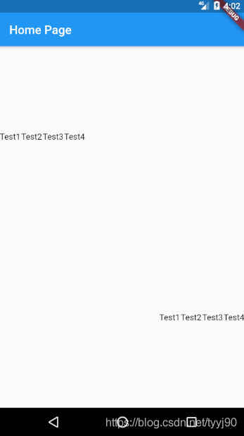
下面是对应的截图,对于Row行布局MainAxisAlignment理解就会一目了然。
接下来修改Demo,看看交叉轴控制。
class _MyHomePageState extends State<MyHomePage> {
  @override
  Widget build(BuildContext context) {
    return Scaffold(
        appBar: AppBar(
          title: Text("Home Page"),
        ),
        body: Column(
            mainAxisAlignment: MainAxisAlignment.start,
            children: <Widget>[
              Row(
                  mainAxisAlignment: MainAxisAlignment.start,
                  crossAxisAlignment: CrossAxisAlignment.center,
                  children: <Widget>[
                    Text(
                      'Test1',
                      textScaleFactor: 3.0,
                    ),
                    Text(
                      'Test2',
                    ),
                    Text(
                      'Test3',
                    ),
                    Text(
                      'Test4',
                    )
                  ]),
              Row(
                  mainAxisAlignment: MainAxisAlignment.start,
                  crossAxisAlignment: CrossAxisAlignment.start,
                  children: <Widget>[
                    Text(
                      'Test1',
                      textScaleFactor: 3.0,
                    ),
                    Text(
                      'Test2',
                    ),
                    Text(
                      'Test3',
                    ),
                    Text(
                      'Test4',
                    )
                  ]),
              Row(
                  mainAxisAlignment: MainAxisAlignment.start,
                  crossAxisAlignment: CrossAxisAlignment.end,
                  children: <Widget>[
                    Text(
                      'Test1',
                      textScaleFactor: 3.0,
                    ),
                    Text(
                      'Test2',
                    ),
                    Text(
                      'Test3',
                    ),
                    Text(
                      'Test4',
                    )
                  ]),
            ]));
  }
}

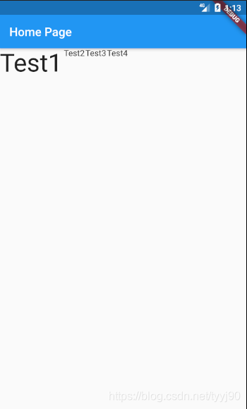
再来研究一下交叉轴crossAxisAlignment设置为CrossAxisAlignment.stretch的效果,它要求子Widget填满交叉轴。对于Row来说交叉轴就是垂直方向。
class _MyHomePageState extends State<MyHomePage> {
  @override
  Widget build(BuildContext context) {
    return Scaffold(
        appBar: AppBar(
          title: Text("Home Page"),
        ),
        body: Row(
            mainAxisAlignment: MainAxisAlignment.start,
            crossAxisAlignment: CrossAxisAlignment.stretch,
            children: <Widget>[
              Text(
                'Test1',
                textScaleFactor: 3.0,
              ),
              Text(
                'Test2',
              ),
              Text(
                'Test3',
              ),
              Text(
                'Test4',
              )
            ]));
  }
}
二、弹性布局
我们先来看一下Flex如何使用,接着来看搭配Expanded组件使用方法。
2.1 Flex
Flex组件可以沿着水平或垂直方向排列子组件,如果你知道主轴方向,使用Row或Column会方便一些,因为Row和Column都继承自Flex,参数基本相同,所以能使用Flex的地方基本上都可以使用Row或Column。Flex本身功能是很强大的,它也可以和Expanded组件配合实现弹性布局。
Flex({
    Key key,
    @required this.direction,
    this.mainAxisAlignment = MainAxisAlignment.start,
    this.mainAxisSize = MainAxisSize.max,
    this.crossAxisAlignment = CrossAxisAlignment.center,
    this.textDirection,
    this.verticalDirection = VerticalDirection.down,
    this.textBaseline,
    List<Widget> children = const <Widget>[],
  })
和Row、Column比起来多了一个direction,它是弹性布局的方向, Row默认为水平方向,Column默认为垂直方向。修改上面的例子把Row和Column替换为Flex,可以看出效果的确是一样的。
class _MyHomePageState extends State<MyHomePage> {
  @override
  Widget build(BuildContext context) {
    return Scaffold(
        appBar: AppBar(
          title: Text("Home Page"),
        ),
        body: Flex(
            mainAxisAlignment: MainAxisAlignment.start,
            direction: Axis.vertical,
            children: <Widget>[
              Flex(
                  mainAxisAlignment: MainAxisAlignment.start,
                  direction: Axis.horizontal,
                  children: <Widget>[
                    Text(
                      'Test1',
                    ),
                    Text(
                      'Test2',
                    ),
                    Text(
                      'Test3',
                    ),
                    Text(
                      'Test4',
                    )
                  ]),
              Flex(
                  mainAxisAlignment: MainAxisAlignment.end,
                  direction: Axis.horizontal,
                  children: <Widget>[
                    Text(
                      'Test1',
                    ),
                    Text(
                      'Test2',
                    ),
                    Text(
                      'Test3',
                    ),
                    Text(
                      'Test4',
                    )
                  ]),
            ]));
  }
}
来看上面代码的运行结果:
2.2 Expanded
可以按比例“扩伸” Row、Column和Flex子组件所占用的空间。这和android里面控件的weight类似。
const Expanded({
    Key key,
    int flex = 1,
    @required Widget child,
  })
flex ---- 为弹性系数,如果为0或null,则child是没有弹性的,即不会被扩伸占用的空间。如果大于0,所有的Expanded按照其flex的比例来分割主轴的全部可用空间。
class _MyHomePageState extends State<MyHomePage> {
  @override
  Widget build(BuildContext context) {
    return Scaffold(
        appBar: AppBar(
          title: Text("Home Page"),
        ),
        body: Flex(
            mainAxisAlignment: MainAxisAlignment.start,
            direction: Axis.vertical,
            children: <Widget>[
              Expanded(
                flex: 2,
                child: Flex(
                    mainAxisAlignment: MainAxisAlignment.start,
                    direction: Axis.horizontal,
                    children: <Widget>[
                      Text(
                        'Test1',
                      ),
                      Text(
                        'Test2',
                      ),
                      Text(
                        'Test3',
                      ),
                      Text(
                        'Test4',
                      )
                    ]),
              ),
              Expanded(
                flex: 2,
                child: Flex(
                    mainAxisAlignment: MainAxisAlignment.end,
                    direction: Axis.horizontal,
                    children: <Widget>[
                      Text(
                        'Test1',
                      ),
                      Text(
                        'Test2',
                      ),
                      Text(
                        'Test3',
                      ),
                      Text(
                        'Test4',
                      )
                    ]),
              )
            ]));
  }
}
来看运行结果
三、流式布局
在使用Row和Colum时,如果子widget超出屏幕范围,则会报溢出错误。我们把超出屏幕显示范围会自动折行的布局称为流式布局,Flutter中通过Wrap和Flow来支持流式布局。
略微调整上个例子中的代码,我们就会看到溢出问题。
Text(
    'Test1'* 200,
),
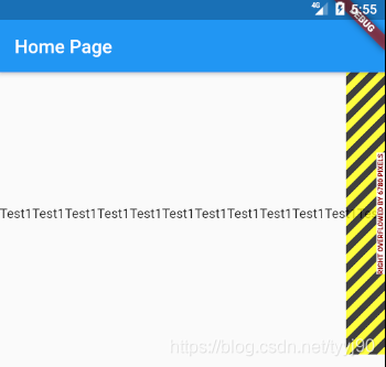
3.1 Wrap
wrap这个单词本身就是包裹的意思,使用Wrap包裹子Widget以后就能实现流式布局。
Wrap({
    Key key,
    this.direction = Axis.horizontal,
    this.alignment = WrapAlignment.start,
    this.spacing = 0.0,
    this.runAlignment = WrapAlignment.start,
    this.runSpacing = 0.0,
    this.crossAxisAlignment = WrapCrossAlignment.start,
    this.textDirection,
    this.verticalDirection = VerticalDirection.down,
    List<Widget> children = const <Widget>[],
  })
大部分Field我们都已经见过了。
spacing ---- 主轴方向子widget的间距
runSpacing ---- 交叉轴方向的间距
runAlignment ---- 交叉轴方向的对齐方式
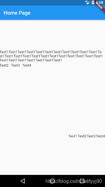
下面是Demo代码
class _MyHomePageState extends State<MyHomePage> {
  @override
  Widget build(BuildContext context) {
    return Scaffold(
        appBar: AppBar(
          title: Text("Home Page"),
        ),
        body: Flex(
            mainAxisAlignment: MainAxisAlignment.start,
            direction: Axis.vertical,
            children: <Widget>[
              Expanded(
                flex: 2,
                child: Wrap(
                    spacing: 8.0,
                    runSpacing: 4.0,
                    alignment: WrapAlignment.start,
                    runAlignment: WrapAlignment.center,
                    children: <Widget>[
                      Text(
                        'Test1' * 30,
                      ),
                      Text(
                        'Test2',
                      ),
                      Text(
                        'Test3',
                      ),
                      Text(
                        'Test4',
                      )
                    ]),
              ),
              Expanded(
                flex: 2,
                child: Flex(
                    mainAxisAlignment: MainAxisAlignment.end,
                    direction: Axis.horizontal,
                    children: <Widget>[
                      Text(
                        'Test1',
                      ),
                      Text(
                        'Test2',
                      ),
                      Text(
                        'Test3',
                      ),
                      Text(
                        'Test4',
                      )
                    ]),
              )
            ]));
  }
}
运行效果如下
3.2 Flow
Flow需要自己实现子widget的位置转换。
Flow({
    Key key,
    @required this.delegate,
    List<Widget> children = const <Widget>[],
  })
delegate ---- 控制流布局外观的委托
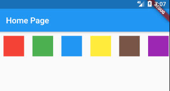
比如下面的代码实现色块绘制,只画一行。
class _MyHomePageState extends State<MyHomePage> {
  @override
  Widget build(BuildContext context) {
    return Scaffold(
        appBar: AppBar(
          title: Text("Home Page"),
        ),
        body: Flow(
          delegate: TestFlowDelegate(margin: EdgeInsets.all(10.0)),
          children: <Widget>[
            new Container(
              width: 50.0,
              height: 50.0,
              color: Colors.red,
            ),
            new Container(
              width: 50.0,
              height: 50.0,
              color: Colors.green,
            ),
            new Container(
              width: 50.0,
              height: 50.0,
              color: Colors.blue,
            ),
            new Container(
              width: 50.0,
              height: 50.0,
              color: Colors.yellow,
            ),
            new Container(
              width: 50.0,
              height: 50.0,
              color: Colors.brown,
            ),
            new Container(
              width: 50.0,
              height: 50.0,
              color: Colors.purple,
            ),
          ],
        ));
  }
}

class TestFlowDelegate extends FlowDelegate {
  EdgeInsets margin = EdgeInsets.zero;

  TestFlowDelegate({this.margin});

  @override
  void paintChildren(FlowPaintingContext context) {
    var x = margin.left;
    var y = margin.top;
    //计算每一个子widget的位置
    for (int i = 0; i < context.childCount; i++) {
      if (x < context.size.width) {
        context.paintChild(i,
            transform: new Matrix4.translationValues(x, y, 0.0));
      }
      x += context.getChildSize(i).width + margin.left + margin.right;
    }
  }

  @override
  getSize(BoxConstraints constraints) {
    //指定Flow的大小
    return Size(double.infinity, 70.0);
  }

  @override
  bool shouldRepaint(FlowDelegate oldDelegate) {
    return oldDelegate != this;
  }
}
运行效果如下:
四、层叠布局
层叠布局包括Stack、Positioned。
4.1 Stack
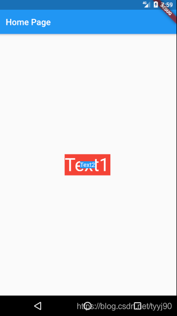
Stack这个词对程序员来说一点都不陌生,先进后出是栈的特性。那么在Flutter中意味着Stack布局是可以堆叠的,顶层会浮在底层之上。
Stack({
    Key key,
    this.alignment = AlignmentDirectional.topStart,
    this.textDirection,
    this.fit = StackFit.loose,
    this.overflow = Overflow.clip,
    List<Widget> children = const <Widget>[],
  })
alignment ---- 如何对齐Stack中未定位和部分定位的子Widget。所谓部分定位,在这里特指没有在某一个轴上定位:left、right为横轴,top、bottom为纵轴,只要包含某个轴上的一个定位属性就算在该轴上有定位。
fit ---- 确定没有定位的子Widget如何去适应Stack的大小
enum StackFit {
  /// 从其父级传递到Stack的约束被放松。
  /// 例如,如果Stack具有将其强制为350x600的约束,
  /// 则这将允许Stack中未定位的子Widget具有从0到350的任何宽度和从0到600的任何高度。
  loose,
  /// 从其父级传递到Stack的约束被收缩到允许的最大限制。
  /// 例如,如果Stack具有宽松的约束,其宽度在10到100的范围内,高度在0到600的范围内,
  /// 那么Stack中未定位的子元素的大小将全部设置为100像素宽和600高。
  expand,
  /// 从其父级传递到Stack的约束将未经修改地传递给未定位的子Widget。
  passthrough,
}
overflow ---- 决定如何显示超出Stack显示空间的子Widget
enum Overflow {
  ///超出部分可见
  visible,
  /// 超出部分会被剪裁
  clip,
}
下面来看一个例子学习Stack如何使用。
class _MyHomePageState extends State<MyHomePage> {
  @override
  Widget build(BuildContext context) {
    return Scaffold(
        appBar: AppBar(
          title: Text("Home Page"),
        ),
        body: ConstrainedBox(
          constraints: BoxConstraints.expand(),
          child: Stack(
            alignment: Alignment.center,
            children: <Widget>[
              Container(
                child: Text(
                  "Text1",
                  style: TextStyle(color: Colors.white),
                  textScaleFactor: 3.0,
                ),
                color: Colors.red,
              ),
              Container(
                child:
                    Text("Text2", style: TextStyle(color: Colors.white)),
                color: Colors.blue,
              ),
            ],
          ),
        ));
  }
}
运行截图如下
4.1 Positioned
Positioned就是可以定位的意思,所以它的Field包括了left、top、width和height,另外还有right和bottom,按照我们的理解前四个就够了。
const Positioned({
    Key key,
    this.left,
    this.top,
    this.right,
    this.bottom,
    this.width,
    this.height,
    @required Widget child,
  })
Positioned的width、height 和其它地方的意义稍微有点区别,此处用于配合left、top 、right和bottom来定位组件,举个例子,在水平方向时,你只能指定left、right、width三个属性中的两个,如指定left和width后,right会自动算出(left + width),如果同时指定三个属性则会报错,垂直方向同理。
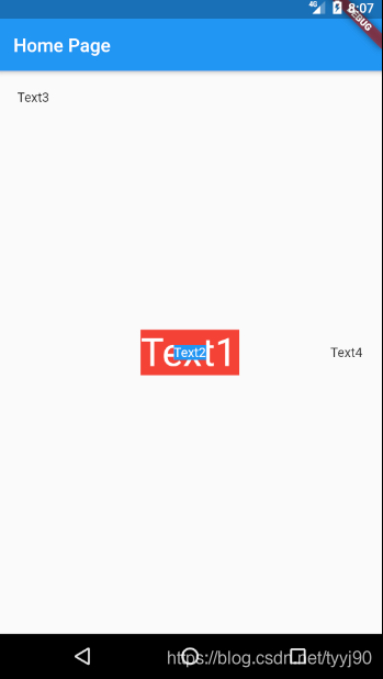
下面是使用Demo示例,由于Positioned存在部分定位,所以Stack alignment属性不在生效。
class _MyHomePageState extends State<MyHomePage> {
  @override
  Widget build(BuildContext context) {
    return Scaffold(
        appBar: AppBar(
          title: Text("Home Page"),
        ),
        body: ConstrainedBox(
          constraints: BoxConstraints.expand(),
          child: Stack(
            alignment: Alignment.center,
            overflow: Overflow.clip,
            children: <Widget>[
              Container(
                child: Text(
                  "Text1",
                  style: TextStyle(color: Colors.white),
                  textScaleFactor: 3.0,
                ),
                color: Colors.red,
              ),
              Container(
                child: Text("Text2", style: TextStyle(color: Colors.white)),
                color: Colors.blue,
              ),
              Positioned(
                left: 20.0,
                top: 20.0,
                child: Text("Text3"),
              ),
              Positioned(
                right: 20.0,
                child: Text("Text4"),
              )
            ],
          ),
        ));
  }
}
运行结果