开发过程中Drawable xml文件膨胀问题
开发过程中,为了实现UX设计的好看的效果,通常避免不了去写很多的Drawable xml文件。比如: 圆角Shape, 渐变,Selector等等。由于UX效果复杂多变,UI元素的尺寸形状必定会存在很多差异,所以就要编写很多Drawable xml文件去实现效果。加之多个开发人员并行开发过程中,如果没有较强的文件命名规定约束,其他人也会加入相同的Drawable xml文件。导致越来越多的xml文件加入到项目中,不仅会增加应用包体积,也不利于后续复用。
通常解决方案
1.通常的解决方案是自定义View代替,用代码去绘制相应效果。但是不能保证代码实现的效率,且常用的View较多,挨个实现自定义View较大。
2.约定文件命名,保证同样的Drawable xml只能存在一份,这样只能避免冗余的Drawable xml 存在,并不能减少必要的Drawable文件的生成。况且,没有程序去约束,光靠人去遵循约定是不可靠的。
XWidget解决方案
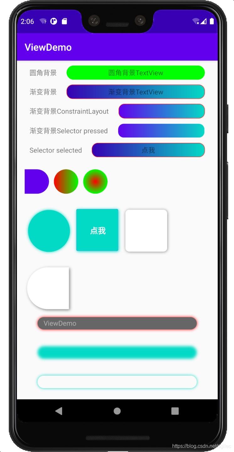
XWidget提供丰富的"自定View",且基本包含常用的Drawable属性。虽然XWidget也是自定义View,但是其只是作为一个载体,真正绘制是和我们写的Drawable xml原理一样,用自定义属性构造出对应的GradientDrawable or StateListDrawable对象,设置到View中。这样的实现方案既保证了绘制时的性能,又能够在布局中高度定制化,实现复杂的UI效果。
支持的控件
XButton, XConstraintLayout, XEditText, XFrameLayout, XImageView, XLinearLayout, XRelativeLayout, XTextView, XCheckBox, XView, XRadioButton …
上面的所有的控件都支持下面表格中的属性,表格中仅以XButtonCustom举例。
支持属性名称
| 属性名称 | 示例 |
|---|---|
| XButtonCustom_corner | 圆角度数 |
| XButtonCustom_corner_type | 圆角类型,默认 all。left_top,left_bottom,right_top,right_bottom |
| XButtonCustom_solid_color | 背景填充颜色,当没有设置渐变填充时生效 |
| XButtonCustom_shadow_color | 外阴影色值 |
| XButtonCustom_shadow_radius | 外阴影半径 |
| XButtonCustom_shadow_dx | 外阴影x方向偏移 |
| XButtonCustom_shadow_dy | 外阴影y方向偏移 |
| XButtonCustom_solid_gradient | 渐变类型,linear, radial, sweep |
| XButtonCustom_gradient_start_color | 渐变起始颜色 |
| XButtonCustom_gradient_center_color | 渐变中间颜色 |
| XButtonCustom_gradient_end_color | 渐变结束颜色 |
| XButtonCustom_gradient_orientation | 渐变的方向 |
| XButtonCustom_gradient_radius | 渐变角度 |
| XButtonCustom_stroke_color | 描边颜色 |
| XButtonCustom_stroke_border | 描边宽度 |
| XButtonCustom_blur_type | 模糊类型,默认为normal。outer,solid,inner |
| XButtonCustom_blur_radius | 模糊半径 |
| XButtonCustom_blur_color | 模糊颜色 |
| XButtonCustom_state | selector类型,默认none。pressed, selected, checked。选定上述状态时,触发state前缀的属性 |
| XButtonCustom_stated_corner | state触发的圆角 |
| XButtonCustom_corner_type | state触发时的圆角类型,默认 all。left_top,left_bottom,right_top,right_bottom |
| XButtonCustom_stated_solid_color | state出发时背景填充颜色,当没有设置渐变填充时生效 |
| XButtonCustom_stated_shadow_color | 外阴影色值 |
| XButtonCustom_stated_shadow_radius | 外阴影半径 |
| XButtonCustom_stated_shadow_dx | 外阴影x方向偏移 |
| XButtonCustom_stated_shadow_dy | 外阴影y方向偏移 |
| XButtonCustom_stated_blur_type | 模糊类型,默认为normal。outer,solid,inner |
| XButtonCustom_stated_blur_radius | 模糊半径 |
| XButtonCustom_stated_blur_color | 模糊颜色 |
| XButtonCustom_stated_solid_gradient | 渐变类型,linear, radial, sweep |
| XButtonCustom_stated_gradient_start_color | 渐变起始颜色 |
| XButtonCustom_stated_gradient_center_color | 渐变中间颜色 |
| XButtonCustom_stated_gradient_end_color | 渐变结束颜色 |
| XButtonCustom_stated_gradient_orientation | 渐变的方向 |
| XButtonCustom_stated_gradient_radius | 渐变角度 |
| XButtonCustom_stated_stroke_color | 描边颜色 |
| XButtonCustom_stated_stroke_border | 描边宽度 |
| XButtonCustom_drawable | 正常情况下显示的drawable |
| XButtonCustom_stated_drawable | 在特定状态下显示的drawable, 如: selector |
上述的字段在代码中的修改方式,支持的修改的字段在
IDrawableEditTransition接口中定义
    // 获取IDrawableEditTransition
    XWidgetParser.getDrawableEditTransition(v)
            ?.beginNormalTransition
            ?.setCorner(10)
            ?.commit()
示例
集成
-
在project build.gradle 中加入
allprojects { repositories { maven { url 'https://jitpack.io' } } } -
在要使用的module 的 build.gradle 中加入
implementation 'com.github.shilec:XWidget:1.2.2' -
添加混淆
-keep public class com.scott.xwidget.parser.**{*;}
扩展
-
自定义解析器
XWidgetParser.addParser(XButton::class.java, XButtonParser2())
插件及注解解析器介绍
- 使用
kapt 'com.github.shilec:XWidget:1.2.2'时,可以为XWidget注解的View生成drawable解析器,用来生成模板代码,也可继承自模板代码进行扩展。 - 使用
apply plugin: "com.scott.xwidget-gradle-plugin"时,可以自动生成XWidget注解的View的attr属性定义,生成文件为res/values/xwidget_attrs.xml。(使用插件时,需要在根目录下的build.gradle文件中配置插件的classpath:'com.github.shilec:XWidget:1.2.2')
最后
大家如果还想了解Android 相关的更多知识点可以点进我的【GitHub】项目中,里面记录了许多的Android 知识点。