1. 布局方式
1.1 表格布局
1.2 DIV+CSS布局
符合W3C标准,兼容性好- 结构和外观分离,
便于团队开发和维护
- 对
搜索引擎更加友好
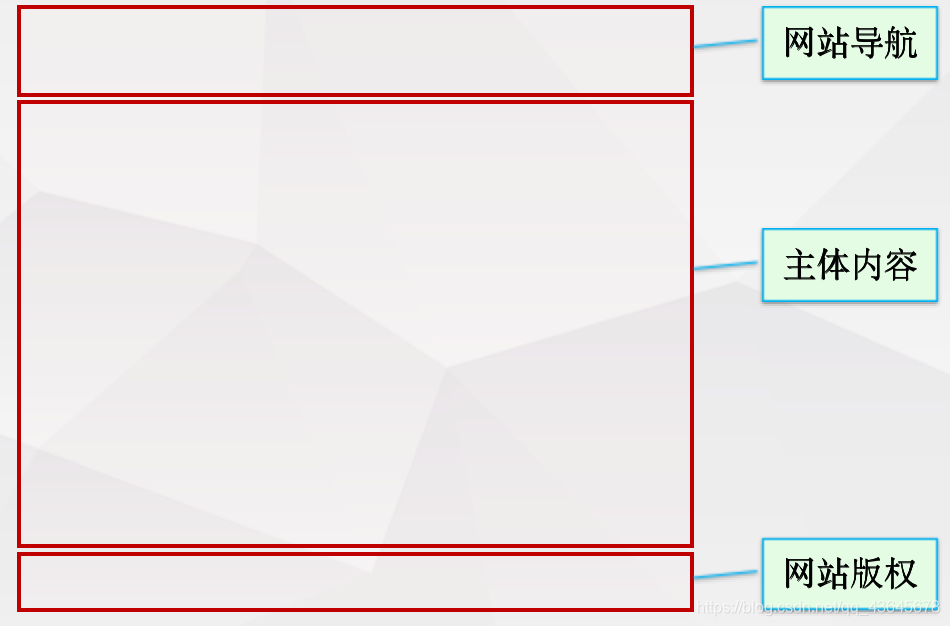
1.3 单列布局
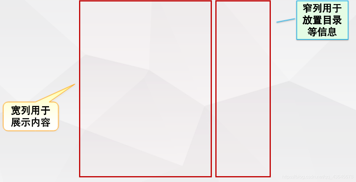
1.4 两列布局
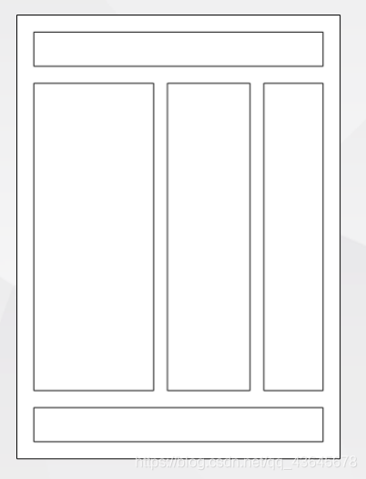
1.5 三列布局
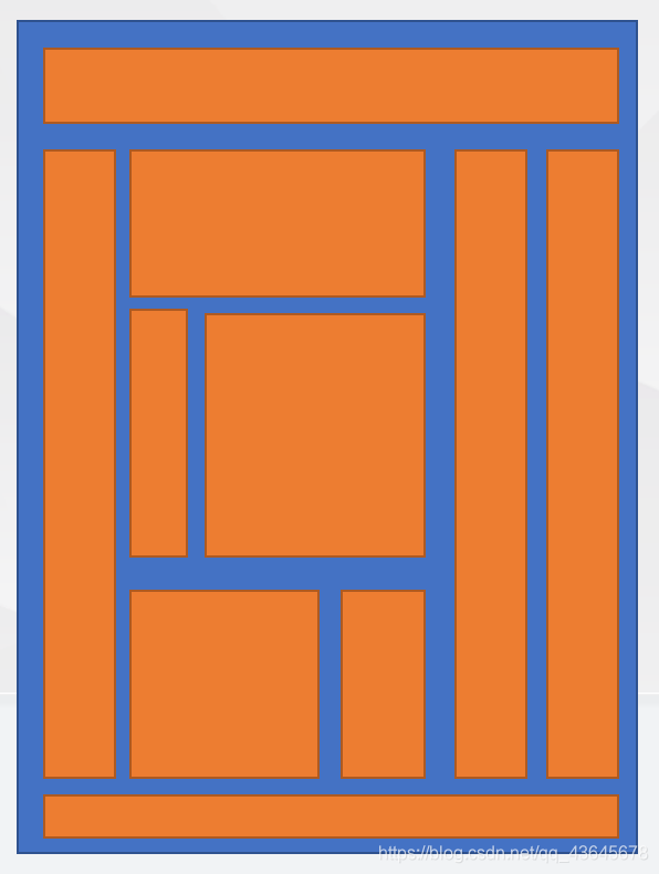
1.6 多列布局
2. 常见布局技术
2.1 单列布局
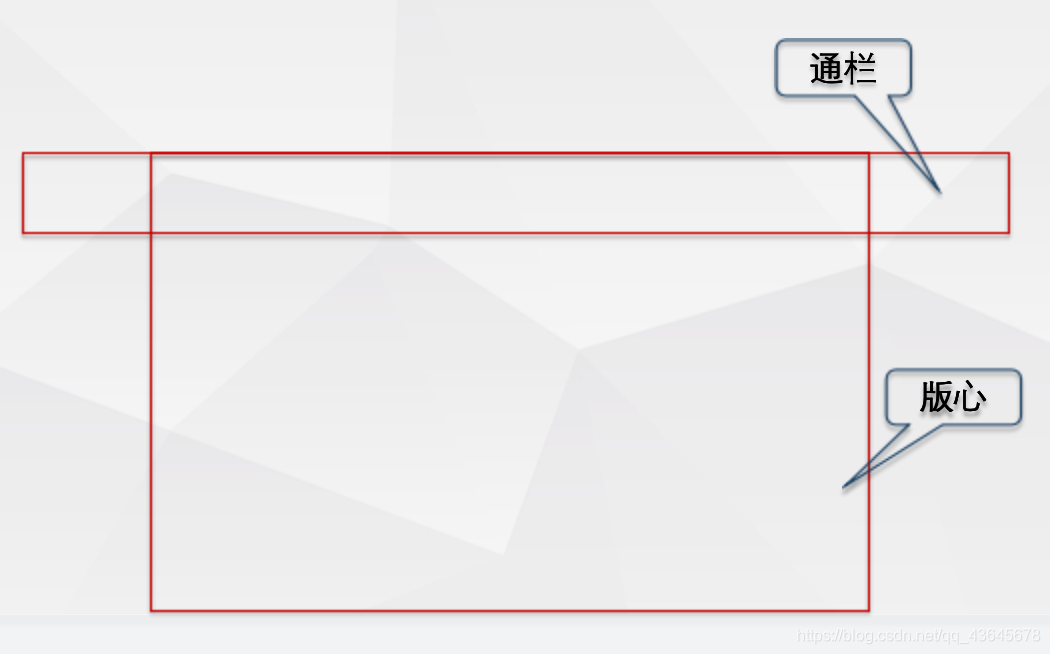
2.1.1 通栏与版心
<style>
    *{

     margin:0;padding:0;}
    header{


        background-color: #666;
    }
    .container{


        width: 1190px;
        height: 50px;
        background-color: #ff0;
        margin:0 auto;
    }
    .logo{

     float:left;}
    .search{

     float:right;}
    section{


        width: 1190px;
        height: 1000px;
        margin:0 auto;
        background-color: #ff0;
    }
</style>
<body>
	<header>
        <div class="container">
            <div class="logo">Logo</div>
            <div class="search">搜索</div>
        </div>
    </header>
    <section>
        版心区域
    </section>
</body>
2.1.2 单列布局的水平对齐
<style>
   .container{


        width: 800px;
        height: 500px;
        background-color: #ff0;
        margin:0 auto;
    }
    p{


        width: 100px;
        height: 100px;
        background-color: #f00;
        margin:0 auto;
    }
</style>
<body>
    <div class="container">
        <p></p>
    </div>
</body>
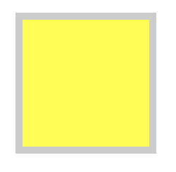
绝对定位的块级元素
- 设置
left(50%)+margin-left(负的一半width)
- 让left、right都为0,左右的margin为auto
<style>
	// 方法一
   .container{


        width: 800px;
        height: 500px;
        background-color: #ff0;
        margin:0 auto;
        position: relative;
    }
    p{


        width: 100px;
        height: 100px;
        background-color: #f00;
        position: absolute;
        left: 50%;
        margin-left: -50px;
    }

	// 方法二
	.container{


        width: 800px;
        height: 500px;
        background-color: #ff0;
        margin:0 auto;
        position: relative;
    }
    p{


        width: 100px;
        height: 100px;
        background-color: #f00;
        position: absolute;
        left: 0;
        right: 0;
        margin: 0 auto;
    }

</style>
<body>
    <div class="container">
        <p></p>
    </div>
</body>
2.1.3 单列布局的垂直对齐
行级元素和未定位块级元素
- 设置
父级容器display和verticle-align样式
- 设置
父级容器的高度=行高(针对行元素)
<style>
	.container {


        width: 800px;
        height: 500px;
        background-color: #ff0;
        display:table-cell;
        vertical-align: middle;
    }

    p {


        width: 100px;
        height: 100px;
        background-color: #f00;
    }
</style>
<body>
    <div class="container">
        <p></p>
    </div>
</body>
<table border="1" width="300">
    <tr style="height: 50px;">
        <td>hello</td>
    </tr>
</table>
绝对定位的块级元素
- 使用
top(50%)+margin-top(负的一半height)
- 设置
top、bottom、left和right都为0,上下的margin为auto
<style>
	// 方法一
	.container {


        width: 800px;
        height: 500px;
        background-color: #ff0;
        position: relative;
    }

    p {


        width: 100px;
        height: 100px;
        background-color: #f00;
        position:absolute;
        top:50%;
        margin-top:-50px;
    }

	// 方法二
	.container {


        width: 800px;
        height: 500px;
        background-color: #ff0;
        position: relative;
    }

    p {


        width: 100px;
        height: 100px;
        background-color: #f00;
        position:absolute;
        top:0;
        bottom:0;
        margin:auto 0;
    }
</style>
<body>
    <div class="container">
        <p></p>
    </div>
</body>
2.2 多列布局类型
2.2.1 固定布局
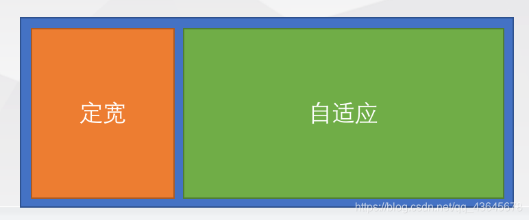
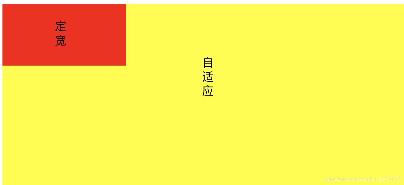
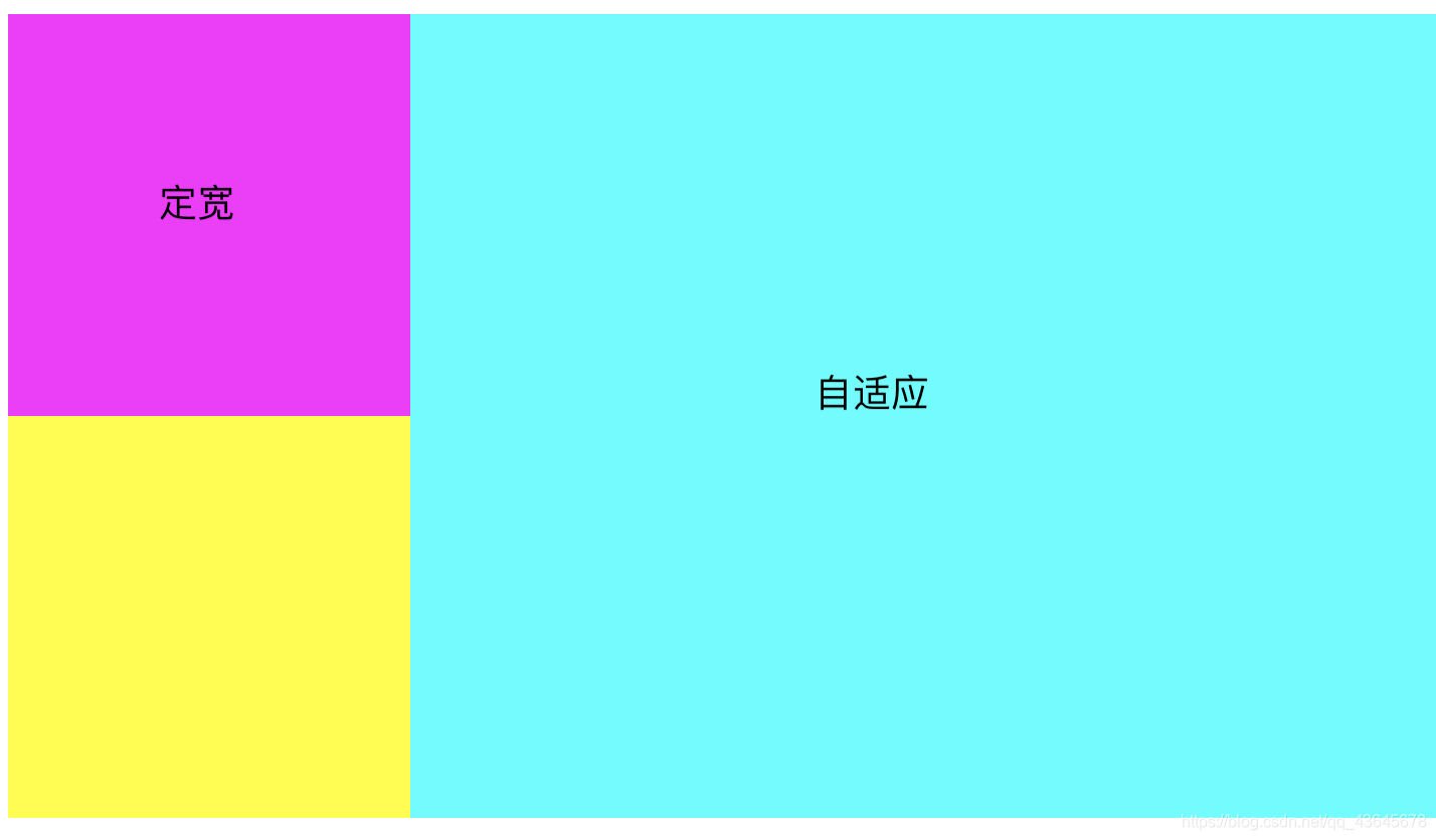
2.2.2 左定宽右自适应布局
<style>
    #d1 {


        width: 200px;
        height: 100px;
        background-color: #f00;
        float:left;
    }
    #d2 {


        height: 400px;
        background-color: #ff0;
    }
</style>
<body>
	<div id="d1"></div>
	<div id="d2"></div>
</body>
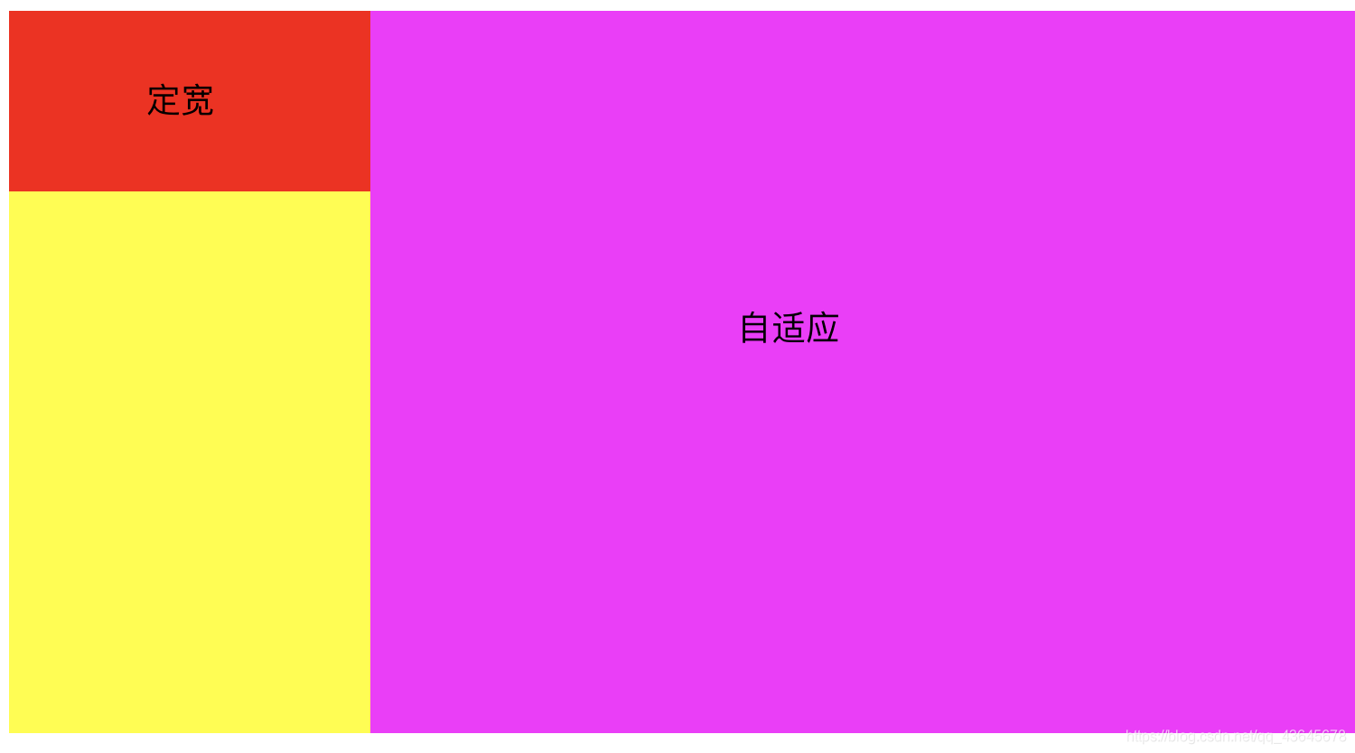
方案二
左侧定宽浮动,右侧全宽+子元素Margin-left
<style>
    #d3{


        width: 200px;
        height: 100px;
        background-color: #f00;
        float:left;
    }
    #d4{


        height: 400px;
        background-color: #ff0;
    }
    .content{


        margin-left:200px;
        height: 400px;
        background-color: #f0f;
    }
</style>
<body>
    <div id="d3"></div>
    <div id="d4">
        <div class="content"></div>
    </div>
</body>
方案三(推荐)
全部浮动,右侧宽度100%,并设置负margin-left
<style>
        .main {


            width: 100%;
            height: 400px;
            background-color: #ff0;
            float: left;
        }
        .content{


            margin-left:200px;
            height: 400px;
            background-color: #0ff;
        }
        .aside {


            float: left;
            width: 200px;
            height: 200px;
            background-color: #f0f;
            margin-left:-100%;
        }
    </style>
</head>

<body>
    <div class="main">
        <div class="content"></div>
    </div>
    <div class="aside"></div>
</body>
2.2.3 左自适应右定宽布局
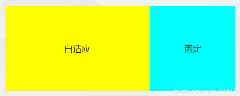
方案一
- 固定在前(右浮动),自适应在后(全宽),内部margin-right
<style>
    .d1{


        width: 100%;
        height: 500px;
        background-color: #ff0;
    }
    .content{


        height: 500px;
        margin-right:200px;
        background-color: #0ff;
    }
   .d2{


        width: 200px;
        height: 200px;
        background-color: #0f0;
        float:right;
    }
</style>
<body>
    <div class="d2">固定区域</div>
    <div class="d1">
        <div class="content">自适应区域</div>
    </div>

</body>
方案二
- 固定在后(浮动+负margin-left),自适应在前(浮动)
<style>
    .d1{


        width: 100%;
        height: 500px;
        background-color: #ff0;
        float:left;
    }
    .content{


        height: 500px;
        margin-right:200px;
        background-color: #0ff;
    }
   .d2{


        width: 200px;
        height: 200px;
        background-color: #0f0;
        float:left;
        margin-left:-200px;
    }
</style>
<body>
    <div class="d1">
        <div class="content">自适应区域</div>
    </div>
    <div class="d2">固定区域</div>
</body>
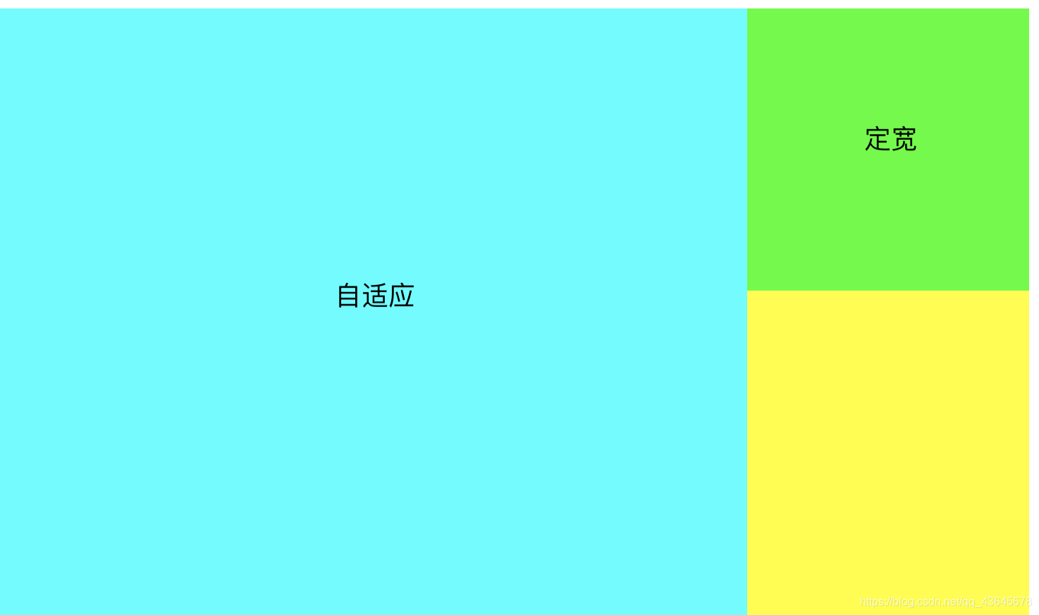
2.2.4 两列定宽右自适应布局
- 左侧两列定宽可以
按一列处理
- 参考左侧定宽右侧自适应解决方案
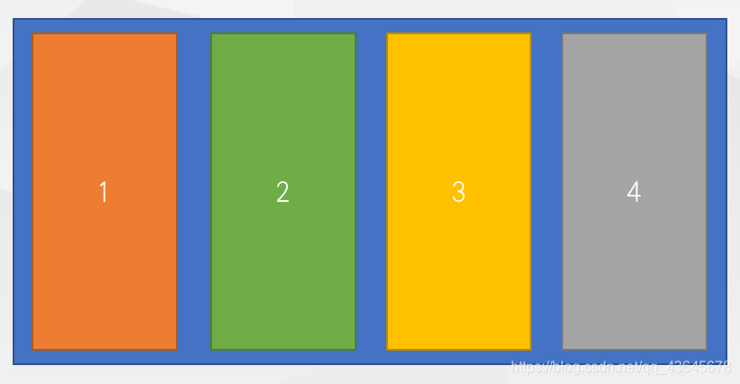
2.2.5 多列等分布局
- 采用
百分比设置宽度
<style media="screen">
    *{

     margin: 0;padding: 0;}
    div{


      width: 25%;
      height: 200px;
      background-color: red;
      float: left;
    }
  </style>
</head>
<body>
  <div style="background-color: red">1</div>
  <div style="background-color: blue">2</div>
  <div style="background-color: yellow">3</div>
  <div style="background-color: green">4</div>
</body>
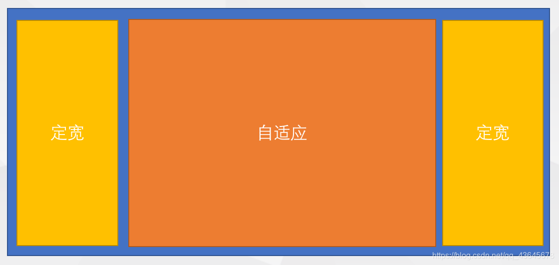
2.2.6 两端固定中间自适应布局
- 简单实现方法
- 两端定宽分别左右浮动,中间设置左右margin,
不设置宽度
- 三个标签
按顺序排列
<style media="screen">
	 *{

     margin: 0;padding: 0;}
	 .left {


	   width: 200px;
	   height: 400px;
	   float: left;
	   background-color: red;
	 }
	 .content {


	   height: 400px;
	   background-color: blue;
	   margin-left: 0;
	   margin-right: 0;
	 }
	 .right {


	   width: 200px;
	   height: 400px;
	   float: right;
	   background-color: green;
	 }
</style>

<body>
  <div class="left">1</div>
  <div class="right">3</div>
  <div class="content">2</div>
</body>
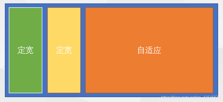
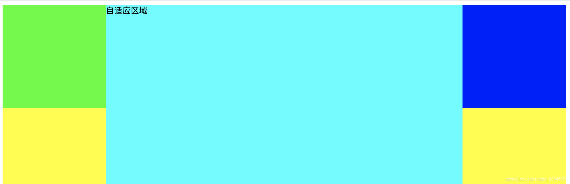
2.2.7 双飞翼布局
- 自适应标签放在
第一位,三个标签全部浮动
- 自适应标签内部嵌套一个子容器,设置
左右margin,留出两端固定区域
- 左侧固定标签
margin-left为负的100%
- 右侧固定标签
margin-left为负的右侧固定区块宽度
<style>
   .center,.left,.right{

     float:left;}
   .center{


       width: 100%;
       height: 500px;
       background-color: #ff0;
   }
   .content{


       margin:0 200px;
       height: 500px;
       background-color: #0ff;
   }
   .left{


       width: 200px;
       height: 200px;
       background-color: #0f0;
       margin-left:-100%;
   }
   .right{


       width: 200px;
       height: 200px;
       background-color: #00f;
       margin-left:-200px;
   }
</style>
<body>
    <div class="center">
        <div class="content">自适应区域</div>
    </div>
    <div class="left"></div>
    <div class="right"></div>
</body>
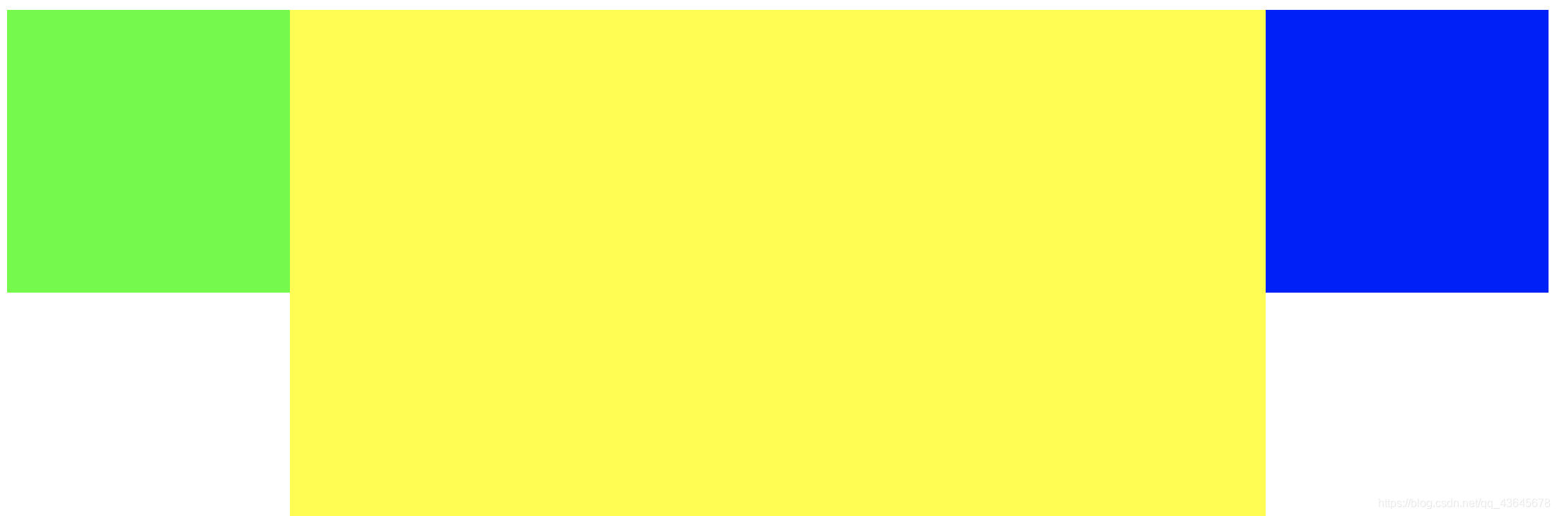
2.2.8 圣杯布局
- 自适应标签放在
第一位,三个标签全部浮动,外部增加一个容器
- 外部容器标签设置
左右的padding,留出两端固定区域
- 自适应标签
宽度为100%
- 左侧固定标签,
margin-left为负的100%,相对定位+left(负数)
- 右侧固定标签,
margin-left为负的右侧固定区块宽度,相对定位+right(负数)
<style>
    .container{


        padding:0 200px;
    }
    .center,.left,.right{

     float:left;}
    .center{


        width: 100%;
        height: 500px;
        background-color: #ff0;
    }
    .left{


        width: 200px;
        height: 200px;
        background-color: #0f0;
        margin-left:-100%;
        position:relative;
        left:-200px;
    }
    .right{


        width: 200px;
        height: 200px;
        background-color: #00f;
        margin-left:-200px;
        position:relative;
        right:-200px;
    }
</style>

<body>
    <div class="container">
        <div class="center"></div>
        <div class="left"></div>
        <div class="right"></div>
    </div>

</body>
3. Flex 布局方式
3.1 增强盒子属性
<style media="screen">
*{
margin: 0;padding: 0;}
div{
width: 100px;
height: 100px;
padding: 10px;
background-color: #ff0;
border: 5px solid #ccc;
box-sizing: border-box;
}
</style>
<body>
<div></div>
</body>
width: calc(100% - 100px)
3.2 弹性布局
- Flex 是 Flexible Box 的缩写,意为“
弹性布局”,用来为盒子模型提供最大的灵活性
- 设为 Flex 布局以后,
子元素的float、clear和vertical-align属性将失效
3.2.1 flex 布局原理

- 交叉轴方向多项目对齐属性
align-content
3.2.2 flex 语法
| 样式 |
说明 |
| display: flex |
设置容器为块级弹性布局 |
| display: inline-flex |
设置容器为内联级弹性布局 |
| flex-direction |
设置容器内部元素的排列顺序,正序或逆序 |
| flex-wrap |
设置容器内部元素是否自动换行 |
| flex-flow |
集成了 direction 和 wrap 设置 |
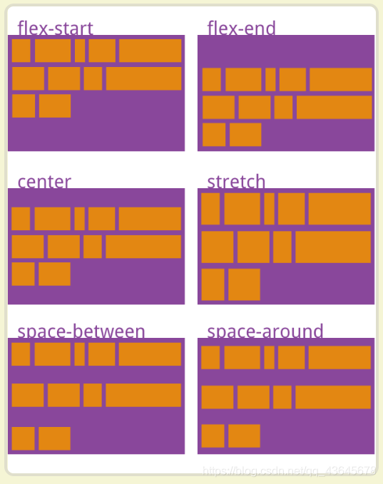
| justify-content |
设置内部元素的主轴对齐方式 |
| align-items |
设置内部元素的交叉轴对齐方式 |
| 样式 |
说明 |
| align-self |
设置元素相对自身交叉轴对齐方式 |
| flex |
设置每个内部元素占用的空间比例 |
| order |
设置内部元素在容器中显示的位置 |
| 属性值 |
描述 |
| flex-start |
默认值,项目位于容器开头 |
| flex-end |
项目位于容器结尾 |
| center |
项目位于容器中心 |
| space-between |
项目位于各行之间留有空白的容器内 |
| space-around |
项目位于各行之前,之间,之后都留有空白的容器内 |
| initial |
设置该属性为它的默认值 |
| inherit |
从父元素继承该属性 |
| 属性值 |
描述 |
| stretch |
默认值,元素被拉伸以适应容器 |
| center |
项目位于容器中心 |
| flex-start |
项目位于容器开头 |
| flex-end |
项目位于容器结尾 |
| space-between |
项目位于各行之间留有空白的容器内 |
| space-around |
项目位于各行之前,之间,之后都留有空白的容器内 |
| initial |
设置该属性为它的默认值 |
| inherit |
从父元素继承该属性 |
3.2.3 flex 练习
<style>
*{
margin: 0;padding: 0;}
.container {
width: 400px;
margin: 10px auto;
border: 1px solid #f00;
display: flex;
flex-wrap: wrap;
justify-content: center;
align-items: center;
}
.item {
width: 100px;
height: 100px;
display: flex;
border-radius: 5px;
border: 1px solid #ccc;
margin: 10px;
}
span {
display: block;
width: 15px;
height: 15px;
background-color: #000;
border-radius: 50%;
margin: 8px;
}
.container>div:nth-child(1) {
justify-content: flex-start;
}
.container>div:nth-child(2) {
justify-content: center;
}
.container>div:nth-child(3) {
justify-content: flex-end;
}
.container>div:nth-child(4) {
flex-direction: column;
justify-content: center;
}
.container>div:nth-child(5) {
flex-direction: column;
justify-content: center;
align-items: center;
}
.container>div:nth-child(6) {
justify-content: flex-end;
align-items: flex-end;
}
.container>div:nth-child(7) {
justify-content: space-between;
}
.container>div:nth-child(8) {
justify-content: space-between;
flex-direction: column;
}
.container>div:nth-child(9) {
flex-direction: column;
justify-content: flex-start;
}
.container>div:nth-child(9) span:nth-child(2){
align-self: center;
}
.container>div:nth-child(10) {
flex-wrap: wrap;
justify-content: flex-end;
align-content: space-between;
}
</style>
<body>
<div class="container">
<div class="item"><span></span></div>
<div class="item"><span></span></div>
<div class="item"><span></span></div>
<div class="item"><span></span></div>
<div class="item"><span></span></div>
<div class="item"><span></span></div>
<div class="item"><span></span><span></span></div>
<div class="item"><span></span><span></span></div>
<div class="item"><span></span><span></span></div>
<div class="item"><span></span><span></span><span></span><span></span></div>
</div>
</body>
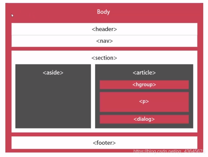
4. HTML5 网站布局
| 元素 |
描述 |
| header |
定义文档或节的页眉 |
| nav |
定义导航链接的容器 |
| section |
定义文档中的节 |
| article |
定义独立的自包含文章 |
| aside |
定义内容之外的内容(比如侧栏) |
| footer |
定义文档或节的页脚 |
| details |
定义额外的细节 |
| summary |
定义 details 元素的标题 |
传统布局

HTML5 布局
4. 总结
- 布局一直是页面最重要的部分之一,优秀的界面布局会提升用户体验,非常重要