一、季节性
只要序列的平均值有规律的、周期性的变化,时间序列就会表现出季节性。 季节性变化通常遵循时钟和日历——一天、一周或一年的重复很常见。 季节性通常是由自然世界在几天和几年内的循环或围绕日期和时间的社会行为惯例驱动的。

两种模拟季节性的特征。 第一种,指标,最适合观察很短的周期,例如每周观察。第二种,傅里叶特征,最适合观测长期变化的季节,比如每年的日常观测季节。
二、季节性图和季节性指标
就像我们使用移动平均线图来发现系列中的趋势一样,我们可以使用季节性图来发现季节性模式。
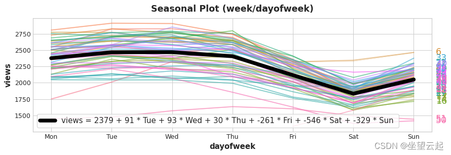
季节性图显示了针对某个常见时期绘制的时间序列片段,该时期是您要观察的“季节”。 该图显示了维基百科关于三角函数的文章的每日浏览量的季节性图:文章的每日浏览量绘制在一个共同的每周时间段内。

1、季节性指标
季节性指标是表示时间序列水平的季节性差异的二元特征。如果您将季节性时段视为分类特征并应用单热编码,则可以得到季节性指标。
通过一周中每天的独热编码,我们得到每周的季节性指标。 为三角函数系列创建每周指标将为我们提供六个新的“虚拟”功能。 (如果你放弃其中一个指标,线性回归效果最好;我们在下图中选择了星期一。)
| Date | Tuesday | Wednesday | Thursday | Friday | Saturday | Sunday |
|---|---|---|---|---|---|---|
| 2016-01-04 | 0.0 | 0.0 | 0.0 | 0.0 | 0.0 | 0.0 |
| 2016-01-05 | 1.0 | 0.0 | 0.0 | 0.0 | 0.0 | 0.0 |
| 2016-01-06 | 0.0 | 1.0 | 0.0 | 0.0 | 0.0 | 0.0 |
| 2016-01-07 | 0.0 | 0.0 | 1.0 | 0.0 | 0.0 | 0.0 |
| 2016-01-08 | 0.0 | 0.0 | 0.0 | 1.0 | 0.0 | 0.0 |
| 2016-01-09 | 0.0 | 0.0 | 0.0 | 0.0 | 1.0 | 0.0 |
| 2016-01-10 | 0.0 | 0.0 | 0.0 | 0.0 | 0.0 | 1.0 |
| 2016-01-11 | 0.0 | 0.0 | 0.0 | 0.0 | 0.0 | 0.0 |
| ... | ... | ... | ... | ... | ... | ... |
向训练数据中添加季节性指标有助于模型区分季节性周期内的平均值:
2、傅立叶特征和周期图
我们现在讨论的这种特征更适合长季节,而不是指标不切实际的许多观察。 傅立叶特征不是为每个日期创建一个特征,而是尝试用几个特征来捕捉季节性曲线的整体形状。
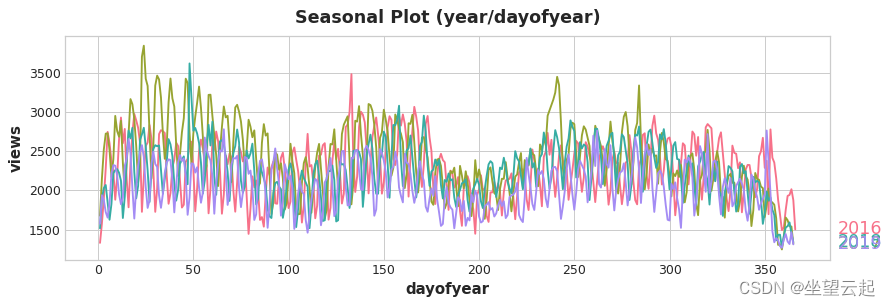
让我们看一下三角函数中年度季节的图。 注意各种频率的重复:每年 3 次长的上下运动,每年 52 次的短周运动,也许还有其他。
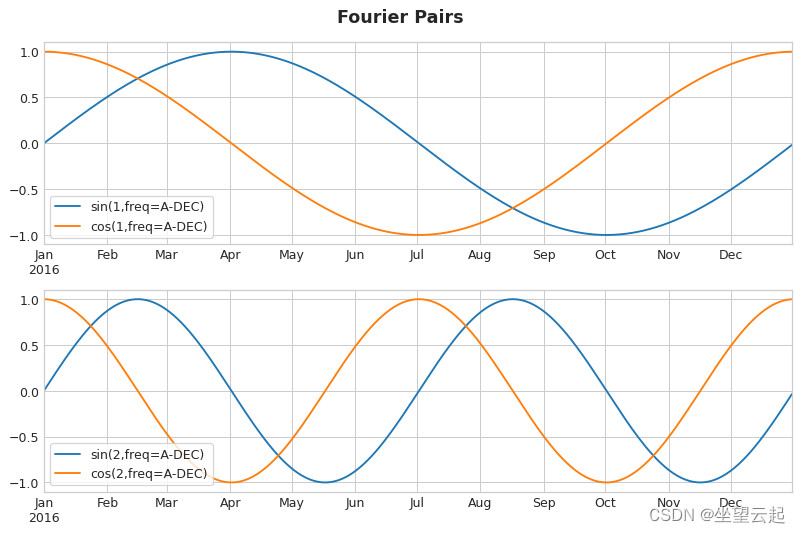
我们试图用傅里叶特征捕捉一个季节内的这些频率。 这个想法是在我们的训练数据中包含与我们试图建模的季节具有相同频率的周期性曲线。 我们使用的曲线是三角函数正弦和余弦的曲线。
傅里叶特征是正弦和余弦曲线对,从最长的季节开始,每个潜在频率对应一对。 模拟年度季节性的傅里叶对将具有频率:每年一次、每年两次、每年三次,等等。
如果我们将一组这些正弦/余弦曲线添加到我们的训练数据中,线性回归算法将计算出适合目标序列中季节性分量的权重。 该图说明了线性回归如何使用四个傅立叶对来模拟 Wiki Trigonometry 系列中的年度季节性。
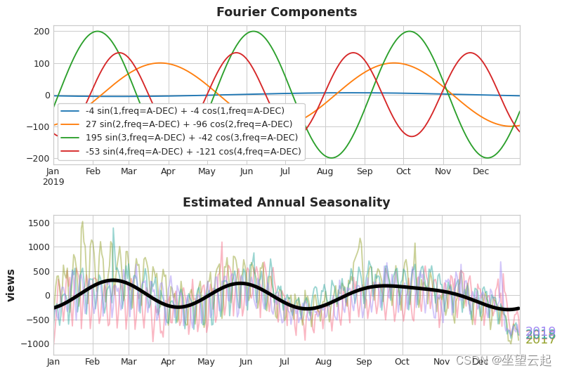
我们只需要八个特征(四个正弦/余弦对)就可以很好地估计年度季节性。将此与需要数百个特征(一年中的每一天一个)的季节性指标方法进行比较。通过仅使用傅立叶特征对季节性的“主效应”进行建模,您通常需要向训练数据中添加更少的特征,这意味着减少了计算时间并降低了过度拟合的风险。
3、使用周期图选择傅里叶特征
我们应该在特征集中实际包含多少傅里叶对?我们可以用周期图来回答这个问题。周期图告诉您时间序列中频率的强度。具体来说,图表 y 轴上的值是 ,其中 a 和 b 是该频率下的正弦和余弦系数(如上面的傅立叶分量图所示))。
从左到右,周期图在 Quarterly 之后下降,每年四次。这就是我们选择四对傅立叶对来模拟年度季节的原因。 我们忽略了每周频率,因为它更好地用指标建模。
计算傅里叶特征
了解傅里叶特征的计算方式对于使用它们并不是必不可少的,但如果看到细节可以澄清事情,下面的单元格隐藏单元说明了如何从时间序列的索引中导出一组傅里叶特征。(不过,我们将在应用程序中使用来自 statsmodels 的库函数。)
import numpy as np


def fourier_features(index, freq, order):
    time = np.arange(len(index), dtype=np.float32)
    k = 2 * np.pi * (1 / freq) * time
    features = {}
    for i in range(1, order + 1):
        features.update({
            f"sin_{freq}_{i}": np.sin(i * k),
            f"cos_{freq}_{i}": np.cos(i * k),
        })
    return pd.DataFrame(features, index=index)


# Compute Fourier features to the 4th order (8 new features) for a
# series y with daily observations and annual seasonality:
#
# fourier_features(y, freq=365.25, order=4)
三、示例 - 隧道流量
我们将再次继续使用隧道交通数据集。这个隐藏的单元格加载数据并定义两个函数:seasonal_plot 和 plot_periodogram。
from pathlib import Path
from warnings import simplefilter

import matplotlib.pyplot as plt
import pandas as pd
import seaborn as sns
from sklearn.linear_model import LinearRegression
from statsmodels.tsa.deterministic import CalendarFourier, DeterministicProcess

simplefilter("ignore")

# Set Matplotlib defaults
plt.style.use("seaborn-whitegrid")
plt.rc("figure", autolayout=True, figsize=(11, 5))
plt.rc(
    "axes",
    labelweight="bold",
    labelsize="large",
    titleweight="bold",
    titlesize=16,
    titlepad=10,
)
plot_params = dict(
    color="0.75",
    style=".-",
    markeredgecolor="0.25",
    markerfacecolor="0.25",
    legend=False,
)
%config InlineBackend.figure_format = 'retina'


# annotations: https://stackoverflow.com/a/49238256/5769929
def seasonal_plot(X, y, period, freq, ax=None):
    if ax is None:
        _, ax = plt.subplots()
    palette = sns.color_palette("husl", n_colors=X[period].nunique(),)
    ax = sns.lineplot(
        x=freq,
        y=y,
        hue=period,
        data=X,
        ci=False,
        ax=ax,
        palette=palette,
        legend=False,
    )
    ax.set_title(f"Seasonal Plot ({period}/{freq})")
    for line, name in zip(ax.lines, X[period].unique()):
        y_ = line.get_ydata()[-1]
        ax.annotate(
            name,
            xy=(1, y_),
            xytext=(6, 0),
            color=line.get_color(),
            xycoords=ax.get_yaxis_transform(),
            textcoords="offset points",
            size=14,
            va="center",
        )
    return ax


def plot_periodogram(ts, detrend='linear', ax=None):
    from scipy.signal import periodogram
    fs = pd.Timedelta("1Y") / pd.Timedelta("1D")
    freqencies, spectrum = periodogram(
        ts,
        fs=fs,
        detrend=detrend,
        window="boxcar",
        scaling='spectrum',
    )
    if ax is None:
        _, ax = plt.subplots()
    ax.step(freqencies, spectrum, color="purple")
    ax.set_xscale("log")
    ax.set_xticks([1, 2, 4, 6, 12, 26, 52, 104])
    ax.set_xticklabels(
        [
            "Annual (1)",
            "Semiannual (2)",
            "Quarterly (4)",
            "Bimonthly (6)",
            "Monthly (12)",
            "Biweekly (26)",
            "Weekly (52)",
            "Semiweekly (104)",
        ],
        rotation=30,
    )
    ax.ticklabel_format(axis="y", style="sci", scilimits=(0, 0))
    ax.set_ylabel("Variance")
    ax.set_title("Periodogram")
    return ax


data_dir = Path("../input/ts-course-data")
tunnel = pd.read_csv(data_dir / "tunnel.csv", parse_dates=["Day"])
tunnel = tunnel.set_index("Day").to_period("D")
下面来看看一周和一年多的曲线。
X = tunnel.copy()

# days within a week
X["day"] = X.index.dayofweek  # the x-axis (freq)
X["week"] = X.index.week  # the seasonal period (period)

# days within a year
X["dayofyear"] = X.index.dayofyear
X["year"] = X.index.year
fig, (ax0, ax1) = plt.subplots(2, 1, figsize=(11, 6))
seasonal_plot(X, y="NumVehicles", period="week", freq="day", ax=ax0)
seasonal_plot(X, y="NumVehicles", period="year", freq="dayofyear", ax=ax1);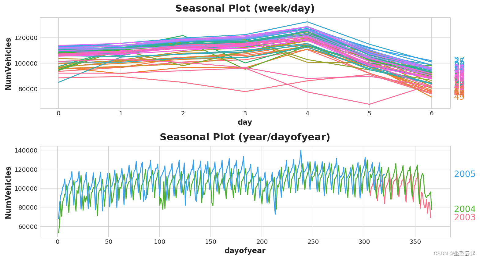
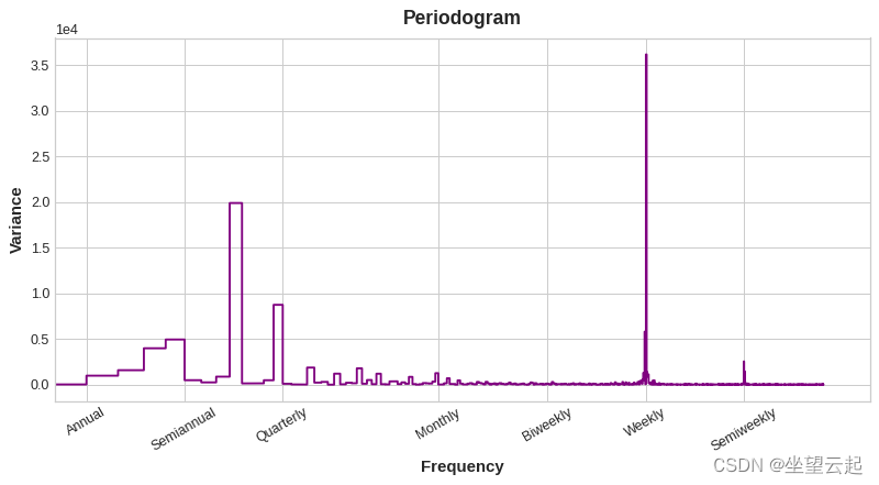
现在让我们看一下周期图:
plot_periodogram(tunnel.NumVehicles);
周期图与上面的季节图一致:每周旺季和年季较弱。 我们将用指标建模每周季节,用傅里叶特征建模每年季节。 从右到左,周期图在双月 (6) 和每月 (12) 之间递减,所以让我们使用10个傅立叶对。
我们将使用 DeterministicProcess 创建我们的季节性特征,这是我们在第 2 课中用于创建趋势特征的相同实用程序。 要使用两个季节性时段(每周和每年),我们需要将其中一个实例化为“附加项”:
from statsmodels.tsa.deterministic import CalendarFourier, DeterministicProcess

fourier = CalendarFourier(freq="A", order=10)  # 10 sin/cos pairs for "A"nnual seasonality

dp = DeterministicProcess(
    index=tunnel.index,
    constant=True,               # dummy feature for bias (y-intercept)
    order=1,                     # trend (order 1 means linear)
    seasonal=True,               # weekly seasonality (indicators)
    additional_terms=[fourier],  # annual seasonality (fourier)
    drop=True,                   # drop terms to avoid collinearity
)

X = dp.in_sample()  # create features for dates in tunnel.index
创建特征集后,我们就可以拟合模型并进行预测了。 我们将添加一个 90 天的预测,以了解我们的模型如何在训练数据之外进行推断。
y = tunnel["NumVehicles"]

model = LinearRegression(fit_intercept=False)
_ = model.fit(X, y)

y_pred = pd.Series(model.predict(X), index=y.index)
X_fore = dp.out_of_sample(steps=90)
y_fore = pd.Series(model.predict(X_fore), index=X_fore.index)

ax = y.plot(color='0.25', style='.', title="Tunnel Traffic - Seasonal Forecast")
ax = y_pred.plot(ax=ax, label="Seasonal")
ax = y_fore.plot(ax=ax, label="Seasonal Forecast", color='C3')
_ = ax.legend()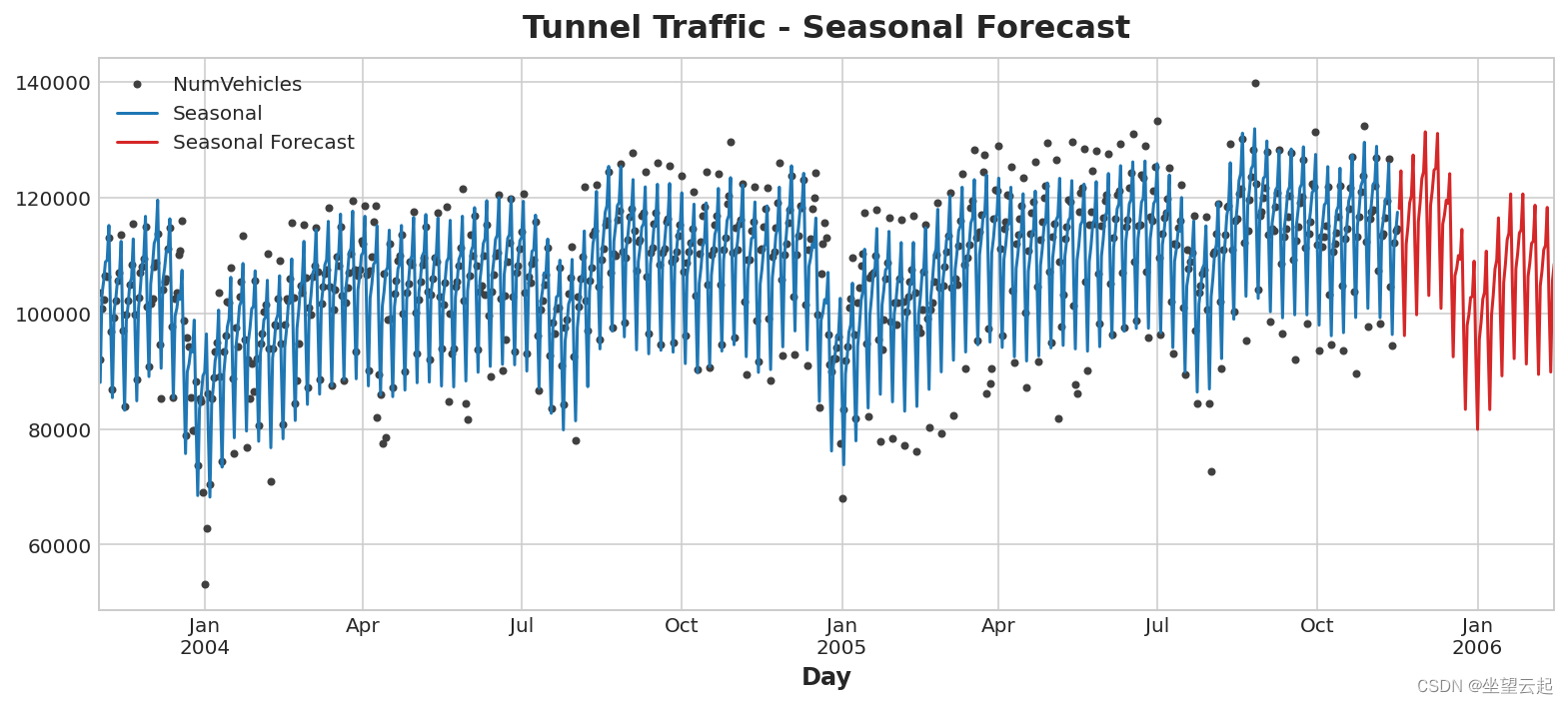
我们还可以用时间序列做更多的事情来改进我们的预测。 下一步可以将时间序列本身用作特征。 使用时间序列作为预测的输入可以让我们对序列中经常出现的另一个组件进行建模:周期。